Summer Entertaining with a complementary color scheme

Source: google.com via Ellen
I use my love of color and color combinations when I entertain. Blue/
Orange are complementary (opposite) colors on an artist’s color wheel.
Here is a sampling of a classic casual look which captures those late-
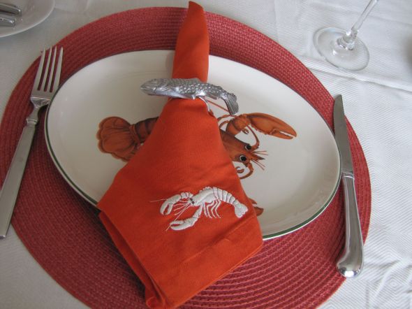
summer colors. Below, a simple but delicious lobster dinner was
served for a family birthday.
Notice the play of the colors in the “Nantucket Red” placemats and
the bright saffron embroidered-lobster napkins, with the complement
of the blue accessories and the blue and cream stripes on the chairs.
 Image ©Color Calling

- Image ©Color Calling
When using the color scheme of blue and orange in decorating, these
complementary colors actually intensify one another visually.
I find true blue/true orange combinations too jolting or too juvenile for
home decór, when you live with them on a daily basis. (The muted versions
of the two colors can be very pleasing, however.)
Most complementary color combos work well in a table setting, though,
because table decór is all about stimulating the senses.
This entry was posted on August 17, 2012 by Ellen at Color Calling. It was filed under entertaining ideas, kitchen tips, Residential styling and was tagged with color wheel, complementary colors, summer entertaining.
Now, what do YOU think? I'd love to hear from you!