An easy delicious recipe for spring pea soup
On these warm summer days, what could be more refreshing than serving a beautiful cold soup?

iPhone photo by M. Hanson
This soup could not be easier. It requires only a few minutes of cooking and a blender. The nasturtium flower shown is completely edible, and gives such an elegant presentation. Its delicately-crunchy peppery taste is perfect for this recipe, and what a color combo! Makes a lovely, light first course at a ladies’ luncheon.
SPRING PEA SOUP
serve cold
Requires a blender
3 tablespoons unsalted butter
Small Vidalia or other sweet white-fleshed onion, diced (about 1/2 cup)
1 (12 oz. to 16oz.) bag frozen spring peas or frozen baby peas
2 1/2 cups chicken broth
1/2 cup fresh mint leaves (no stems), rinsed.
1 cup crème fraîche, divided (recipe follows, so easy but takes 12 hours to set up)
In a medium fry pan, sauté onions in butter over medium heat until soft and golden but not brown, about 10 minutes.
Set aside.
In a medium large pot, pour in chicken broth and bring to a rolling boil.
With broth fully boiling, add cooked onions, then peas.
Bring back to a boil and cook for 2 or 3 minutes more. Peas should still be bright green. Remove from heat.
Working quickly, so that the pea mixture does not continue to cook and fade color, add about 3/4 cup of pea/broth mixture to blender. Place top on blender. Whirl a few seconds. Add mint leaves, salt and pepper. Place top on blender. Whirl again. Add another 3/4 cup broth mixture and whirl until smooth. With blender running, and with blender lid on but opened,

SLOWLY stream in remaining broth mixture, making sure that warm broth does not splatter. Blend until very smooth and velvety. Stir in 1/2 cup crème fraîche. Chill.
Before serving, drizzle with more crème fraîche.
Makes about 8 appetizer servings.
Crème fraîche recipe
(So easy you’ll never buy expensive ready-made again)
One cup heavy cream (supposedly the ultra-pasteurized brands do not work)
2 tablespoons buttermilk
That’s it. Stir together in a glass canning jar, and screw lid on.
Put in a warm place (I put under my kitchen counter-top lamp with the light on) for 12 hours until thickened but not solidified. Stir again until smooth and refrigerate up to 10 days. If mixture has become too thick, it can be thinned with a little more cream. Stir again before drizzling.
.

Ready for lunch!
My expensive custom draperies don’t look nice anymore, now what?
Custom draperies are not just a luxury. They are an investment, an investment which can easily run to thousands of dollars or more PER WINDOW. With nicer designer fabrics running upwards of $150-$200 per yard, multiplied times, say, 9 yards of fabric for each window, you will have possibly $1300 to $1800 invested in the fabric alone per window. This does not include labor for drapery construction, purchase and installation of drapery rods, or decorative trim.
Nothing warms up a room better than beautiful soft furnishings, and the right window treatments finish a room like nothing else can. That is why you want to get at least 12-15 years or more of good use from your gorgeous expensive custom draperies.
Here are the stage curtains in Lincoln Center in NYC, with hundreds of yards of fabric, which I snapped before a performance of “The King and I.” I can’t even imagine the work and expense that went into a drapery project of this magnitude. There must be 1500 pleats in those bad boys.

But, I digress…
My own library/family room has four large double-hung windows plus a triple window. And, after almost thirteen years of hanging, my beautiful imported linen damask draperies were really starting to show their age.
When I come into your home for an interior consultation, I do everything possible to help you work with what you have.
So, I want to show you how I re-worked the look and feel of the draperies in my own space, for a very small fraction of what completely replacing them would have run.
Here is the before, shown on the triple window:
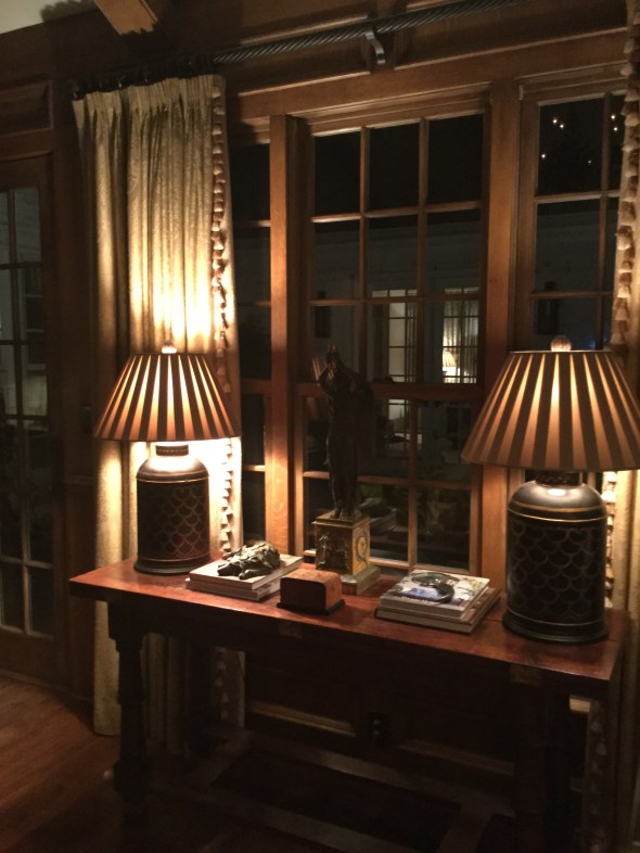
Not horrible, but here is what you can’t see in the photo:

Really bad faded places on the edge. That is not a shadow. That is where the old trim was. And, see how many panes are covered by the fabric? The fabric was smothering the courtyard and backyard views.
The drapery trim was looking dated, and frankly, the tone-on-tone look did not hold its own with the colorful Serapi carpet, see below, that is “the boss” of the room.
 P
P
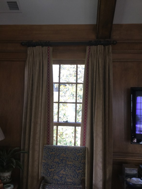
The poles have also always bugged me. They weren’t the correct length (hopefully you can learn from my mistake made long ago) and are part of the reason why the fabric faded so badly. Drapery rods should extend a measurement of 12-15 (sometimes more) inches from each side of the outer edge of the outermost window pane. This extra foot on each side adds gravitas to the window when the panels are hung, and allows the drapery fabric to be more protected from sun exposure, since the fabric is pushed further away from the window panes.
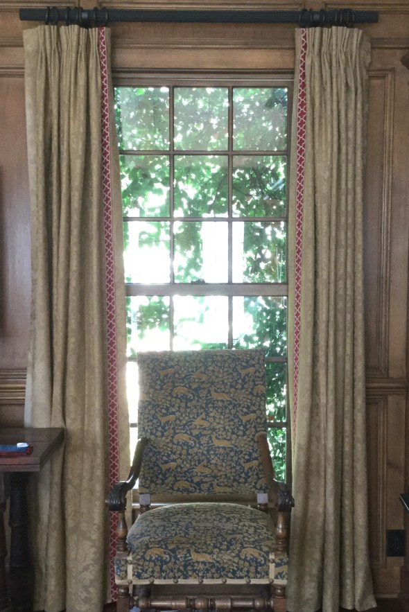
For example, my windows measure 35″ wide (inside the frame) and my new poles are 60″ long, not including the decorative finials. This is not an in-stock standard size from the company I ordered from, so I incurred a custom-cut fee, but if you are going to do it, do it right!
Here are the re-worked draperies with the new flat ribbon trim, in a beautiful poppy color that repeats the colorful poppy red accents in the carpet and also used elsewhere in the room.
 The fresh-looking quatrefoil motif echoes the ancient patterns of the carpet. For your comparison, notice how the draperies look, first hung on the old too-short rod and then on the new longer rod. First here are the re-worked panels on the old, shorter rod. See how only one full vertical row of glass pane is visible? This is still exposing the fabric to damaging light rays for sure. Remember, this is the old rod:
Now here is the “new” drapery hung on the new longer wood rod, below. See how all three vertical rows of window pane are now showing? This also gives the windows more elegance and importance, because the draperies are now ‘framing’ the windows instead of ‘covering up’ the windows. My drapery professional will be coming soon to re-hang the panels to fall perfectly, and there will be absolutely no sagging. The finials have not been reattached. But, this will give you the gist of the new work.
Here are the mechanics of the new work:
The old trim–all thirty yards of it– was meticulously hand-clipped off with tiny embroidery scissors (by moi, it was actually kinda fun and reminded me of my smocking days). I spot-cleaned and freshened each panel in the dryer (see below), then it was off to the workroom with all 10 nine-foot panels and 30 yards of colorful new trim.
The new trim was sewn onto the opposite edge of the panel of where the old trim had been. So, on each pair of draperies, the right panel became the left panel. Now, when the panels are professionally hung by the fabulous man I always use, the faded edge is going to be tucked and turned away out of sight toward the wall (called “the return” in my biz), and the fresher edge (now the “leading edge”) sports the brand new trim. Pretty clever, right?
My wonderful to-the-trade workroom professionally re-pressed each panel after the new trim was sewn on, now the panels look (almost) brand new. It really gives a new look and feel to the windows specifically, and to the room as a whole. I’ll be sure to share a wider view when everything is finished.

So, there you have it! Before:
And (almost finished) after:
Don’t you agree that the windows look bigger?
And, just for you, a couple of my best drapery tips and caveats….
- skimpy draperies are not worth doing. They will still be somewhat costly, and it is much better to install budget-friendly woven wooden shades (similar to below) than to pay for draperies that aren’t right.

- a good designer can help you “cheat” a solid fabric. Meaning, a knowledgable decorator can help you find a less-expensive solid and most people would not be able to really tell if it is a nice little Pindler or a break-the-bank Brunschwig. But remember, construction/labor costs are going to be similar whether the fabric is $5 a yard or $500 a yard, so make sure you are buying a quality fabric from the start.
- a good professional drapery installer is your best friend. S/he is trained to get everything looking perfect, and will know every trick in the book to get it right. While bloggers like myself are generally generous with our sources, don’t expect us (as design professionals) to divulge names on this one, however, unless you have hired us. The best installers often won’t work directly with the public.
- your favorite shelter magazine will usually have a wealth of photos of gorgeous drapery to use for inspiration. Your design professional is invaluable in deciding whether to do woven wood shades, a roman shade, fully operable draw drapery, rings and poles, etc. We have seen it all, and we can help you avoid an expensive mistake. And, yes, you need to line and interline your custom draperies. It is worth every penny.
- some installations will benefit from using woven wood shades IN ADDITION to existing drapery. Open any “house” magazine and surely there will be a feature to show you what I mean. I love the look, and plan to add woven wood shades to my own family room.
- avoid treatments that are trying too hard, like this one in a current popular shelter magazine this month, which is just bizarre in my opinion with its ultra-wide flat tape mitering into those ultra-thin ironed-in pleats.

- soft pleats generally look more elegant than heavily ironed-in pleats.
- never dry clean your draperies. They will shrink and then they will be too short. Use the upholstery attachment of your vacuum cleaner (on lowest possible suction, by opening the suction control tab) to keep dust and pet hair at bay.
- you can usually air-fluff most panels (no heat!!!) in your home dryer to freshen them. Remove any drapery pins and corner weights before doing this, and try 20 to 30 minutes. I always spot clean first whenever possible, and on heavier fabrics, you can usually safely spray some lightly scented fabric refresher before fluffing. A dryer sheet is also a possibility. Go slowly, proceeding panel by panel, to avoid damaging the fabric. Did I say, no heat?
- for pole-and- ring type installations, try a long strip of clear silicone tape called “curtain slide tape” on top of the pole to help the rings slide more smoothly when closing.
If you reside in the Birmingham metro area and need help with an interior project of your own, I’d love to hear from you. I also accept limited online and out-of-town commissions for color consulting. Please email me for rates and availability: colorcalling@gmail.com
Best,
Ellen

The Power of Contrast
To followers of “Southern Charm” on Bravo, or aficionados of Charleston, you will recognize the second photograph immediately, if not the first.


I assume that decorator Mario Buatta suggested the striking green for the new shutter color. Bravo, indeed.
The true story of how a Hand-me-down Clock ended up in the Metropolitan Museum
What do you do when a long-time friend tells you that the clock she recently inherited is going to be part of an exhibit opening in the American Wing at the Metropolitan Museum?
‘The Artistic Furniture of the Gilded Age’….the American period from the late 1870s until about 1900.

Daylight view of the Engelhard Court in the American Wing
And, that she is inviting me to attend the gala preview party at the Museum?
Well, you hop on a plane and get to New York, that’s what!
How many opportunities in life will there be to sip a cocktail and nibble caviar hors d’oeuvres with 200 museum patrons in the gorgeous Charles Engelhard Court of the museum? And, then have a private after-hours tour of the exhibit?

Engelhard Court during the Gala Preview.
Here are some highlights of that magical evening.
This is the model of a New York City townhouse of the Gilded Age period, just off Fifth Avenue. This beautiful manse was demolished in 1938. Sadly, other similarly situated houses as elaborate and historically important as this one also have been razed in the name of progress.
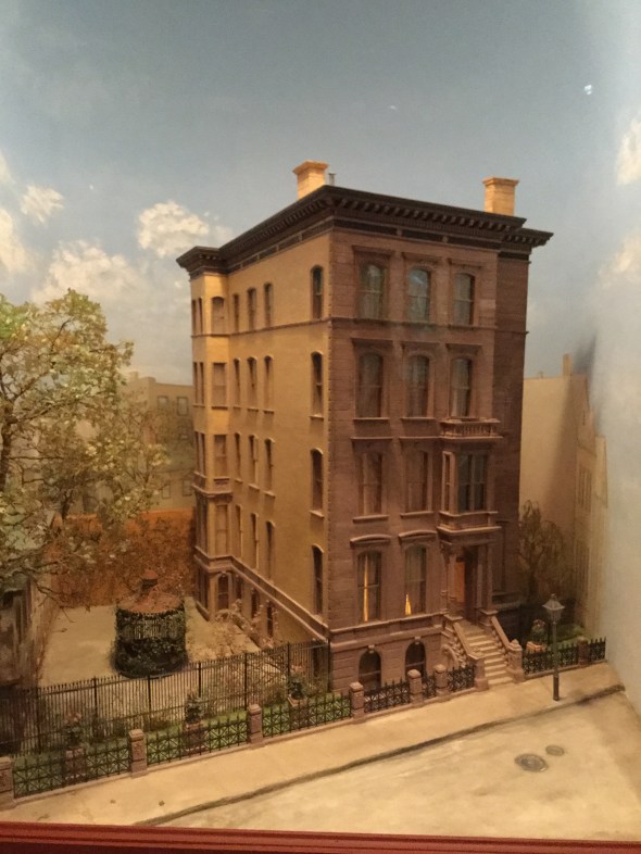
Model of Worsham-Rockefeller house

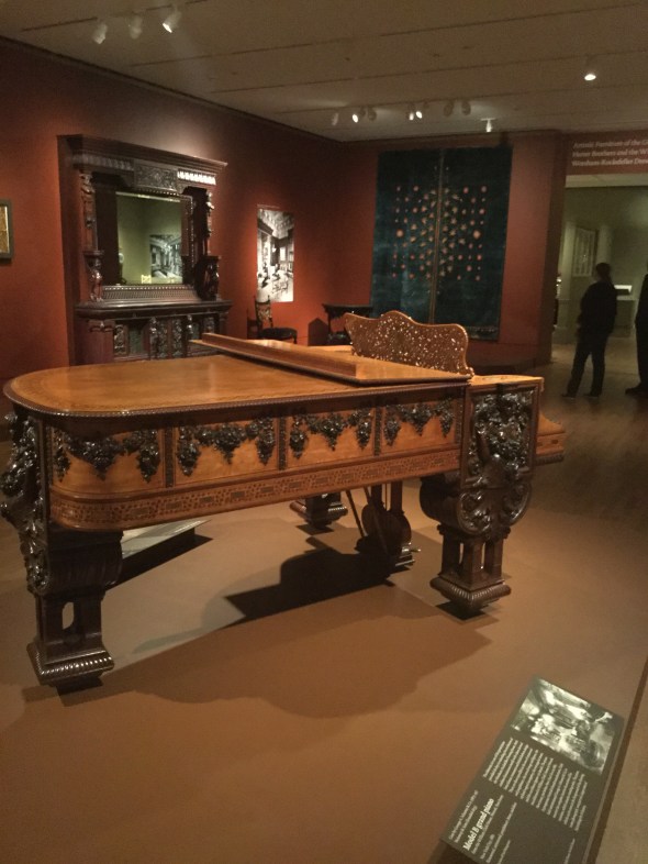
Richly carved, dark or inlaid wood, and heavy, elaborate fabrics ruled the interiors of the day. Here is the piano in the exhibit, which was rescued from a church basement. It still has the original strings!
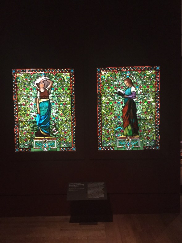
Two stained glass window panels, representing Morning and Evening, are stunning.
My friend, a native Alabamian living in Houston for years, by nature is curious and detailed (she is also very smart, as her C.P.A. designation attests).
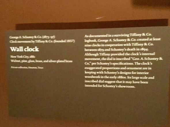
Once she began researching the very unusual wall clock, she felt like it had a measure of importance. Here is the clock, so special and integral to the exhibit, that the director of the American Wing flew to Houston the next day after my friend called to tell him what she thought might have.

1880s Schastey clock with Tiffany movement
Let me backtrack a moment, now that you have seen the clock. The clock was actually inherited by a friend of my friend, who did not have a place for it. It was given to my friend, knowing that she adored the father who owned the clock, and out of generosity.
Truly, the clock is so ornate, and of such scale, that it needs just the right place to hang. And, I must say, it was sincerely offered back to the original family once its true provenance was learned.
After the clock was in the hands of museum curators, careful examination with mirrors into the clock’s movement yielded proof that the clock was signed Tiffany. This was very exciting news for both the museum and my friend! Furthermore, a surviving Tiffany logbook from the period records the exact serial number (only nine are known to have been made, this was the ninth) and a price of $187.50!
For some reason, George A. Schastey, one of the most important interior designers of the day, is not now a household name. His chief rival, the Herter Brothers Company, is more widely recognized, and also represented in this fascinating, strictly American exhibit.
Mr. Schastey’s great-great granddaughter was an honored guest at the exhibit, attending with her husband of 58 years!
A night to remember!
Thank you, dear friend L.B.D. for including me.
New York City Christmas windows
‘Tis the season!
On a whirlwind trip to New York, I had to play tourist and snap a few window photos.

Colorful and bright windows at Bergdorf’s


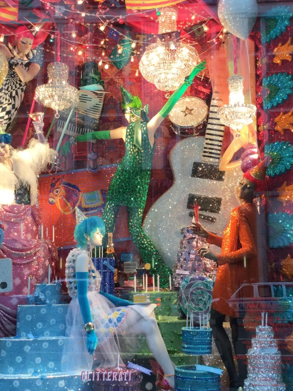


Bergdorf’s showstopper window
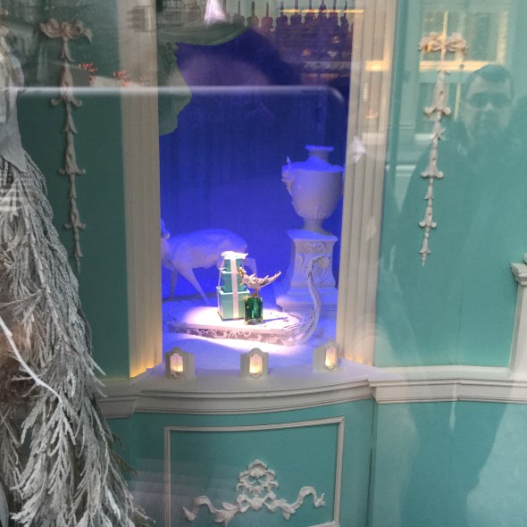
Tiffany

DeBeers. Gorgeous diamond necklace!
A few diamonds with your gingerbread?


So many beautiful windows to see!
At Home on a Squirrel’s Tail


This little guy has chosen his home right outside my kitchen window. Always tippy top of the squirrel’s tail, that is his favorite perch. He is there almost every day, many times a day. It is fun to have something to look at outside, a nice focal point. This is my own secret focal point, because you can’t even see this from the street. You would have to walk up the drive and look behind the hemlock tree. Mister has been enjoying the dozen or so shelled, raw peanuts I set out for him every few days. What should I name him?
Tea, camellias, and eBay
Camellias, the state flower of Alabama. Here are my first “White by the Gate” of the season, stems trimmed short and then floated in a vintage Wedgwood jasperware gardenia bowl (very shallow), which I found on eBay for
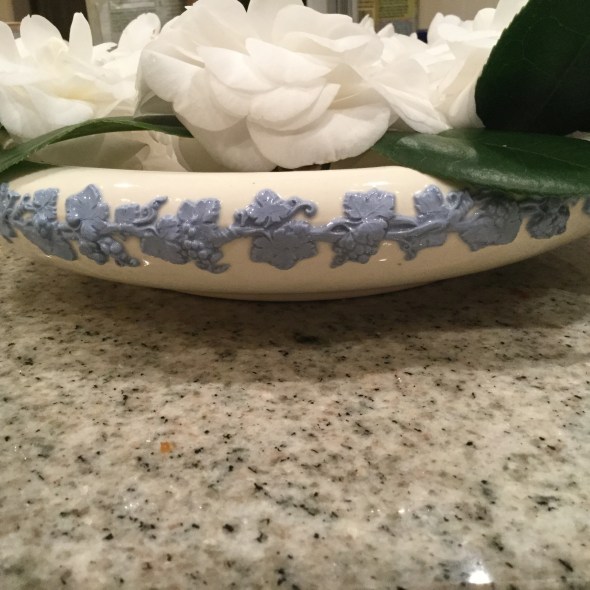
a song. Doesn’t it go nicely with an old tea-set my husband inherited from his Gammy?
Happy Thanksgiving
Wishing all my readers a Happy Thanksgiving!


I hope your day is filled with love and blessings.
Gorgeous statuary gives personality to a garden

 Have you ever seen a more gorgeous focal point? This is in my friend’s fabulous garden.
A beautiful young woman inhaling deeply into a bouquet of spring flowers.


Spence’s macarons

My friend Spence makes the most gorgeous macarons.
They are as delicious as they are pretty.
She made these for my study club’s annual luncheon.
Which was at my house this year. What a friend!
The purple are made with a lavender filling; the pink are strawberry; the yellow are lemon basil; the white (my absolute fav) are clover honey.
Have you ever?
Oh, and catch a glimpse of her “perfect” cheese straws to the upper left.
Here is the long table (actually three six-foot tables pushed together,)
set with my grandmother’s china, Sunnyvale.
Purple hobnail glasses give a lady-like vintage touch.

xo
Ellen
High/low Great Lamps
One of my favorite recent projects has been helping my young adult daughter with her very first apartment.
I am loving these Chris-Spitz look-alikes from Overstock:

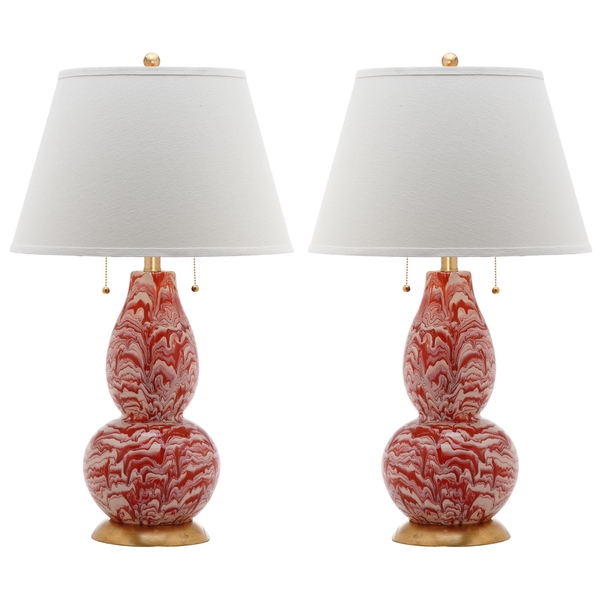
Can you tell which, above, is the
Christopher Spitzmiller Aurora Double Gourd Marbleized Lamp
$2,665.00 (EACH!!!)
and which is from Overstock.com ($144.99 per pair)?
XO

Ellen
My easiest kitchen update
Are you contemplating–
or in the middle of–
a kitchen renovation or update?
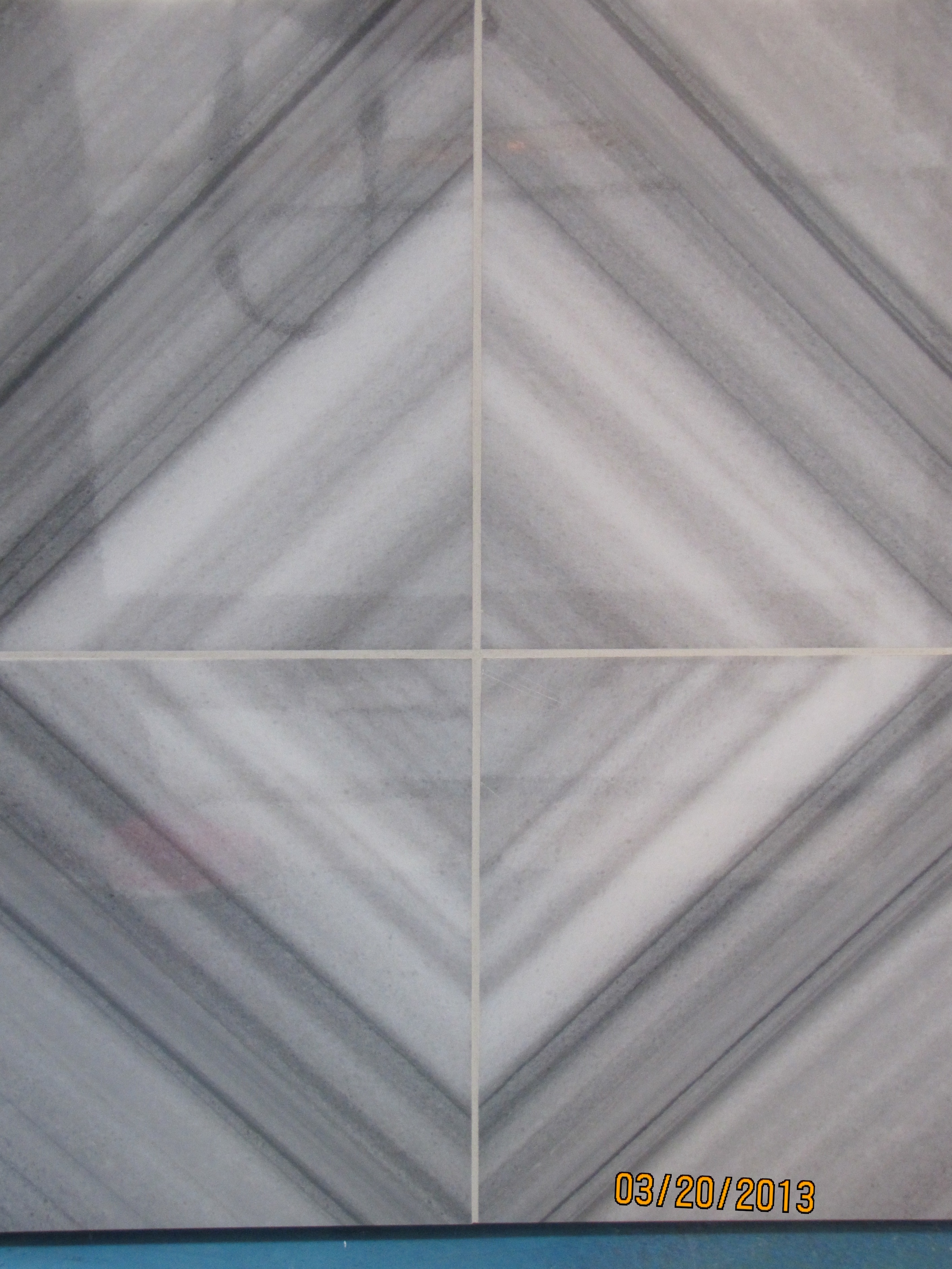
The easiest update I am suggesting to my clients right now is removing their dated brown tumbled-marble kitchen backsplash.
Which was likely installed circa 1996. On the diagonal.
.
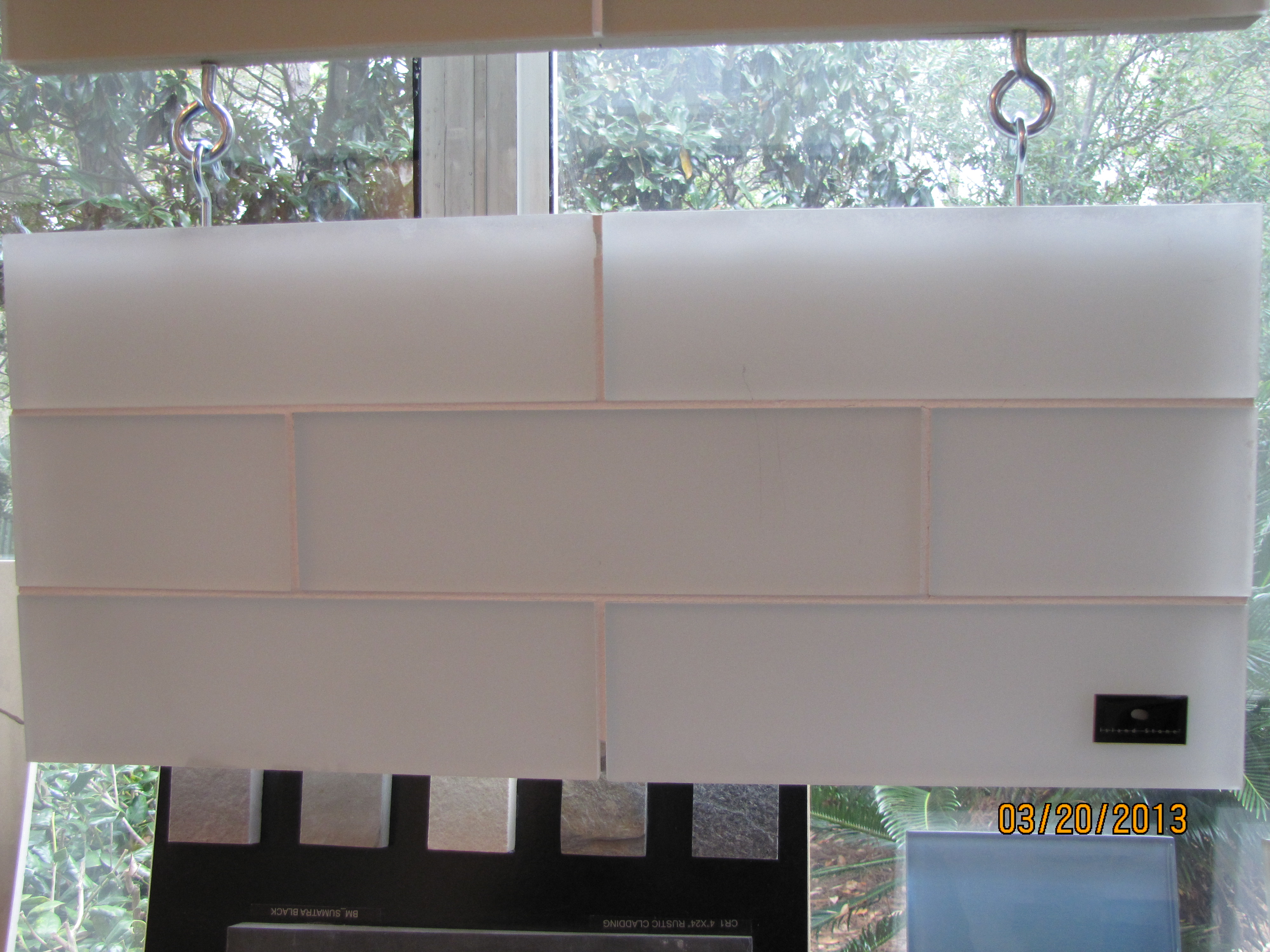
Who knew that a lighter, fresher look and feel could be yours for $3.50 a square foot (above)!
Yes, you guessed it.
Plain vanilla subway tile. White or off-white, both shown above.
The choice depends on your countertop.
I’d love to help you select finishes for your renovation, new build, or simple update.
I’ll also bring my 200 large (11″ x 14″) painted samples of the best neutrals, whites and colors,
and help you discover the perfect paint color for your kitchen walls and cabinetry.
Online, or in person if you live in Birmingham.
Email me for rates: colorcalling@gmail.com
How to love your exterior color


The color designer followed these rules:
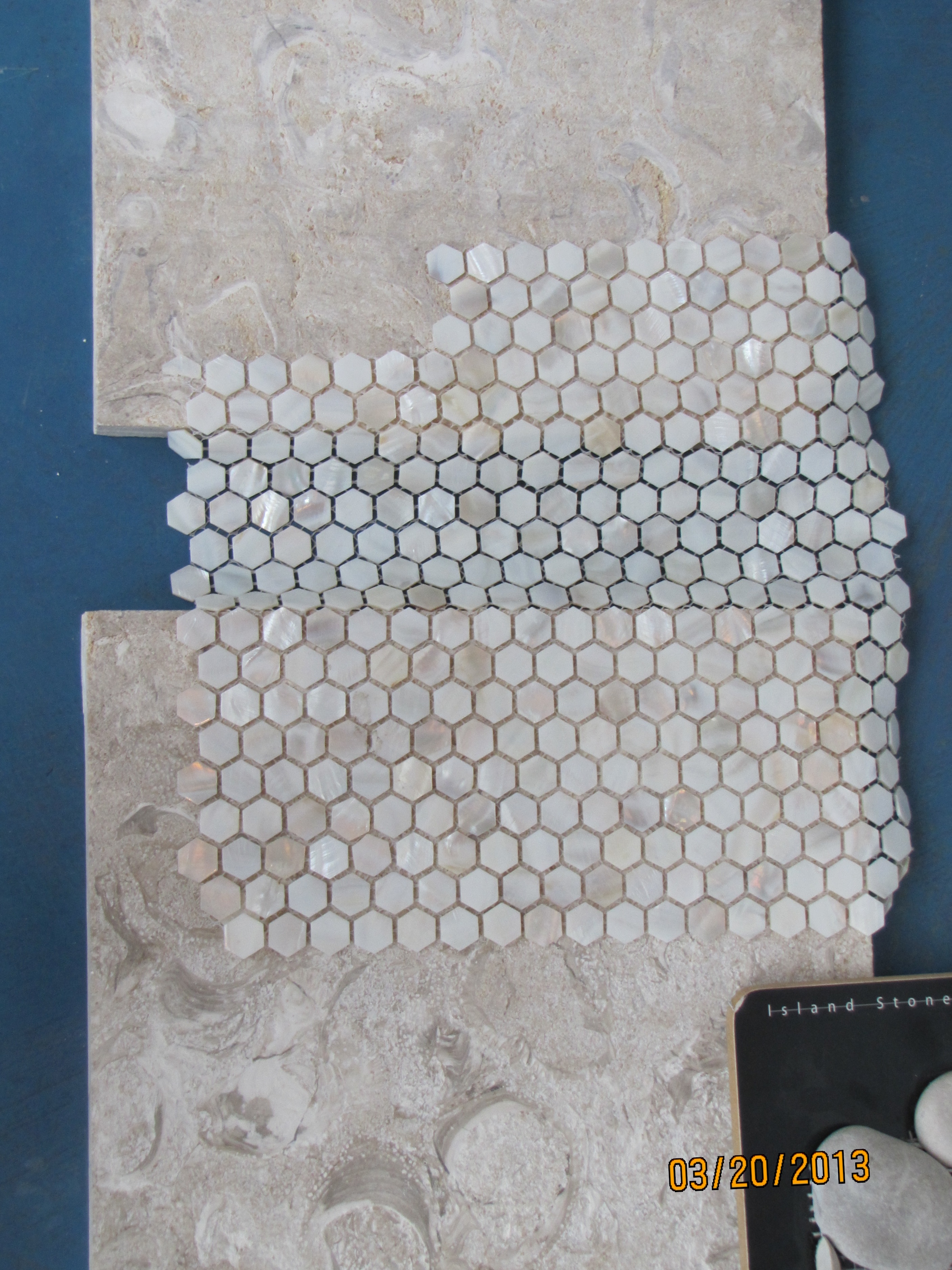
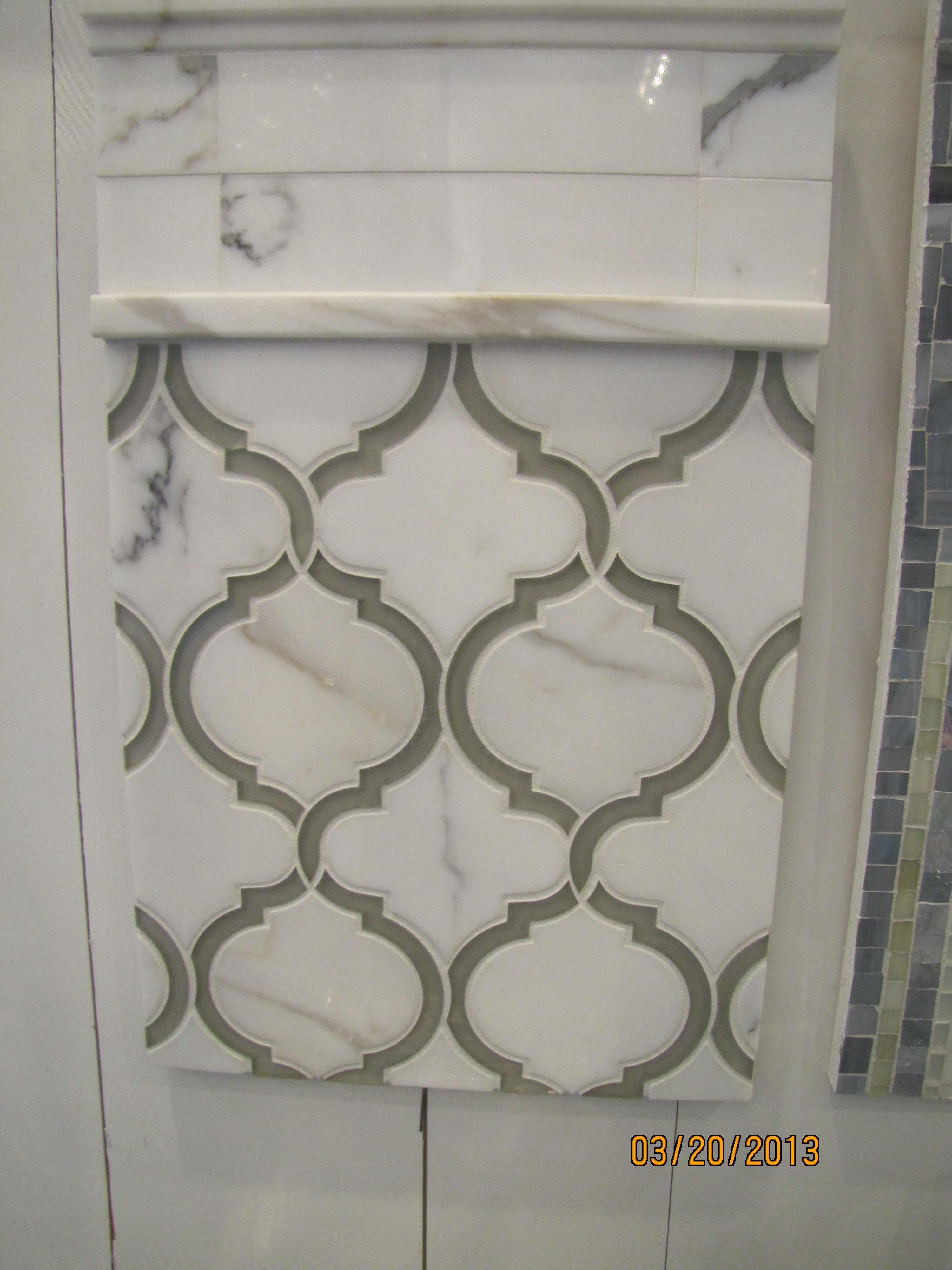
Trend Alert: The Very Latest in Countertops

PURE countertop at Z-Tile, Santa Rosa Beach, FL
The new sushi restaurant in Rosemary Beach, Florida, sports “PURE” glass counters.

image via Facebook
The PURE countertop type is so new that it isn’t to be found anywhere on Google.
And, the only fabricating company that I know of installing this product is
in northwest Florida.
A quick check to the staff at Aqua Sushi confirmed that they all “love it.”
It just looks so fresh and clean.
I am going to say this new product is a keeper.
(A similar product that I have been keeping an eye on is called Nano,
but I am hearing that PURE is a better product).
Bossy granite is what I try to steer clients away from.
Bossy granite = lots of color and/or movement.
“Bossy” elements dictate every other design decision.
Even though granite was all the rage for the last 15 years (after the Corian trend played out),
More and more people are asking, “what can I use besides granite?”
Suzy, the owner of Z-Tile, where I first saw PURE, is Green-Certified. She says that PURE is
considered a very environmentally-friendly product.
I predict we’ll be seeing a lot more of PURE.
One chandelier or two?

If you have noticed that many shelter magazines are showing not one, but two,
chandeliers over a dining-room table, you are picking up on something.
And, that something is a trend.
Not just a trend, but a trendy-trend.
For a classic, timeless, look, stick with a single chandelier over your dining room table.
Save the pair for a long hall .
Trust me on this one.
This is a trend, it will not last, and in five years it will announce:
“I decorated my dining room in 2013.”
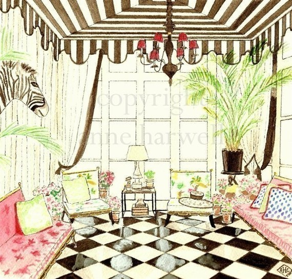
Save the two chandelier/two lantern look for something like the above.
That is a timeless look that never goes out of style.

Alabama White Marble

Did you know that different types of marble have different densities?
The more dense the marble, the less porous it is.
Higher density means less staining.
Alabama White (quarried just a few miles from where I live) is one of the whitest, densest, most beautiful marble types.
It is considered equal to the famous Italian Carrara (frequently misspelled Carrera) marble.
Alabama White marble was used in the Washington Monument.

The bust of Abraham Lincoln at the U.S. Capitol Rotunda? Also, Alabama White.
(I believe this is the right one, there are several marble busts of Lincoln at the Capitol building)

The Lincoln Memorial? My source says that the ceiling is Alabama White. Not sure you can see it, though!

U.S. Supreme Court Building? Interiors are full of Alabama White.

Here is a marble top I just received in Alabama White.
To go on this antique French garden table.
It will be permanently outdoors. I consider it a little slice of history to have Alabama White.

Alabama White is prized for its crystalline structure. It will be fine outdoors.

The {movement} is lovely and not too overwhelming.
For a table-top or small counter, ask your fabricator if there is a scrap piece
which is large enough. You will get a much better price than a slab price.
Alabama White. From my Sweet Home Alabama.


You can ring my bell
That late 1970s/early 1980s disco song keeps rummaging
through my head.
You see, we just installed this darling marine bell at the beach home of a family member.

ring my bell
We installed it to relate to the door, without being too close to interfere
with normal comings and goings.
It has the nicest, most welcoming cling-clang.
Solid brass.
Adorable anchor-motif backplate.
Genuine marine-grade rope pull.
So much more “beachy” than a regular electric doorbell.
You can ring my bell.

Do your toenails match your bath tile?
Well, if you are Suzy, they certainly do!
Suzy, the owner of a brand-new tile center in Santa Rosa Beach, Florida,
showed me that your toes can indeed match your bath tile:

Suzy’s shimmery toes!!!
Suzy is hard at work selecting the tile for the upcoming Maison de Vie,
the showhome opening this summer at WaterColor resort in the Florida Panhandle.
Her company is the lead sponsor of the home:

She gave me a sneak preview of some of the hard surfaces she will be using.
Here is the floor tile she has selected for the master bath:

flooring
It feels incredibly smooth and cool underfoot. Perfect for a beach home.
She will be using this one in the home as well. Loving the soft beach colors:

wall tile
Look at the same tile as above with dark gray grout, for a completely different look:

gray grout
Another display in the showroom:
Q-tile vignette
I fell in love with this gorgeous cross-cut marble piece:
crosscut marble
Here are some other beauties:
This one looks like a coastal sunrise. Subtle and shimmery. And, very glamorous:

shimmery
What about this subway tile with an opacity that sets it apart? Stunning.
opaque subway
Moorish Arch

moorish arch
And another Moorish arch in marble:
marble moorish arch
Here is a new product I saw in Suzy’s showroom, which is green-certified, and makes a great surface used as a bath or kitchen slab. Suzy told me that a local fabricator installed this product for her, called “Pure.” It is a glass product which looks like the whitest marble.
I have seen similar slabs called “Nano,” but was not familiar with the “Pure” brand. I will be keeping an eye on this as the next big thing, and I would love to use this in a bath installation. It really looks like pure white marble:

Pure slab
Suzy, thank you for allowing me to take photos of your beautiful new showroom!

Susie
Can’t wait to see the showhouse when I come to the beach this summer!
This is not a sponsored post, just thought you would enjoy seeing some of the latest trends in the high-end tile market.

A Spring Meeting and Diana Vreeland

set for tea
We set out light refreshments at my ladies’ study club meetings. Yesterday was my turn to host.
We learned about Diana Vreeland.
Our topic this year has been “Legendary Ladies of Style.”
It was also our topic last year, we just loved it so much we kept going!
Babe Paley, Dorothy Draper, Gloria Vanderbilt, Marella Agnelli, Lee Radziwill to name a few.
Someone said, Ellen, you should take pictures of the table.
(There were a few tarts and berries already gone by this point.)
I thought you would enjoy these photos of the offerings:
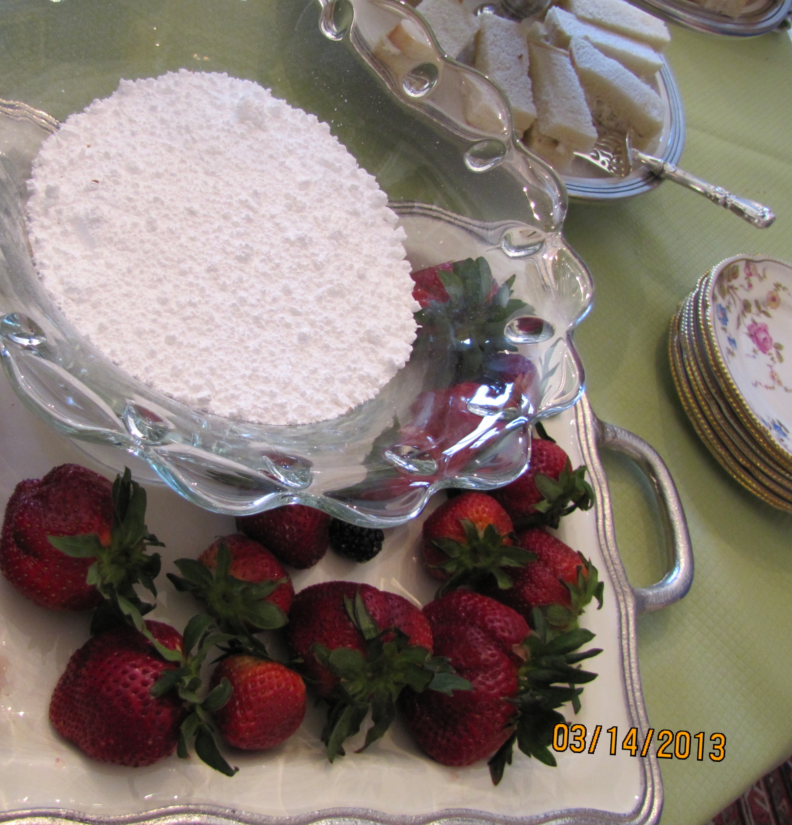
berries with powdered sugar

chicken salad and pimiento cheese finger sandwiches
mini-cheesecake bites topped with fresh blackberries (top photo)
Mrs. Vreeland would have approved of the huge strawberries.
She absolutely adored the color red.

Fascinating life, fascinating woman.
She “discovered” Lauren Bacall. Now, that was a discovery!
Why your design professional should have a blog
Because—
when you need a chandelier, your designer spots this
chinoiserie chandelier for a song in a local antique store:

And knows that world famous designer Barbara Barry has it in her client’s Beverly Hills breakfast room, guaranteed for a lot more than a song: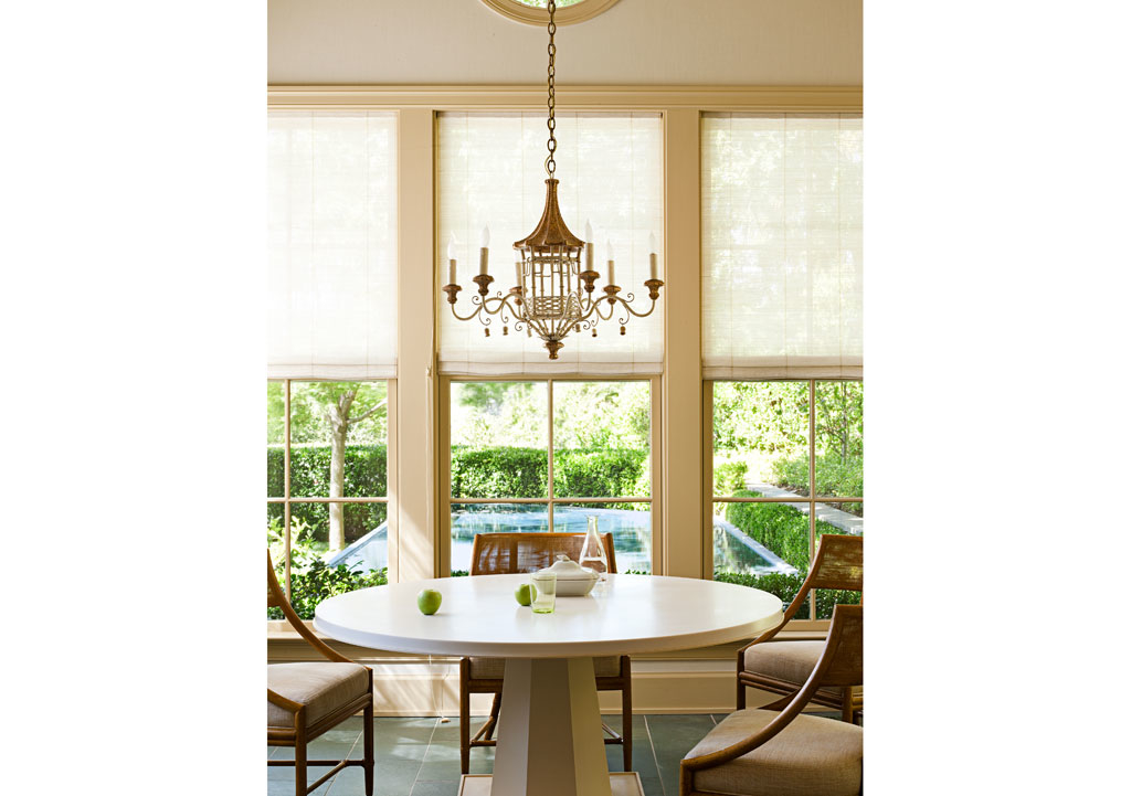
Blogging keeps us current.

Style Watch

via Horchow.com
I am really loving the cleaner lines of a full-drop bedspread.
With mattress depths all over the yardstick: 9 to 22 inches deep,
a ready-made option will rarely work, with standard drop
[measurement from the seam to the floor] about 28″.
A good design professional can guide you through fabric and tailoring options.
What do you think?
Theme Overdose
Sometimes, but not everytime, a theme needs MORE.
MORE of the same to get the right look.
A theme overdose, says fellow blogger Tara Dillard.

Maybe Tara will weigh in as to whether a bunny overdose actually works!
Those bunnies are either a huge hit or a giant miss. Not quite sure.
I know that the interiors work.
One of a kind sofa table
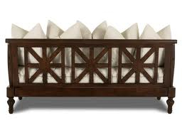
Unlike the above example, most sofas are not designed to be
interesting and beautiful in the back.
Sometimes, a sofa table is perfect for adding needed interest and beauty.
Function, too. Think storage, display, or a pair of lamps.
Check out this top, below. A beautifully carved French top, perfect width. Just sitting there waiting.
It hasn’t been there for long. It was once part of a larger piece.
And it won’t last. Nope, not this one. Not at this price.

The sconces on top aren’t part of the piece, in case you are wondering.
It is going to be perfect for someone with a home in the French taste.
I see it going on top of a simple but sturdy wrought iron stand.
Custom made, just enough height to raise it to the exact sofa-table height.
A tiny flip of iron at the foot. Just enough to say, “I honor your French heritage.
But, I won’t try to compete.”
Nothing more. Eyes only on the carving.

And, no pretense of trying to marry a modern leg, made to look old, on this old piece.
Perfect for a country French room, where the back of the sofa meets the eye.
So much more beautiful to hide a visible plain sofa’s back view when possible.
And much more beautiful when you do so with a one-of-a-kind piece,
with room for a lovely pair of lamps. And even some storage space in the three bays.
What do you think?

