Trend Alert: The Very Latest in Countertops

PURE countertop at Z-Tile, Santa Rosa Beach, FL
The new sushi restaurant in Rosemary Beach, Florida, sports “PURE” glass counters.

image via Facebook
The PURE countertop type is so new that it isn’t to be found anywhere on Google.
And, the only fabricating company that I know of installing this product is
in northwest Florida.
A quick check to the staff at Aqua Sushi confirmed that they all “love it.”
It just looks so fresh and clean.
I am going to say this new product is a keeper.
(A similar product that I have been keeping an eye on is called Nano,
but I am hearing that PURE is a better product).
Bossy granite is what I try to steer clients away from.
Bossy granite = lots of color and/or movement.
“Bossy” elements dictate every other design decision.
Even though granite was all the rage for the last 15 years (after the Corian trend played out),
More and more people are asking, “what can I use besides granite?”
Suzy, the owner of Z-Tile, where I first saw PURE, is Green-Certified. She says that PURE is
considered a very environmentally-friendly product.
I predict we’ll be seeing a lot more of PURE.

Simple Perfection

Source: designcrushblog.com via Ellen on Pinterest

Source: prettystuff.tumblr.com via Ellen on Pinterest

Source: bymildred.blogspot.com via Maria on Pinterest

Source: prettystuff.tumblr.com via Ellen on Pinterest

Source: prettystuff.tumblr.com via Ellen on Pinterest

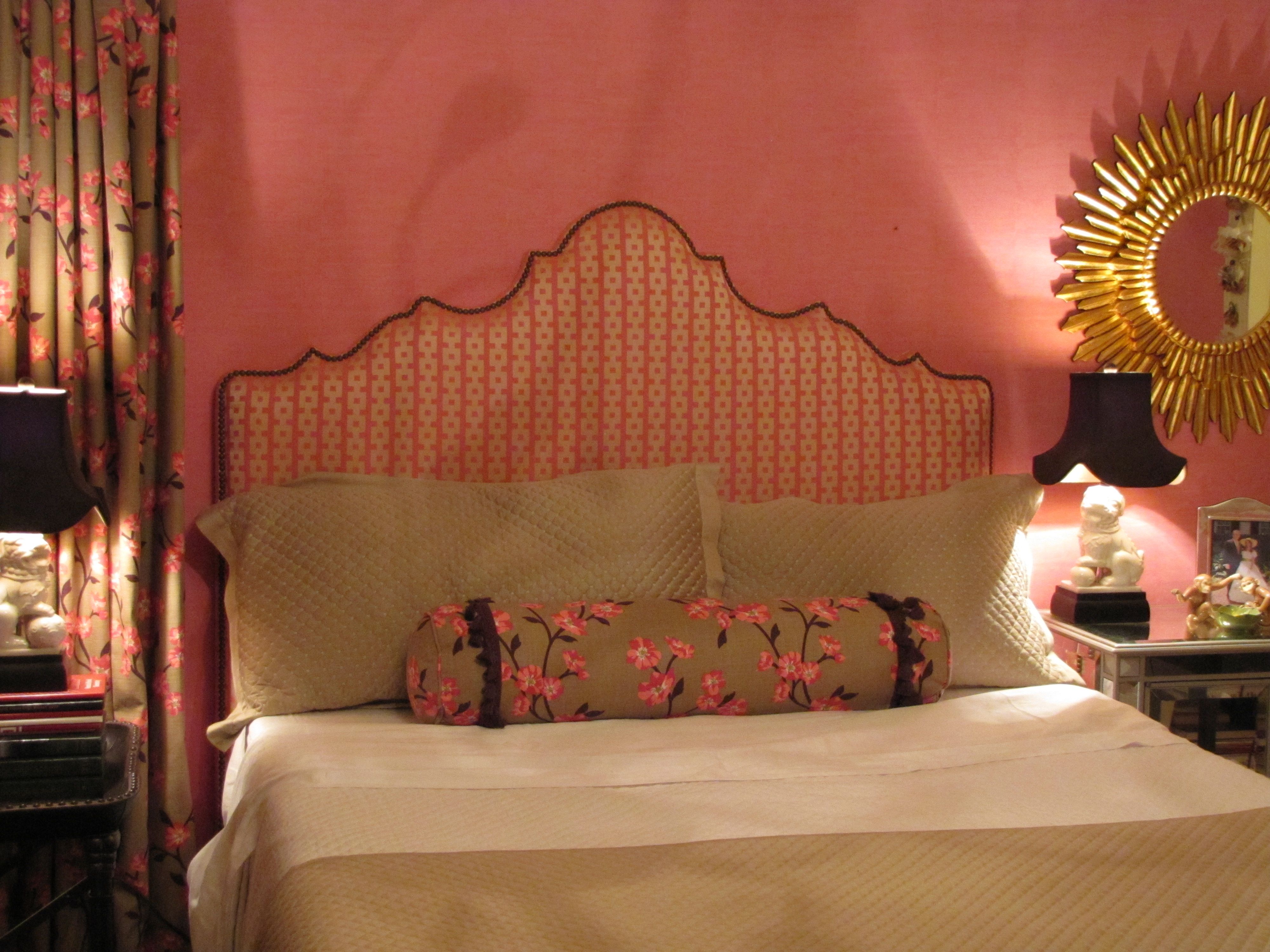
Chinoiserie bedroom makeover for a young twenty-something
Design by Ellen Rhett
My young collegiate was anxious for an update to the room that had last been decorated when she was thirteen.
A college co-ed desires a sophisticated space to return to when she’s home.
Chic chinoiserie details pleased and surprised.

Pink dogwood linen fabric unifies the hot-pink wallpaper with the neutrals.
And repeats the Chinoiserie theme.
Existing strié wallpaper was kept.
Foo dog lamps add a youthful vibe and continue the Chinoiserie theme.
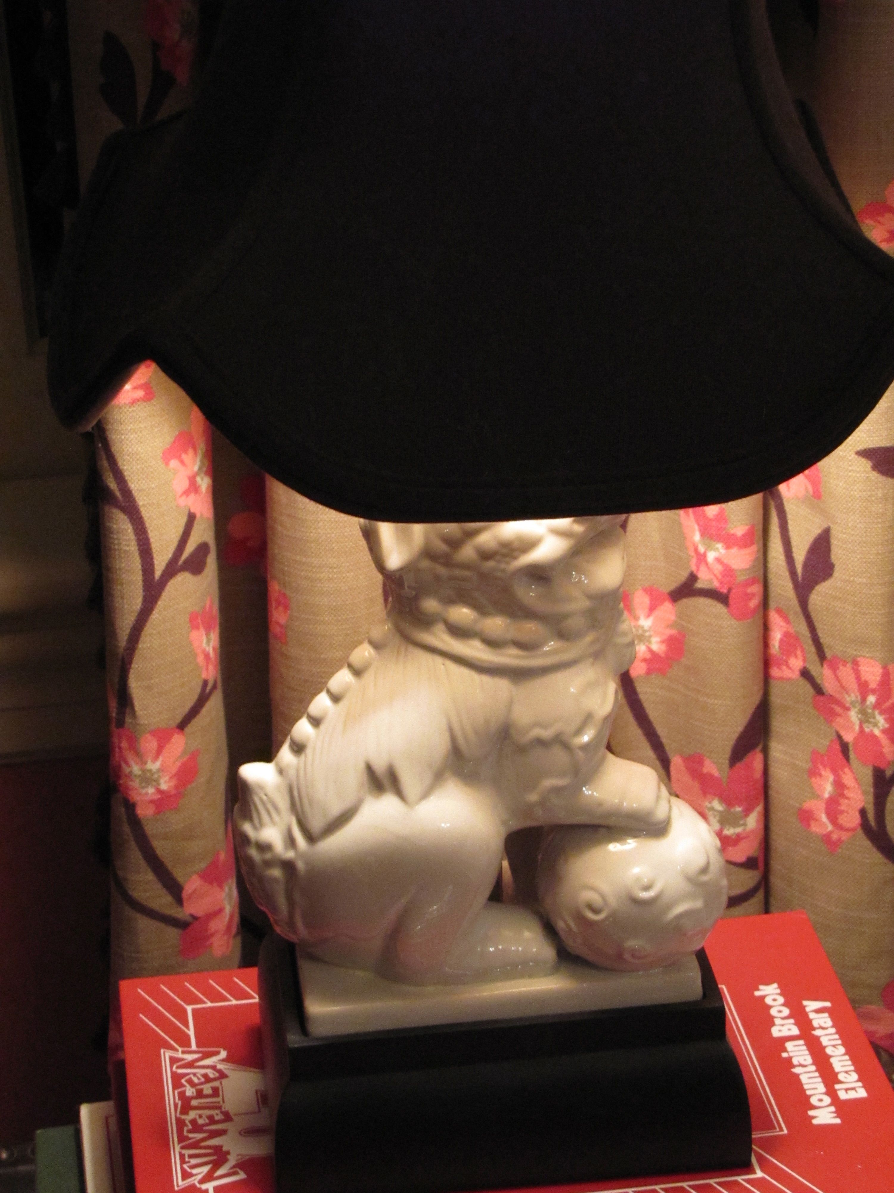
They also repeat the white in the dogwood fabric and bedding.
Remember, white is never a neutral in décor, even though it always is in fashion.
It must be repeated at least three times in a room.
White peonies, a favorite, are a natural in this room.

Design by Ellen Rhett
Custom padded headboard with expertly hand-applied nailheads (by my wonderful upholsterer)

Fun and funky and ultra-feminine light fixture, below, with plenty of sparkle and a dark finish.
Repeating the shape, movement, darkness, of the branches on the drapery and neckroll fabric.
Repeating the color of the lampshades as well.
And, a gorgeous on-trend sunburst accent mirror, handmade and all-wood.

Design by Ellen Rhett
Both sourced online for a song.
If I told you from where, you wouldn’t believe it anyway.
But, I know you, reader.
I know what you really want.
You want the before.
I’ll show you the before.
Get ready.
A little embarrassing so I’ll make this quick.
Here you are:
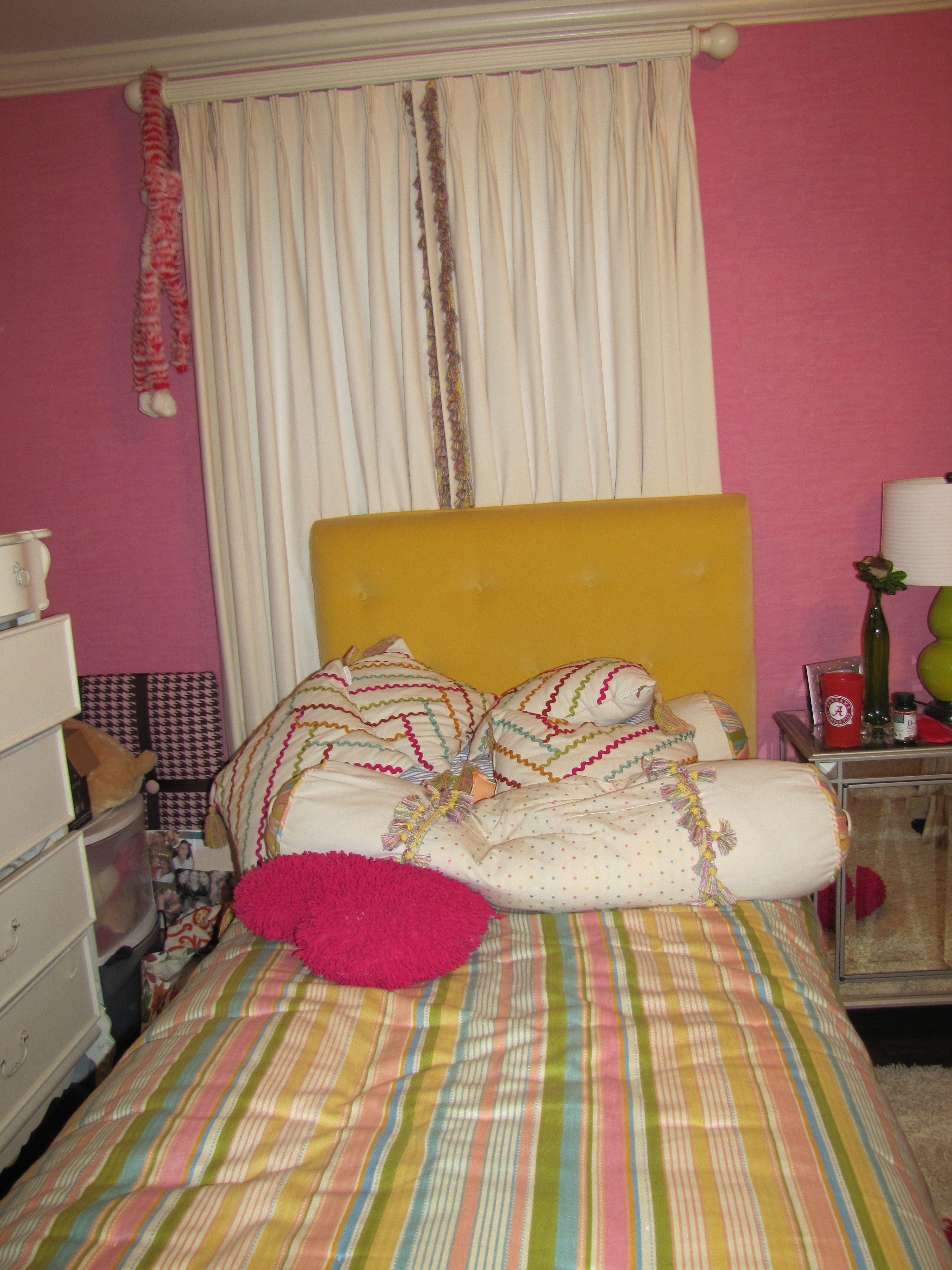
Before
And, one more time, the AFTER:

All Images Color Calling
Fabric Sources
Neckroll: Clark and Clark “Dogwood” (trade only)
Draperies: same as above.
Headboard fabric: Clark and Clark “Chinese Square” (trade only)
Bedspread, shams, comforter: Macy’s
Keeping it Simple in the Master Bath
Color harmony. A simple concept.
Made easier with an understanding of undertones.
Now, I don’t mean plain or too matching.
And I certainly don’t mean boring.
As a color specialist, it means selecting the right color.
For example, today, with my large samples, I selected a gorgeous white paint color
for a friend’s Carrara marble bath.
If you have been reading this blog, you know about my large samples, right?
Here are my inspiration photos.

Source: cotedetexas.blogspot.com via Ellen on Pinterest

Source: countryliving.com via Ellen on Pinterest

Source: pinkpreppylillylover.blogspot.com via Buffi on Pinterest
Sometimes the right color is white.
So, when you have Carrara marble, for instance,
don’t be afraid to go with white walls.
There are several whites that really sing with Carrara.
An all white bath.
A very simple concept, which will always be timeless.
Beautiful. Not boring.
I am humming to myself just thinking about this project.
If she agrees to photos, I’ll post before and afters.
What’s the best color for a workout room?

Contemporary Home Gym design by Vancouver Design-build Capstone Dwellings, Design-Build
I am often asked, What is the best color for my ______ room? What do I say?

So what is the best color for a workout room?
Here is a hint: NOT BORING BEIGE!
Think about it: you are stimulating your heart, and your other muscles when
you work out. Why not give yourself something pleasing to stimulate the eye as
well. I like to recommend that we start with your favorite color, and go from
there.
Anything that pleases your eye will help encourage you to go in and really use your work-out room.
Many work-out rooms (home gyms) are in low-natural-light areas, such as a
basement, anyway.
Beige is probably the worst possible color for a low-light area.
Contrary to anything you may have been told about keeping low-light areas light
in color, “A light color will never come to life in a dark room.” (wise words from Maria Killam).
Beige just looks dingy when there is little or no natural light.
So, which room would you rather exercise in, one that looks like these two, below:

 Contemporary Home Gym design by Seattle Interior DesignerShannon Diana Lynn, Klang NorthWest

HERE are some dedicated home exercise rooms in a variety of colors to give you some inspiration.
Cool gray walls and persimmon flooring.

Muted green walls with bright blue accents.

Gray walls AND ceilings with silver accents.

Happy yellow walls with an accent rug in charcoal gray.

Green.
Contemporary Home Gym design by Seattle Interior DesignerShannon Diana Lynn, Klang NorthWest
Acid green.

A more Spa-like green.


A cleaner yellow combined with greens and taupes, bamboo flooring.

Red.
Source: google.com via Katie on Pinterest
Aonther bold, fun choice, terracotta red (tip: don’t ever paint out a ceiling like this).

Mustard with walnut flooring.

And another look at my favorite, Yankee blue with zippy striped carpet.


My Top Ten Rules for Gorgeous Powder Rooms

I love to decorate Powder Rooms. Here are my Top Ten rules for a beautiful powder room:

#1
DECIDE WHAT IS MOST IMPORTANT
Select the design element that you want to have stand out. Then low-key most of the other elements so that the end result is pleasing.
So, if you are using a killer tile, scale back on the other accents, and don’t go with a too-busy-anything-else.
If you have a mirror that is extremely decorative, don’t kill it with everything else being extremely decorative.
If you like wallpaper, this is the place for that wonderful statement wallpaper. High-end designer wallpaper that would be too-too much in a regular sized room can be perfect in a powder room.
Decide what is going to become your most important design element, so you don’t get carried away with too many other decorative finishes.
A good residential stylist can keep you on track if you are prone to going over the top.


#2
Don’t mix your metals/finishes in a Powder Room.
Try to keep the same finishes in the tiny space for a more harmonious look, below.

BELOW: The Pewter color is repeated even in the wallpaper, and the all-pewter gives the powder room a harmonious look.

#3
Don’t use dinky mirrors

#4
Use sconces in addition to overhead lighting.
Over-mirror lighting can throw odd shadows and is to be avoided.

#5
VESSEL SINKS WILL BECOME DATED
If you must use a vessel sink, be sure that it has enough depth to minimize
splashing. However, I try to avoid them altogether.

#6
Use Chinoiserie for Color and Drama

#7
Keep your undertones similar.

BELOW: Undertone Perfection.


#8
Use antique, repurposed, or vintage pieces if doing a furniture-look built-in.


Otherwise, use nice built-in cabinetry. A brand-new piece of furniture for your sink almost never works .
#9
Use creamy whites with brown, and whiter whites with black.


#10
Quality over quantity. Don’t over-accessorize, and do use the nicest soaps and linens you can possibly afford.


What do you think? Do you agree with my Ten Rules for Beautiful Powder Rooms?
How to use repetition in your entry hall
We’ll look today at interior entries and foyers, and the importance of repeating shapes, colors and motifs for unifying the space.
So, let’s look at what works with interior entries/foyers, from grand to humble. And for clarity, I’ll mention a few things that in my opinion don’t work.


ALL YOU DÉCOR BUFFS WHO LOVE GRAY RIGHT NOW, DOES THIS, below, DO IT FOR YOU?


SIMPLE AND BEAUTIFUL, above. A great example of good design that probably didn’t cost a fortune. What is repeated here?
WATER REFERENCE: See the subtle reference to the ocean in the coral print pillows and the jaunty black and white photograph? Both repeating the reference to the water. Just enough.
VERTICAL LINES: The slats on the settee repeat the vertical lines of the tongue in groove panels and the vertical border of the rug. Also, the center pillow has a strong vertical motif.
BALL/CIRCLE MOTIF: The circles on the two end settee pillows repeat the balls of the little sconce. Are you seeing that when things are repeated, they are more pleasing to the eye?
COLOR HARMONY: The pale blue wall is perfect with the pinky-beige paver tiles. No clashing undertones in this humble but lovely space.

NOW, I’ll BREAK DOWN THIS “HIT AND MISS”, below:
THE MILLWORK IS NICE, AND THE PAINTING MAKES A BEAUTIFUL STATEMENT ON THE LANDING. THE HANDRAIL IS PERFECT.
However, they should have repeated the black, on the door. The ash finish of the wood door is off, it needs to be black.The countrified rust and beige check coloration on the relaxed-Roman shade comes out of nowhere, do you agree? I think a cozy ebonized settee with a soft cushion covered in a rich emerald green (cue color from the oil painting) would be much prettier and more welcoming than the oddly place round table, and would have kept your eye away from the A/C return vent. And, if I were styling this entry, I would certainly add a rug. Additionally, I find the flooring a tad busy since it is stained a different way than the stair. P.S. I hate rounded door hinges. See prior post on Does your Million Dollar Home have $2 hinges?.


NEVER OBSTRUCT YOUR STAIRS, but otherwise love this rustic rear entry, below. Can you name the two main repetitions used here to nice effect?

FARMHOUSE PERFECTION, below. Repeating the color black again here. I could just die over the iron door strapping and original hardware. The arch of the bookcase references the ellipses in the transom, and repeats in the lantern as well. The strong vertical lines of the tongue in groove paneling, stair spindles, and bench spindles work perfectly. The rug has motifs which reference each of these.

My Top Rules for Perfect Porches
FRAME THE VIEW


Don’t be too matchy-matchy.
Break up sets with vintage finds and flea market items.
See how one little vintage footstool and a couple of quirky lights break up the matched set of furniture, below? And a couple of roughed-up vintage tables, next image down?


Too matchy-matchy, below:

Propped up Vintage shutters can add interest and depth to a plain long wall:


Image ©Color Calling
Keep CLEAN colors together

and MUTED colors together

See what happens when you mix clean [the pillows] with muted [the fireplace stone]? The effect is not as visually pleasing or harmonious.

So, don’t mix “Clean” (the red pillows) with “Muted”(everything else)

If you wish to use humorous or cliché phrases, do so with a little subtlety, like this:

Use plants to help carry out your color scheme
(you do have a color scheme, right?)


Use pretty colors as a vignette if space allows, even if no one ever sits there. It can just “BE” pretty.

Respect the architecture of the home when furnishing and styling the porch:

Don’t forget to use plants on your porch! (Look at this no-plant porch. Did you realize what was wrong?)

USE UNDERSTATED OR SOLID UPHOLSTERY FABRIC which can be more easily jazzed up with toss pillows:

Image ©Color Calling

Too much graphic upholstery doesn’t work. It looks dated:


Do give a nod to the topographical area of your porch, but don’t go overboard.
These two porches, below, hit the right note of “beach”, without giving in to too many clichés:


AND, IN THE HILL COUNTRY, how is this for rustic perfection?

COMFORT MATTERS
IF YOU WANT YOUR PORCH TO BE USED, you must have comfortable (deep seating) furniture.
Which lovely porch would you rather sit in for a while?

OR THIS?

WHITE IS NOT A NEUTRAL

WHITE PERFECTION:

GO FORMAL IF YOU WISH.

DON’T BE AFRAID TO USE NOT-OUTDOOR-ONLY THINGS IN A COVERED AREA. But, use only outdoor-approved electrical items on your covered porch.


PAINT THE PORCH CEILING BLUE OR UNIFYING A COLOR.


ADD SPEAKERS FROM YOUR SOUND SYSTEM OR A TELEVISION TO ADD LIVELINESS.

Don’t make an expensive mistake

Image ©Color Calling
When I first started my color consulting and residential styling business, my very first client (who kindly allowed me to photograph her living room for the blog) was a dear friend who has a very pretty house. She wanted me to help her change her living room draperies. Because of my color training, I could see the problem. Though a little old, the draperies themselves weren’t bad (though I do like my draperies to “kiss” the floor when doing a new installation.) The problem was, other than to the walls themselves, that the color of the draperies wasn’t really relating to anything else in the room.
So, we went shopping around in her own house, because she has really beautiful things. I suggested that a large gorgeous painting hanging in another room would be perfect in the living room. We removed a lovely mirror from over the mantel and moved it over a console on the same wall. If you have been reading this blog, you know how I feel about mirrors over a mantel. But, I digress. The main color (golden yellow) in the painting allowed us to repeat the drapery color again.

Image ©Color Calling
Then, all that was necessary was a little rearranging, and one simple but expert reupholstery job which repeated the color yet again. (I usually like to repeat a color three or more times.) The chair, before, is on the left, and remember, white is NOT a neutral. The chair, after, is on the right. The jewel tone silk with plenty of gold in the velvet stripe (middle photo) is just the pop of color that was needed to bring the room to life. The second of the pair of chairs is just out of camera range, but can be seen in the final shot.


Now, the draperies don’t stand out, because the color of the drapery is repeated several times. They are in harmony with the rest of the room. Have you priced custom floor length draperies lately? This one decision saved a very expensive change from being made.


Images above ©Color Calling
I have seen it happen over and over and over: the thing that you think is wrong with your room may not be the thing we end up changing!
Always call a trusted design professional when you think you want to make a change. She may just help you avoid what might be a very expensive mistake.
