Trend Alert: The Very Latest in Countertops

PURE countertop at Z-Tile, Santa Rosa Beach, FL
The new sushi restaurant in Rosemary Beach, Florida, sports “PURE” glass counters.

image via Facebook
The PURE countertop type is so new that it isn’t to be found anywhere on Google.
And, the only fabricating company that I know of installing this product is
in northwest Florida.
A quick check to the staff at Aqua Sushi confirmed that they all “love it.”
It just looks so fresh and clean.
I am going to say this new product is a keeper.
(A similar product that I have been keeping an eye on is called Nano,
but I am hearing that PURE is a better product).
Bossy granite is what I try to steer clients away from.
Bossy granite = lots of color and/or movement.
“Bossy” elements dictate every other design decision.
Even though granite was all the rage for the last 15 years (after the Corian trend played out),
More and more people are asking, “what can I use besides granite?”
Suzy, the owner of Z-Tile, where I first saw PURE, is Green-Certified. She says that PURE is
considered a very environmentally-friendly product.
I predict we’ll be seeing a lot more of PURE.

Do your toenails match your bath tile?
Well, if you are Suzy, they certainly do!
Suzy, the owner of a brand-new tile center in Santa Rosa Beach, Florida,
showed me that your toes can indeed match your bath tile:

Suzy’s shimmery toes!!!
Suzy is hard at work selecting the tile for the upcoming Maison de Vie,
the showhome opening this summer at WaterColor resort in the Florida Panhandle.
Her company is the lead sponsor of the home:

She gave me a sneak preview of some of the hard surfaces she will be using.
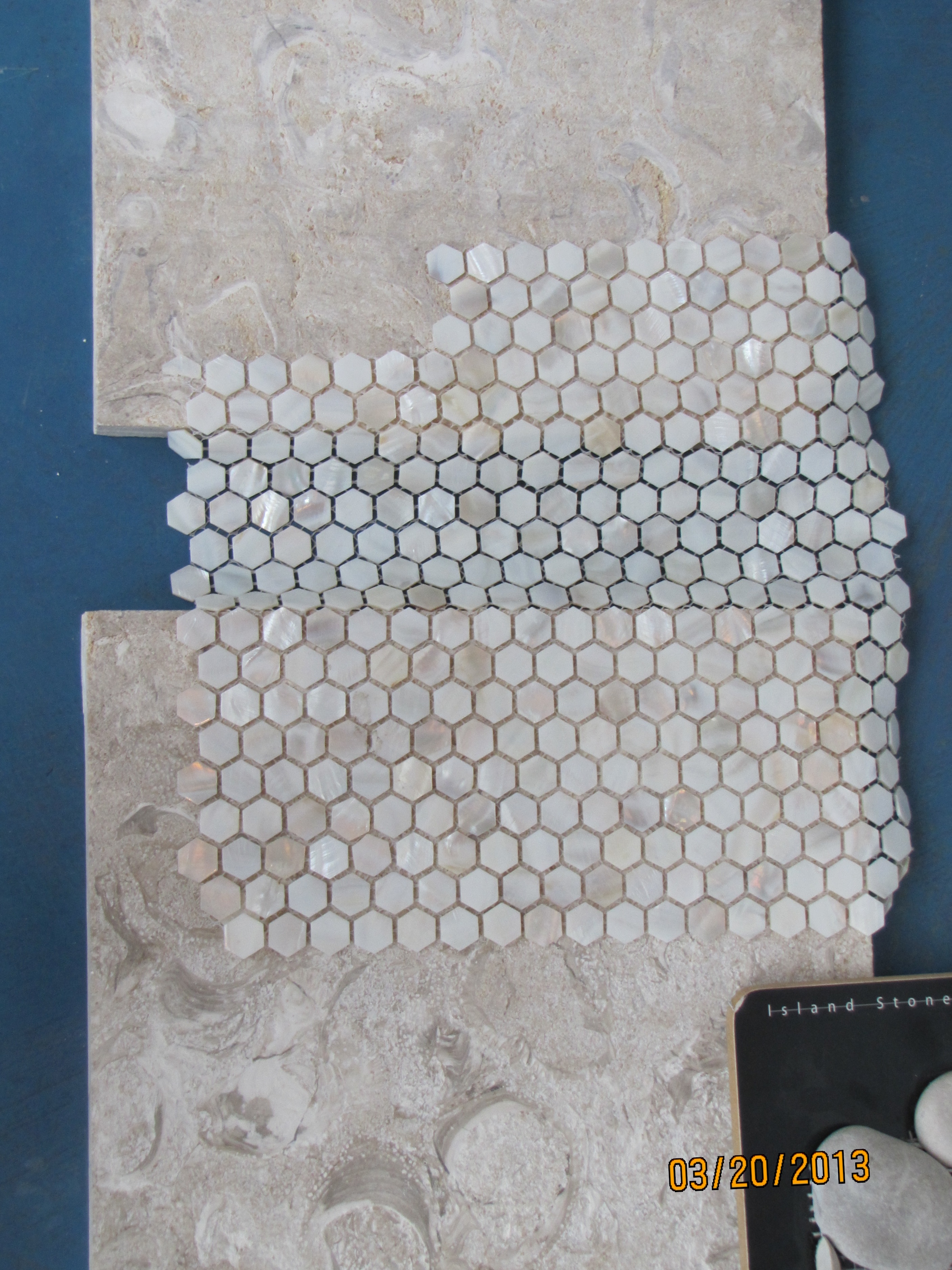
Here is the floor tile she has selected for the master bath:

flooring
It feels incredibly smooth and cool underfoot. Perfect for a beach home.
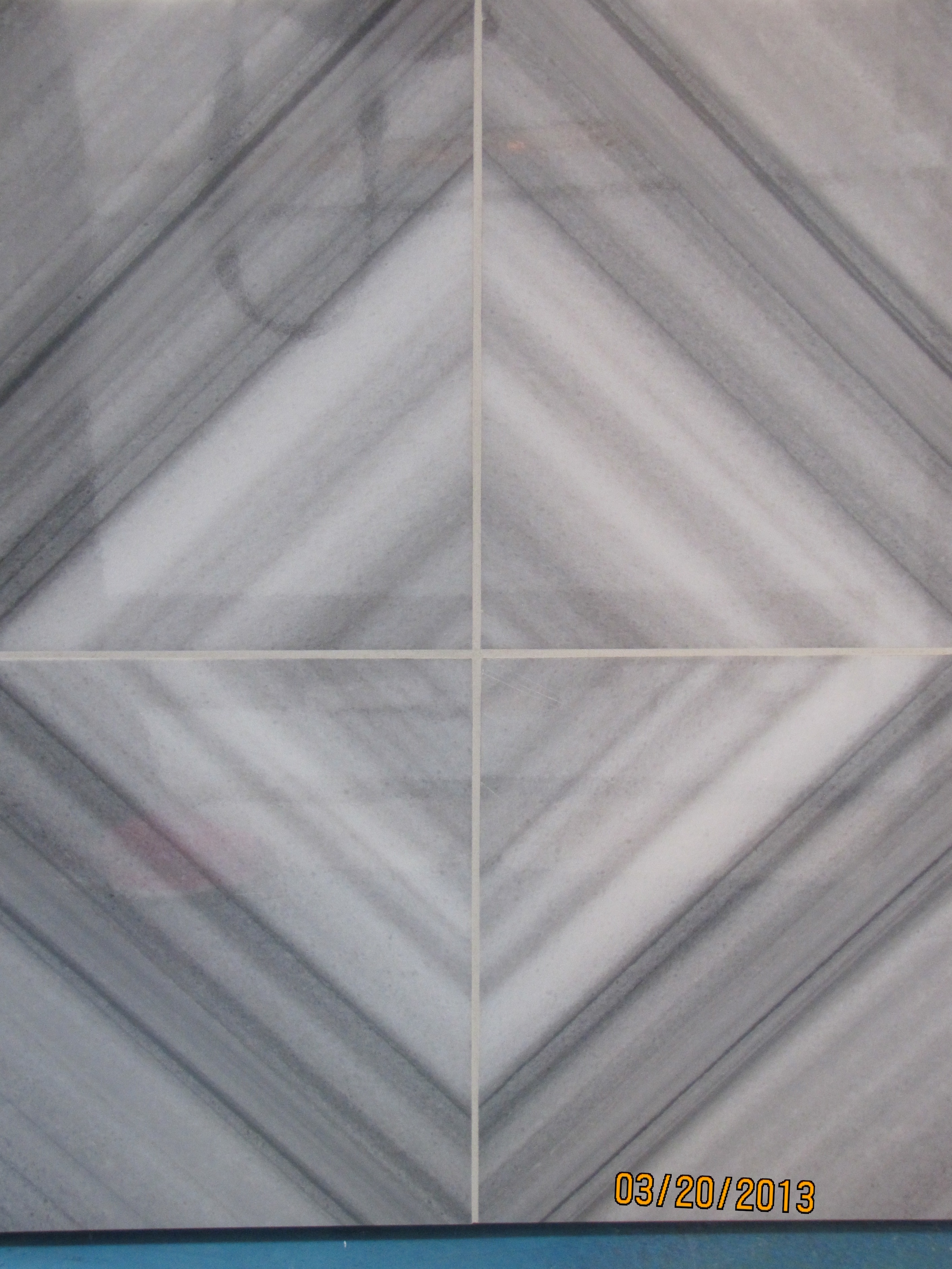
She will be using this one in the home as well. Loving the soft beach colors:

wall tile
Look at the same tile as above with dark gray grout, for a completely different look:

gray grout
Another display in the showroom:
Q-tile vignette
I fell in love with this gorgeous cross-cut marble piece:
crosscut marble
Here are some other beauties:
This one looks like a coastal sunrise. Subtle and shimmery. And, very glamorous:

shimmery
What about this subway tile with an opacity that sets it apart? Stunning.
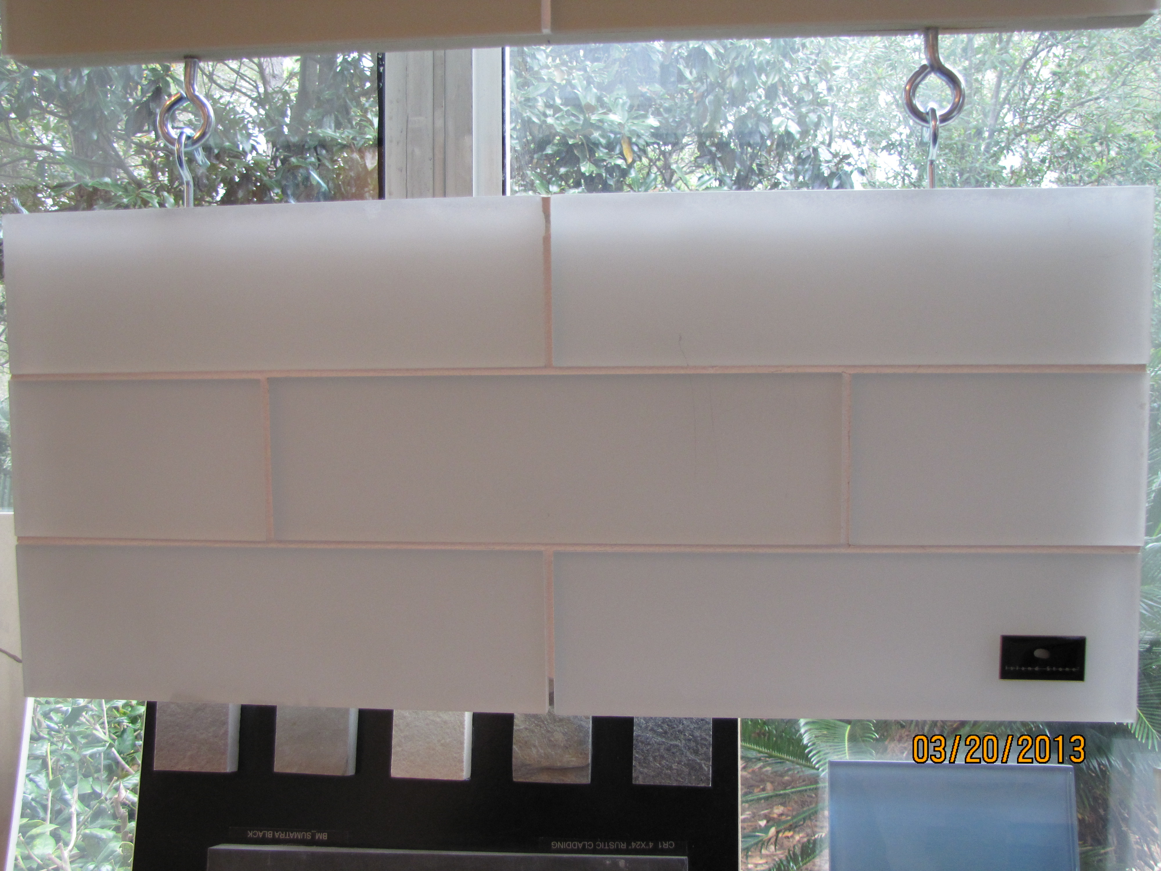
opaque subway
Moorish Arch

moorish arch
And another Moorish arch in marble:
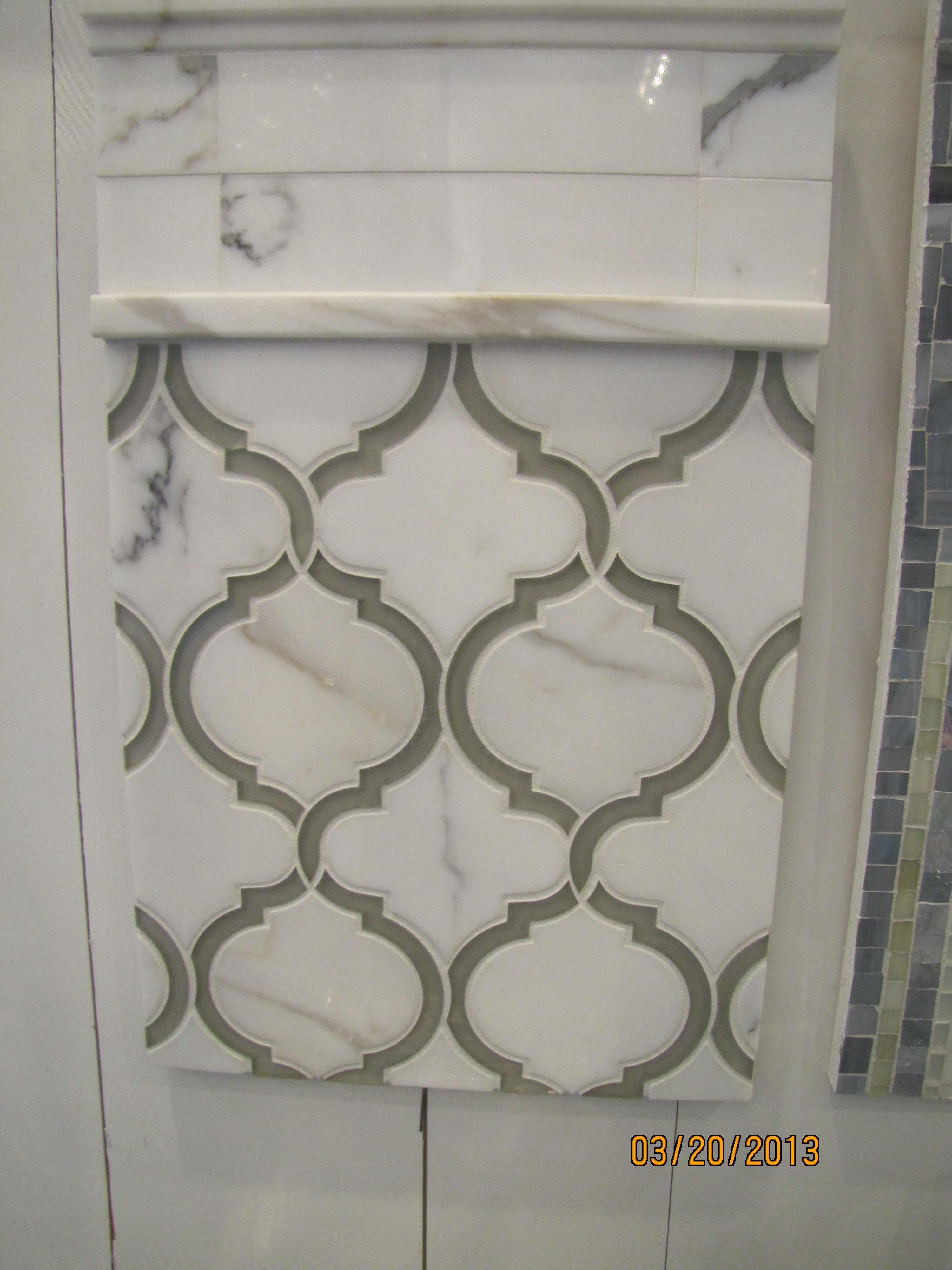
marble moorish arch
Here is a new product I saw in Suzy’s showroom, which is green-certified, and makes a great surface used as a bath or kitchen slab. Suzy told me that a local fabricator installed this product for her, called “Pure.” It is a glass product which looks like the whitest marble.
I have seen similar slabs called “Nano,” but was not familiar with the “Pure” brand. I will be keeping an eye on this as the next big thing, and I would love to use this in a bath installation. It really looks like pure white marble:

Pure slab
Suzy, thank you for allowing me to take photos of your beautiful new showroom!

Susie
Can’t wait to see the showhouse when I come to the beach this summer!
This is not a sponsored post, just thought you would enjoy seeing some of the latest trends in the high-end tile market.

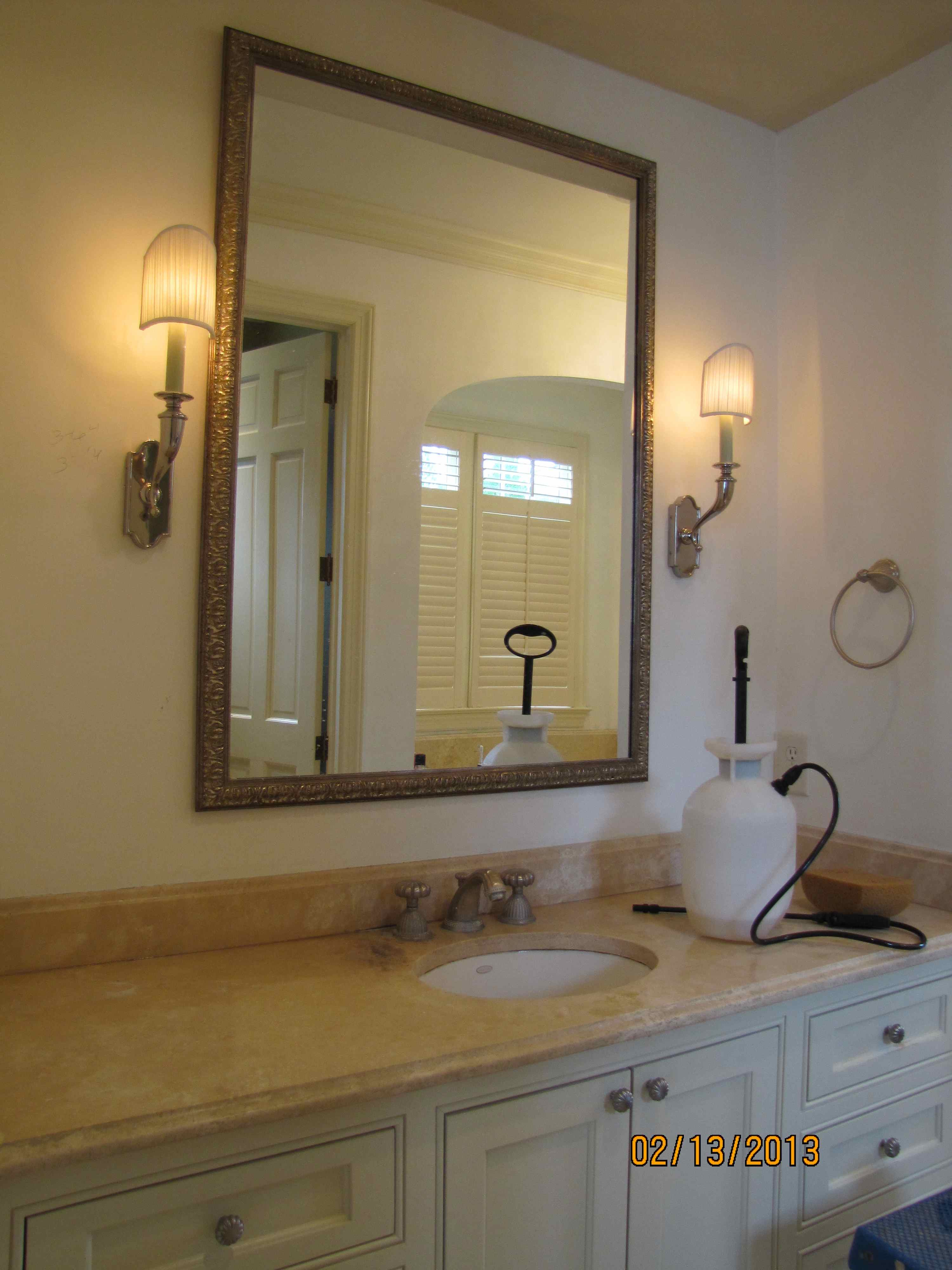
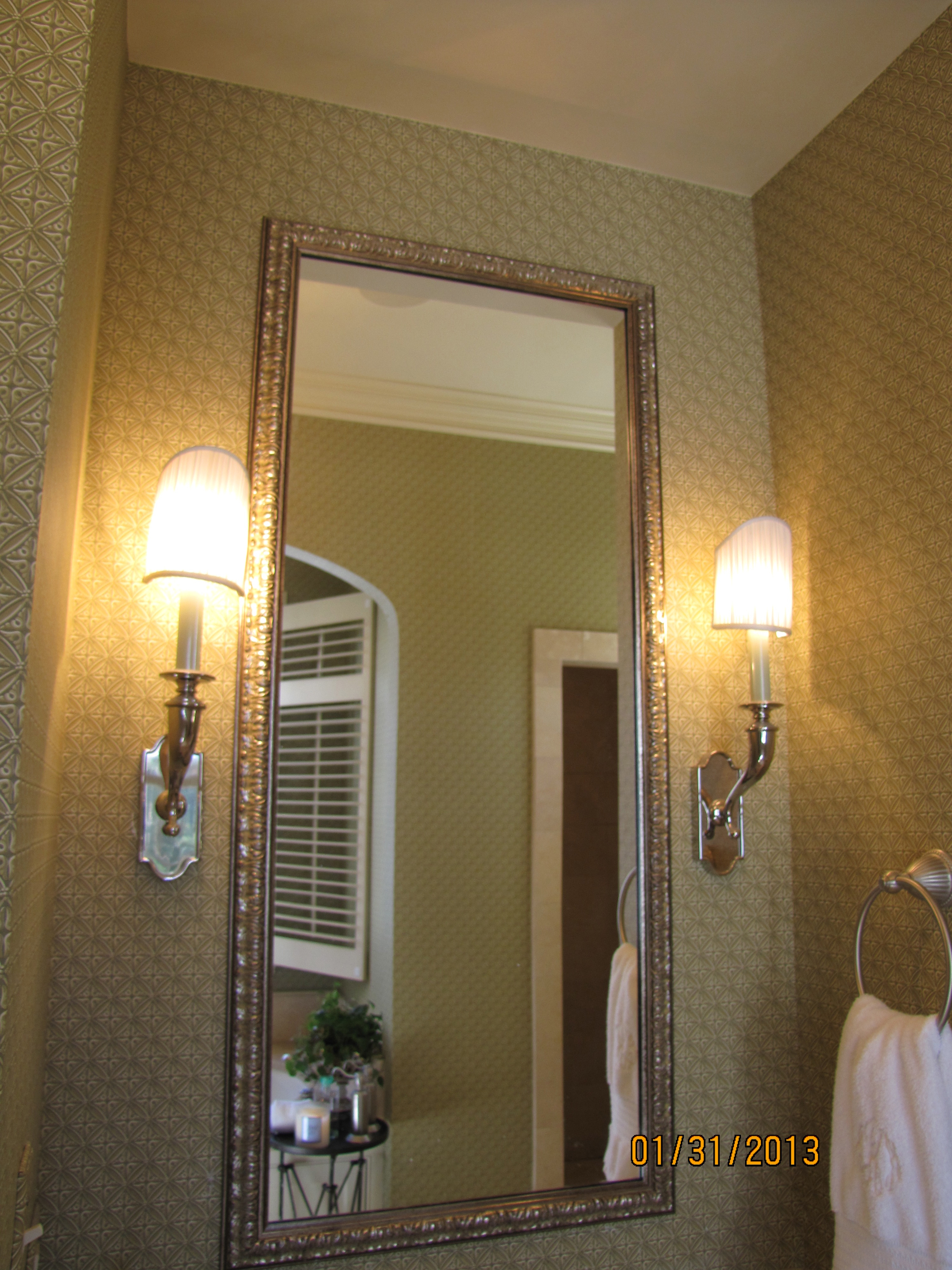
Sneak peek: Pardon our progress…


wallpaper gone
People, let me tell you, this is huge! The first step is always the hardest.
But, I am in motion. My wonderful wallpaper man is busy finishing stripping the existing paper as I type this.
Just look!
The rusty green wallpaper is au revoir!
Adios!
Goodbye!
I am so uplifted just walking in and looking at the bare SheetRock.
In all my color installations/demolitions, I have never seen a wallpaper absorb the light out of a room like
ol’ Rusty Green.
It is amazing, the difference.
Furthermore, my husband hates changing anything in our house. He loves everything to stay the same.
Bless his heart, he agreed to put up with the disruption entailed by this project.
So I will say again, this is huge!
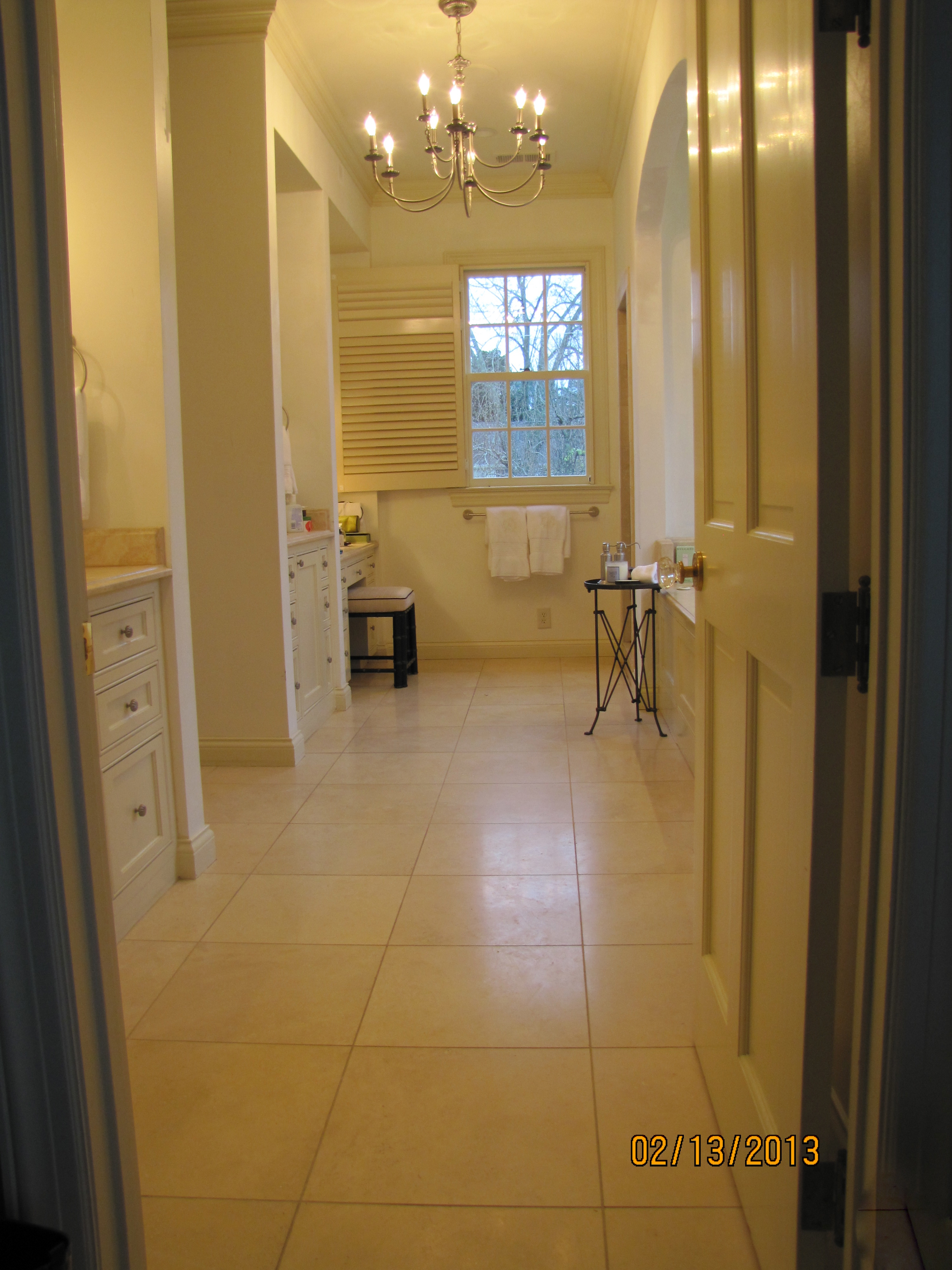
Remember, this is just the bare SheetRock, not the new paint color. Obviously, still a work site!
making progress!
above, BEFORE (Ol’ Rusty Green)

I know you probably don’t want to see contractor bags, you come here to look at the pretty pictures.
This is real life, though. And, it will look nice in no time.
It is a very cloudy gray day, but you’d never know it by what is going on in my house today.
I can’t wait to get my crew over from Atlanta to work on the travertine. It must be cleaned, re-honed and re-grouted, then we’ll be ready for the new paint.
Can you notice that the pink undertone in the travertine is looking much less pink, now that Rusty Green is gone? Compare the before with the ‘during’:

Cleaned up a bit to show you the difference:
Is Green the Perfect Color?

Source: charmhomedesign.com via Melissa on Pinterest
With Green so often used in Christmas decorating

Source: tginteriors.blogspot.com via Lisa Farmer on Pinterest
and since Pantone just announced its 2013 Color of the Year

Source: pantone.com via Ellen on Pinterest
Let’s talk about the color green.
Here are the primary colors on a color wheel– red, blue and yellow:

Source: kmb-designs.com via tlm2 on Pinterest
The color green is sometimes called the fourth primary color.
This is not true, because primary colors can’t be made by mixing any other colors together.
Green is not a primary color because it is made by mixing blue and yellow.
However, I think this refers to its versatility in décor, as it is the one and only color
that has some shade of it which will go beautifully with every other color.

Source: Uploaded by user via iinviteall on Pinterest
Janice Lindsay refers to greens as “the chromatic peacekeepers, getting along with any color.”
Green is actually categorized as a secondary for color (as in paint, with the three primaries being red, blue and yellow),
but a primary for light (speaking in terms of wavelength, with red and blue being
the other two).
[credit: Janice Lindsay, All about Colour]

Source: outoforderdesign.com via Mich on Pinterest
When you think of nature, our Creator, the perfect colorist, gave every possible flower color an equally perfect leaf color!

Source: Uploaded by user via Betty & Gary on Pinterest

Source: finegardening.com via Mychelle on Pinterest

Source: thedphoto.com via Denita on Pinterest
When you draw greens from nature’s palette, the way colors are found naturally,
it is hard to go wrong!
Green, it really is the perfect color.
A Craftsman Paint Story: Before and After
Before, a tin-roofed cottage painted a non-traditional minty green by the previous owner.
Which stuck out like a sore thumb in a transitional neighborhood of sidewalks lined with
classic Craftsman bungalows as well as some brick houses.

Image ©Color Calling

Image ©Color Calling
After, classic Craftsman paint colors selected for the new homeowners, newlyweds.
Minty green does not belong in a classic Craftsman palette.
Greeny-grays are perfect. Great with a tin roof as well.
Grays in the mortared stone columns are reflected in the choice of color for the house body
and the darker grays accenting the trim.
Think of the earth colors of nature and there you have a pretty complete Craftsman palette.
“Georgian Brick” (Benjamin Moore) front door, which echoes the exact color of the next door
neighbor’s brick (very close by) as well as the brick High School across the street.
The young wife liked my color palette, explained to her by her husband after my initial consultation.
She was busy performing surgery and could not attend the original color consultation.
There was just one thing.
She had her heart set on a REALLY RED front door.
But, once I explained “WHY” the more muted red I selected was picked out
(it is better for a Craftsman palette;
it reflects the adjoining neighbor’s red brick;
matches the brick of the high school very visible across the street;
honors some similarly colored decorative brickwork set in their yard, etc.).
And, with this color selection system, there is ALWAYS a WHY.
She immediately understood.
She is one smart cookie. Beautiful, too.
The system works.
And, this is it: Evaluate the FIXED finishes and go from there.
Doesn’t have to include the neighbors, but when you can reach out and almost touch their brick side wall from your front porch, better to take into consideration. Think existing stone, brick, roof, etc., that will not be changed. That is what a fixed finish is.
Felt a glow of satisfaction when a passerby walking down the sidewalk told me, “Wow, the house looks great. What a difference!” as I was taking the ‘after’ photo shot.
Eden Gardens State Park
We spent a lovely late afternoon at Eden Gardens State Park, located about 10 minutes from WaterColor Resort, in
Point Washington, Florida. Dogs on a leash are welcome. The azaleas were sadly past their peak, but a few camellias were blooming. The other real enjoyment for me was taking photos of the fabulous bronze sculptures of children at play placed beautifully along the walking trail. What a treat!

March blooming camellia
Image ©Color Calling

Beautiful bronze fountain
Image ©Color Calling

Close up of one of the several wonderful sculptures
Image ©Color Calling

close up of little boy sculpture
Image ©Color Calling

Under the gorgeous 600 year old oak tree, a favorite wedding venue for local brides
Image ©Color Calling

Source: google.com via Ellen on Pinterest
Below: the Wesley House is open for tours on the grounds of the Eden State Park

Source: gardenthemedwedding.com via Ellen on Pinterest

Source: inspirationforhome.blogspot.com via Tanya on Pinterest
Sage green kitchen:

Source: 3.bp.blogspot.com via Staci on Pinterest

Source: marthastewart.com via Shanthi on Pinterest

Source: housebeautiful.com via Jane on Pinterest

Source: housebeautiful.com via Tamara on Pinterest

Source: abigailahern.wordpress.com via Hilde on Pinterest

Source: itkupilli-inspirations.blogspot.com via OKIFOLKI on Pinterest
Be sure to check back tomorrow. I will be showcasing a very glamorous Bobby McAlpine-designed home!
