My expensive custom draperies don’t look nice anymore, now what?
Custom draperies are not just a luxury. They are an investment, an investment which can easily run to thousands of dollars or more PER WINDOW. With nicer designer fabrics running upwards of $150-$200 per yard, multiplied times, say, 9 yards of fabric for each window, you will have possibly $1300 to $1800 invested in the fabric alone per window. This does not include labor for drapery construction, purchase and installation of drapery rods, or decorative trim.
Nothing warms up a room better than beautiful soft furnishings, and the right window treatments finish a room like nothing else can. That is why you want to get at least 12-15 years or more of good use from your gorgeous expensive custom draperies.
Here are the stage curtains in Lincoln Center in NYC, with hundreds of yards of fabric, which I snapped before a performance of “The King and I.” I can’t even imagine the work and expense that went into a drapery project of this magnitude. There must be 1500 pleats in those bad boys.

But, I digress…
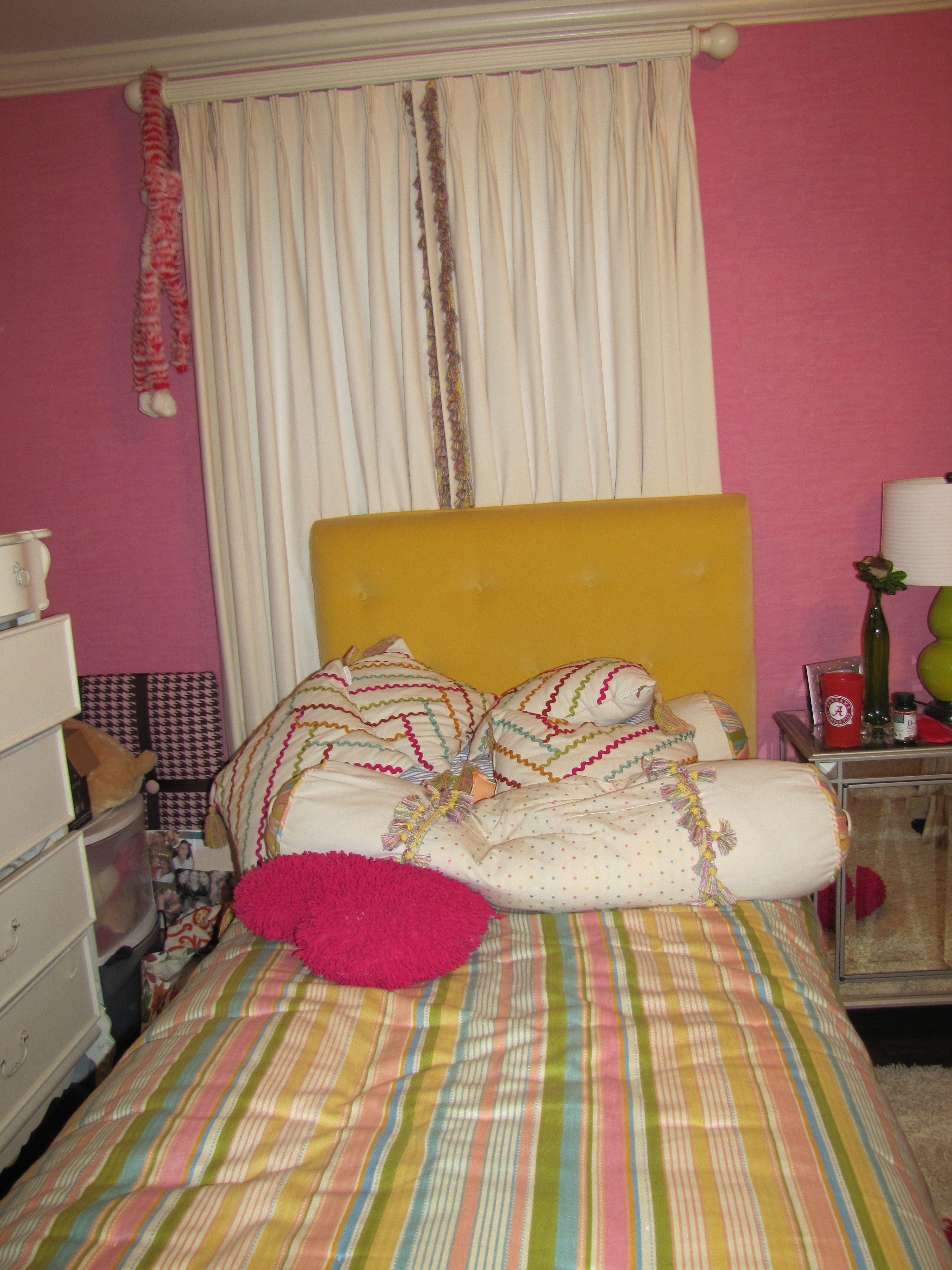
My own library/family room has four large double-hung windows plus a triple window. And, after almost thirteen years of hanging, my beautiful imported linen damask draperies were really starting to show their age.
When I come into your home for an interior consultation, I do everything possible to help you work with what you have.
So, I want to show you how I re-worked the look and feel of the draperies in my own space, for a very small fraction of what completely replacing them would have run.
Here is the before, shown on the triple window:
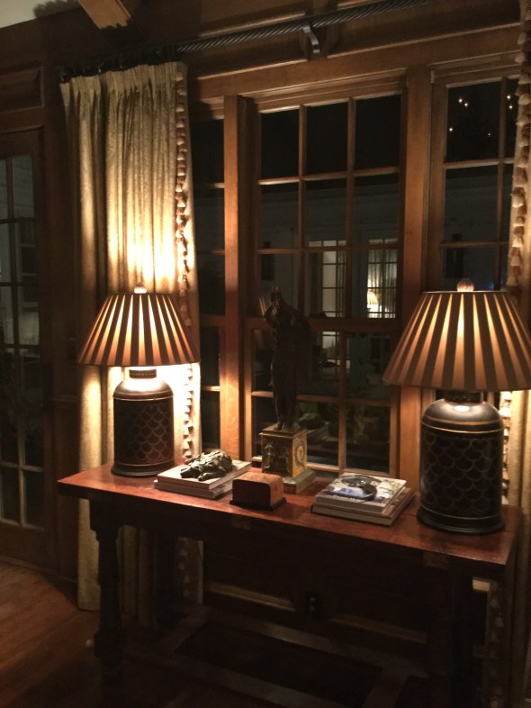
Not horrible, but here is what you can’t see in the photo:

Really bad faded places on the edge. That is not a shadow. That is where the old trim was. And, see how many panes are covered by the fabric? The fabric was smothering the courtyard and backyard views.
The drapery trim was looking dated, and frankly, the tone-on-tone look did not hold its own with the colorful Serapi carpet, see below, that is “the boss” of the room.
 P
P
The poles have also always bugged me. They weren’t the correct length (hopefully you can learn from my mistake made long ago) and are part of the reason why the fabric faded so badly. Drapery rods should extend a measurement of 12-15 (sometimes more) inches from each side of the outer edge of the outermost window pane. This extra foot on each side adds gravitas to the window when the panels are hung, and allows the drapery fabric to be more protected from sun exposure, since the fabric is pushed further away from the window panes.
For example, my windows measure 35″ wide (inside the frame) and my new poles are 60″ long, not including the decorative finials. This is not an in-stock standard size from the company I ordered from, so I incurred a custom-cut fee, but if you are going to do it, do it right!
Here are the re-worked draperies with the new flat ribbon trim, in a beautiful poppy color that repeats the colorful poppy red accents in the carpet and also used elsewhere in the room.
 The fresh-looking quatrefoil motif echoes the ancient patterns of the carpet. For your comparison, notice how the draperies look, first hung on the old too-short rod and then on the new longer rod. First here are the re-worked panels on the old, shorter rod. See how only one full vertical row of glass pane is visible? This is still exposing the fabric to damaging light rays for sure. Remember, this is the old rod:
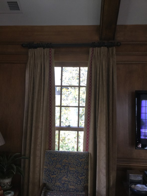
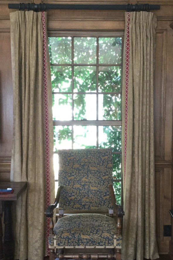
Now here is the “new” drapery hung on the new longer wood rod, below. See how all three vertical rows of window pane are now showing? This also gives the windows more elegance and importance, because the draperies are now ‘framing’ the windows instead of ‘covering up’ the windows. My drapery professional will be coming soon to re-hang the panels to fall perfectly, and there will be absolutely no sagging. The finials have not been reattached. But, this will give you the gist of the new work.
Here are the mechanics of the new work:
The old trim–all thirty yards of it– was meticulously hand-clipped off with tiny embroidery scissors (by moi, it was actually kinda fun and reminded me of my smocking days). I spot-cleaned and freshened each panel in the dryer (see below), then it was off to the workroom with all 10 nine-foot panels and 30 yards of colorful new trim.
The new trim was sewn onto the opposite edge of the panel of where the old trim had been. So, on each pair of draperies, the right panel became the left panel. Now, when the panels are professionally hung by the fabulous man I always use, the faded edge is going to be tucked and turned away out of sight toward the wall (called “the return” in my biz), and the fresher edge (now the “leading edge”) sports the brand new trim. Pretty clever, right?
My wonderful to-the-trade workroom professionally re-pressed each panel after the new trim was sewn on, now the panels look (almost) brand new. It really gives a new look and feel to the windows specifically, and to the room as a whole. I’ll be sure to share a wider view when everything is finished.

So, there you have it! Before:
And (almost finished) after:
Don’t you agree that the windows look bigger?
And, just for you, a couple of my best drapery tips and caveats….
- skimpy draperies are not worth doing. They will still be somewhat costly, and it is much better to install budget-friendly woven wooden shades (similar to below) than to pay for draperies that aren’t right.

- a good designer can help you “cheat” a solid fabric. Meaning, a knowledgable decorator can help you find a less-expensive solid and most people would not be able to really tell if it is a nice little Pindler or a break-the-bank Brunschwig. But remember, construction/labor costs are going to be similar whether the fabric is $5 a yard or $500 a yard, so make sure you are buying a quality fabric from the start.
- a good professional drapery installer is your best friend. S/he is trained to get everything looking perfect, and will know every trick in the book to get it right. While bloggers like myself are generally generous with our sources, don’t expect us (as design professionals) to divulge names on this one, however, unless you have hired us. The best installers often won’t work directly with the public.
- your favorite shelter magazine will usually have a wealth of photos of gorgeous drapery to use for inspiration. Your design professional is invaluable in deciding whether to do woven wood shades, a roman shade, fully operable draw drapery, rings and poles, etc. We have seen it all, and we can help you avoid an expensive mistake. And, yes, you need to line and interline your custom draperies. It is worth every penny.
- some installations will benefit from using woven wood shades IN ADDITION to existing drapery. Open any “house” magazine and surely there will be a feature to show you what I mean. I love the look, and plan to add woven wood shades to my own family room.
- avoid treatments that are trying too hard, like this one in a current popular shelter magazine this month, which is just bizarre in my opinion with its ultra-wide flat tape mitering into those ultra-thin ironed-in pleats.

- soft pleats generally look more elegant than heavily ironed-in pleats.
- never dry clean your draperies. They will shrink and then they will be too short. Use the upholstery attachment of your vacuum cleaner (on lowest possible suction, by opening the suction control tab) to keep dust and pet hair at bay.
- you can usually air-fluff most panels (no heat!!!) in your home dryer to freshen them. Remove any drapery pins and corner weights before doing this, and try 20 to 30 minutes. I always spot clean first whenever possible, and on heavier fabrics, you can usually safely spray some lightly scented fabric refresher before fluffing. A dryer sheet is also a possibility. Go slowly, proceeding panel by panel, to avoid damaging the fabric. Did I say, no heat?
- for pole-and- ring type installations, try a long strip of clear silicone tape called “curtain slide tape” on top of the pole to help the rings slide more smoothly when closing.
If you reside in the Birmingham metro area and need help with an interior project of your own, I’d love to hear from you. I also accept limited online and out-of-town commissions for color consulting. Please email me for rates and availability: colorcalling@gmail.com
Best,
Ellen

My easiest kitchen update
Are you contemplating–
or in the middle of–
a kitchen renovation or update?
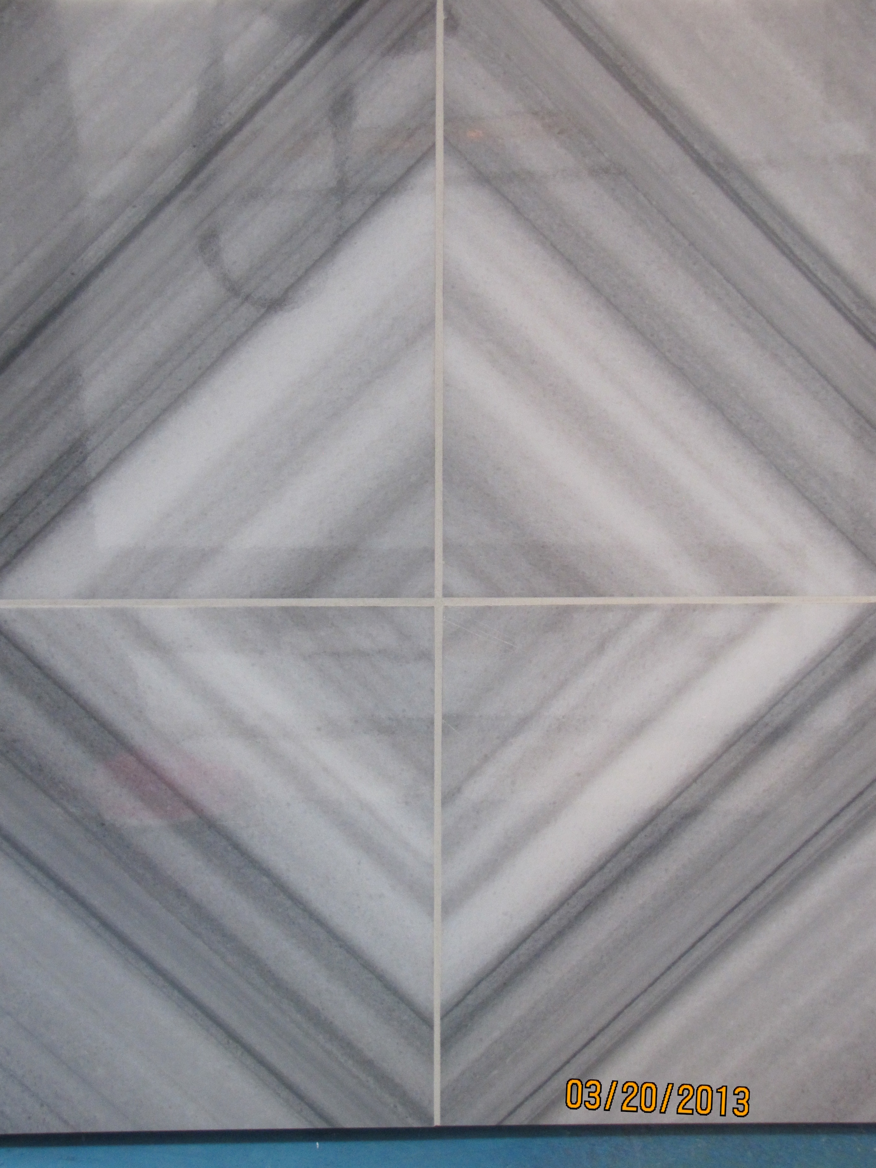
The easiest update I am suggesting to my clients right now is removing their dated brown tumbled-marble kitchen backsplash.
Which was likely installed circa 1996. On the diagonal.
.
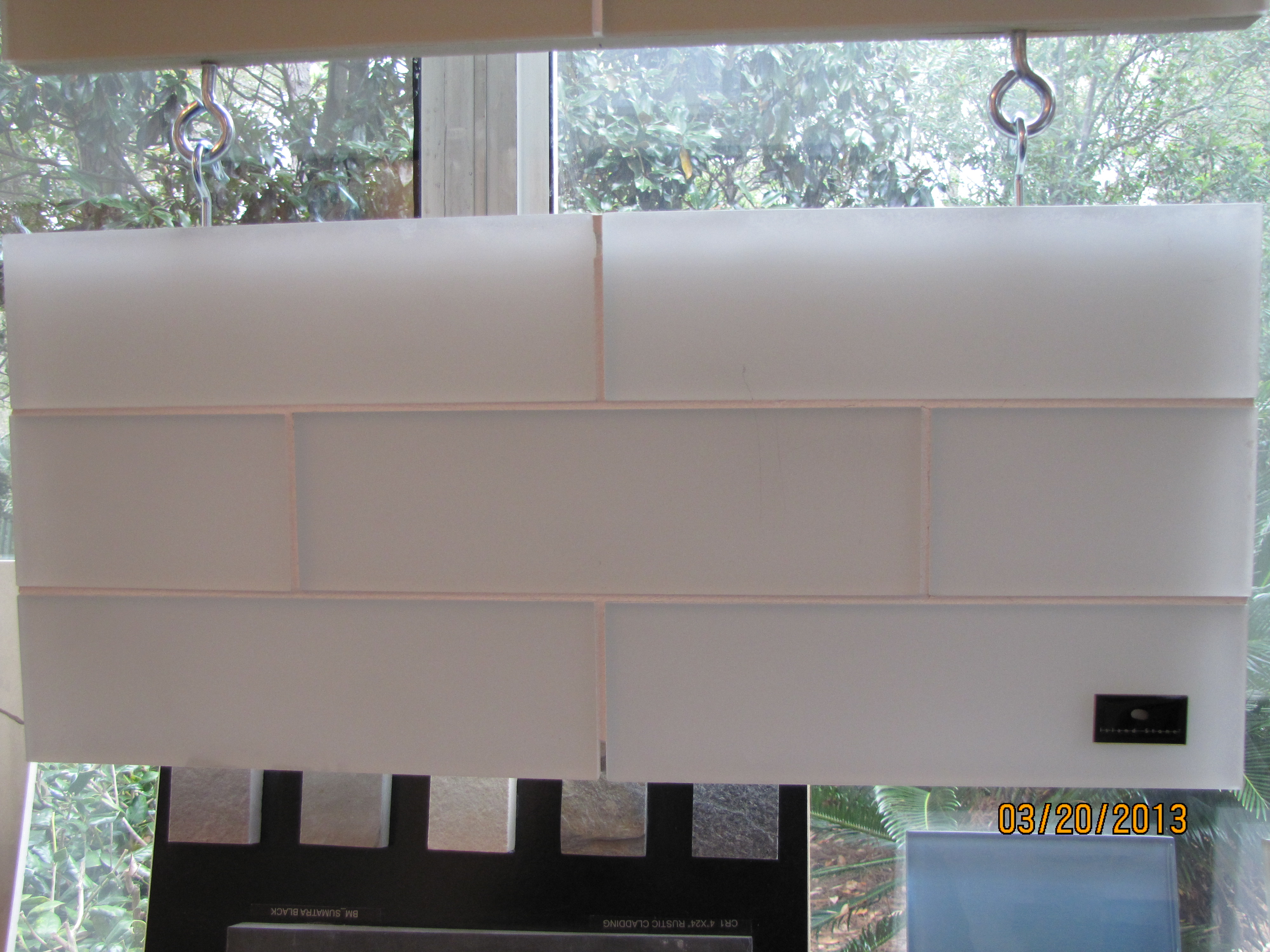
Who knew that a lighter, fresher look and feel could be yours for $3.50 a square foot (above)!
Yes, you guessed it.
Plain vanilla subway tile. White or off-white, both shown above.
The choice depends on your countertop.
I’d love to help you select finishes for your renovation, new build, or simple update.
I’ll also bring my 200 large (11″ x 14″) painted samples of the best neutrals, whites and colors,
and help you discover the perfect paint color for your kitchen walls and cabinetry.
Online, or in person if you live in Birmingham.
Email me for rates: colorcalling@gmail.com

Do your toenails match your bath tile?
Well, if you are Suzy, they certainly do!
Suzy, the owner of a brand-new tile center in Santa Rosa Beach, Florida,
showed me that your toes can indeed match your bath tile:

Suzy’s shimmery toes!!!
Suzy is hard at work selecting the tile for the upcoming Maison de Vie,
the showhome opening this summer at WaterColor resort in the Florida Panhandle.
Her company is the lead sponsor of the home:

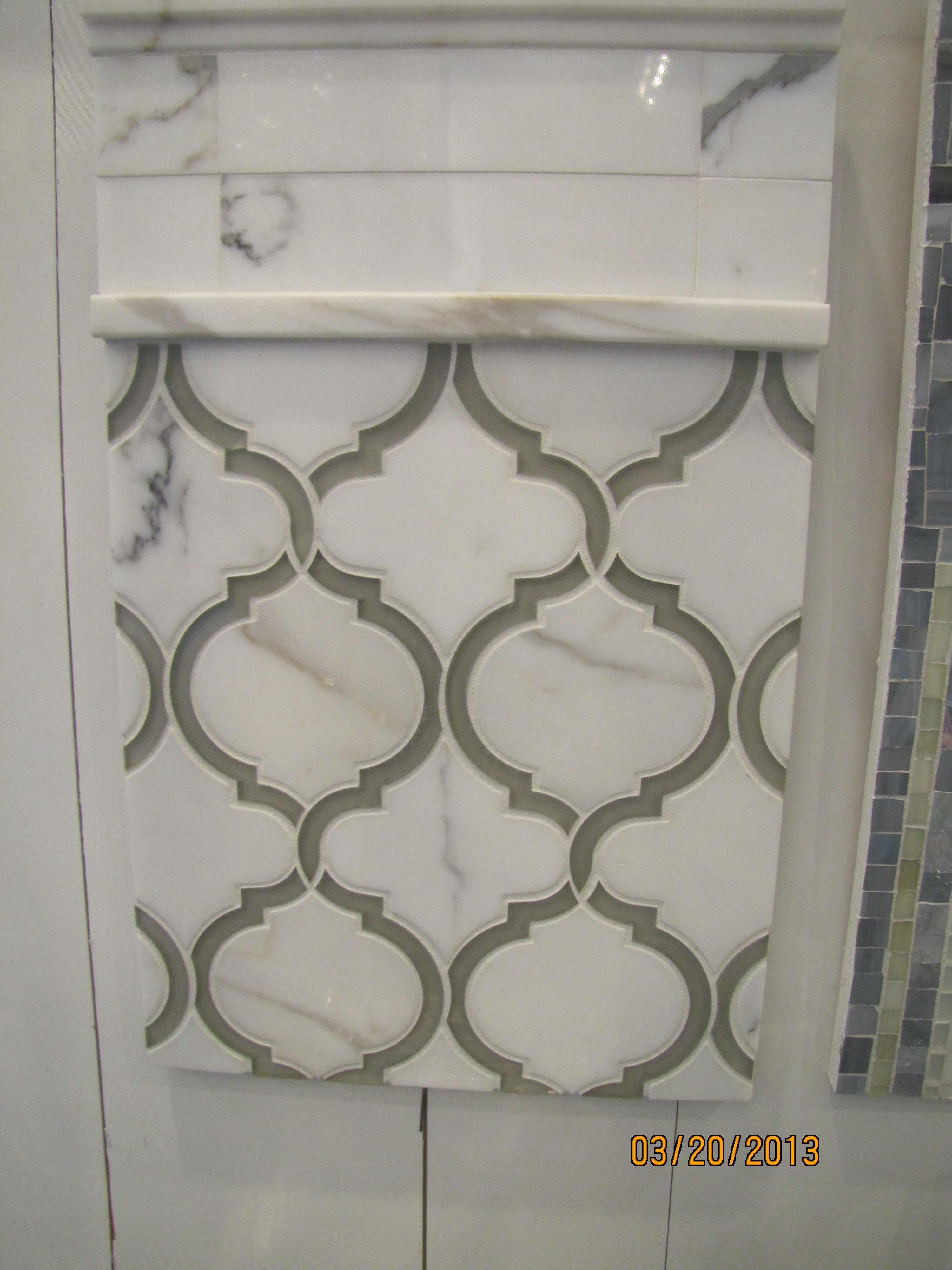
She gave me a sneak preview of some of the hard surfaces she will be using.
Here is the floor tile she has selected for the master bath:

flooring
It feels incredibly smooth and cool underfoot. Perfect for a beach home.
She will be using this one in the home as well. Loving the soft beach colors:

wall tile
Look at the same tile as above with dark gray grout, for a completely different look:

gray grout
Another display in the showroom:
Q-tile vignette
I fell in love with this gorgeous cross-cut marble piece:
crosscut marble
Here are some other beauties:
This one looks like a coastal sunrise. Subtle and shimmery. And, very glamorous:

shimmery
What about this subway tile with an opacity that sets it apart? Stunning.
opaque subway
Moorish Arch

moorish arch
And another Moorish arch in marble:
marble moorish arch
Here is a new product I saw in Suzy’s showroom, which is green-certified, and makes a great surface used as a bath or kitchen slab. Suzy told me that a local fabricator installed this product for her, called “Pure.” It is a glass product which looks like the whitest marble.
I have seen similar slabs called “Nano,” but was not familiar with the “Pure” brand. I will be keeping an eye on this as the next big thing, and I would love to use this in a bath installation. It really looks like pure white marble:

Pure slab
Suzy, thank you for allowing me to take photos of your beautiful new showroom!

Susie
Can’t wait to see the showhouse when I come to the beach this summer!
This is not a sponsored post, just thought you would enjoy seeing some of the latest trends in the high-end tile market.

Theme Overdose
Sometimes, but not everytime, a theme needs MORE.
MORE of the same to get the right look.
A theme overdose, says fellow blogger Tara Dillard.

Maybe Tara will weigh in as to whether a bunny overdose actually works!
Those bunnies are either a huge hit or a giant miss. Not quite sure.
I know that the interiors work.

One of a kind sofa table
Unlike the above example, most sofas are not designed to be
interesting and beautiful in the back.
Sometimes, a sofa table is perfect for adding needed interest and beauty.
Function, too. Think storage, display, or a pair of lamps.
Check out this top, below. A beautifully carved French top, perfect width. Just sitting there waiting.
It hasn’t been there for long. It was once part of a larger piece.
And it won’t last. Nope, not this one. Not at this price.

The sconces on top aren’t part of the piece, in case you are wondering.
It is going to be perfect for someone with a home in the French taste.
I see it going on top of a simple but sturdy wrought iron stand.
Custom made, just enough height to raise it to the exact sofa-table height.
A tiny flip of iron at the foot. Just enough to say, “I honor your French heritage.
But, I won’t try to compete.”
Nothing more. Eyes only on the carving.

And, no pretense of trying to marry a modern leg, made to look old, on this old piece.
Perfect for a country French room, where the back of the sofa meets the eye.
So much more beautiful to hide a visible plain sofa’s back view when possible.
And much more beautiful when you do so with a one-of-a-kind piece,
with room for a lovely pair of lamps. And even some storage space in the three bays.
What do you think?

Bringing the outside in?
But, I have to laugh when I see some of the
whacky things that a designer suggested and the owner actually implemented.
These greenery interior walls are just too much. Can you say maintenance nightmare?

Source: ainonline.com via Ellen on Pinterest
Source: tournesolsiteworks.com via Ellen on Pinteres
Source: blumohito.com via Ellen on Pinterest

Source: dezeen.com via Ellen on Pinterest

Source: blackeiffel.blogspot.com via Ellen on Pinterest
This is a trend that makes a novel one-time photo opportunity for an edgy magazine.
Don’t fall for this one.

What is the Energy Level of your Room?
Rooms can have energy. By that I mean a sense of drama or punch. Some would say pop.
Can you feel it? Now, imagine the painting gone. See what I mean? There is the room’s energy.

Some of the quietest, lowest-key people I know have extremely vibrant rooms in their homes.
And, some of the most boisterous of my acquaintances have some of the most neutrally-decorated rooms.
With little memory of all those college-level psych courses I took, I can’t begin to tell you why that might be.
But I can help you infuse some energy…drama…pop….punch….into your existing space.
As a color designer, I respect the existing undertones of fixed elements which are not being changed.
And, I have tried to select examples with the same, where undertones are coordinating, or at least are non-clashing.
So, today, let’s look at some things that can rev-up a space if you want to give it more energy.
A dramatic focal point.


Traditional Entry design by Sroka Design, Inc.
Color.

Red, yellow, black and orange can be especially dramatic.
Do you see how this is otherwise an extremely neutral space? The eye goes STRAIGHT to the high visual energy in the large painting, below:

Something graphic.


And, even something as simple as vibrant toss pillows, one of the easiest ways to punch up an existing room:

Source: st.houzz.com via Ellen on Pinterest
Do you have a place somewhere in your home for a little extra energy?
Next time, what to do when you want to quiet down a room….please stay tuned.

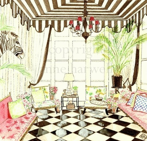
Wild about animal prints
Animal prints glam up a room better than almost anything.

There are a couple of tricks, though.
First, is to use only in moderation.
ONCE is enough. This is an accent, not the main attraction.
Second, make sure you repeat the color of the animal print somewhere else in the room.
The key is not to overdose so that it kills the look.
You can overdose some themes, and succeed. But, animal prints are not for overdosing.
The exception is when you use an animal print carpet. It will be the main attraction:

Source: morewejadore.com via Maria on Pinterest

Source: Uploaded by user via Wilma on Pinterest

Source: houzz.com via Emily on Pinterest
And please save leopard print walls for Snooki 😉
It takes a practiced hand to repeat the colors without overdosing the accent fabric.
Take a look at some gorgeous examples.

Source: col109.mail.live.com via
Below, the gold and the black of the leopard ottoman are repeated in the portrait.

Source: alovelybeing.com via Gloria on Pinterest


Memphis/Palm Beach decorator William Eubanks takes it to the max, but he always follows the rule of one:

William Eubanks again:

And I will let you see for yourself what happens
when you break the “rule of one”:


Or the colors in the animal print are not
repeated properly or at all:


Is there a place for an accent animal print in your home?
It can be done very tastefully.
Just remember to use as an accent.
And repeat the colors in the animal print elsewhere in the room.
They never sit here together

Source: architecturaldigest.com via Rivers on Pinterest

Source: bhg.com via Jessi on Pinterest

Source: theenchantedhome.blogspot.com via Liz on Pinterest

Source: myhomeideas.com via Allyson on Pinterest

Source: coastalliving.com via Laura on Pinterest

Source: casatreschic.blogspot.com via Anna on Pinterest

Source: houseofturquoise.com via Anna on Pinterest

No, the couple have never sat together, here.
Not even once, well, maybe just that one time when they first arrived.
But, so what?
A pair of comfy chairs looks dynamite in the master bedroom.
What a nice secondary focal point to the bed.
It is nice to have a place to sit in the bedroom (besides the bed).
The perfect place to toss a robe before climbing into bed.
Comfortable enough for her five-minute morning check-in conversation with her best friend.
He likes to put his socks on here.
And, the teenage daughter always perches here, on the edge, just so,
to tell them that she is back by curfew.
A pair of chairs in the master.
Do you have room in yours for this wonderful style vignette?
High Style Chinoiserie for the powder room!
for beautiful chinoiserie (or other high style) wallpapers, fabrics, and finishes.
Because of the small scale, it is much more affordable to install that fancy wallpaper,
go for the silk roman shades, the marble counter, gorgeous pair of sconces, etc.
I like to advise my design/color clients to go all out with the colors, and/or high style they love
but might not like in larger doses for a big room.
My own powder room is teeny tiny. I would never go Plain Jane in a space this small.
Here is a detail of my sconce and mirror.
Which set against a scenic chinoiserie toile paper, causes the eye to travel.
Style maven Diana Vreeland said it first, and it is so true: “The Eye Must Travel.“
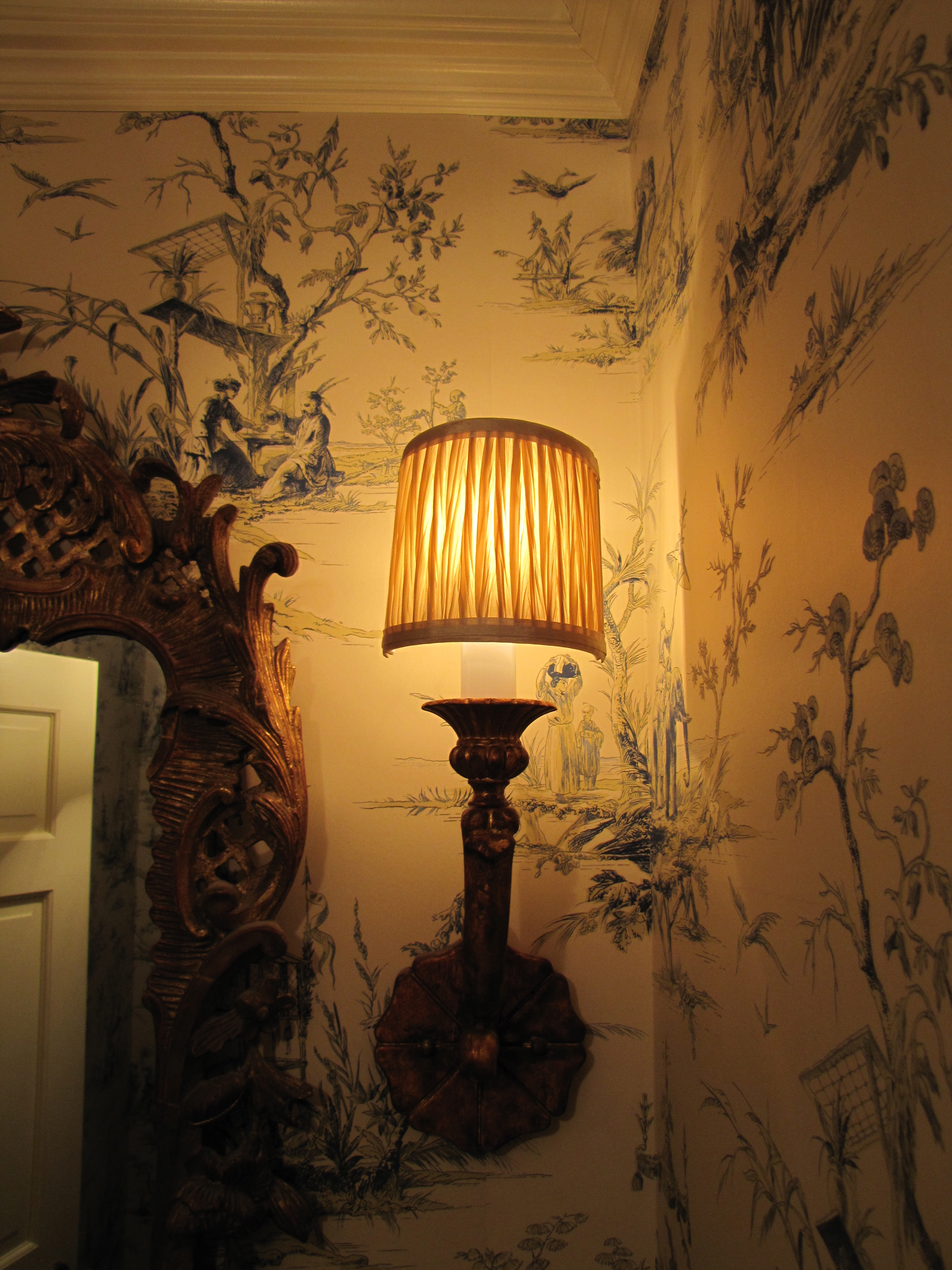
Image Color Calling
Here is another powder room with similar scale to mine (basically a chest-of-drawers width
wide).
Although I would avoid grouted tile counter tops, which are dated, I truly love the lyrical
nature of the yellow and muted green scenic paper.
The touch of red is perfect, as are the golden koi decorations on the counter top. As for
the red in the wallpaper, notice how your eye travels from the red to the red,
almost involuntarily?
Let’s look at some other fabulous chinoiserie powder rooms that may give you some ideas.
More scenic paper, see anything you like?
Style tip: No offense to whom I am sure is a very talented designer, but the cabinetry, just below,
is a little “too-too” for me.
I personally find this mix of finishes jarring (i.e, the pewter basin + gilt mirror + shiny cabinet
+ heavily veined marble top.)
Remember the “decide what is most important” rule?
I would have underplayed/simplified the basin, countertop, and cabinetry to let the over-the-top
trio of fabulous wallpaper, gorgeous rock crystal sconces and ornate mirror take center stage.
Together, it just way too much ornateness.
That being said, “it is much easier to criticize than it is to create something from scratch.“
And hopefully, this is taken as constructive feedback for my readers rather than criticism
to another design professional.
All is forgiven, though, by use of the handpainted Gracie silvered scenic, which is divine.
Breath-taking!


Christmas Mailbox
Do you live in a community where residents decorate their mailboxes?

Image Color Calling
Just one more way to add a festive look to your house for the holidays!
Is Green the Perfect Color?

Source: charmhomedesign.com via Melissa on Pinterest
With Green so often used in Christmas decorating

Source: tginteriors.blogspot.com via Lisa Farmer on Pinterest
and since Pantone just announced its 2013 Color of the Year

Source: pantone.com via Ellen on Pinterest
Let’s talk about the color green.
Here are the primary colors on a color wheel– red, blue and yellow:

Source: kmb-designs.com via tlm2 on Pinterest
The color green is sometimes called the fourth primary color.
This is not true, because primary colors can’t be made by mixing any other colors together.
Green is not a primary color because it is made by mixing blue and yellow.
However, I think this refers to its versatility in décor, as it is the one and only color
that has some shade of it which will go beautifully with every other color.

Source: Uploaded by user via iinviteall on Pinterest
Janice Lindsay refers to greens as “the chromatic peacekeepers, getting along with any color.”
Green is actually categorized as a secondary for color (as in paint, with the three primaries being red, blue and yellow),
but a primary for light (speaking in terms of wavelength, with red and blue being
the other two).
[credit: Janice Lindsay, All about Colour]

Source: outoforderdesign.com via Mich on Pinterest
When you think of nature, our Creator, the perfect colorist, gave every possible flower color an equally perfect leaf color!

Source: Uploaded by user via Betty & Gary on Pinterest

Source: finegardening.com via Mychelle on Pinterest

Source: thedphoto.com via Denita on Pinterest
When you draw greens from nature’s palette, the way colors are found naturally,
it is hard to go wrong!
Green, it really is the perfect color.
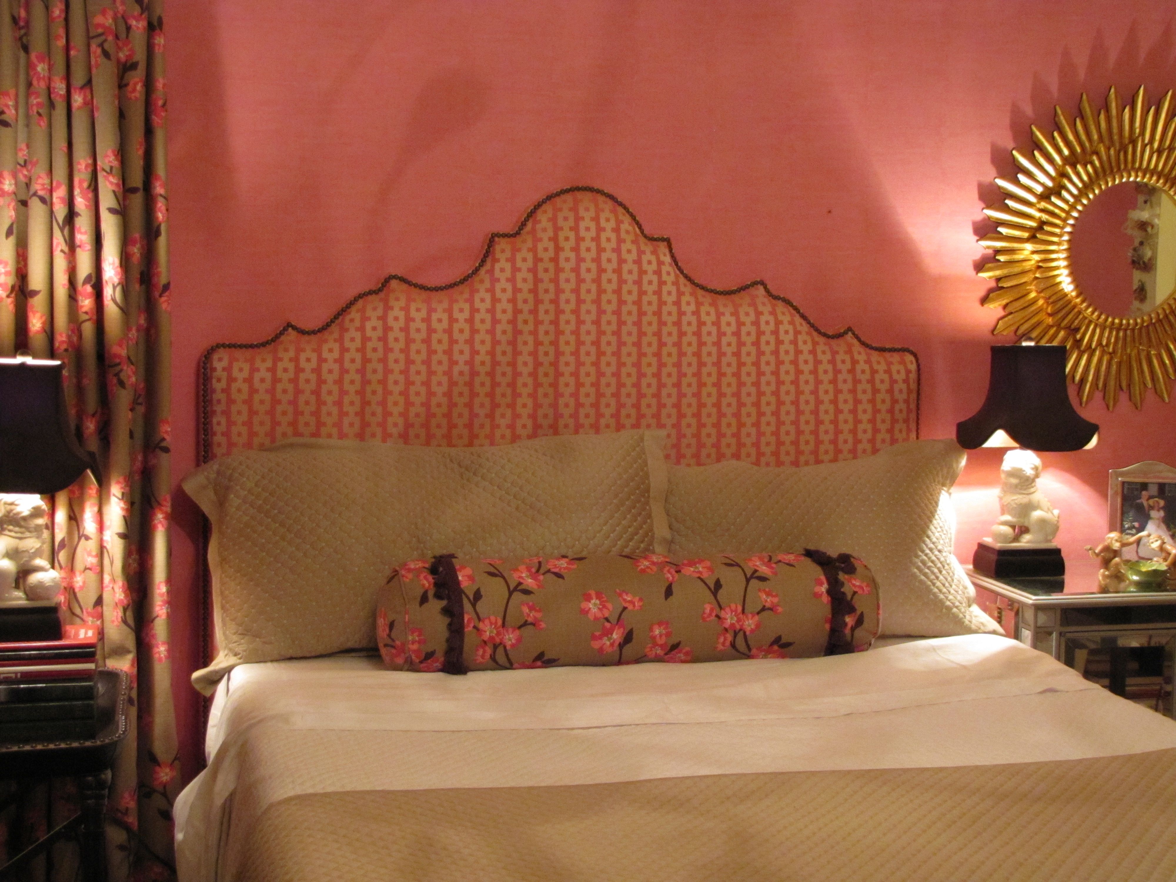
Chinoiserie bedroom makeover for a young twenty-something
Design by Ellen Rhett
My young collegiate was anxious for an update to the room that had last been decorated when she was thirteen.
A college co-ed desires a sophisticated space to return to when she’s home.
Chic chinoiserie details pleased and surprised.

Pink dogwood linen fabric unifies the hot-pink wallpaper with the neutrals.
And repeats the Chinoiserie theme.
Existing strié wallpaper was kept.
Foo dog lamps add a youthful vibe and continue the Chinoiserie theme.
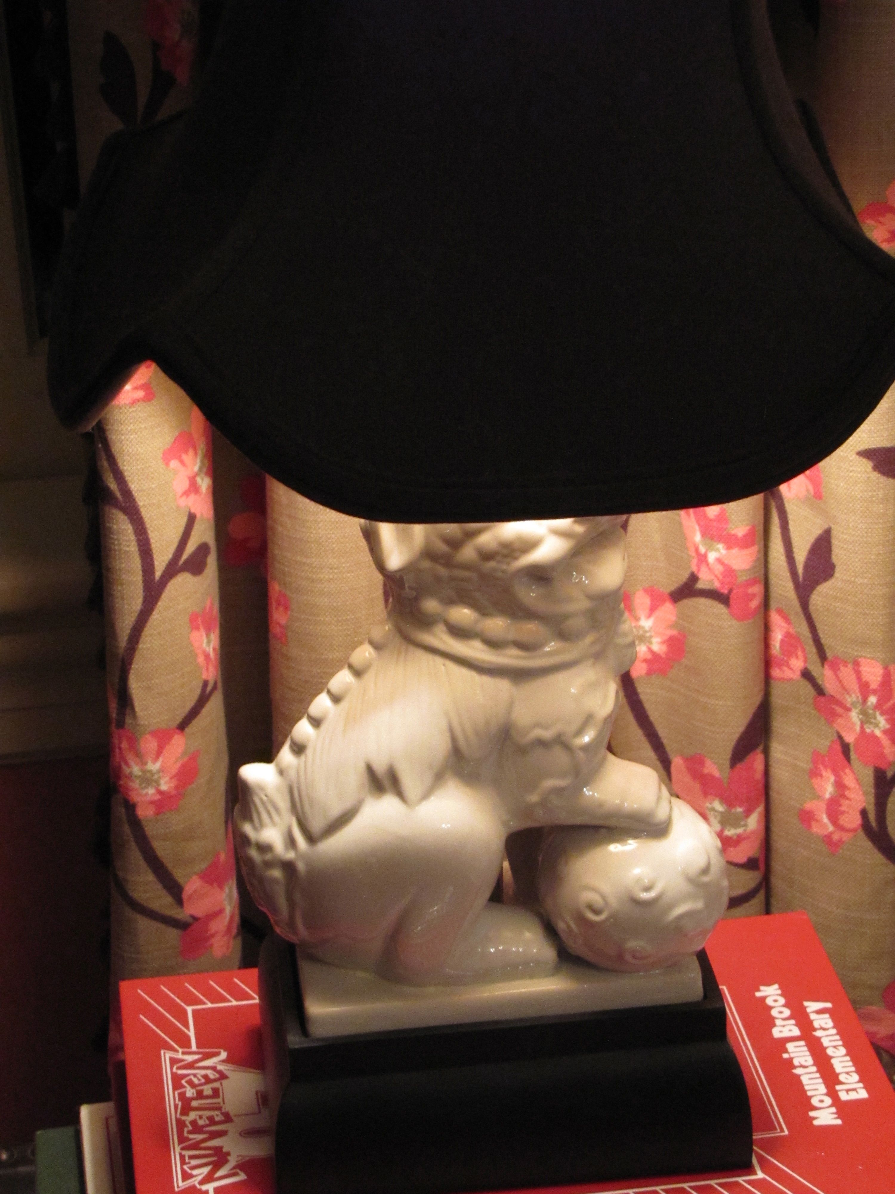
They also repeat the white in the dogwood fabric and bedding.
Remember, white is never a neutral in décor, even though it always is in fashion.
It must be repeated at least three times in a room.
White peonies, a favorite, are a natural in this room.

Design by Ellen Rhett
Custom padded headboard with expertly hand-applied nailheads (by my wonderful upholsterer)

Fun and funky and ultra-feminine light fixture, below, with plenty of sparkle and a dark finish.
Repeating the shape, movement, darkness, of the branches on the drapery and neckroll fabric.
Repeating the color of the lampshades as well.
And, a gorgeous on-trend sunburst accent mirror, handmade and all-wood.

Design by Ellen Rhett
Both sourced online for a song.
If I told you from where, you wouldn’t believe it anyway.
But, I know you, reader.
I know what you really want.
You want the before.
I’ll show you the before.
Get ready.
A little embarrassing so I’ll make this quick.
Here you are:
Before
And, one more time, the AFTER:

All Images Color Calling
Fabric Sources
Neckroll: Clark and Clark “Dogwood” (trade only)
Draperies: same as above.
Headboard fabric: Clark and Clark “Chinese Square” (trade only)
Bedspread, shams, comforter: Macy’s
Decorating for Christmas

Image ©Color Calling
I have a new go-to resource for my Christmas greenery.
The Curb Market, located in downtown Montgomery, Alabama.
Above is one of the large centerpieces, (there are two) which will go on my mantels,
after I gussy them up a bit with pine cones and holly sprigs.
And maybe some pomegranates and lady apples as well.
Here are my box garlands and wreaths.
The velvet bows came with the wreaths, and maybe need a little work before everything is hung.

Image ©Color Calling
For some reason, I have always wanted a gold spray-painted magnolia wreath.
This one is a very muted gold. I like it because it doesn’t look too shiny.
I have no idea where it will go (somewhere inside, maybe on the breakfast room table?), but here it is:

Image ©Color Calling
Readers, what are your decorating plans this year?
Accents for the Master Bath


Sometimes an accent table in the Master Bath is the perfect touch.
This is for looks as well as extra surface area near the tub,
or anywhere you need some extra space.
For your fanciest bath gel, cell phone, a magazine, a drink.
Your accent table should repeat one of the colors or finishes in the room.
Here are some well-scaled ideas.


Avoiding Your Master Bath Wish-List


Source: us.kohler.com via Ragan on Pinterest

Source: google.com via P on Pinterest
A few months ago, I posted about a popular current look in master baths: Free Standing Tubs
Yes, claw foot tubs have been around since the early 1880s. But, you know what I mean.
The new ones with no feet. The ones which sit plop on the floor.
With very fancy, very expensive plumbing hardware, usually located at the center back.
When I see more and more and more of this look appearing in magazines and design blogs,
I know that my residential clients are going to be talking about the same in their own baths.
Remember when we talked about how a good design professional
can keep you from making an expensive mistake?
Let’s talk about some potential pitfalls which might look wonderful, but would go into that category:
An expensive mistake.
Are any of these master bath trends on your wish list? Stay with me.
For starters: do you notice how far you are going to have to reach across these new tubs
to access some of the plumbing hardware you are seeing everywhere?
Some of the hardware is so far back that you will actually have to step into the tub to reach it!

Or, walk around to the back of the tub to access.

Do you see all the problems with bathing here? Yes, it appears very sleek and modern. But, look.

You’ll have to GET UP out of the tub to reach the spigots if you want to add more warm water.
You will probably get soap and water all over the painted SheetRock spigot wall if you do.
And that sink-sized wall spout is way too small for quick filling,
It would probably take an hour to fill that huge tub!
I am putting this notion of hard-to-reach plumbing hardware in the same category as these other
they-look-great-but-they-are-impractical master bath ideas:
1) full-length draperies (they will be just unsightly from water damage)


2) no window treatment in the bathroom (surely no explanation needed)


3) vessel sinks in a master bathroom (though I don’t mind them at times for light duty places)

with vessel sinks a) there is a huge splash-factor
b) they are not a comfortable height for hand washing, since you can’t lower your hands below counter-level
This last one is not necessarily impractical, but it is downright dangerous.
4) Chandeliers like low-hanging fruit above the tub.


While pretty, I find all these ideas just completely impractical.
What about it? Do you agree with my list to avoid in a master bath?
The Pillow Dilemma

Image ©Color Calling
It seems like everyone under the sun has an opinion on how many pillows you should have on your bed.
Mrs. Howard likes a lot of pillows. Here is the eight-pillow combo that she suggests:
“A king bed with three euros, 2 king pillows, 1 square decorative, 2 lumbar pillows,” shown here, below,

Source: mrshowardpersonalshopper.com via Ellen on Pinterest
Another pillowed-out Mrs. Howard bed, below:

Source: Uploaded by user via Tobi on Pinterest
Vicente Wolfe is more minimalistic in his coloration, but apparently he likes a lot of pillows:

Source: images.search.yahoo.com via Lindajane on Pinterest
Color king Miles Redd likes white pillows, with some flat and some propped pillows:

Source: saragilbaneinteriors.com via Ellen on Pinterest
Style maven Martha Stewart is not afraid to let her sleeping pillows show:

Source: marthastewart.com via Raquel on Pinterest
Queen of graphic-look rooms Mary MacDonald likes to go all out with her pillows:

Source: stylecourt.blogspot.com via Lauren on Pinterest
Colour designer Maria Killam likes a jazz of fresh orange plus green prints and white Euros:

Source: mariakillam.com via Maria on Pinterest
Kelly Wearstler goes for one long round neckroll-type back pillow with a single breakfast pillow in front:

Source: google.com via Ellen on Pinterest
Ralph Lauren is one of the few decorators doing shams with big ruffles right now:

Source: blog.timesunion.com via Ellen on Pinterest
Keith Langham designed this fancy bed, with white embroidered pillows,
all matching but in different sizes:

Source: francesschultz.com via Ellen on Pinterest
My Top 10 for Loving your Master Bedroom
As promised in my post last week, here are some practical guidelines for getting started with your new Master Bedroom.

1) BUY THE BEST MATTRESS YOU CAN AFFORD.

I have had wonderful luck with Tempurpedic. I like their Cloud. Do your own research.
This is an investment, and worth your time to get it right.
If you have a queen size mattress currently, and want a little more room, don’t miss trying out a California King.
The proportions are so much better than a regular King, and I don’t know why they aren’t more popular.
I find a regular King almost too wide for most couples (and they are so boxy looking, because they are almost square.)
A California King is 4″ narrower and 4″ LONGER than a standard King.
California Kings are fully 12″ wider than most Queens.
Love them.
2) LET THERE BE LIGHT. OR NOT.

Source
Natural light is a must for our emotional well-being.
If your bedroom has dinky windows, consider elongating them.
If you have access to the outdoors, consider installing French doors.
You will love having access to the outdoors on pretty days. Yes, this is an investment.
Your master bedroom is the most important room in your house for your peace of mind.
So, don’t put it at the very bottom of your wish-list.
Your bedroom draperies should be on a draw-rod, not the kind on rings which must be pushed and pulled by hand across the rod.
They should be lined and interlined for privacy, and should also have black-out lining to control the morning light.
3) QUALITY SHEETS.

You will spend over 1/3 of your life in bed. I consider quality sheets a necessity.
I personally like either Matouk or Sferra though there are certainly others that are wonderful.
Some designers swear by Soft Sheets at Target. I am not one of them.
(I do like their nicest quality plain white towels by Thomas O’Brien, though.)
I buy my Sferra sheets for a great price at Tuesday Morning.
You have to be diligent now, because it has gotten harder to find them. I like the embroidered ones.
The ones I have all say “Hand Embroidered” on the hang-tag, but skeptic that I am, I do think they are machine embroidered.
Still, they are gorgeous, they feel so crisp/soft, and my house guests almost always comment on them.
There is also now an on-line sheet section on their website.
I buy my Matouk sheets at the Matouk Outlet in Fall River, MA.
It can be hit or miss there, but lately I have been hitting. This is an in-person proposition only.
No phone or internet orders accepted. They have some truly amazing deals if you are ever in the area.
Use fabric softener to keep your sheets soft.
And, have your pillowcases and at least the top of your sheet, ironed. It is worth it.
Oh, and in case you don’t know this, NEVER wash your sheets with towels. That is what causes pilling.
A little ‘cheat’ that works pretty well, is to buy wrinkle remover spray (I use the kind they sell at Dollar General)
and spray lightly on your bottom sheet after you have put the bottom sheet on the bed.
Smooth by hand. Spray and smooth some more. This works.
4) A PAIR OF LAMPS

With upgraded lampshades if necessary. Yes, a pair. With bedroom lamps,
Matchy matchy = Good, sometimes. This is one of those times.
On the same visual plane as each other, even if you have non-matching bedside tables.
You can use pretty books to raise the lower lamp if needed.
One of my pet peeves is dinky lighting by a bed.
If your bedside lamp isn’t 28″ (at least) from top to bottom, it is likely not proper height for reading at bedside.
I like my lamps with regular incandescent 3-way bulbs. Stock up.
I hate those new snakey, one-second-pause-before-working, bulbs, otherwise known as CFL.
They throw out the most horrible excuse for lighting.
Supposedly, the incandescent 100W bulbs are being completely phased out,
due to concerns about their energy usage.
(Big government over-reach, since the new swirly ones have up to 4 mg of mercury, per bulb, in them,
but that is for another post.
Just don’t feel too smug if you are using them, I personally think they are far more dangerous to your person.
If you break one accidentally, you will have one big toxic problem on your hands.
Please do your own research. And, as I said, stock up on the old 100w kind while you still can.)
5) WALL TO WALL carpet or big room-sized rug.

If you or your spouse are allergy prone, you might consider skipping the big rug
and going for a small rug by each side of the bed only.
6) WATCH THE VOLUME OF DARK WOOD FURNITURE
Lighter may be better.

Source
Nothing dates a bedroom more than a matching bedroom suite consisting of a dark chest of drawers,
a dark highboy, and a pair of dark matching bedside tables.
A good residential stylist can advise you how to update your existing pieces or guide you if you need new furniture.
Bedrooms today are much lighter in their look and feel.
7) Please say NO to a ceiling fan
in your Master Bedroom space. A chandelier is 100x better.

Put it on a dimmer.
You will never look back.
Trust me on this one.
8) SEATING if you have room

Source
A nice side chair or a lounge chair (or a pair) is terrific for so many reasons.
It is nice to sit in a proper chair when you are zipping up or pulling up boots, lacing up your tennis shoes, etc.
A chaise longue is ideal and can be visually pleasing as well as versatile.
Of course, make sure you have a lamp beside your chair.
If you are a really light sleeper, experts advise that you don’t go to bed
until you are actually ready for sleep.
A bedroom lounge chair can help the transition from awake to asleep.
9) No television
I am unlike many in that I truly hate television.
As I have gotten older, I see how addictive and utterly useless it is, and what a time waster it can be.
I do enjoy watching my Crimson Tide football team play (RTR!) when I can’t make it to the stadium.
And, Downton Abbey. Don’t even get me started.
But, other than that, I almost never turn the television on.
Yes, it is hard to give up a master tv if you are used to it. You may not be able to give it up.
But, if you don’t have one, may I suggest keeping it that way?
Television is not conducive for conversation. Television programs are certainly not relaxing these days.
Your master bedroom should be a sanctuary and an oasis of calm.
You will assuredly sleep better with no television to distract or disturb you.
10) Only Non squirmy/non-whiny pets on the bed.

Source: cocomale.com via Margie on Pinterest
You may have to crate the squirmers and the whiners elsewhere.
They really won’t mind after the first few nights.
YOUR sleep is more important than giving in to squirminess, so stand firm.
Don’t feel guilty about this.
If you have a storm-related whiner, try a sleep/sound machine in your room
instead of giving them so-called doggy valium.
Works wonders on my dogs.
So, those are my top 10 for a master bedroom.
Any thoughts or additions to the list? Fire away!
How to work with a design professional

Source: google.com via Ellen on Pinterest
Get ready.
This is a long post, one that I have been thinking about for months.
I have been on both sides of the decorating equation, so to speak.
First, as the client decorating my house with the help of a decorator.
And, now, for the past several years, as a Certified Color Specialist
and design professional helping others.
Here are a few things I have learned.
As a homeowner, do you love and gravitate towards neutral, subdued,
calming colors, as below

via Horchow.com
Or, do you prefer bright happy colors?

When you call us, we are going to give you a look
and feel in your home that is a reflection of YOU.
This takes time, and it is an investment.
I was taught that good design can cost about the same
as bad design.
And, the right paint color will not cost one penny more
than the wrong paint color.
I believe that your home should be a beautiful sanctuary
away from the stresses of your job and your busy life.
It should be a treasured place to come together as a
family for meals, for rest,
and for relaxation.
It should be a place you look forward to, and a place you
are happy to share with friends and relatives.
If your home is not all of these things, why not?
Is there something holding you back?
Even if you say “money,” keep reading.
Good design can occur at a number of price points.
Don’t let a limited budget keep you from having the
best possible look and feel for your home.
The gorgeous stair runner, below, has an equestrian motif that looks
like it could have come straight
from the Hermès Paris showroom.
But, it did not come from Hermès.
(Nope, it came from JC Penney online.
Installed to perfection by one of my resources.)
Are you with me?
I have worked with a number of young couples
just starting out, some with very, very tiny budgets.
If you are working on a tight budget,
you can’t afford to make a mistake!
This is when a resourceful design professional
is going to be invaluable.
The labor alone for painting one room is well into the hundreds,
and for kitchens and baths with cabinetry, it can easily go
into the thousands.
I have been selecting paint colors for people for several years,
and my system never relies just on those tiny 2 x 2 inch chips.

Image ©Color Calling
In fact, one difference between my system and the way you
might select a color, is that I KNOW that I can’t choose a
color properly from a tiny paint chip.
Those chips aren’t even paint, they are printed interpretations
of the paint color.
They do not reflect light the way that the
real painted wall will, either.
If you are currently a client working with,
or thinking of working with, a design professional,
there are several pointers I might suggest
to help establish and keep a good working relationship.
Custom interiors are expensive, and there are some things
you, the client, can do to get the most from your
design professional.
I would make sure that I know the following:
1) Does she keep current with
what is going on in design?

(latest collection Schumacher fabric on classicly simple Roman shade)
Do not confuse “current” with “trendy.”
Blogging keeps you current, and it helps a design professional spot
the comings and goings in decorating long before they hit print.
If you are working on a new room, today in 2012, and your designer
is suggesting starting with a brown or floral sofa, or example,
then she is probably not current.
Floral on a sofa is long gone, and Brown is trending out,
having been around for years (a decade).
Now Gray is the current neutral.
Your designer should know this.
Does this mean you need to start with Gray? Absolutely not!
See the first two images, above.
Neutral “important” pieces are the way to go if you have a limited
budget and don’t want to change out things every few years.
So, I would suggest a fairly good browsing session through magazines
such as Traditional Home, House Beautiful, and Veranda.
Get an idea of what is current so that you can see if your design
professional’s suggestions are helping you move forward,
or if she’ll just be taking you back in time.
2) Does your professional have access
to good resources?
The details and the construction in design make all the difference.
The quality of this construction would not pass my test.
See how the seams are slightly askew?
See how the lumbar pillow looks off-square?
See how the box pleats look saggy on the left?
This is an amateur job.

Source: google.com via Ellen on Pinterest
Does the workroom she uses work with quality lining and
interlining fabrics, stand behind their work, and are they
willing to come make reasonable adjustments
if necessary?
If you are doing expensive work, are they accustomed
to working with designer fabrics(fabrics which start at $150 a yard,
and you will need 12 yards for your average window)?
Can they do custom touches, for example?
You don’t want an expensive mistake being made on your job
because of inexperience.
Does your professional use a quality upholsterer?
Are your seams, lines and patterns nicely matched when you
get back your upholstery?
And, if your designer reps a particular line exclusively,
do you love that look and are you willing to forego other options?
Does she have an excellent painter, a great wallpaper hanger,
a quality furniture refinisher, a perfectionist carpet installer,
and someone who can professionally and
correctly hang those expensive new draperies?
Can she have custom furniture fabricated if you are looking for
something not readily available?
3) Does your professional always specify
the most expensive lighting, fabrics, and
carpets?
Or, does she know how to resource budget-friendly items,
say for a child’s bedroom or a playroom?
Does she at least occasionally show you a trim option from somewhere
like Lewis and Sheron fabrics (running $35/yard, not $250/yard),
a lamp from Shades of Light or Ballard or even Overstock, or an accessory
from Target, Anthro, West Elm or Pottery Barn?
When appropriate, she should.
(Wallpaper is a different story. Don’t buy cheap wallpaper, ever.
Good wallpaper is worth every penny.)
It takes work to know where to find nice reasonably-priced accessories
and budget options.
Is your professional willing to do the legwork necessary to know where?
4) Does your professional use correct/useful
design terminology?
Knowledgeable residential design professionals should be discussing concepts
such as “fixed finishes,” “undertones,” “focal point,” “symmetry,” “color harmony/
flow,” “repetition” and “balance,”
when helping you achieve an overall look and feel in your home.
She should be happy to explain (without condescension)
any terms which you aren’t familiar with.
If someone you are thinking of working with uses the words
“a matching dinette set,”
you are going to get a very different proposed look from someone who says,
“an antique Regency breakfast table mixed with Louis Seize-style chairs.”
And, watch out for someone who uses the same vague buzz words
(“edgy” and “whimsical” are two which come to my mind) many times
during a consultation.
A decorating cliché is likely to follow.
And here is what you can do for your
trusted design professional to help the
collaboration:
1) Provide magazine pictures
(tear them out and keep them in a file)
Provide your designer with pictures of rooms you love.
YOU need to decide, and then communicate, what it is that attracts
you to a particular look.
Don’t hand your designer random pictures if you don’t want her
to achieve a similar look.
We are not mind readers.
We can’t determine from a photograph that you hated the room
in general, but absolutely loved the fabric on the ottoman.
So, tell us.
If you trust your professional, you should be able to
2) articulate a clear reasonable budget
for whatever you want done.
If you have never given out a budget, you, the client, should go
to your nearest quality furniture retailer
(if they carry primarily brands such as Henkel-Harris, Sherrill, Baker,
Hancock & Moore, Henredon, then they are a quality retailer).
In Birmingham, I would tell you to start at Birmingham Wholesale Furniture,
and price out whatever is closest to what you think you may want.
That means pricing every single thing you need off of your list: rugs, tables,
chairs, sofas, lamps, etc.
If you want antiques, they have a selection of antiques there as well,
which you can price out for your budget.
This is valuable time spent, and it matters, because you now will have a
minimum starting point for the budget that you give your professional.
It will not include draperies, but you can get your professional to roughly
estimate this for you in advance.
Custom is always more expensive. Custom draperies are exorbitant.
Custom wool carpeting is price-prohibitive for most.
But, you are in for less sticker-shock, and you can spend your time more
productively, if you price needed items at retail first.
And, if you are lucky enough to be one for whom the sky is the limit,
say so if you trust your design professional.
The best professionals will save you from making expensive mistakes.
(click to go to this previous post).
3) Let your trusted professional’s ideas
percolate for a bit.
Try not to make a snap judgment about every single thing that
we suggest.
Whether designing, decorating, or selecting fabrics, accessories,
and colors, this is what we do.
We will not suggest something that we don’t think will have a
reasonable chance of filling a need or a space.
We usually see things in a different way, and our fresh eye may
have come up with a solution that you hadn’t thought of.
We know which fabrics will stand up to children and pets.
We know how to achieve a total look and feel for your home.
Try to keep an open mind and try to appreciate the vision we have
for your space, and give us the chance to articulate that vision to you.
4) Understand that quality jobs take time.
A good design professional will allocate your resources in a certain order.
Rugs should be chosen before your wall color, for example.
Special order upholstery takes 8-12 weeks.
Custom drapery jobs may take 6 weeks just to fabricate.
My best painters may be booked up for weeks.
Oh, I didn’t even mention “backorder” or “no longer current.”
We might have found the perfect fabric, and it might be out of stock with
3 months to wait for new stock.
Or, the colorway that works may have been discontinued and
is completely unavailable.
Stay flexible.
We might have to look for something else.
5) Make us tell you “the because.”
We know there are some of you out there who are going to be resistant
to any change we suggest, because that is human nature.
Ha, I always meet resistance when I suggest painting dated wood or brick
(usually orangey or pinky, but can be other colors).
Want to see “the because” on this one? Here is a great before and after by
fellow True Color Expert Kristie Barnett who lives in Tennessee,
well worth the read for an amazing transformation:
Before, dated wood and brick:

Source: thedecorologist.com via Ellen on Pinterest
After, with paint instead of dated brick and wood:

Source: thedecorologist.com via Ellen on Pinterest
Isn’t it hard to believe it is the same room? Read the entire article here.
Make sure we explain “why” to you, the client. There is a reason (or should be one!)
for everything we suggest.
We want your home to be a beautiful reflection of you.
We can tell what is visually working
and not working in a space from the moment we step in a room.
It may be that the wall color is not working
(because it is clashing with the undertones of your fixed finishes);
it may be that the artwork over your sofa is not working
(because it is entirely the wrong scale– too small, or needs upgrading);
it may be that the chest in your entry hall is much too large for the space and
is impeding access to the next room.
Ask questions and make sure you understand why we are suggesting a change.
If you get the idea that the person is just trying to sell you “more stuff,”
without a thoughtful and deliberate taking-stock of
every single room of existing furniture, you are probably right.
Listen to your instincts!
Good design professionals of integrity want your home to look great, function
beautifully, and reflect you.
We are thrilled when we can show you how to work with something
you already have.
We are ecstatic to “go shopping” in your own home and
find something we can use in a way you may not have thought of.
We are also going to think about your job when we are actually out,
and we may call you if we see something that is perfect for you.
We will mentally go over your job when we are home, when all is quiet,
and when we are “off the clock.”
Some of our best ideas come when we aren’t even charging you for our time.
We don’t just want to sell you something.
6) We do not work for free.
Unless you are our mother.
Please be prepared to pay for my time. I charge an hourly rate.
I tell you everything in advance to avoid any misunderstandings.
You are never expected to buy even one thing in return for my best advice.
I was called in several years ago to help someone replace her living room
draperies, which she said she hated, and which would have been been a very,
very expensive job.
After going through the initial consultation, I recognized that the draperies,
though a bit old, were not the problem at all.
I showed the client how we could work with the existing draperies,
and make some other, much less costly, changes to achieve a beautiful end
result.
This one piece of advice actually saved her thousands of dollars in the end.
Trust me when I tell you, we want your house to look wonderful.
But, no designer of integrity will suggest something, or even go along
with something the client thinks she needs, just to make a sale.
We want to do what is right for your home.
We want you to be happy, and a happy client is our very best referral.
~~~~~~~~~~~~~~~~~~~~~~~~~~~~~~~~~~~~~~~~~~~~~~~~~~~~~~~~~~~~~~~~~~~~~~~~~~~~~~~~~~~~~~~~~~~~~~~~~~~~~~~~~~~~~~~~~~~~~~~~~~~~~~~~~~~~~~
So, there is my list of some of the things I find important on both sides of the
equation.
Thoughts, other examples, or anything you would express differently?
Chinoiserie Saint Francis
When I saw this finely carved “ivoryesque” figurine at a church thrift store for a song, I couldn’t resist.
He is a Chinoiserie version of Saint Francis. See the little birds he is holding?
He looks right at home in my Chinoiserie powder room.
The wallpaper also has birds on it, do you see those storks to the left of the figurine? 
This little illustration shows one of my favorite decorating secrets, which I happily share:

Repeat, repeat, repeat.
It is visually and artistically pleasing to use repetition.
The eye will pick up on repetition as it processes what it sees in a room.
Sometimes the conscious mind does not recognize the repetition, but the subconscious mind has processed it as pleasing.
So, in the above vignette, the Chinoiserie St. Francis repeats several things from the wallpaper:
the antique cream color, the Chinoiserie style, the birds, the figural images, and even the cross-hatching in his hat is also in the wallpaper.
Take another peek and you will see these things that perhaps you didn’t notice before they were pointed out.
Now, let’s look at some elements in another room, images below.
Notice the repetitive geometric motif, diamond shapes, which I have broken down individually.
Diamond shapes are repeated throughout the room. You probably wouldn’t even notice.

Image ©Color Calling

Cut velvet upholstery, Image ©Color Calling
And here


Drapery trim Image ©Color Calling
Subtle, very subtle.
Powerful, very powerful when used together.
Because of the repetition.
Repetition, one of the best ideas in any good design professional’s bag of tricks.
Are you using repetition effectively to please the eye in the rooms in your home?
Is your sofa this comfortable?

Buy the best sofa you can afford. A good sofa can last 20+ years with a few re-coverings. There are several trade-only lines that I have had very good luck with over the years. There are also some excellent retail lines if you are a do-it-yourselfer.
If you are investing in a new sofa, check the legs to see if they are wood. Many brands use cheap plastic legs which will not withstand heavy wear. “8 way, hand-tied” is also an indication of quality.
Don’t think you have to have down or blend-down. Down backs require constant re-plumping to look good. Sometimes a “tight back” style is the way to go, which has no separate back cushions. Again, a good designer can help you make the right decision.
As for style, you need to decide how you will use the sofa.
In a family room where someone might lie down to watch television, for instance, you would want to avoid a Knowles-style sofa which has very high sides.
Toss-type back cushions will end up on the floor, especially if you have young children. Semi-tight backs aren’t able to be rotated, or even easily re-plumped, since they are attached.
A single bench cushion for the seat is a good look and on-trend, and is more widely available as an option now.
Two seat cushions are not as comfy for someone lying down to watch television, but more comfy if two people are sitting together (upright). All of this is worth a discussion with your design professional.
A good design professional will keep you from making an expensive mistake.

Source: cocoerosboutique.com via Coco on Pinterest
For color, a good solid neutral gives you the most flexibility.
Punches of color can come from pillows and accessories. You should avoid a pinky-beige undertone, because that particular color will limit your other design options the most.
Here is the pinky-beige color you will want to avoid if possible, especially if you have yellow or yellow beige walls. This creates a very undesirable clash of undertones:

A nicely designed quality sofa is always a good investment. The wrong sofa will just be an expensive mistake.
A sofa will probably be the third most expensive soft furnishing in your room. Drapery and rug will be one and two, most likely.
Good Design is always an investment, but Bad Design is just costly.
Designing a Tasteful Home Movie Room
Yes, it is possible to have a tasteful home movie room. What are some decorator secrets for an attractive dedicated home movie room?


Eclectic Media Room design by Minneapolis Interior Designer Mingle
#1 Don’t call it a Home Theater
This verbiage has less-than-tasteful connotations, I am going to call it like I see it.
Home Theater draws an image of a soldier-row of lumpy leather recliners with built-in cup holders.
What about calling it your movie room? It sounds so much more attractive already!

#2 Function First

A good Audio Video specialist can help you decide what type of equipment fits your demands and your budget.
If possible, have your room pre-wired for the type of equipment before your walls are installed.
I personally like a front-projection system in a dedicated (completely light-controlled) movie room, see the little projector mounted on the ceiling below? Visit a good A/V demonstration room to see what you like and what fits your parameters.

#3 Know your optimal viewing distance
Ask your A/V specialist what the optimal viewing distance is for the system you have selected. Obviously, the larger the screen, the further away the optimal viewing distance. This is where your main sofa should be placed.
Make sure your screen is placed at optimal viewing height as well (above a fireplace is usually NOT optimal height if you wish to avoid neck strain.) You can see how comfortable viewing would be from the main sofa here, below:

This is not the time to go it alone. Get an experienced designer involved before your installation is purchased.
If you are on a budget, you can not afford to make a mistake.
Working together, your designer can suggest a floor plan and soft furnishings that will enhance the use and beauty of your movie room, so that it will be one of your favorite rooms in your house.
#4 Pad and cover your walls with fabric for optimal sound.
This is a job for an experienced professional.
Don’t forget extra sound-proofing between floors.
#5 Carpet is a must for any good audio system to sound its best.

#6 Use operable (hand-drawn) draperies with full black-out lining for complete light control.
#7 Good-looking case goods/built in cabinetry for housing components.

#8 Comfortable furniture and a soft place to prop your feet
Think a full-sized sofa, some lounge chairs, and ottomans.
No hard-surface coffee tables, which are uncomfortable for foot-propping, and will improperly reflect sound waves.
A better look is to have your dedicated movie room look more like a regular family room, tailored around the movie screen.
#9 No extraneous appliances or auxiliary activities
As tempting as this may be, don’t put anything else such as pool table, ping-pong or appliances in the same room. If possible use an adjoining area nearby.

Ice machines, even the most expensive, make distracting noise and should never be placed in the movie room.
Find a place in a nearby area to install the wet bar, ice machine, a small fridge, etc.
It might sound like a fun idea at the time, but a ping-pong table or pool-playing are not really compatible activities with movie-viewing, and as such really don’t belong in a dedicated movie room.
#10 Dimmers on all lights in a movie room.
Make sure that you can easily and quickly access them when entering and exiting, because a dedicated movie room is dark without natural light. This is an overlooked tip that will enhance your enjoyment of the room.

Source: homedepot.com via Dani on Pinterest
Do you have a movie room, or would you want one? What are the important elements for you in a room like this?
Use These Six S’s to Jazz up your Bedroom
#1 The Show-Stopper
The bed.
First, I assess the actual placement of the bed. If possible, the bed should be the first thing you see when you come into
the bedroom. It should be the focal point. It should provide the visual wow factor. This is always an investment.

Bed Design by Ellen Rhett, Image ©Color Calling


#2 SYMMETRY
Use pairings to create symmetry, which keeps the eye rested. Then add a few unusual pieces and accessories to keep the eye interested!

I like to create symmetry by using matching lamps on the tables to each side of the bed.
I sometimes specify matching bedside tables, but we want to avoid the dark, dated “bedroom suite” look.
It is important that the matching lamps are on the same plane, in other words, that one is not higher than the other.
This can be easily accomplished by resting the lamp base on a coffee table book or a decorative box, below.

Think a pair of smallish upholstered lounge chairs, with at least one ottoman if there is space, for further symmetry.

Source: thefoodogatemyhomework.tumblr.com via Jennifer on Pinterest
Another tip: Never, never, never place a leather chair in a traditional master bedroom.
It is not the right element and will look cheesy, unless it it done like this, in a darker bedroom with a clearly funky/masculine vibe:

#3 SCALE
Don’t overload your wall space with furniture. This is the room that should be your sanctuary from your busy life.
It will be a much more restful place without huge pieces of hulking furniture.
If possible, use closet shelving for storage rather than big chests-of-drawers. If you must use large furniture, consider lighter colors to keep
from overwhelming the space.
Resist the urge to put a television in your master. Remember, you are creating a space apart from the real world!

Source: weightloster.com via Elmer on Pinterest
#4 STYLE
Scour decorating magazines and find your style. A good design person can help you bring your vision to life. She can also help you decide which of your existing pieces of art or furniture can be used again, and where to allocate your budget for maximum impact.


#5 SOFTEN
Soften hard edges. Place a bench at the end of the bed. Think of ways to add soft furnishings to the bedroom.
Use a gorgeous vintage chandelier, and put the switch on a dimmer for soft, romantic lighting.

Design by Ellen Rhett, Image ©Color Calling
Add a cashmere or other luxury throw somewhere in the room. Add a chaise and then use it for reading / napping!

Source: jalonburton.blogspot.com via Jalon on Pinterest
#6 SAVOR

Invest in the finest mattress and sheets you can afford.
I love Tempurpedic and would recommend it to anyone. (full disclosure: I am not getting anything for saying that, I truly believe in the product).
I love luxury linens and I make sure they are ironed each week. Nothing is more heavenly!
Enjoy your retreat from the outside world. Make it beautiful and make it your own. You can’t afford to make mistakes, so invest in professional advice to
stay on track!
These are my “S” tips for creating a master bedroom that you will love. What do you think? Is this advice you can live with?
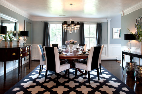
Why are dining rooms so difficult to decorate?

Everyone in the design business knows this: dining rooms are notoriously difficult to decorate.
Have you ever wondered why?
Here are some thoughts, and some suggestions for avoiding some common pitfalls.
Dining rooms have very little in the way of upholstery to soften all the wood in the room.
I find that draperies are a must in a dining area, both for acoustical reasons as well as to visually soften the hard surfaces of sideboard and table.
No other room in the house has so many horizontally-planed wooden surfaces, think about it.
Even a wood-paneled study has vertically-planed wood, which for some reason, seems much different than the horizontal planes of the dining room wood.
And a study is filled with soft furnishings (like a sofa.)

Make sure that your dining room has a proper focal point. Below, it is simply the graphic black mutton and mullion
elements of the windows. The chandelier is so airy it almost goes away.

 Source: savearecipe.blogspot.ca via Shannon on Pinterest
TWO CHANDELIERS OR ONE?
I usually prefer one, the two below keep the room from having its proper focal point, and are too delicate for the space.
Have you noticed many more rooms in magazines and blogs are showing two full-sized chandeliers? (This is just a trend, so it is going to look dated in a few years).

WATCH OUT FOR MATCHY MATCHY
What about a different pair at the host and hostess place to break up a matched set?

If art is the focal point, make it as large and dramatic as possible, here: Source: houzz.com via Julie on Pinterest
And here, for a very modern treatment, P.S. Dear Owner, please drop the painting 30-36″ and it will be visually correct. It is hung entirely too high.

A few common pitfalls:
- Make sure that your rug fits the space.
It is better–far better– to have a bare floor than to have a too-skimpy rug. A residential style expert or even a friend
with a good eye can help you decide the proper size for your space.
- Beware of banquette seating. It is one trend that looks great in photographs, but can be extremely impractical.
See my post here
- Consider a round table if you have a square or square-ish dining room:

Source: hookedonhouses.net via Adrienne on Pinterest
