You can ring my bell
That late 1970s/early 1980s disco song keeps rummaging
through my head.
You see, we just installed this darling marine bell at the beach home of a family member.

ring my bell
We installed it to relate to the door, without being too close to interfere
with normal comings and goings.
It has the nicest, most welcoming cling-clang.
Solid brass.
Adorable anchor-motif backplate.
Genuine marine-grade rope pull.
So much more “beachy” than a regular electric doorbell.
You can ring my bell.


Doors and gates of Charleston
A few days in Charleston is all you need to get hooked (for the fourth time or the fortieth).
Here are a few peeks from a random stroll down Church St. All images by Color Calling.
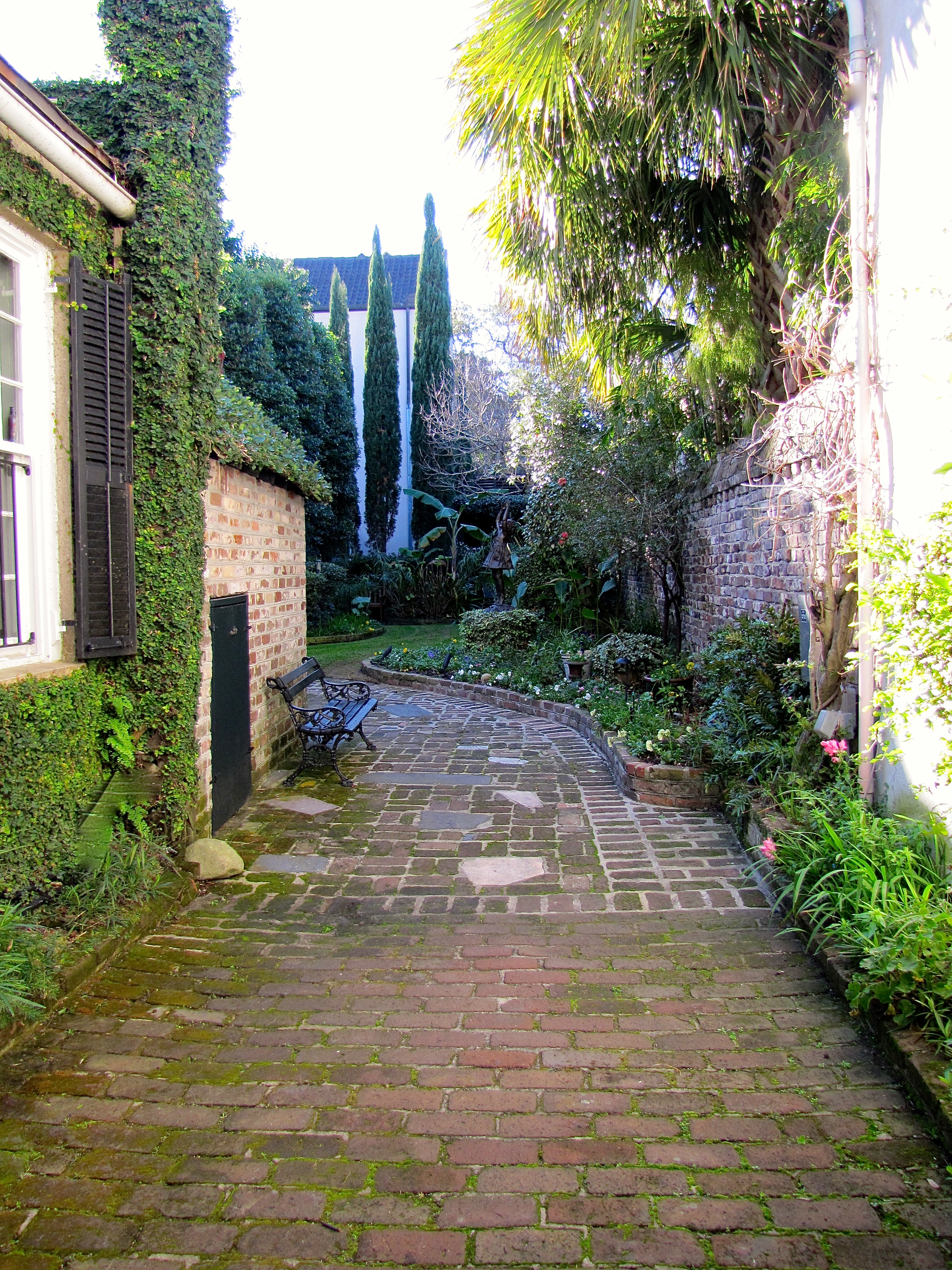
Typical Charleston courtyard

Charleston courtyard, same as above, with close up of bronze child. She is on tippy-toes and still just can’t quite reach the tree branch! How cute is she?
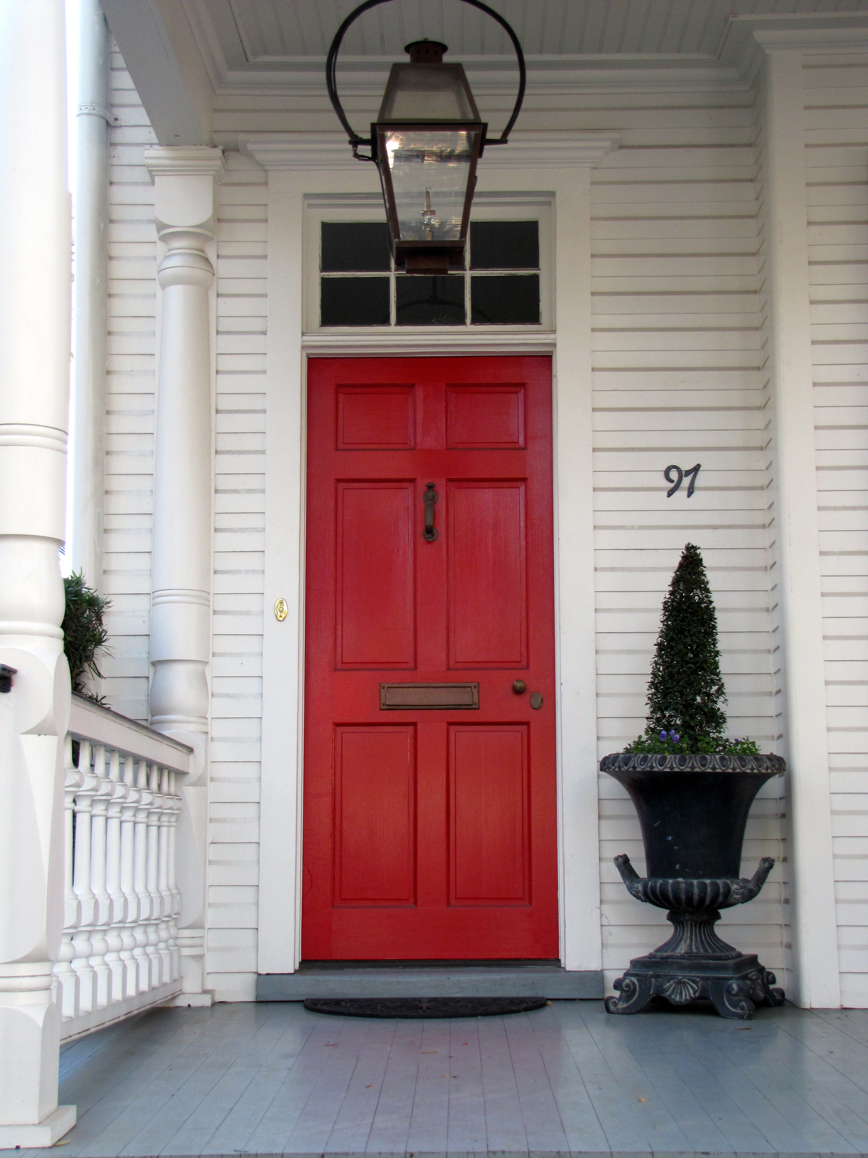
red door in Charleston
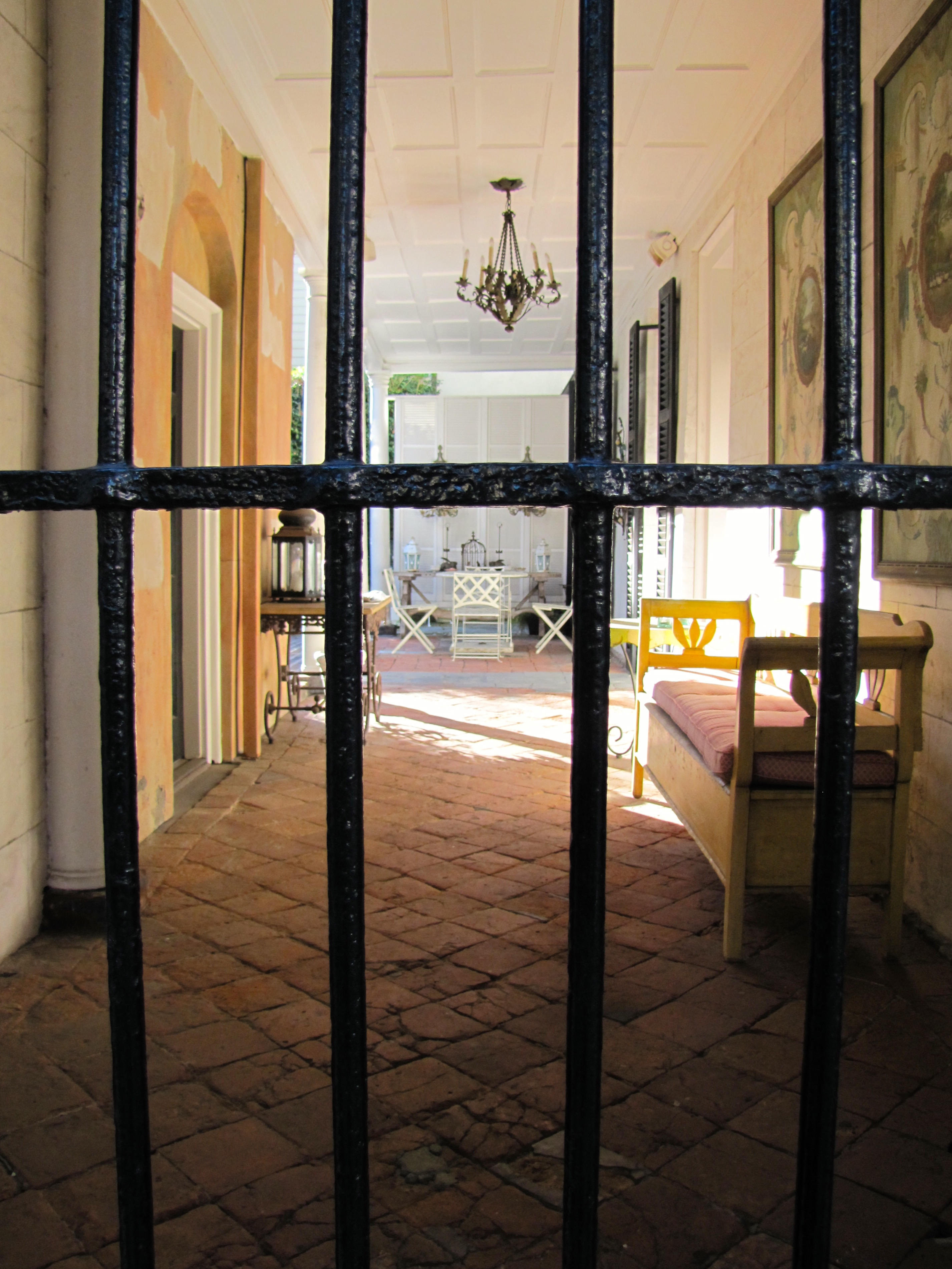
Now, this is what I call an outdoor room!

close up of outdoor room

black door with freshly polished brass gleaming in the sun
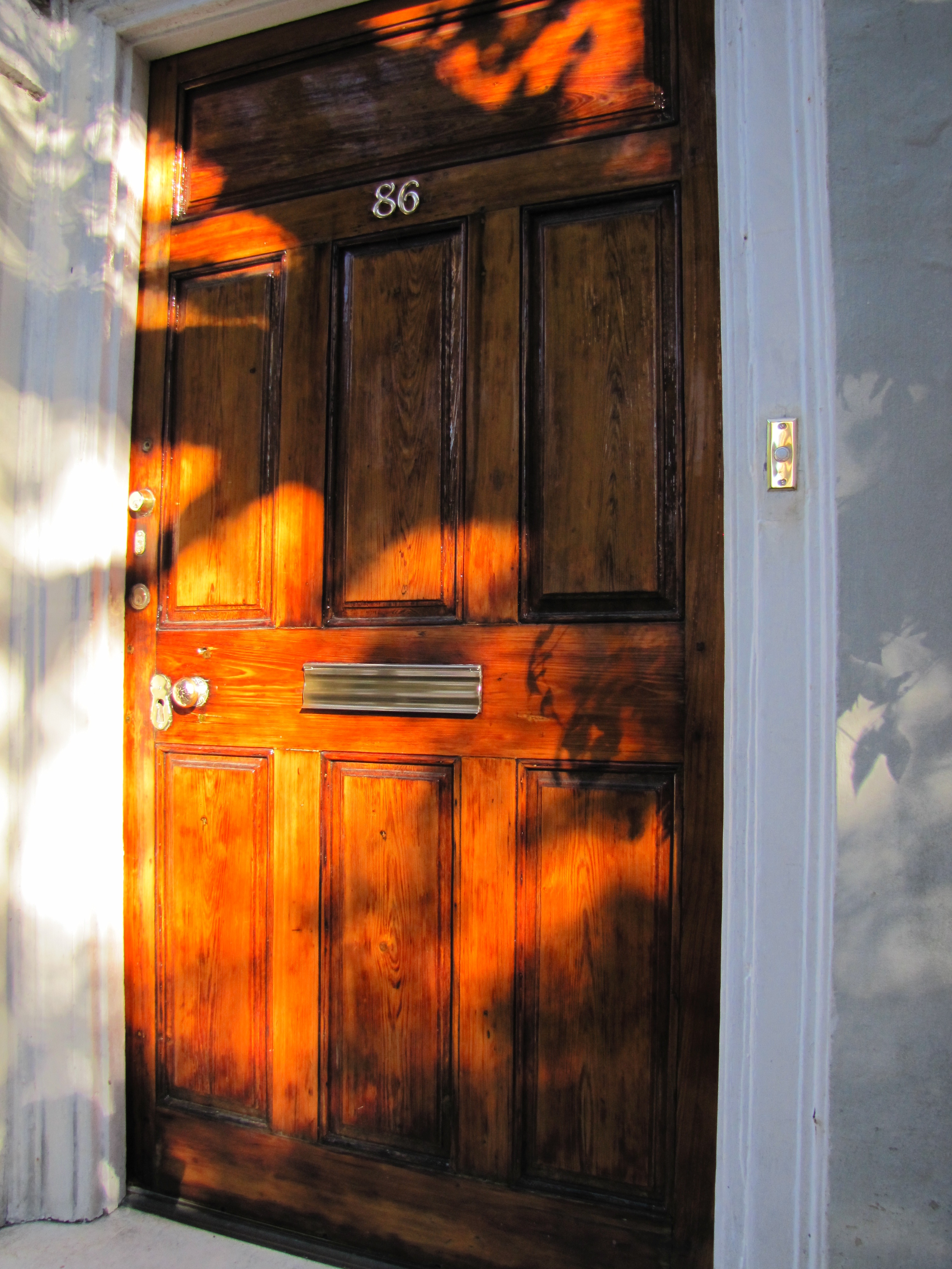
Varnished Wooden door

side porch

black gate

silver gate
A Craftsman Paint Story: Before and After
Before, a tin-roofed cottage painted a non-traditional minty green by the previous owner.
Which stuck out like a sore thumb in a transitional neighborhood of sidewalks lined with
classic Craftsman bungalows as well as some brick houses.

Image ©Color Calling

Image ©Color Calling
After, classic Craftsman paint colors selected for the new homeowners, newlyweds.
Minty green does not belong in a classic Craftsman palette.
Greeny-grays are perfect. Great with a tin roof as well.
Grays in the mortared stone columns are reflected in the choice of color for the house body
and the darker grays accenting the trim.
Think of the earth colors of nature and there you have a pretty complete Craftsman palette.
“Georgian Brick” (Benjamin Moore) front door, which echoes the exact color of the next door
neighbor’s brick (very close by) as well as the brick High School across the street.
The young wife liked my color palette, explained to her by her husband after my initial consultation.
She was busy performing surgery and could not attend the original color consultation.
There was just one thing.
She had her heart set on a REALLY RED front door.
But, once I explained “WHY” the more muted red I selected was picked out
(it is better for a Craftsman palette;
it reflects the adjoining neighbor’s red brick;
matches the brick of the high school very visible across the street;
honors some similarly colored decorative brickwork set in their yard, etc.).
And, with this color selection system, there is ALWAYS a WHY.
She immediately understood.
She is one smart cookie. Beautiful, too.
The system works.
And, this is it: Evaluate the FIXED finishes and go from there.
Doesn’t have to include the neighbors, but when you can reach out and almost touch their brick side wall from your front porch, better to take into consideration. Think existing stone, brick, roof, etc., that will not be changed. That is what a fixed finish is.
Felt a glow of satisfaction when a passerby walking down the sidewalk told me, “Wow, the house looks great. What a difference!” as I was taking the ‘after’ photo shot.
How to work with a design professional

Source: google.com via Ellen on Pinterest
Get ready.
This is a long post, one that I have been thinking about for months.
I have been on both sides of the decorating equation, so to speak.
First, as the client decorating my house with the help of a decorator.
And, now, for the past several years, as a Certified Color Specialist
and design professional helping others.
Here are a few things I have learned.
As a homeowner, do you love and gravitate towards neutral, subdued,
calming colors, as below

via Horchow.com
Or, do you prefer bright happy colors?

When you call us, we are going to give you a look
and feel in your home that is a reflection of YOU.
This takes time, and it is an investment.
I was taught that good design can cost about the same
as bad design.
And, the right paint color will not cost one penny more
than the wrong paint color.
I believe that your home should be a beautiful sanctuary
away from the stresses of your job and your busy life.
It should be a treasured place to come together as a
family for meals, for rest,
and for relaxation.
It should be a place you look forward to, and a place you
are happy to share with friends and relatives.
If your home is not all of these things, why not?
Is there something holding you back?
Even if you say “money,” keep reading.
Good design can occur at a number of price points.
Don’t let a limited budget keep you from having the
best possible look and feel for your home.
The gorgeous stair runner, below, has an equestrian motif that looks
like it could have come straight
from the Hermès Paris showroom.
But, it did not come from Hermès.
(Nope, it came from JC Penney online.
Installed to perfection by one of my resources.)
Are you with me?
I have worked with a number of young couples
just starting out, some with very, very tiny budgets.
If you are working on a tight budget,
you can’t afford to make a mistake!
This is when a resourceful design professional
is going to be invaluable.
The labor alone for painting one room is well into the hundreds,
and for kitchens and baths with cabinetry, it can easily go
into the thousands.
I have been selecting paint colors for people for several years,
and my system never relies just on those tiny 2 x 2 inch chips.

Image ©Color Calling
In fact, one difference between my system and the way you
might select a color, is that I KNOW that I can’t choose a
color properly from a tiny paint chip.
Those chips aren’t even paint, they are printed interpretations
of the paint color.
They do not reflect light the way that the
real painted wall will, either.
If you are currently a client working with,
or thinking of working with, a design professional,
there are several pointers I might suggest
to help establish and keep a good working relationship.
Custom interiors are expensive, and there are some things
you, the client, can do to get the most from your
design professional.
I would make sure that I know the following:
1) Does she keep current with
what is going on in design?

(latest collection Schumacher fabric on classicly simple Roman shade)
Do not confuse “current” with “trendy.”
Blogging keeps you current, and it helps a design professional spot
the comings and goings in decorating long before they hit print.
If you are working on a new room, today in 2012, and your designer
is suggesting starting with a brown or floral sofa, or example,
then she is probably not current.
Floral on a sofa is long gone, and Brown is trending out,
having been around for years (a decade).
Now Gray is the current neutral.
Your designer should know this.
Does this mean you need to start with Gray? Absolutely not!
See the first two images, above.
Neutral “important” pieces are the way to go if you have a limited
budget and don’t want to change out things every few years.
So, I would suggest a fairly good browsing session through magazines
such as Traditional Home, House Beautiful, and Veranda.
Get an idea of what is current so that you can see if your design
professional’s suggestions are helping you move forward,
or if she’ll just be taking you back in time.
2) Does your professional have access
to good resources?
The details and the construction in design make all the difference.
The quality of this construction would not pass my test.
See how the seams are slightly askew?
See how the lumbar pillow looks off-square?
See how the box pleats look saggy on the left?
This is an amateur job.

Source: google.com via Ellen on Pinterest
Does the workroom she uses work with quality lining and
interlining fabrics, stand behind their work, and are they
willing to come make reasonable adjustments
if necessary?
If you are doing expensive work, are they accustomed
to working with designer fabrics(fabrics which start at $150 a yard,
and you will need 12 yards for your average window)?
Can they do custom touches, for example?
You don’t want an expensive mistake being made on your job
because of inexperience.
Does your professional use a quality upholsterer?
Are your seams, lines and patterns nicely matched when you
get back your upholstery?
And, if your designer reps a particular line exclusively,
do you love that look and are you willing to forego other options?
Does she have an excellent painter, a great wallpaper hanger,
a quality furniture refinisher, a perfectionist carpet installer,
and someone who can professionally and
correctly hang those expensive new draperies?
Can she have custom furniture fabricated if you are looking for
something not readily available?
3) Does your professional always specify
the most expensive lighting, fabrics, and
carpets?
Or, does she know how to resource budget-friendly items,
say for a child’s bedroom or a playroom?
Does she at least occasionally show you a trim option from somewhere
like Lewis and Sheron fabrics (running $35/yard, not $250/yard),
a lamp from Shades of Light or Ballard or even Overstock, or an accessory
from Target, Anthro, West Elm or Pottery Barn?
When appropriate, she should.
(Wallpaper is a different story. Don’t buy cheap wallpaper, ever.
Good wallpaper is worth every penny.)
It takes work to know where to find nice reasonably-priced accessories
and budget options.
Is your professional willing to do the legwork necessary to know where?
4) Does your professional use correct/useful
design terminology?
Knowledgeable residential design professionals should be discussing concepts
such as “fixed finishes,” “undertones,” “focal point,” “symmetry,” “color harmony/
flow,” “repetition” and “balance,”
when helping you achieve an overall look and feel in your home.
She should be happy to explain (without condescension)
any terms which you aren’t familiar with.
If someone you are thinking of working with uses the words
“a matching dinette set,”
you are going to get a very different proposed look from someone who says,
“an antique Regency breakfast table mixed with Louis Seize-style chairs.”
And, watch out for someone who uses the same vague buzz words
(“edgy” and “whimsical” are two which come to my mind) many times
during a consultation.
A decorating cliché is likely to follow.
And here is what you can do for your
trusted design professional to help the
collaboration:
1) Provide magazine pictures
(tear them out and keep them in a file)
Provide your designer with pictures of rooms you love.
YOU need to decide, and then communicate, what it is that attracts
you to a particular look.
Don’t hand your designer random pictures if you don’t want her
to achieve a similar look.
We are not mind readers.
We can’t determine from a photograph that you hated the room
in general, but absolutely loved the fabric on the ottoman.
So, tell us.
If you trust your professional, you should be able to
2) articulate a clear reasonable budget
for whatever you want done.
If you have never given out a budget, you, the client, should go
to your nearest quality furniture retailer
(if they carry primarily brands such as Henkel-Harris, Sherrill, Baker,
Hancock & Moore, Henredon, then they are a quality retailer).
In Birmingham, I would tell you to start at Birmingham Wholesale Furniture,
and price out whatever is closest to what you think you may want.
That means pricing every single thing you need off of your list: rugs, tables,
chairs, sofas, lamps, etc.
If you want antiques, they have a selection of antiques there as well,
which you can price out for your budget.
This is valuable time spent, and it matters, because you now will have a
minimum starting point for the budget that you give your professional.
It will not include draperies, but you can get your professional to roughly
estimate this for you in advance.
Custom is always more expensive. Custom draperies are exorbitant.
Custom wool carpeting is price-prohibitive for most.
But, you are in for less sticker-shock, and you can spend your time more
productively, if you price needed items at retail first.
And, if you are lucky enough to be one for whom the sky is the limit,
say so if you trust your design professional.
The best professionals will save you from making expensive mistakes.
(click to go to this previous post).
3) Let your trusted professional’s ideas
percolate for a bit.
Try not to make a snap judgment about every single thing that
we suggest.
Whether designing, decorating, or selecting fabrics, accessories,
and colors, this is what we do.
We will not suggest something that we don’t think will have a
reasonable chance of filling a need or a space.
We usually see things in a different way, and our fresh eye may
have come up with a solution that you hadn’t thought of.
We know which fabrics will stand up to children and pets.
We know how to achieve a total look and feel for your home.
Try to keep an open mind and try to appreciate the vision we have
for your space, and give us the chance to articulate that vision to you.
4) Understand that quality jobs take time.
A good design professional will allocate your resources in a certain order.
Rugs should be chosen before your wall color, for example.
Special order upholstery takes 8-12 weeks.
Custom drapery jobs may take 6 weeks just to fabricate.
My best painters may be booked up for weeks.
Oh, I didn’t even mention “backorder” or “no longer current.”
We might have found the perfect fabric, and it might be out of stock with
3 months to wait for new stock.
Or, the colorway that works may have been discontinued and
is completely unavailable.
Stay flexible.
We might have to look for something else.
5) Make us tell you “the because.”
We know there are some of you out there who are going to be resistant
to any change we suggest, because that is human nature.
Ha, I always meet resistance when I suggest painting dated wood or brick
(usually orangey or pinky, but can be other colors).
Want to see “the because” on this one? Here is a great before and after by
fellow True Color Expert Kristie Barnett who lives in Tennessee,
well worth the read for an amazing transformation:
Before, dated wood and brick:

Source: thedecorologist.com via Ellen on Pinterest
After, with paint instead of dated brick and wood:

Source: thedecorologist.com via Ellen on Pinterest
Isn’t it hard to believe it is the same room? Read the entire article here.
Make sure we explain “why” to you, the client. There is a reason (or should be one!)
for everything we suggest.
We want your home to be a beautiful reflection of you.
We can tell what is visually working
and not working in a space from the moment we step in a room.
It may be that the wall color is not working
(because it is clashing with the undertones of your fixed finishes);
it may be that the artwork over your sofa is not working
(because it is entirely the wrong scale– too small, or needs upgrading);
it may be that the chest in your entry hall is much too large for the space and
is impeding access to the next room.
Ask questions and make sure you understand why we are suggesting a change.
If you get the idea that the person is just trying to sell you “more stuff,”
without a thoughtful and deliberate taking-stock of
every single room of existing furniture, you are probably right.
Listen to your instincts!
Good design professionals of integrity want your home to look great, function
beautifully, and reflect you.
We are thrilled when we can show you how to work with something
you already have.
We are ecstatic to “go shopping” in your own home and
find something we can use in a way you may not have thought of.
We are also going to think about your job when we are actually out,
and we may call you if we see something that is perfect for you.
We will mentally go over your job when we are home, when all is quiet,
and when we are “off the clock.”
Some of our best ideas come when we aren’t even charging you for our time.
We don’t just want to sell you something.
6) We do not work for free.
Unless you are our mother.
Please be prepared to pay for my time. I charge an hourly rate.
I tell you everything in advance to avoid any misunderstandings.
You are never expected to buy even one thing in return for my best advice.
I was called in several years ago to help someone replace her living room
draperies, which she said she hated, and which would have been been a very,
very expensive job.
After going through the initial consultation, I recognized that the draperies,
though a bit old, were not the problem at all.
I showed the client how we could work with the existing draperies,
and make some other, much less costly, changes to achieve a beautiful end
result.
This one piece of advice actually saved her thousands of dollars in the end.
Trust me when I tell you, we want your house to look wonderful.
But, no designer of integrity will suggest something, or even go along
with something the client thinks she needs, just to make a sale.
We want to do what is right for your home.
We want you to be happy, and a happy client is our very best referral.
~~~~~~~~~~~~~~~~~~~~~~~~~~~~~~~~~~~~~~~~~~~~~~~~~~~~~~~~~~~~~~~~~~~~~~~~~~~~~~~~~~~~~~~~~~~~~~~~~~~~~~~~~~~~~~~~~~~~~~~~~~~~~~~~~~~~~~
So, there is my list of some of the things I find important on both sides of the
equation.
Thoughts, other examples, or anything you would express differently?
How do you determine exterior light size?
We all know curb appeal is important. When I do exterior color consultations, I always look at the big picture.
Many times, I will recommend that my homeowner consider upgrading the main doorway light fixture(s).
Think about it, your home is being most often viewed from street distance. Make sure your light fixture is proper size.


Now that your eye has been shown a good proportion, take a look at the following lighting scheme:

Don’t you prefer the 4:1 ratio of door to light? Doesn’t the above lighting scheme look dinky now that I am pointing this out?
The house below is a tad busy, but the main front door lighting has nice proportions. By the way, better to be a bit big than too little:

What about this one?

If you said too small, I agree. (I am not loving the huge sidelight to the right of the door, which would be the correct place to have a light).
What about this?

Did this visual exercise help you determine the correct size for your lighting? Does your own exterior lighting have enough presence?
Do you agree with my proper proportions guideline?
How to use repetition in your entry hall
We’ll look today at interior entries and foyers, and the importance of repeating shapes, colors and motifs for unifying the space.
So, let’s look at what works with interior entries/foyers, from grand to humble. And for clarity, I’ll mention a few things that in my opinion don’t work.


ALL YOU DÉCOR BUFFS WHO LOVE GRAY RIGHT NOW, DOES THIS, below, DO IT FOR YOU?


SIMPLE AND BEAUTIFUL, above. A great example of good design that probably didn’t cost a fortune. What is repeated here?
WATER REFERENCE: See the subtle reference to the ocean in the coral print pillows and the jaunty black and white photograph? Both repeating the reference to the water. Just enough.
VERTICAL LINES: The slats on the settee repeat the vertical lines of the tongue in groove panels and the vertical border of the rug. Also, the center pillow has a strong vertical motif.
BALL/CIRCLE MOTIF: The circles on the two end settee pillows repeat the balls of the little sconce. Are you seeing that when things are repeated, they are more pleasing to the eye?
COLOR HARMONY: The pale blue wall is perfect with the pinky-beige paver tiles. No clashing undertones in this humble but lovely space.

NOW, I’ll BREAK DOWN THIS “HIT AND MISS”, below:
THE MILLWORK IS NICE, AND THE PAINTING MAKES A BEAUTIFUL STATEMENT ON THE LANDING. THE HANDRAIL IS PERFECT.
However, they should have repeated the black, on the door. The ash finish of the wood door is off, it needs to be black.The countrified rust and beige check coloration on the relaxed-Roman shade comes out of nowhere, do you agree? I think a cozy ebonized settee with a soft cushion covered in a rich emerald green (cue color from the oil painting) would be much prettier and more welcoming than the oddly place round table, and would have kept your eye away from the A/C return vent. And, if I were styling this entry, I would certainly add a rug. Additionally, I find the flooring a tad busy since it is stained a different way than the stair. P.S. I hate rounded door hinges. See prior post on Does your Million Dollar Home have $2 hinges?.


NEVER OBSTRUCT YOUR STAIRS, but otherwise love this rustic rear entry, below. Can you name the two main repetitions used here to nice effect?

FARMHOUSE PERFECTION, below. Repeating the color black again here. I could just die over the iron door strapping and original hardware. The arch of the bookcase references the ellipses in the transom, and repeats in the lantern as well. The strong vertical lines of the tongue in groove paneling, stair spindles, and bench spindles work perfectly. The rug has motifs which reference each of these.

Your front door is speaking
According to the latest research, a first impression is formed in 1/10th of a second. Make the first impression of your entryway a good one.

Source: athomearkansas.com via Ellen on Pinterest
The stunningly beautiful entryway above, which belongs to my fellow True Colour Expert Andrea Brooks of Arkansas, speaks to guests long before they arrive at the stoop. Any guesses as to what it is saying? This has to be one of the prettiest front doors I have ever seen. Welcome, how do you do, and please come in, is what it is saying. Wouldn’t it be exciting to walk up to this beauty and ring the bell?
And, speaking of bells, if you have a doorbell, does it work? Do you have your door freshly re-painted or re-varnished every two or three years? Or do the dogs’ claw marks and muddy run-off rule the day?
When is the last time you or whoever helps you trotted out the metal polish and worked on the door hardware? Are your stoop and steps swept regularly, and power-washed occasionally? Do you have your windows professionally cleaned at least every one to two years?
Is your door mat (think simple, natural material, and with a size relating to the actual front door frontage) in reasonable shape?
If you have planters and pots nestled close by, do they look of high quality and are they tended? The easiest gardener’s formula for a pretty planter: use a thriller, a filler, and a spiller.
In less than 30 minutes a week, and an annual call to the painter or the pressure-washer, your entryway will make a good impression. It will tell me that you are glad I’m here, even if you are not at home!
