What is the Energy Level of your Room?
Rooms can have energy. By that I mean a sense of drama or punch. Some would say pop.
Can you feel it? Now, imagine the painting gone. See what I mean? There is the room’s energy.

Some of the quietest, lowest-key people I know have extremely vibrant rooms in their homes.
And, some of the most boisterous of my acquaintances have some of the most neutrally-decorated rooms.
With little memory of all those college-level psych courses I took, I can’t begin to tell you why that might be.
But I can help you infuse some energy…drama…pop….punch….into your existing space.
As a color designer, I respect the existing undertones of fixed elements which are not being changed.
And, I have tried to select examples with the same, where undertones are coordinating, or at least are non-clashing.
So, today, let’s look at some things that can rev-up a space if you want to give it more energy.
A dramatic focal point.


Traditional Entry design by Sroka Design, Inc.
Color.

Red, yellow, black and orange can be especially dramatic.
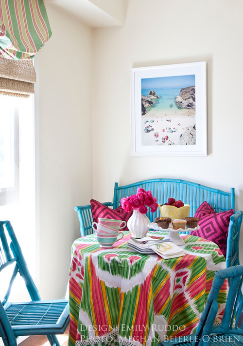
Do you see how this is otherwise an extremely neutral space? The eye goes STRAIGHT to the high visual energy in the large painting, below:

Something graphic.


And, even something as simple as vibrant toss pillows, one of the easiest ways to punch up an existing room:

Source: st.houzz.com via Ellen on Pinterest
Do you have a place somewhere in your home for a little extra energy?
Next time, what to do when you want to quiet down a room….please stay tuned.


Simple Perfection

Source: designcrushblog.com via Ellen on Pinterest

Source: prettystuff.tumblr.com via Ellen on Pinterest

Source: bymildred.blogspot.com via Maria on Pinterest

Source: prettystuff.tumblr.com via Ellen on Pinterest

Source: prettystuff.tumblr.com via Ellen on Pinterest
Wild about animal prints
Animal prints glam up a room better than almost anything.

There are a couple of tricks, though.
First, is to use only in moderation.
ONCE is enough. This is an accent, not the main attraction.
Second, make sure you repeat the color of the animal print somewhere else in the room.
The key is not to overdose so that it kills the look.
You can overdose some themes, and succeed. But, animal prints are not for overdosing.
The exception is when you use an animal print carpet. It will be the main attraction:

Source: morewejadore.com via Maria on Pinterest

Source: Uploaded by user via Wilma on Pinterest

Source: houzz.com via Emily on Pinterest
And please save leopard print walls for Snooki 😉
It takes a practiced hand to repeat the colors without overdosing the accent fabric.
Take a look at some gorgeous examples.

Source: col109.mail.live.com via
Below, the gold and the black of the leopard ottoman are repeated in the portrait.

Source: alovelybeing.com via Gloria on Pinterest


Memphis/Palm Beach decorator William Eubanks takes it to the max, but he always follows the rule of one:

William Eubanks again:

And I will let you see for yourself what happens
when you break the “rule of one”:


Or the colors in the animal print are not
repeated properly or at all:


Is there a place for an accent animal print in your home?
It can be done very tastefully.
Just remember to use as an accent.
And repeat the colors in the animal print elsewhere in the room.
Love Came Down at Christmas

The really hectic days preceding Christmas can make us lose sight
of the reason for the season.
If you have just three minutes, watch and listen to this beautiful video set to
“Love Came Down at Christmas.”
I promise you that you will feel so uplifted.
The music is soaring and the art is gorgeous.
Click here to watch and listen.
Safe and happy holidays to all my readers!
I will be posting very sporadically this very busy week while I spend time with family and friends.
See you in the New Year!
How to work with a design professional

Source: google.com via Ellen on Pinterest
Get ready.
This is a long post, one that I have been thinking about for months.
I have been on both sides of the decorating equation, so to speak.
First, as the client decorating my house with the help of a decorator.
And, now, for the past several years, as a Certified Color Specialist
and design professional helping others.
Here are a few things I have learned.
As a homeowner, do you love and gravitate towards neutral, subdued,
calming colors, as below

via Horchow.com
Or, do you prefer bright happy colors?

When you call us, we are going to give you a look
and feel in your home that is a reflection of YOU.
This takes time, and it is an investment.
I was taught that good design can cost about the same
as bad design.
And, the right paint color will not cost one penny more
than the wrong paint color.
I believe that your home should be a beautiful sanctuary
away from the stresses of your job and your busy life.
It should be a treasured place to come together as a
family for meals, for rest,
and for relaxation.
It should be a place you look forward to, and a place you
are happy to share with friends and relatives.
If your home is not all of these things, why not?
Is there something holding you back?
Even if you say “money,” keep reading.
Good design can occur at a number of price points.
Don’t let a limited budget keep you from having the
best possible look and feel for your home.
The gorgeous stair runner, below, has an equestrian motif that looks
like it could have come straight
from the Hermès Paris showroom.
But, it did not come from Hermès.
(Nope, it came from JC Penney online.
Installed to perfection by one of my resources.)
Are you with me?
I have worked with a number of young couples
just starting out, some with very, very tiny budgets.
If you are working on a tight budget,
you can’t afford to make a mistake!
This is when a resourceful design professional
is going to be invaluable.
The labor alone for painting one room is well into the hundreds,
and for kitchens and baths with cabinetry, it can easily go
into the thousands.
I have been selecting paint colors for people for several years,
and my system never relies just on those tiny 2 x 2 inch chips.

Image ©Color Calling
In fact, one difference between my system and the way you
might select a color, is that I KNOW that I can’t choose a
color properly from a tiny paint chip.
Those chips aren’t even paint, they are printed interpretations
of the paint color.
They do not reflect light the way that the
real painted wall will, either.
If you are currently a client working with,
or thinking of working with, a design professional,
there are several pointers I might suggest
to help establish and keep a good working relationship.
Custom interiors are expensive, and there are some things
you, the client, can do to get the most from your
design professional.
I would make sure that I know the following:
1) Does she keep current with
what is going on in design?

(latest collection Schumacher fabric on classicly simple Roman shade)
Do not confuse “current” with “trendy.”
Blogging keeps you current, and it helps a design professional spot
the comings and goings in decorating long before they hit print.
If you are working on a new room, today in 2012, and your designer
is suggesting starting with a brown or floral sofa, or example,
then she is probably not current.
Floral on a sofa is long gone, and Brown is trending out,
having been around for years (a decade).
Now Gray is the current neutral.
Your designer should know this.
Does this mean you need to start with Gray? Absolutely not!
See the first two images, above.
Neutral “important” pieces are the way to go if you have a limited
budget and don’t want to change out things every few years.
So, I would suggest a fairly good browsing session through magazines
such as Traditional Home, House Beautiful, and Veranda.
Get an idea of what is current so that you can see if your design
professional’s suggestions are helping you move forward,
or if she’ll just be taking you back in time.
2) Does your professional have access
to good resources?
The details and the construction in design make all the difference.
The quality of this construction would not pass my test.
See how the seams are slightly askew?
See how the lumbar pillow looks off-square?
See how the box pleats look saggy on the left?
This is an amateur job.

Source: google.com via Ellen on Pinterest
Does the workroom she uses work with quality lining and
interlining fabrics, stand behind their work, and are they
willing to come make reasonable adjustments
if necessary?
If you are doing expensive work, are they accustomed
to working with designer fabrics(fabrics which start at $150 a yard,
and you will need 12 yards for your average window)?
Can they do custom touches, for example?
You don’t want an expensive mistake being made on your job
because of inexperience.
Does your professional use a quality upholsterer?
Are your seams, lines and patterns nicely matched when you
get back your upholstery?
And, if your designer reps a particular line exclusively,
do you love that look and are you willing to forego other options?
Does she have an excellent painter, a great wallpaper hanger,
a quality furniture refinisher, a perfectionist carpet installer,
and someone who can professionally and
correctly hang those expensive new draperies?
Can she have custom furniture fabricated if you are looking for
something not readily available?
3) Does your professional always specify
the most expensive lighting, fabrics, and
carpets?
Or, does she know how to resource budget-friendly items,
say for a child’s bedroom or a playroom?
Does she at least occasionally show you a trim option from somewhere
like Lewis and Sheron fabrics (running $35/yard, not $250/yard),
a lamp from Shades of Light or Ballard or even Overstock, or an accessory
from Target, Anthro, West Elm or Pottery Barn?
When appropriate, she should.
(Wallpaper is a different story. Don’t buy cheap wallpaper, ever.
Good wallpaper is worth every penny.)
It takes work to know where to find nice reasonably-priced accessories
and budget options.
Is your professional willing to do the legwork necessary to know where?
4) Does your professional use correct/useful
design terminology?
Knowledgeable residential design professionals should be discussing concepts
such as “fixed finishes,” “undertones,” “focal point,” “symmetry,” “color harmony/
flow,” “repetition” and “balance,”
when helping you achieve an overall look and feel in your home.
She should be happy to explain (without condescension)
any terms which you aren’t familiar with.
If someone you are thinking of working with uses the words
“a matching dinette set,”
you are going to get a very different proposed look from someone who says,
“an antique Regency breakfast table mixed with Louis Seize-style chairs.”
And, watch out for someone who uses the same vague buzz words
(“edgy” and “whimsical” are two which come to my mind) many times
during a consultation.
A decorating cliché is likely to follow.
And here is what you can do for your
trusted design professional to help the
collaboration:
1) Provide magazine pictures
(tear them out and keep them in a file)
Provide your designer with pictures of rooms you love.
YOU need to decide, and then communicate, what it is that attracts
you to a particular look.
Don’t hand your designer random pictures if you don’t want her
to achieve a similar look.
We are not mind readers.
We can’t determine from a photograph that you hated the room
in general, but absolutely loved the fabric on the ottoman.
So, tell us.
If you trust your professional, you should be able to
2) articulate a clear reasonable budget
for whatever you want done.
If you have never given out a budget, you, the client, should go
to your nearest quality furniture retailer
(if they carry primarily brands such as Henkel-Harris, Sherrill, Baker,
Hancock & Moore, Henredon, then they are a quality retailer).
In Birmingham, I would tell you to start at Birmingham Wholesale Furniture,
and price out whatever is closest to what you think you may want.
That means pricing every single thing you need off of your list: rugs, tables,
chairs, sofas, lamps, etc.
If you want antiques, they have a selection of antiques there as well,
which you can price out for your budget.
This is valuable time spent, and it matters, because you now will have a
minimum starting point for the budget that you give your professional.
It will not include draperies, but you can get your professional to roughly
estimate this for you in advance.
Custom is always more expensive. Custom draperies are exorbitant.
Custom wool carpeting is price-prohibitive for most.
But, you are in for less sticker-shock, and you can spend your time more
productively, if you price needed items at retail first.
And, if you are lucky enough to be one for whom the sky is the limit,
say so if you trust your design professional.
The best professionals will save you from making expensive mistakes.
(click to go to this previous post).
3) Let your trusted professional’s ideas
percolate for a bit.
Try not to make a snap judgment about every single thing that
we suggest.
Whether designing, decorating, or selecting fabrics, accessories,
and colors, this is what we do.
We will not suggest something that we don’t think will have a
reasonable chance of filling a need or a space.
We usually see things in a different way, and our fresh eye may
have come up with a solution that you hadn’t thought of.
We know which fabrics will stand up to children and pets.
We know how to achieve a total look and feel for your home.
Try to keep an open mind and try to appreciate the vision we have
for your space, and give us the chance to articulate that vision to you.
4) Understand that quality jobs take time.
A good design professional will allocate your resources in a certain order.
Rugs should be chosen before your wall color, for example.
Special order upholstery takes 8-12 weeks.
Custom drapery jobs may take 6 weeks just to fabricate.
My best painters may be booked up for weeks.
Oh, I didn’t even mention “backorder” or “no longer current.”
We might have found the perfect fabric, and it might be out of stock with
3 months to wait for new stock.
Or, the colorway that works may have been discontinued and
is completely unavailable.
Stay flexible.
We might have to look for something else.
5) Make us tell you “the because.”
We know there are some of you out there who are going to be resistant
to any change we suggest, because that is human nature.
Ha, I always meet resistance when I suggest painting dated wood or brick
(usually orangey or pinky, but can be other colors).
Want to see “the because” on this one? Here is a great before and after by
fellow True Color Expert Kristie Barnett who lives in Tennessee,
well worth the read for an amazing transformation:
Before, dated wood and brick:

Source: thedecorologist.com via Ellen on Pinterest
After, with paint instead of dated brick and wood:

Source: thedecorologist.com via Ellen on Pinterest
Isn’t it hard to believe it is the same room? Read the entire article here.
Make sure we explain “why” to you, the client. There is a reason (or should be one!)
for everything we suggest.
We want your home to be a beautiful reflection of you.
We can tell what is visually working
and not working in a space from the moment we step in a room.
It may be that the wall color is not working
(because it is clashing with the undertones of your fixed finishes);
it may be that the artwork over your sofa is not working
(because it is entirely the wrong scale– too small, or needs upgrading);
it may be that the chest in your entry hall is much too large for the space and
is impeding access to the next room.
Ask questions and make sure you understand why we are suggesting a change.
If you get the idea that the person is just trying to sell you “more stuff,”
without a thoughtful and deliberate taking-stock of
every single room of existing furniture, you are probably right.
Listen to your instincts!
Good design professionals of integrity want your home to look great, function
beautifully, and reflect you.
We are thrilled when we can show you how to work with something
you already have.
We are ecstatic to “go shopping” in your own home and
find something we can use in a way you may not have thought of.
We are also going to think about your job when we are actually out,
and we may call you if we see something that is perfect for you.
We will mentally go over your job when we are home, when all is quiet,
and when we are “off the clock.”
Some of our best ideas come when we aren’t even charging you for our time.
We don’t just want to sell you something.
6) We do not work for free.
Unless you are our mother.
Please be prepared to pay for my time. I charge an hourly rate.
I tell you everything in advance to avoid any misunderstandings.
You are never expected to buy even one thing in return for my best advice.
I was called in several years ago to help someone replace her living room
draperies, which she said she hated, and which would have been been a very,
very expensive job.
After going through the initial consultation, I recognized that the draperies,
though a bit old, were not the problem at all.
I showed the client how we could work with the existing draperies,
and make some other, much less costly, changes to achieve a beautiful end
result.
This one piece of advice actually saved her thousands of dollars in the end.
Trust me when I tell you, we want your house to look wonderful.
But, no designer of integrity will suggest something, or even go along
with something the client thinks she needs, just to make a sale.
We want to do what is right for your home.
We want you to be happy, and a happy client is our very best referral.
~~~~~~~~~~~~~~~~~~~~~~~~~~~~~~~~~~~~~~~~~~~~~~~~~~~~~~~~~~~~~~~~~~~~~~~~~~~~~~~~~~~~~~~~~~~~~~~~~~~~~~~~~~~~~~~~~~~~~~~~~~~~~~~~~~~~~~
So, there is my list of some of the things I find important on both sides of the
equation.
Thoughts, other examples, or anything you would express differently?
Chinoiserie Saint Francis
When I saw this finely carved “ivoryesque” figurine at a church thrift store for a song, I couldn’t resist.
He is a Chinoiserie version of Saint Francis. See the little birds he is holding?
He looks right at home in my Chinoiserie powder room.
The wallpaper also has birds on it, do you see those storks to the left of the figurine? 
This little illustration shows one of my favorite decorating secrets, which I happily share:

Repeat, repeat, repeat.
It is visually and artistically pleasing to use repetition.
The eye will pick up on repetition as it processes what it sees in a room.
Sometimes the conscious mind does not recognize the repetition, but the subconscious mind has processed it as pleasing.
So, in the above vignette, the Chinoiserie St. Francis repeats several things from the wallpaper:
the antique cream color, the Chinoiserie style, the birds, the figural images, and even the cross-hatching in his hat is also in the wallpaper.
Take another peek and you will see these things that perhaps you didn’t notice before they were pointed out.
Now, let’s look at some elements in another room, images below.
Notice the repetitive geometric motif, diamond shapes, which I have broken down individually.
Diamond shapes are repeated throughout the room. You probably wouldn’t even notice.

Image ©Color Calling

Cut velvet upholstery, Image ©Color Calling
And here


Drapery trim Image ©Color Calling
Subtle, very subtle.
Powerful, very powerful when used together.
Because of the repetition.
Repetition, one of the best ideas in any good design professional’s bag of tricks.
Are you using repetition effectively to please the eye in the rooms in your home?
Does your house tell a story?

The story of a house. Landscape Designer extraordinaire Tara Dillard says it best. The narrative. Tara designs gardens that tell a story. I work with houses. Story-telling. Narratives. Narratives are wonderful.
The golden codfish overdoor, above, is part of the narrative of my little Cape Cod summer cottage. Don’t get me wrong, I am not talking about going overboard with a cloying theme for your house. No “Welcome to the Beach” signs over the sink. I am talking about a simple story-line, a thread, a narrative. A narrative is how I say “welcome to the beach.” Here is my narrative. What story does your house tell?


All images ©Color Calling
My Top Ten Tips for Styling a Fireplace Mantel
Tip #1: Use real art, not a mirror, over the fireplace. This will provide depth and character.

Source: houseofturquoise.com via Minna on Pinterest
Tip #2: If you have a collection, pair it with complementary real art for a statement that is yours alone:


Source: eleanorcummings.com via Emily Cayne on Pinterest
Tip #4 Select art with a color palette that looks good with the rest of the room. This is a good place for a pop of color (that you should repeat three more times in the room.)

Tip #5 No dinky accessories. (These are nicely proportioned.)

Source: houzz.com via Natalie on Pinterest
Tip #6 Handcrafted vases, antique vases, bronzes, antique tapestry hangings, are all good possibilities. Take a look around your house for others. Look for pieces with presence to accessorize.

Source: vacationist.com via Cathy on Pinterest
Tip #7 This is your main focal point in the room. Make it count.

Source: saffroniabaldwin.com via Ann on Pinterest
Tip #7 Use sconces.

Source: Uploaded by user via Sandy on Pinterest
Tip #8 No framed family photographs. Find other accessories for a more current overall look.

Tip #9 Remember that you must balance the large dark hole of the firebox. Think deep and rich, not dainty, for the over mantel décor.

Source: housebeautiful.com via Harper on Pinterest
(#9 Balance the dark hole of the firebox)

Tip #10 Use a portrait light (not shown).

For easy reference, here are my top ten tips for styling a beautiful fireplace and mantel area:
(1) Use real art, not a mirror.
(2) Bigger is better, but don’t exceed the width of the mantel.
(3) This is your main focal point in the room. Make it count.
(4) No dinky accessories.
(5) No framed family photographs.
(6) Handcrafted vases, antique vases, bronzes, antique tapestry hangings, are all good possibilities. Take a look around your house for others. Look for pieces with presence to accessorize. If you have a collection, this may be a good place to incorporate it with a complementary piece of art overhead.
(7) Remember that you must balance the large dark hole of the firebox. Think deep and rich, not dainty, for the over mantel décor.
(8) Select art with a color palette that looks good with the rest of the room.
(9) Use a portrait light over an oil painting.
(10) Add a pair of sconces.
Adding Accessories
Accessories are like jewelry for your home. Accessories make your home yours, they reflect your style and design aesthetic. I am always on the lookout for that unique element of style, the one that will be just perfect. The casual nautical vibe of this one-of-a-kind stained glass, below, is perfect for a beach home.

Stained glass bluefish in a beach home window Image ©Color Calling
In addition to the beautiful color pop in this kitchen, the stained glass art blocks an uninspiring view of the back parking area, and affords privacy, while still allowing light to stream in.

Image ©Color Calling
A good designer or even a friend with a great eye can tell you where to accessorize and where to edit. You want your accessories to have maximum impact with minimum clutter. It is all about creating visual appeal. A good designer can help you vary colors, shapes, heights, and textures to achieve just that.
Don’t make an expensive mistake

Image ©Color Calling
When I first started my color consulting and residential styling business, my very first client (who kindly allowed me to photograph her living room for the blog) was a dear friend who has a very pretty house. She wanted me to help her change her living room draperies. Because of my color training, I could see the problem. Though a little old, the draperies themselves weren’t bad (though I do like my draperies to “kiss” the floor when doing a new installation.) The problem was, other than to the walls themselves, that the color of the draperies wasn’t really relating to anything else in the room.
So, we went shopping around in her own house, because she has really beautiful things. I suggested that a large gorgeous painting hanging in another room would be perfect in the living room. We removed a lovely mirror from over the mantel and moved it over a console on the same wall. If you have been reading this blog, you know how I feel about mirrors over a mantel. But, I digress. The main color (golden yellow) in the painting allowed us to repeat the drapery color again.

Image ©Color Calling
Then, all that was necessary was a little rearranging, and one simple but expert reupholstery job which repeated the color yet again. (I usually like to repeat a color three or more times.) The chair, before, is on the left, and remember, white is NOT a neutral. The chair, after, is on the right. The jewel tone silk with plenty of gold in the velvet stripe (middle photo) is just the pop of color that was needed to bring the room to life. The second of the pair of chairs is just out of camera range, but can be seen in the final shot.


Now, the draperies don’t stand out, because the color of the drapery is repeated several times. They are in harmony with the rest of the room. Have you priced custom floor length draperies lately? This one decision saved a very expensive change from being made.


Images above ©Color Calling
I have seen it happen over and over and over: the thing that you think is wrong with your room may not be the thing we end up changing!
Always call a trusted design professional when you think you want to make a change. She may just help you avoid what might be a very expensive mistake.
Bronze sculpture by Jane DeDecker
A recent post spoke of focal points. Have you considered a beautiful bronze sculpture as your focal point? Yes, the price point is high. But, a museum-quality bronze is forever. It is timeless. And, Jane DeDecker is one of the best. Can’t you see this resting on the corner of a Carrara marble tub surround?

Source: saksgalleries.com via Ellen on Pinterest
Can you stand the darling daddy, below, tying his baby’s shoe? And, the baby just in awe. Priceless.

Source: morriswhiteside.com via Ellen on Pinterest

Source: flickr.com via Ellen on Pinterest
The above Jane DeDecker sculpture is a gift of a couple in Des Moines, Iowa, in memory of their son, Christopher, who was a victim of juvenile diabetes. Apparently, their dog clearly mourned the loss of his human companion so that the parents were moved to donate this sculpture to the City. What a beautiful and heartfelt (and heartbreaking) tribute to boy and dog.
My friend, Master’s of Art holder Holly S., introduced me to the sculpture of Jane DeDecker 11 years ago. I have been captivated ever since. I am the proud owner of two of her works, “Tippy-Toes,” which reminds me of my dancing daughter,

Source: google.com via Ellen on Pinterest
and an almost-sleeping dog bronze called “Ol’ Faithful” (which looks just like my ‘Pepper’, prone to one floppy ear)

Source: cavaliergalleries.com via Ellen on Pinterest
Source: flickr.com via Ellen on Pinterest

Image ©Color Calling, Pepper.

Source: cavaliergalleries.com via Ellen on Pinterest
And, please tell me you have never seen anything cuter than this little snow elf:

Source: claggettrey.com via Ellen on Pinterest
Another stunner:

Source: claggettrey.com via Ellen on Pinterest
DeDecker is a master. Save. Save some more. You will love forever.
How do you collect art?
Art is one of the most personal things in your home. Art reflects your personality more than any other single thing that you have in your home. Art can be used to create drama or frissón, add elegance or humor, or contribute a desired pop of color.
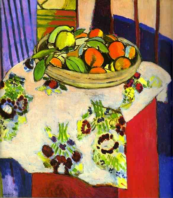
Whatever your budget, there is art available that will enhance the look and feel of your home. For the last few days, we have talked about mirrors. Today, we will talk about collecting real art. Below, please take a look at three still-life paintings:

Above, Alabama regional artist Mark Singer still life, private collection. Photograph ©Color Calling
The influence of French painter Henri-Émile-Benoît Matisse, below, on Mark Singer, unmistakable.
 Matisse painting
image via: http://www.join2day.net/abc/M/matisse/matisse99.JPG

Original still-life. Nice price point, $295. Image via Etsy
http://img0.etsystatic.com/il_fullxfull.282025564.jpg
When color and drama are needed to infuse personality into a room, you need real art. If you are new to collecting, but want to learn more, the best way to train your eye is to pay regular visits to art museums. From the exercise above, you can see that if you love a Matisse painting in a museum, you can capture some of that look and feel in your own home.What appeals to you and moves you? Perhaps, go to a museum by yourself the first time or two. What do you gravitate toward? Once you see something you love, you know that you are training your eye. Ask the museum if a docent could show you galleries with similar paintings when you find something you like.
When you love a painting, it will create a visceral reaction. Do you remember the movie scene in “Pretty Woman” when Julia Roberts experiences opera for the first time? How she was moved to tears by the beauty and the emotion? Wonderful art elicits an emotional response as well. It is a personal response, and you may respond to something entirely differently from your husband or wife. Hopefully, you can find common ground and then you can build on that.
 Above: a museum-quality misty landscape, by Birmingham favorite John Lonergan
Image via: http://www.heritagehallmuseum.org/exhibits_apr2010.html
Below, completely different style from the same artist: private collection, photograph ©Color Calling

Once you understand what you like and love, you can go to your local art galleries and see what is for sale. When I am retained to style a room, I love to select for clients from our local Birmingham artists and our cozy galleries. (My favorite thing to do when I am helping a client, is to take down a mirror that is not doing anything for the room, and bring in a painting to fill the place.) Your nearest large town will certainly have wonderful galleries. Ask friends who have art that you love, where they acquired it.
Established quality regional artists such as the above command prices well into the thousands. After you have trained your eye, though, you can begin to take a look at internet sites where emerging artists offer their works directly. Etsy.com is a good one. There are some very talented artists, at fabulous price points, just waiting to be discovered. This large painting would add a charming pop of color to a neutral painted wall in a bungalow, and it is an original oil. Price? $375. Then, take some of the color from the painting and accessorize the room. If you decide to choose the warm Hermès shade of orange as your accent color (Pantone’s Color of the Year 2012, by the way), a reliable styling tip is to repeat that same orange another three times in the room.

Image: via Etsy
http://img0.etsystatic.com/il_fullxfull.273721060.jpg
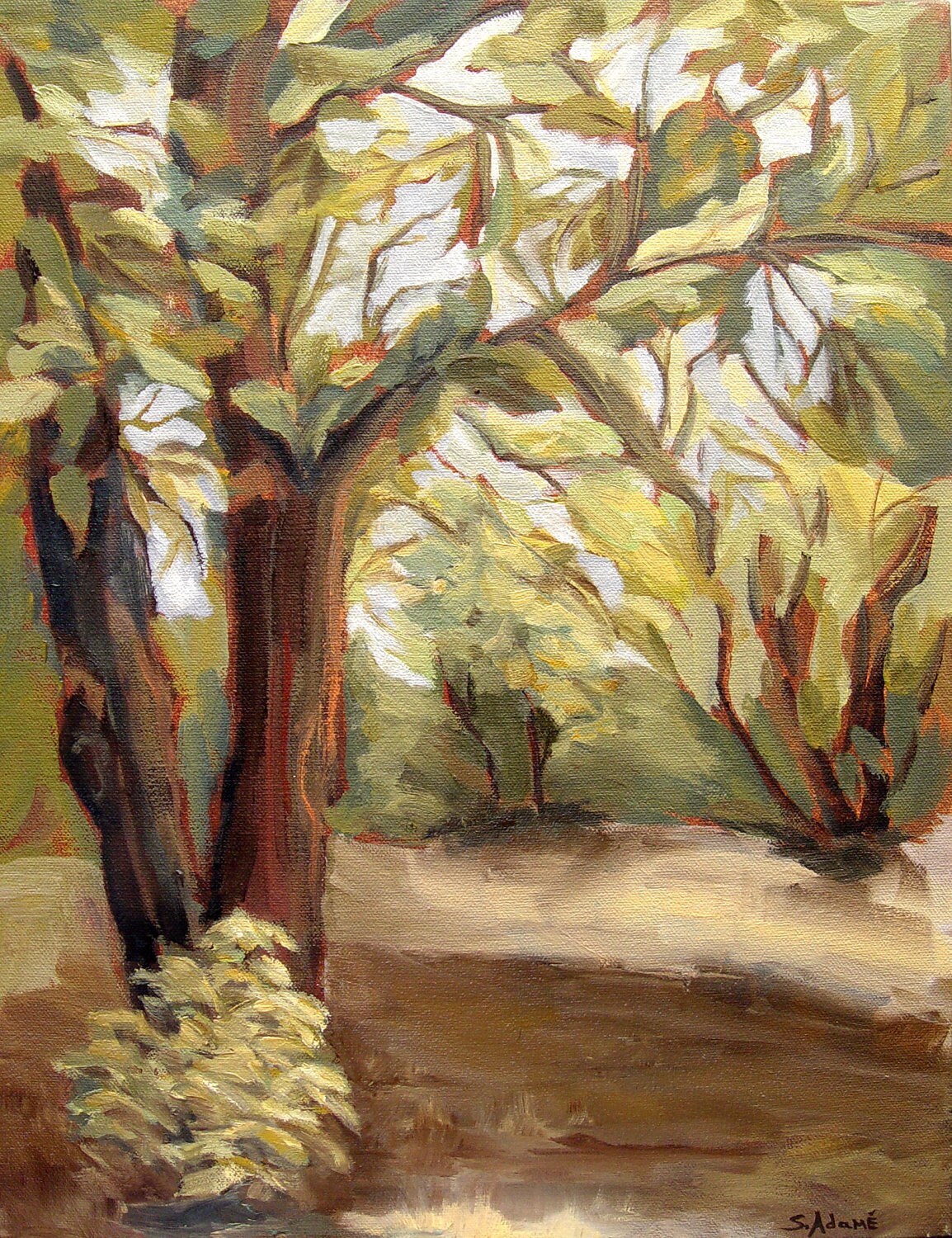
Below, a more sophisticated landscape, painted loosely, great price point.

image via Etsy, 18×24 original oil, $250
http://img0.etsystatic.com/il_fullxfull.261758576.jpg
The best advice I ever received about art was from my mother. She said that when it comes to art, if you truly love something and you can afford it, you should buy it. I will tell you, two decades later, that advice has rung very true. I have never regretted a single piece of art that we truly loved and have purchased.
