My expensive custom draperies don’t look nice anymore, now what?
Custom draperies are not just a luxury. They are an investment, an investment which can easily run to thousands of dollars or more PER WINDOW. With nicer designer fabrics running upwards of $150-$200 per yard, multiplied times, say, 9 yards of fabric for each window, you will have possibly $1300 to $1800 invested in the fabric alone per window. This does not include labor for drapery construction, purchase and installation of drapery rods, or decorative trim.
Nothing warms up a room better than beautiful soft furnishings, and the right window treatments finish a room like nothing else can. That is why you want to get at least 12-15 years or more of good use from your gorgeous expensive custom draperies.
Here are the stage curtains in Lincoln Center in NYC, with hundreds of yards of fabric, which I snapped before a performance of “The King and I.” I can’t even imagine the work and expense that went into a drapery project of this magnitude. There must be 1500 pleats in those bad boys.

But, I digress…
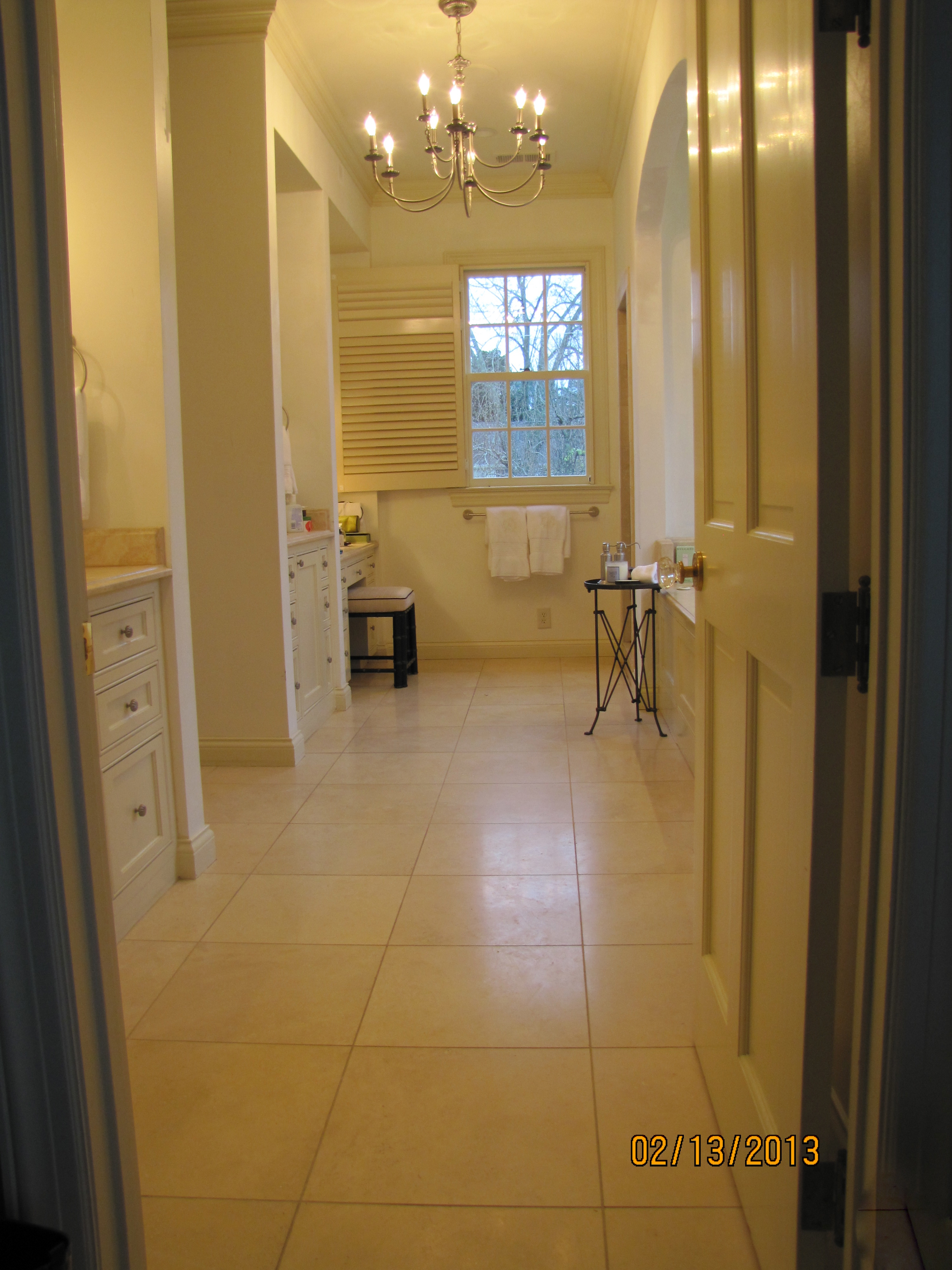
My own library/family room has four large double-hung windows plus a triple window. And, after almost thirteen years of hanging, my beautiful imported linen damask draperies were really starting to show their age.
When I come into your home for an interior consultation, I do everything possible to help you work with what you have.
So, I want to show you how I re-worked the look and feel of the draperies in my own space, for a very small fraction of what completely replacing them would have run.
Here is the before, shown on the triple window:
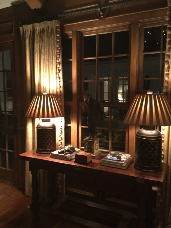
Not horrible, but here is what you can’t see in the photo:

Really bad faded places on the edge. That is not a shadow. That is where the old trim was. And, see how many panes are covered by the fabric? The fabric was smothering the courtyard and backyard views.
The drapery trim was looking dated, and frankly, the tone-on-tone look did not hold its own with the colorful Serapi carpet, see below, that is “the boss” of the room.
 P
P
The poles have also always bugged me. They weren’t the correct length (hopefully you can learn from my mistake made long ago) and are part of the reason why the fabric faded so badly. Drapery rods should extend a measurement of 12-15 (sometimes more) inches from each side of the outer edge of the outermost window pane. This extra foot on each side adds gravitas to the window when the panels are hung, and allows the drapery fabric to be more protected from sun exposure, since the fabric is pushed further away from the window panes.
For example, my windows measure 35″ wide (inside the frame) and my new poles are 60″ long, not including the decorative finials. This is not an in-stock standard size from the company I ordered from, so I incurred a custom-cut fee, but if you are going to do it, do it right!
Here are the re-worked draperies with the new flat ribbon trim, in a beautiful poppy color that repeats the colorful poppy red accents in the carpet and also used elsewhere in the room.
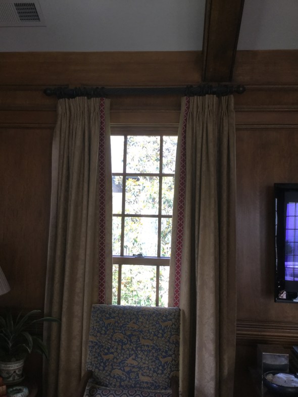
 The fresh-looking quatrefoil motif echoes the ancient patterns of the carpet. For your comparison, notice how the draperies look, first hung on the old too-short rod and then on the new longer rod. First here are the re-worked panels on the old, shorter rod. See how only one full vertical row of glass pane is visible? This is still exposing the fabric to damaging light rays for sure. Remember, this is the old rod:
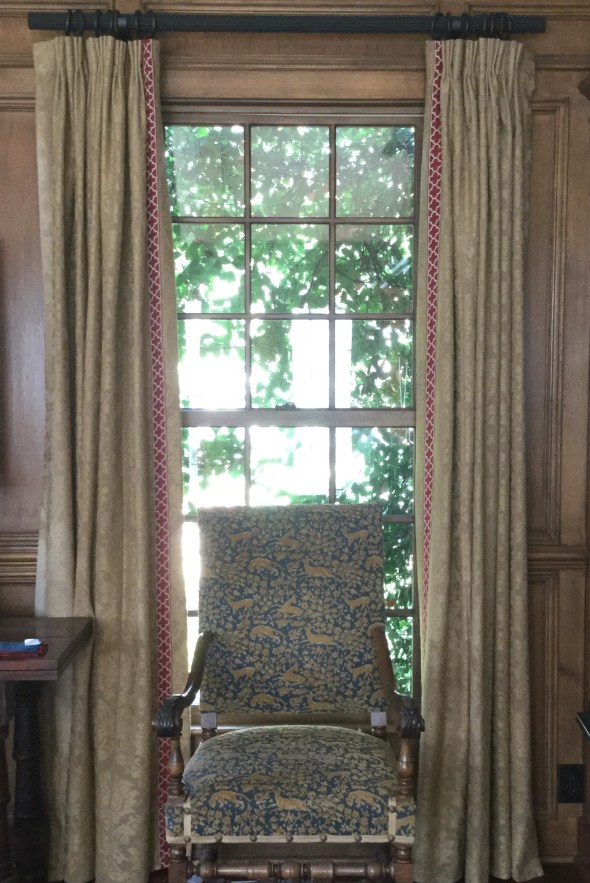
Now here is the “new” drapery hung on the new longer wood rod, below. See how all three vertical rows of window pane are now showing? This also gives the windows more elegance and importance, because the draperies are now ‘framing’ the windows instead of ‘covering up’ the windows. My drapery professional will be coming soon to re-hang the panels to fall perfectly, and there will be absolutely no sagging. The finials have not been reattached. But, this will give you the gist of the new work.
Here are the mechanics of the new work:
The old trim–all thirty yards of it– was meticulously hand-clipped off with tiny embroidery scissors (by moi, it was actually kinda fun and reminded me of my smocking days). I spot-cleaned and freshened each panel in the dryer (see below), then it was off to the workroom with all 10 nine-foot panels and 30 yards of colorful new trim.
The new trim was sewn onto the opposite edge of the panel of where the old trim had been. So, on each pair of draperies, the right panel became the left panel. Now, when the panels are professionally hung by the fabulous man I always use, the faded edge is going to be tucked and turned away out of sight toward the wall (called “the return” in my biz), and the fresher edge (now the “leading edge”) sports the brand new trim. Pretty clever, right?
My wonderful to-the-trade workroom professionally re-pressed each panel after the new trim was sewn on, now the panels look (almost) brand new. It really gives a new look and feel to the windows specifically, and to the room as a whole. I’ll be sure to share a wider view when everything is finished.

So, there you have it! Before:
And (almost finished) after:
Don’t you agree that the windows look bigger?
And, just for you, a couple of my best drapery tips and caveats….
- skimpy draperies are not worth doing. They will still be somewhat costly, and it is much better to install budget-friendly woven wooden shades (similar to below) than to pay for draperies that aren’t right.

- a good designer can help you “cheat” a solid fabric. Meaning, a knowledgable decorator can help you find a less-expensive solid and most people would not be able to really tell if it is a nice little Pindler or a break-the-bank Brunschwig. But remember, construction/labor costs are going to be similar whether the fabric is $5 a yard or $500 a yard, so make sure you are buying a quality fabric from the start.
- a good professional drapery installer is your best friend. S/he is trained to get everything looking perfect, and will know every trick in the book to get it right. While bloggers like myself are generally generous with our sources, don’t expect us (as design professionals) to divulge names on this one, however, unless you have hired us. The best installers often won’t work directly with the public.
- your favorite shelter magazine will usually have a wealth of photos of gorgeous drapery to use for inspiration. Your design professional is invaluable in deciding whether to do woven wood shades, a roman shade, fully operable draw drapery, rings and poles, etc. We have seen it all, and we can help you avoid an expensive mistake. And, yes, you need to line and interline your custom draperies. It is worth every penny.
- some installations will benefit from using woven wood shades IN ADDITION to existing drapery. Open any “house” magazine and surely there will be a feature to show you what I mean. I love the look, and plan to add woven wood shades to my own family room.
- avoid treatments that are trying too hard, like this one in a current popular shelter magazine this month, which is just bizarre in my opinion with its ultra-wide flat tape mitering into those ultra-thin ironed-in pleats.

- soft pleats generally look more elegant than heavily ironed-in pleats.
- never dry clean your draperies. They will shrink and then they will be too short. Use the upholstery attachment of your vacuum cleaner (on lowest possible suction, by opening the suction control tab) to keep dust and pet hair at bay.
- you can usually air-fluff most panels (no heat!!!) in your home dryer to freshen them. Remove any drapery pins and corner weights before doing this, and try 20 to 30 minutes. I always spot clean first whenever possible, and on heavier fabrics, you can usually safely spray some lightly scented fabric refresher before fluffing. A dryer sheet is also a possibility. Go slowly, proceeding panel by panel, to avoid damaging the fabric. Did I say, no heat?
- for pole-and- ring type installations, try a long strip of clear silicone tape called “curtain slide tape” on top of the pole to help the rings slide more smoothly when closing.
If you reside in the Birmingham metro area and need help with an interior project of your own, I’d love to hear from you. I also accept limited online and out-of-town commissions for color consulting. Please email me for rates and availability: colorcalling@gmail.com
Best,
Ellen

One chandelier or two?

If you have noticed that many shelter magazines are showing not one, but two,
chandeliers over a dining-room table, you are picking up on something.
And, that something is a trend.
Not just a trend, but a trendy-trend.
For a classic, timeless, look, stick with a single chandelier over your dining room table.
Save the pair for a long hall .
Trust me on this one.
This is a trend, it will not last, and in five years it will announce:
“I decorated my dining room in 2013.”
Save the two chandelier/two lantern look for something like the above.
That is a timeless look that never goes out of style.

Sneak peek: Pardon our progress…


wallpaper gone
People, let me tell you, this is huge! The first step is always the hardest.
But, I am in motion. My wonderful wallpaper man is busy finishing stripping the existing paper as I type this.
Just look!
The rusty green wallpaper is au revoir!
Adios!
Goodbye!
I am so uplifted just walking in and looking at the bare SheetRock.
In all my color installations/demolitions, I have never seen a wallpaper absorb the light out of a room like
ol’ Rusty Green.
It is amazing, the difference.
Furthermore, my husband hates changing anything in our house. He loves everything to stay the same.
Bless his heart, he agreed to put up with the disruption entailed by this project.
So I will say again, this is huge!
Remember, this is just the bare SheetRock, not the new paint color. Obviously, still a work site!
making progress!
above, BEFORE (Ol’ Rusty Green)

I know you probably don’t want to see contractor bags, you come here to look at the pretty pictures.
This is real life, though. And, it will look nice in no time.
It is a very cloudy gray day, but you’d never know it by what is going on in my house today.
I can’t wait to get my crew over from Atlanta to work on the travertine. It must be cleaned, re-honed and re-grouted, then we’ll be ready for the new paint.
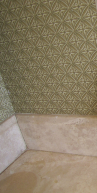
Can you notice that the pink undertone in the travertine is looking much less pink, now that Rusty Green is gone? Compare the before with the ‘during’:

Cleaned up a bit to show you the difference:
Identical Layout!

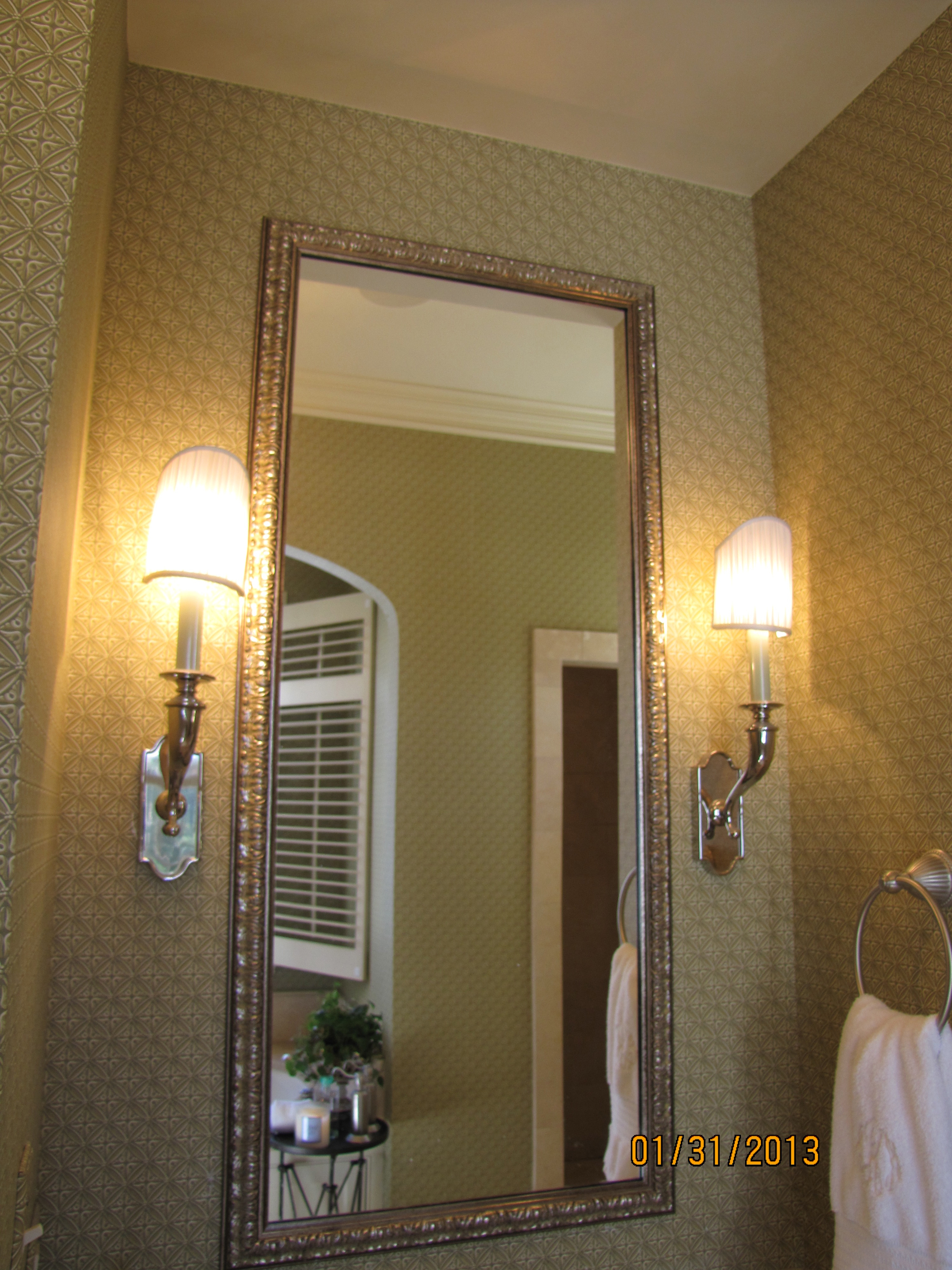
I almost fell out of my chair when I saw this bath.
And, not because of the textures, finishes, or colors used.
It is because the layout is EXACTLY. LIKE. MINE.
I mean, identical. Same placement of tub, shower, his sink, her sink and vanity. Same window.
Same opening to the closet area.
I have never seen this exact layout ever before in a photo.
Here is mine. I have wing walls instead of completely open cabinetry or a full-glass shower enclosure.
It hides everyday toiletries better. It hides the workings of the shower.
You know the family above keeps soap on the counter. And shampoo bottles in the shower.
So do I, you just can’t see it.

master bath
even the sconces are similar
And, yes, this is the same bath
from which I am removing all the existing wallpaper.
I can hardly wait!
Then, it is going to be painted Shaker Beige, see the dollop.

Source: benjaminmoore.com via Laura on Pinterest
Cabinets will be Ivory White.
Soon.
Goodbye rusty green wallpaper!

Are you CHASING the color or CHOOSING the color?

YES, we’ve been there.
The contractor is breathing down our neck, he needs the colors picked out.
He needs them ALL, two weeks from today!
As we’ve talked about before, paint color should be the last thing that is chosen.
It should be the thing that pulls everything else in the room together.
But, sometimes that is not possible.
What are some good neutrals to use?
Where should there be an actual color?

Source: benjaminmoore.com via Ellen on Pinterest
How should it all tie together so the home has color flow?
This is when you really, really need to call in a certified color consultant.
We know how some of the prettiest neutrals can “go pink” on some walls.
We know which neutral colors turn “apartment beige” in which rooms.
We know how to pick out/rule out the tile for your bath and the counter for your kitchen.
We are trained in color flow throughout the house.
We know where to insist on oil-based paint, and where not ever to use high-gloss.
Many consultants are happy to schedule a couple of hours, one-time.
Not saying all of the above can be accomplished in two hours, but you’d be amazed what can.
Benjamin Moore Sandy Brown

I don’t work with those tiny chips you find at the paint store.
I work with large painted samples on boards.
There is now a big difference in this young man’s bedroom.
Above, the new paint color, Sandy Brown. A rich caramel beige.
Lots of depth and warmth, perfect for a cozy bedroom,
and gorgeous against the existing caramel color draperies.
Before, the color was Linen White.
With my large samples, we were easily able to narrow the color selection,
based on the undertones in the existing soft furnishings, to the clear winner.
Sandy Brown.
(If you want richness, depth, and warmth in a bedroom, Linen White is not your color.)

Source: housebeautiful.com via Ellen on Pinterest
Linen White

Source: pinterest.com via Ellen on Pinterest
Sandy Brown
Keeping it Simple in the Master Bath
Color harmony. A simple concept.
Made easier with an understanding of undertones.
Now, I don’t mean plain or too matching.
And I certainly don’t mean boring.
As a color specialist, it means selecting the right color.
For example, today, with my large samples, I selected a gorgeous white paint color
for a friend’s Carrara marble bath.
If you have been reading this blog, you know about my large samples, right?
Here are my inspiration photos.

Source: cotedetexas.blogspot.com via Ellen on Pinterest

Source: countryliving.com via Ellen on Pinterest

Source: pinkpreppylillylover.blogspot.com via Buffi on Pinterest
Sometimes the right color is white.
So, when you have Carrara marble, for instance,
don’t be afraid to go with white walls.
There are several whites that really sing with Carrara.
An all white bath.
A very simple concept, which will always be timeless.
Beautiful. Not boring.
I am humming to myself just thinking about this project.
If she agrees to photos, I’ll post before and afters.
A Craftsman Paint Story: Before and After
Before, a tin-roofed cottage painted a non-traditional minty green by the previous owner.
Which stuck out like a sore thumb in a transitional neighborhood of sidewalks lined with
classic Craftsman bungalows as well as some brick houses.

Image ©Color Calling

Image ©Color Calling
After, classic Craftsman paint colors selected for the new homeowners, newlyweds.
Minty green does not belong in a classic Craftsman palette.
Greeny-grays are perfect. Great with a tin roof as well.
Grays in the mortared stone columns are reflected in the choice of color for the house body
and the darker grays accenting the trim.
Think of the earth colors of nature and there you have a pretty complete Craftsman palette.
“Georgian Brick” (Benjamin Moore) front door, which echoes the exact color of the next door
neighbor’s brick (very close by) as well as the brick High School across the street.
The young wife liked my color palette, explained to her by her husband after my initial consultation.
She was busy performing surgery and could not attend the original color consultation.
There was just one thing.
She had her heart set on a REALLY RED front door.
But, once I explained “WHY” the more muted red I selected was picked out
(it is better for a Craftsman palette;
it reflects the adjoining neighbor’s red brick;
matches the brick of the high school very visible across the street;
honors some similarly colored decorative brickwork set in their yard, etc.).
And, with this color selection system, there is ALWAYS a WHY.
She immediately understood.
She is one smart cookie. Beautiful, too.
The system works.
And, this is it: Evaluate the FIXED finishes and go from there.
Doesn’t have to include the neighbors, but when you can reach out and almost touch their brick side wall from your front porch, better to take into consideration. Think existing stone, brick, roof, etc., that will not be changed. That is what a fixed finish is.
Felt a glow of satisfaction when a passerby walking down the sidewalk told me, “Wow, the house looks great. What a difference!” as I was taking the ‘after’ photo shot.
Decorating around Travertine

Source: google.com via Lauren on Pinterest
Many homeowners choose travertine for master bathrooms if they want a “fairly” neutral
natural stone with some warmth of color.
Travertine is very tricky to decorate around, however.
Unless you understand undertones.
Most travertine has a pink undertone.
For wallpaper, I really like this great-looking Thibaut paper (trade-only).
This choice looks great with Travertine and the existing satin stainless hardware,
with a somewhat modern vibe.

Image Color Calling
If painting, I would start with Benjamin Moore Shaker Beige, a warm neutral which has a
slight pink undertone.
A warm white with a whisper of pink could also work, such as Muslin, also a Benjamin Moore
color.
Too much pink will just look dated, though.
Here is one of my samples of Shaker Beige, painted on poster board and held up to the
travertine.

Avoid yellow-beige (the wrong undertone) on walls or cabinetry.
Green is not the best choice either. See how the existing yellow-green wallpaper
(above to the right side, and also
below) fights the stone, and the Shaker Beige just looks
so much more harmonious?

Travertine is the largest fixed element in this master bath. So, we look for ways to bring
more color harmony into the space. Undertones must be considered for color harmony.
(As a side note, I am starting to move away from natural stone in my consultations.
The maintenance factor is just horrendous. This travertine which is 7 years installed, has begun
to pit and even crack in places.
I am looking at Cambria Quartz, which is 90% natural, but much easier to maintain,
for my next bath project).
Matchy-matchy versus Harmonious
In my consulting business, I am frequently told by the client that she doesn’t want things to be too matchy-matchy.
I love some matchy-matchy. Matching lamps flanking a bed, for example.
To look more restful, and to add to the feeling of balance in the room.
Too much matching, though, just looks amateur. Not collected over time.
However, I always believe in HARMONY. Colors must be harmonious, especially.
Take a look at my latest paint transformation. A small bath with dated fixed finishes.
No styling, no photographic tricks, just the transformative power of the right paint color.

Bath, above, BEFORE

- Bath, AFTER Images © Color Calling

Benjamin Moore “In Your Eyes” blue.
Painted by Noah, below.

How to work with a design professional

Source: google.com via Ellen on Pinterest
Get ready.
This is a long post, one that I have been thinking about for months.
I have been on both sides of the decorating equation, so to speak.
First, as the client decorating my house with the help of a decorator.
And, now, for the past several years, as a Certified Color Specialist
and design professional helping others.
Here are a few things I have learned.
As a homeowner, do you love and gravitate towards neutral, subdued,
calming colors, as below

via Horchow.com
Or, do you prefer bright happy colors?

When you call us, we are going to give you a look
and feel in your home that is a reflection of YOU.
This takes time, and it is an investment.
I was taught that good design can cost about the same
as bad design.
And, the right paint color will not cost one penny more
than the wrong paint color.
I believe that your home should be a beautiful sanctuary
away from the stresses of your job and your busy life.
It should be a treasured place to come together as a
family for meals, for rest,
and for relaxation.
It should be a place you look forward to, and a place you
are happy to share with friends and relatives.
If your home is not all of these things, why not?
Is there something holding you back?
Even if you say “money,” keep reading.
Good design can occur at a number of price points.
Don’t let a limited budget keep you from having the
best possible look and feel for your home.
The gorgeous stair runner, below, has an equestrian motif that looks
like it could have come straight
from the Hermès Paris showroom.
But, it did not come from Hermès.
(Nope, it came from JC Penney online.
Installed to perfection by one of my resources.)
Are you with me?
I have worked with a number of young couples
just starting out, some with very, very tiny budgets.
If you are working on a tight budget,
you can’t afford to make a mistake!
This is when a resourceful design professional
is going to be invaluable.
The labor alone for painting one room is well into the hundreds,
and for kitchens and baths with cabinetry, it can easily go
into the thousands.
I have been selecting paint colors for people for several years,
and my system never relies just on those tiny 2 x 2 inch chips.

Image ©Color Calling
In fact, one difference between my system and the way you
might select a color, is that I KNOW that I can’t choose a
color properly from a tiny paint chip.
Those chips aren’t even paint, they are printed interpretations
of the paint color.
They do not reflect light the way that the
real painted wall will, either.
If you are currently a client working with,
or thinking of working with, a design professional,
there are several pointers I might suggest
to help establish and keep a good working relationship.
Custom interiors are expensive, and there are some things
you, the client, can do to get the most from your
design professional.
I would make sure that I know the following:
1) Does she keep current with
what is going on in design?

(latest collection Schumacher fabric on classicly simple Roman shade)
Do not confuse “current” with “trendy.”
Blogging keeps you current, and it helps a design professional spot
the comings and goings in decorating long before they hit print.
If you are working on a new room, today in 2012, and your designer
is suggesting starting with a brown or floral sofa, or example,
then she is probably not current.
Floral on a sofa is long gone, and Brown is trending out,
having been around for years (a decade).
Now Gray is the current neutral.
Your designer should know this.
Does this mean you need to start with Gray? Absolutely not!
See the first two images, above.
Neutral “important” pieces are the way to go if you have a limited
budget and don’t want to change out things every few years.
So, I would suggest a fairly good browsing session through magazines
such as Traditional Home, House Beautiful, and Veranda.
Get an idea of what is current so that you can see if your design
professional’s suggestions are helping you move forward,
or if she’ll just be taking you back in time.
2) Does your professional have access
to good resources?
The details and the construction in design make all the difference.
The quality of this construction would not pass my test.
See how the seams are slightly askew?
See how the lumbar pillow looks off-square?
See how the box pleats look saggy on the left?
This is an amateur job.

Source: google.com via Ellen on Pinterest
Does the workroom she uses work with quality lining and
interlining fabrics, stand behind their work, and are they
willing to come make reasonable adjustments
if necessary?
If you are doing expensive work, are they accustomed
to working with designer fabrics(fabrics which start at $150 a yard,
and you will need 12 yards for your average window)?
Can they do custom touches, for example?
You don’t want an expensive mistake being made on your job
because of inexperience.
Does your professional use a quality upholsterer?
Are your seams, lines and patterns nicely matched when you
get back your upholstery?
And, if your designer reps a particular line exclusively,
do you love that look and are you willing to forego other options?
Does she have an excellent painter, a great wallpaper hanger,
a quality furniture refinisher, a perfectionist carpet installer,
and someone who can professionally and
correctly hang those expensive new draperies?
Can she have custom furniture fabricated if you are looking for
something not readily available?
3) Does your professional always specify
the most expensive lighting, fabrics, and
carpets?
Or, does she know how to resource budget-friendly items,
say for a child’s bedroom or a playroom?
Does she at least occasionally show you a trim option from somewhere
like Lewis and Sheron fabrics (running $35/yard, not $250/yard),
a lamp from Shades of Light or Ballard or even Overstock, or an accessory
from Target, Anthro, West Elm or Pottery Barn?
When appropriate, she should.
(Wallpaper is a different story. Don’t buy cheap wallpaper, ever.
Good wallpaper is worth every penny.)
It takes work to know where to find nice reasonably-priced accessories
and budget options.
Is your professional willing to do the legwork necessary to know where?
4) Does your professional use correct/useful
design terminology?
Knowledgeable residential design professionals should be discussing concepts
such as “fixed finishes,” “undertones,” “focal point,” “symmetry,” “color harmony/
flow,” “repetition” and “balance,”
when helping you achieve an overall look and feel in your home.
She should be happy to explain (without condescension)
any terms which you aren’t familiar with.
If someone you are thinking of working with uses the words
“a matching dinette set,”
you are going to get a very different proposed look from someone who says,
“an antique Regency breakfast table mixed with Louis Seize-style chairs.”
And, watch out for someone who uses the same vague buzz words
(“edgy” and “whimsical” are two which come to my mind) many times
during a consultation.
A decorating cliché is likely to follow.
And here is what you can do for your
trusted design professional to help the
collaboration:
1) Provide magazine pictures
(tear them out and keep them in a file)
Provide your designer with pictures of rooms you love.
YOU need to decide, and then communicate, what it is that attracts
you to a particular look.
Don’t hand your designer random pictures if you don’t want her
to achieve a similar look.
We are not mind readers.
We can’t determine from a photograph that you hated the room
in general, but absolutely loved the fabric on the ottoman.
So, tell us.
If you trust your professional, you should be able to
2) articulate a clear reasonable budget
for whatever you want done.
If you have never given out a budget, you, the client, should go
to your nearest quality furniture retailer
(if they carry primarily brands such as Henkel-Harris, Sherrill, Baker,
Hancock & Moore, Henredon, then they are a quality retailer).
In Birmingham, I would tell you to start at Birmingham Wholesale Furniture,
and price out whatever is closest to what you think you may want.
That means pricing every single thing you need off of your list: rugs, tables,
chairs, sofas, lamps, etc.
If you want antiques, they have a selection of antiques there as well,
which you can price out for your budget.
This is valuable time spent, and it matters, because you now will have a
minimum starting point for the budget that you give your professional.
It will not include draperies, but you can get your professional to roughly
estimate this for you in advance.
Custom is always more expensive. Custom draperies are exorbitant.
Custom wool carpeting is price-prohibitive for most.
But, you are in for less sticker-shock, and you can spend your time more
productively, if you price needed items at retail first.
And, if you are lucky enough to be one for whom the sky is the limit,
say so if you trust your design professional.
The best professionals will save you from making expensive mistakes.
(click to go to this previous post).
3) Let your trusted professional’s ideas
percolate for a bit.
Try not to make a snap judgment about every single thing that
we suggest.
Whether designing, decorating, or selecting fabrics, accessories,
and colors, this is what we do.
We will not suggest something that we don’t think will have a
reasonable chance of filling a need or a space.
We usually see things in a different way, and our fresh eye may
have come up with a solution that you hadn’t thought of.
We know which fabrics will stand up to children and pets.
We know how to achieve a total look and feel for your home.
Try to keep an open mind and try to appreciate the vision we have
for your space, and give us the chance to articulate that vision to you.
4) Understand that quality jobs take time.
A good design professional will allocate your resources in a certain order.
Rugs should be chosen before your wall color, for example.
Special order upholstery takes 8-12 weeks.
Custom drapery jobs may take 6 weeks just to fabricate.
My best painters may be booked up for weeks.
Oh, I didn’t even mention “backorder” or “no longer current.”
We might have found the perfect fabric, and it might be out of stock with
3 months to wait for new stock.
Or, the colorway that works may have been discontinued and
is completely unavailable.
Stay flexible.
We might have to look for something else.
5) Make us tell you “the because.”
We know there are some of you out there who are going to be resistant
to any change we suggest, because that is human nature.
Ha, I always meet resistance when I suggest painting dated wood or brick
(usually orangey or pinky, but can be other colors).
Want to see “the because” on this one? Here is a great before and after by
fellow True Color Expert Kristie Barnett who lives in Tennessee,
well worth the read for an amazing transformation:
Before, dated wood and brick:

Source: thedecorologist.com via Ellen on Pinterest
After, with paint instead of dated brick and wood:

Source: thedecorologist.com via Ellen on Pinterest
Isn’t it hard to believe it is the same room? Read the entire article here.
Make sure we explain “why” to you, the client. There is a reason (or should be one!)
for everything we suggest.
We want your home to be a beautiful reflection of you.
We can tell what is visually working
and not working in a space from the moment we step in a room.
It may be that the wall color is not working
(because it is clashing with the undertones of your fixed finishes);
it may be that the artwork over your sofa is not working
(because it is entirely the wrong scale– too small, or needs upgrading);
it may be that the chest in your entry hall is much too large for the space and
is impeding access to the next room.
Ask questions and make sure you understand why we are suggesting a change.
If you get the idea that the person is just trying to sell you “more stuff,”
without a thoughtful and deliberate taking-stock of
every single room of existing furniture, you are probably right.
Listen to your instincts!
Good design professionals of integrity want your home to look great, function
beautifully, and reflect you.
We are thrilled when we can show you how to work with something
you already have.
We are ecstatic to “go shopping” in your own home and
find something we can use in a way you may not have thought of.
We are also going to think about your job when we are actually out,
and we may call you if we see something that is perfect for you.
We will mentally go over your job when we are home, when all is quiet,
and when we are “off the clock.”
Some of our best ideas come when we aren’t even charging you for our time.
We don’t just want to sell you something.
6) We do not work for free.
Unless you are our mother.
Please be prepared to pay for my time. I charge an hourly rate.
I tell you everything in advance to avoid any misunderstandings.
You are never expected to buy even one thing in return for my best advice.
I was called in several years ago to help someone replace her living room
draperies, which she said she hated, and which would have been been a very,
very expensive job.
After going through the initial consultation, I recognized that the draperies,
though a bit old, were not the problem at all.
I showed the client how we could work with the existing draperies,
and make some other, much less costly, changes to achieve a beautiful end
result.
This one piece of advice actually saved her thousands of dollars in the end.
Trust me when I tell you, we want your house to look wonderful.
But, no designer of integrity will suggest something, or even go along
with something the client thinks she needs, just to make a sale.
We want to do what is right for your home.
We want you to be happy, and a happy client is our very best referral.
~~~~~~~~~~~~~~~~~~~~~~~~~~~~~~~~~~~~~~~~~~~~~~~~~~~~~~~~~~~~~~~~~~~~~~~~~~~~~~~~~~~~~~~~~~~~~~~~~~~~~~~~~~~~~~~~~~~~~~~~~~~~~~~~~~~~~~
So, there is my list of some of the things I find important on both sides of the
equation.
Thoughts, other examples, or anything you would express differently?
My top five decorating no-no’s
Well, we all have our likes and dislikes.
And, if you have been following this blog at all during the last six months since I started it, you’ve seen a lot of rooms that I like, since I try to keep the negative verbiage to a minimum.
But today, please indulge me, just this once, to name a few things I don’t like.
These are some things that bug me in otherwise beautiful homes.
#1. Too many personal photographs.
Especially on bookcase shelves.
A plethora of family photographs= visual clutter.
Pick a few gorgeous ones of meaningful life events (weddings or christenings, for instance).
Invest in pretty frames that complement each other. Don’t mix a hodge podge of frame styles or color finishes.
For all your other cherished photos: Why not invest in a nice leather archival photo album, fill it with your favorites, and place it on the family room coffee table where you or your friends can actually take the time to enjoy looking through the pages?
If you have too many displayed photographs, I can practically guarantee that you don’t really “see” them anymore.
#2 Paperback books on display
This downgrades an open bookshelf immediately.
If you don’t have a decent collection of hardbacks for your shelves, use the space for some other type of collection or grouping until you do. A good designer or a friend with a practiced eye can help you style your bookshelves for maximum visual appeal.
And, as a p.s. while we are talking about books: don’t fall for the contrivance that is shown in some magazines of covering your books, paper or hardbound, in white butcher paper. That is the silliest thing I have seen lately. Books are to be seen, and read, not covered up as strictly decoration.
When you buy a paperback: Read it, then Pass It to a friend, or Donate It. Never open-shelve a paperback book.
3. Skimpy drapery.
Look through any high-end decorating magazine. Quality draperies “kiss” the floor, but yes, you can puddle your draperies if you live in New Orleans or the in English countryside. Otherwise, it is a bit dated looking. The kind of pleats you see will be soft, unpressed pleats, and several widths of fabric to look luxurious. I am not saying this isn’t an investment. It is, but well-done draperies finish a room. For a budget decorating project, use two panels of ready-made curtains per side of the window. Hang the rod high, and let the rod extend out beyond the outer sides of the sill.

Triple-width French doors with drapery. Image ©Color Calling
4. Pink or orange wood cabinetry anywhere.
This is a very dated look. And, yes, I know men hate to paint wood.
Paint it.
White.
Here is orange:

And here is pink:

pickled cabinet-yes, this is pink.
#5 Using colors out of the blue that ignore a room’s fixed finishes.
Here, below, the yellow wallpaper is just wrong in every way for the space. It is too bright for the muted blue counter and tiles, and it is not repeated anywhere else in the room, and so it sticks out like a sore thumb.
Middle image, the correct color (In Your Eyes, Benjamin Moore) takes into account the fixed muted blues everywhere else in the room. Bathrooms and kitchens are the two worst offenders, because of tile and countertops being expensive to replace.

Yellow wallpaper with blue fixed finish

Newly painted bath, Image ©Color Calling
Do you have something decoration-wise that bugs you? Do tell!
What’s the best color for a workout room?

Contemporary Home Gym design by Vancouver Design-build Capstone Dwellings, Design-Build
I am often asked, What is the best color for my ______ room? What do I say?

So what is the best color for a workout room?
Here is a hint: NOT BORING BEIGE!
Think about it: you are stimulating your heart, and your other muscles when
you work out. Why not give yourself something pleasing to stimulate the eye as
well. I like to recommend that we start with your favorite color, and go from
there.
Anything that pleases your eye will help encourage you to go in and really use your work-out room.
Many work-out rooms (home gyms) are in low-natural-light areas, such as a
basement, anyway.
Beige is probably the worst possible color for a low-light area.
Contrary to anything you may have been told about keeping low-light areas light
in color, “A light color will never come to life in a dark room.” (wise words from Maria Killam).
Beige just looks dingy when there is little or no natural light.
So, which room would you rather exercise in, one that looks like these two, below:

 Contemporary Home Gym design by Seattle Interior DesignerShannon Diana Lynn, Klang NorthWest

HERE are some dedicated home exercise rooms in a variety of colors to give you some inspiration.
Cool gray walls and persimmon flooring.

Muted green walls with bright blue accents.

Gray walls AND ceilings with silver accents.

Happy yellow walls with an accent rug in charcoal gray.

Green.
Contemporary Home Gym design by Seattle Interior DesignerShannon Diana Lynn, Klang NorthWest
Acid green.

A more Spa-like green.


A cleaner yellow combined with greens and taupes, bamboo flooring.

Red.
Source: google.com via Katie on Pinterest
Aonther bold, fun choice, terracotta red (tip: don’t ever paint out a ceiling like this).

Mustard with walnut flooring.

And another look at my favorite, Yankee blue with zippy striped carpet.


My Top Ten Rules for Gorgeous Powder Rooms

I love to decorate Powder Rooms. Here are my Top Ten rules for a beautiful powder room:

#1
DECIDE WHAT IS MOST IMPORTANT
Select the design element that you want to have stand out. Then low-key most of the other elements so that the end result is pleasing.
So, if you are using a killer tile, scale back on the other accents, and don’t go with a too-busy-anything-else.
If you have a mirror that is extremely decorative, don’t kill it with everything else being extremely decorative.
If you like wallpaper, this is the place for that wonderful statement wallpaper. High-end designer wallpaper that would be too-too much in a regular sized room can be perfect in a powder room.
Decide what is going to become your most important design element, so you don’t get carried away with too many other decorative finishes.
A good residential stylist can keep you on track if you are prone to going over the top.


#2
Don’t mix your metals/finishes in a Powder Room.
Try to keep the same finishes in the tiny space for a more harmonious look, below.

BELOW: The Pewter color is repeated even in the wallpaper, and the all-pewter gives the powder room a harmonious look.

#3
Don’t use dinky mirrors

#4
Use sconces in addition to overhead lighting.
Over-mirror lighting can throw odd shadows and is to be avoided.

#5
VESSEL SINKS WILL BECOME DATED
If you must use a vessel sink, be sure that it has enough depth to minimize
splashing. However, I try to avoid them altogether.

#6
Use Chinoiserie for Color and Drama

#7
Keep your undertones similar.

BELOW: Undertone Perfection.


#8
Use antique, repurposed, or vintage pieces if doing a furniture-look built-in.


Otherwise, use nice built-in cabinetry. A brand-new piece of furniture for your sink almost never works .
#9
Use creamy whites with brown, and whiter whites with black.


#10
Quality over quantity. Don’t over-accessorize, and do use the nicest soaps and linens you can possibly afford.


What do you think? Do you agree with my Ten Rules for Beautiful Powder Rooms?
How to use repetition in your entry hall
We’ll look today at interior entries and foyers, and the importance of repeating shapes, colors and motifs for unifying the space.
So, let’s look at what works with interior entries/foyers, from grand to humble. And for clarity, I’ll mention a few things that in my opinion don’t work.


ALL YOU DÉCOR BUFFS WHO LOVE GRAY RIGHT NOW, DOES THIS, below, DO IT FOR YOU?


SIMPLE AND BEAUTIFUL, above. A great example of good design that probably didn’t cost a fortune. What is repeated here?
WATER REFERENCE: See the subtle reference to the ocean in the coral print pillows and the jaunty black and white photograph? Both repeating the reference to the water. Just enough.
VERTICAL LINES: The slats on the settee repeat the vertical lines of the tongue in groove panels and the vertical border of the rug. Also, the center pillow has a strong vertical motif.
BALL/CIRCLE MOTIF: The circles on the two end settee pillows repeat the balls of the little sconce. Are you seeing that when things are repeated, they are more pleasing to the eye?
COLOR HARMONY: The pale blue wall is perfect with the pinky-beige paver tiles. No clashing undertones in this humble but lovely space.

NOW, I’ll BREAK DOWN THIS “HIT AND MISS”, below:
THE MILLWORK IS NICE, AND THE PAINTING MAKES A BEAUTIFUL STATEMENT ON THE LANDING. THE HANDRAIL IS PERFECT.
However, they should have repeated the black, on the door. The ash finish of the wood door is off, it needs to be black.The countrified rust and beige check coloration on the relaxed-Roman shade comes out of nowhere, do you agree? I think a cozy ebonized settee with a soft cushion covered in a rich emerald green (cue color from the oil painting) would be much prettier and more welcoming than the oddly place round table, and would have kept your eye away from the A/C return vent. And, if I were styling this entry, I would certainly add a rug. Additionally, I find the flooring a tad busy since it is stained a different way than the stair. P.S. I hate rounded door hinges. See prior post on Does your Million Dollar Home have $2 hinges?.


NEVER OBSTRUCT YOUR STAIRS, but otherwise love this rustic rear entry, below. Can you name the two main repetitions used here to nice effect?

FARMHOUSE PERFECTION, below. Repeating the color black again here. I could just die over the iron door strapping and original hardware. The arch of the bookcase references the ellipses in the transom, and repeats in the lantern as well. The strong vertical lines of the tongue in groove paneling, stair spindles, and bench spindles work perfectly. The rug has motifs which reference each of these.

Choosing the perfect ceiling color

Benjamin Moore Vanilla Ice Cream Image ©Color Calling
This can be a wonderful look: paint your ceilings the same color as your trim. Here is the formula. Use semi-gloss oil-based paint on the trim. Oil-based semi-gloss is also what I like to specify for painted kitchen cabinetry. Then, use flat latex in the same color for the ceiling. Here, I specified Benjamin Moore Vanilla Ice Cream. This creamy white is a perfect match for the subtle stripe in the wallpaper. And, how did I find this perfect match? With my large samples, of course!
One more tip: make sure that your painter paints the air conditioning vents and speaker covers. Yes, you can safely paint your vents and ceiling speakers (by hand with a brush, please and thank you). Don’t be afraid to venture out from the dreaded “Ceiling White.” A good color consultant can help you find your perfect color match!
What can a Color Consultant do for my home?
What does a color consultant do? That is a question that I am frequently asked.

My goal is, always, to help you love the look and feel of your home. If I had a mission statement, that would pretty well sum it up. I believe Jane Austen, my literary hero, wrote it well: “There is nothing like staying home for real comfort.” So, what I want to do is to make your home a haven, a place of comfort, a place of beauty, and a place where you can retreat after a busy day. I want your home to be the place that you look forward to.
You see, it breaks my heart when someone says that they hate their house. Why would anyone want to feel that way? That’s what I am here for! I have access to designer carpet, wallpaper, fabric and custom furniture, available to trade-only, in addition to helping select paint colors. If we need to rearrange the existing furniture, I have someone who can come in to move things around and hang or re-hang pictures and mirrors. Sometimes a fresh eye is all that is needed, and that is what I can be.
Now, let me be clear. I don’t have any particular gift of vision. I see exactly the way that anyone with normal vision sees. However, it is the understanding of what I see as compared to other colors that is perhaps different than many.
After going through True Color Expert Training with Canadian color expert Maria Killam, something that was not in me before, actually became a wired-in part of my visual understanding. Have you ever heard someone say, “The lightbulb in my head went on” ? That is exactly what her course did for me. It turned on a lightbulb of understanding undertones of colors, and of how to achieve visual harmony through common undertones, color flow, focal points, and repetition. The rhythm of a home. That’s what I do.
Every house is different, and that is why I love doing what I do. But, my best work happens when the client trusts me and implements the ideas to make the changes I am suggesting. People are naturally resistant to change. But, when something is not working (functionally or visually), you must be prepared for possible changes if you want to be happy with your house. The things that are holding your home back from being its best: those things won’t magically get better, and you are not going wake up one morning to find that you suddenly love something that you now hate. That I can promise you.
~~~~~~~~~~~~~~~~~~~~~~~~~~~~~~~~~~~~~~~~~~~~~~~~~~~~~~~~
It is my passion, my calling, and a joy to select colors as a certified color professional. I stay current by writing this blog and by reading dozens of other décor blogs and magazines.
And, on a final note, if you are a decision-making executive affiliated with Habitat for Humanity, I now offer a number of pro bono hours each year in the Birmingham, AL metro area to Habitat House homeowners who are selecting the color finishes, interior and exterior, for their new Habitat House. Click on the “about” section in the top bar, and you will see how send me an email. Please include the details of your request, including the time frame and location involved.
Benjamin Moore Smokey Taupe

Source: traditionalhome.com via Ellen on Pinterest
Benjamin Moore Smokey Taupe is one of the great interior colors. BM-983. Such a beautiful complex neutral! Remember, always paint a large sample when considering a new color (paint your sample on a 1/2 sheet of white poster paper, 2 full coats, so you can move it around the room).
And, did you know color should be the last thing selected? The right wall color should pull everything else in the room together, beautifully!
Happy decorating!
Benjamin Moore Sea Haze

Let’s look at the beautiful Benjamin Moore paint color called Sea Haze, pictured in actual rooms.
As a Certified True Color Expert, trained by Canadian colour (I add the ‘u’ to the word color because she does) expert Maria Killam, I know that color on the wall can’t be chosen successfully from a tiny paint chip from a fan deck. And, I know that the color on the chip isn’t even paint, it is a printed interpretation of a paint color. That is why I always rely on my large painted samples when helping a client select paint color.
Sea Haze is what I call a magic color, because it changes beautifully with the light. Of course, every color changes with the light. Sea Haze just has so many permutations when the light is changing, and each one is wonderful. Here is Sea Haze used in a tranquil bedroom:

Image: google.com via Ellen on Pinterest
And Sea Haze used in a Candace Olson-designed bedroom/bath combination, where you can see some of the various shades which the color Sea Haze can read.

Image: google.com via Ellen on Pinterest
My very first kitchen consultation had greeny gray granite countertops as the focal color in the kitchen. The existing beige color on the walls wasn’t doing a thing for the focal color granite in the room.
At the initial consultation, I selected Sea Haze with my magic wand fan deck as the probable choice. Once the large sample was painted up and brought over, it was the clear choice. The client and I could immediately see that the granite color simply came alive next to Sea Haze. Remember, Sea Haze is a magic color, and changes beautifully with the light.
Here is the actual Sea Haze sample I used in the kitchen consultation. Notice how the color of the large sample brings out the rich greeny grays of the existing granite countertop. That is what the right color does in a room. It creates visual harmony. Remember that, because it is one of the most important things that will happen when you paint the right color on your walls. The right color creates visual harmony.

Benjamin Moore Sea Haze. Image ©Color Calling
Are the paint colors in your home helping you achieve visual harmony? With furniture, between a pricey antique and even a wonderful reproduction, there could be many thousands of dollars’ difference. With paint, it costs exactly the same to paint a wonderful color which gives visual harmony, as it does to paint the wrong color which never will!
