High Style Chinoiserie for the powder room!
for beautiful chinoiserie (or other high style) wallpapers, fabrics, and finishes.
Because of the small scale, it is much more affordable to install that fancy wallpaper,
go for the silk roman shades, the marble counter, gorgeous pair of sconces, etc.
I like to advise my design/color clients to go all out with the colors, and/or high style they love
but might not like in larger doses for a big room.
My own powder room is teeny tiny. I would never go Plain Jane in a space this small.
Here is a detail of my sconce and mirror.
Which set against a scenic chinoiserie toile paper, causes the eye to travel.
Style maven Diana Vreeland said it first, and it is so true: “The Eye Must Travel.“
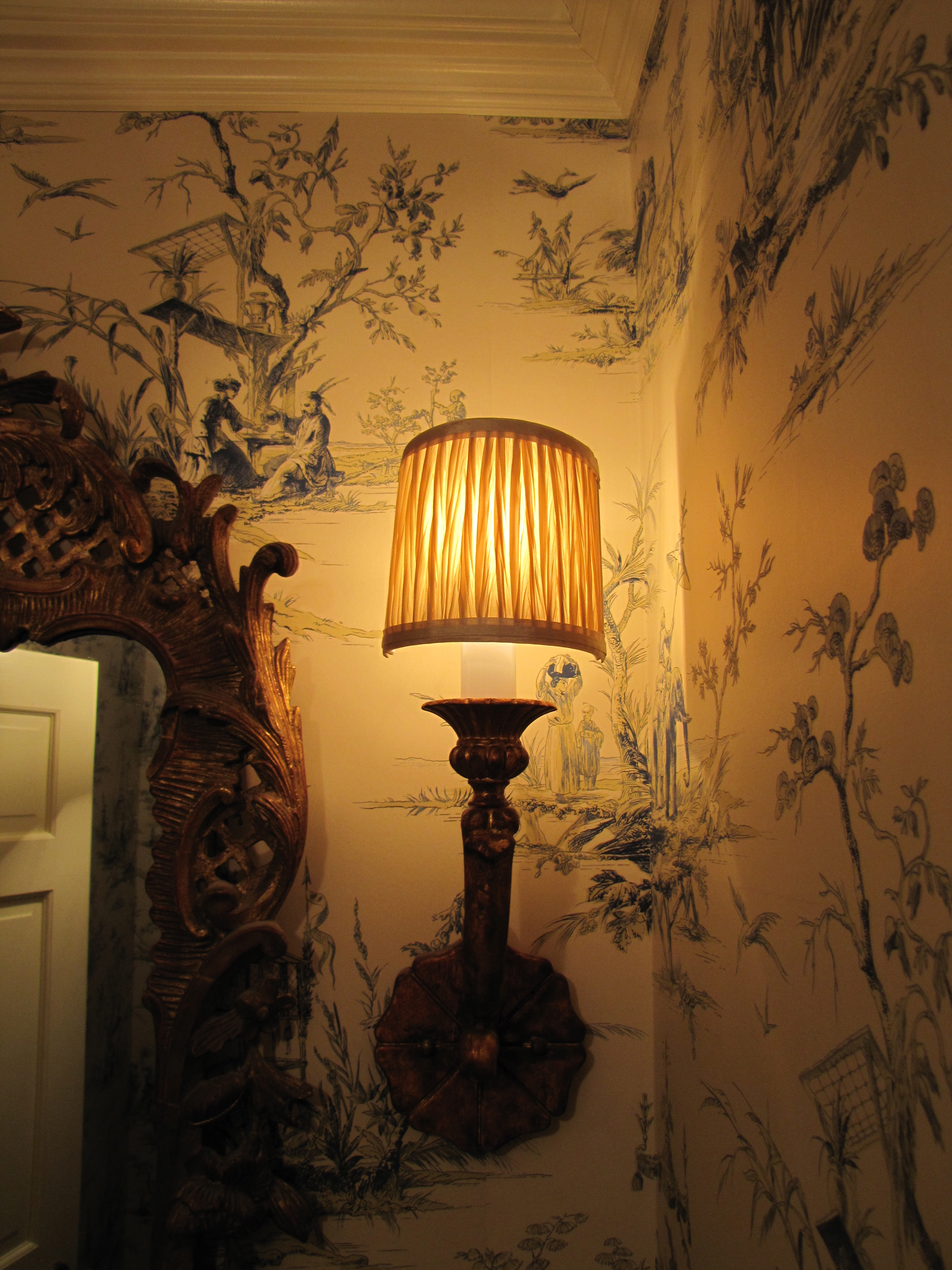
Image Color Calling
Here is another powder room with similar scale to mine (basically a chest-of-drawers width
wide).
Although I would avoid grouted tile counter tops, which are dated, I truly love the lyrical
nature of the yellow and muted green scenic paper.
The touch of red is perfect, as are the golden koi decorations on the counter top. As for
the red in the wallpaper, notice how your eye travels from the red to the red,
almost involuntarily?
Let’s look at some other fabulous chinoiserie powder rooms that may give you some ideas.
More scenic paper, see anything you like?
Style tip: No offense to whom I am sure is a very talented designer, but the cabinetry, just below,
is a little “too-too” for me.
I personally find this mix of finishes jarring (i.e, the pewter basin + gilt mirror + shiny cabinet
+ heavily veined marble top.)
Remember the “decide what is most important” rule?
I would have underplayed/simplified the basin, countertop, and cabinetry to let the over-the-top
trio of fabulous wallpaper, gorgeous rock crystal sconces and ornate mirror take center stage.
Together, it just way too much ornateness.
That being said, “it is much easier to criticize than it is to create something from scratch.“
And hopefully, this is taken as constructive feedback for my readers rather than criticism
to another design professional.
All is forgiven, though, by use of the handpainted Gracie silvered scenic, which is divine.
Breath-taking!


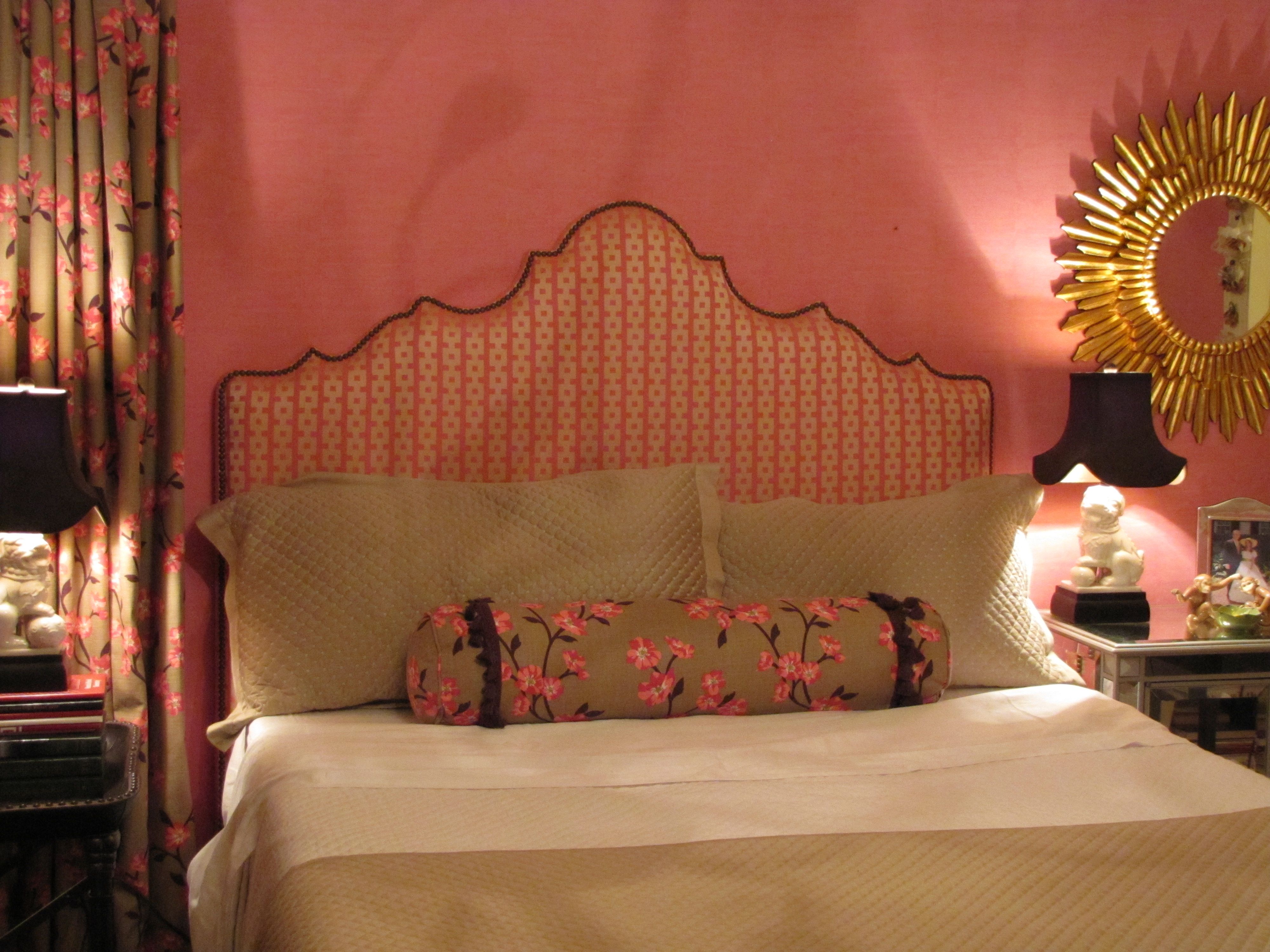
Chinoiserie bedroom makeover for a young twenty-something
Design by Ellen Rhett
My young collegiate was anxious for an update to the room that had last been decorated when she was thirteen.
A college co-ed desires a sophisticated space to return to when she’s home.
Chic chinoiserie details pleased and surprised.

Pink dogwood linen fabric unifies the hot-pink wallpaper with the neutrals.
And repeats the Chinoiserie theme.
Existing strié wallpaper was kept.
Foo dog lamps add a youthful vibe and continue the Chinoiserie theme.
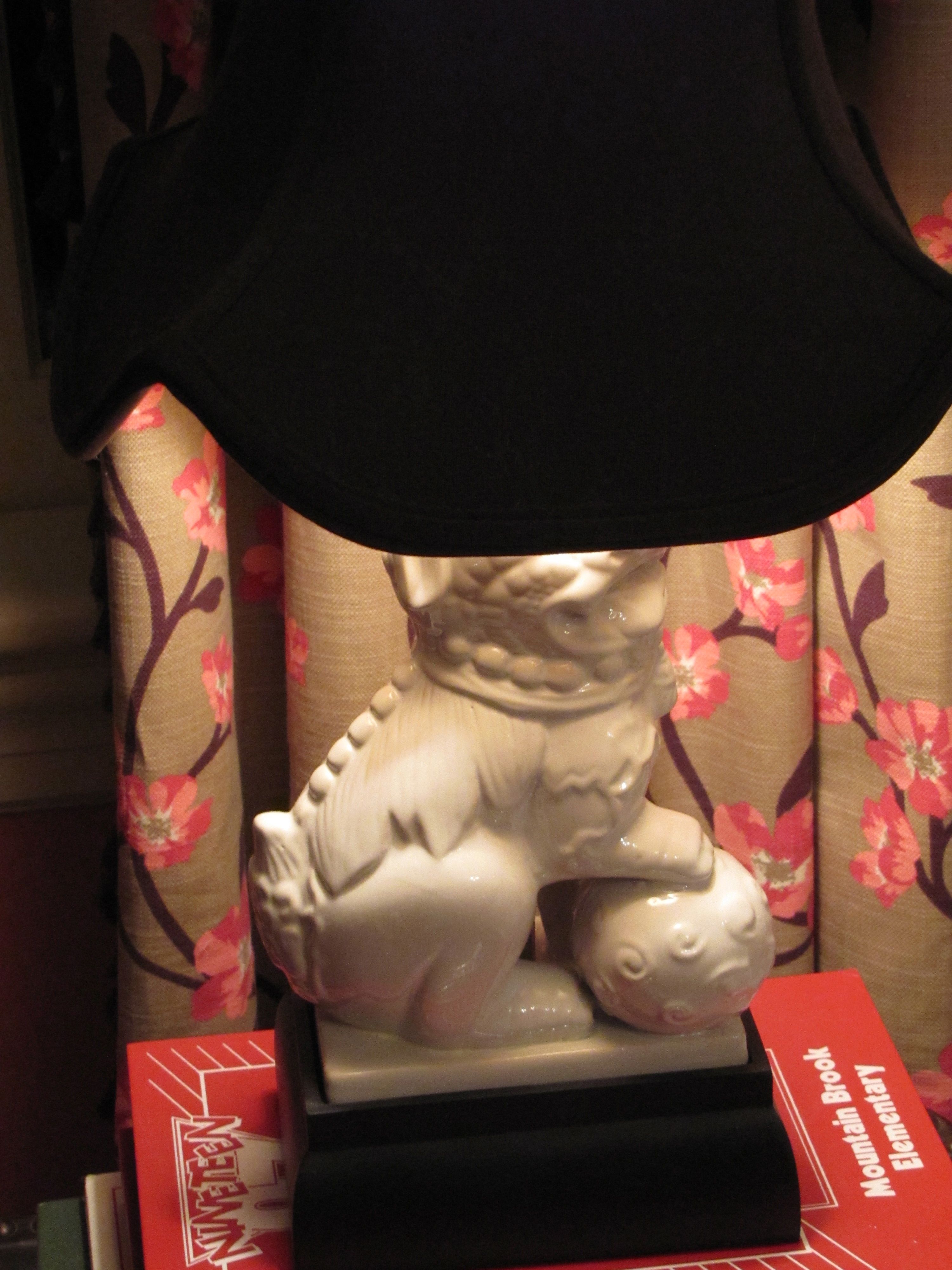
They also repeat the white in the dogwood fabric and bedding.
Remember, white is never a neutral in décor, even though it always is in fashion.
It must be repeated at least three times in a room.
White peonies, a favorite, are a natural in this room.

Design by Ellen Rhett
Custom padded headboard with expertly hand-applied nailheads (by my wonderful upholsterer)

Fun and funky and ultra-feminine light fixture, below, with plenty of sparkle and a dark finish.
Repeating the shape, movement, darkness, of the branches on the drapery and neckroll fabric.
Repeating the color of the lampshades as well.
And, a gorgeous on-trend sunburst accent mirror, handmade and all-wood.

Design by Ellen Rhett
Both sourced online for a song.
If I told you from where, you wouldn’t believe it anyway.
But, I know you, reader.
I know what you really want.
You want the before.
I’ll show you the before.
Get ready.
A little embarrassing so I’ll make this quick.
Here you are:
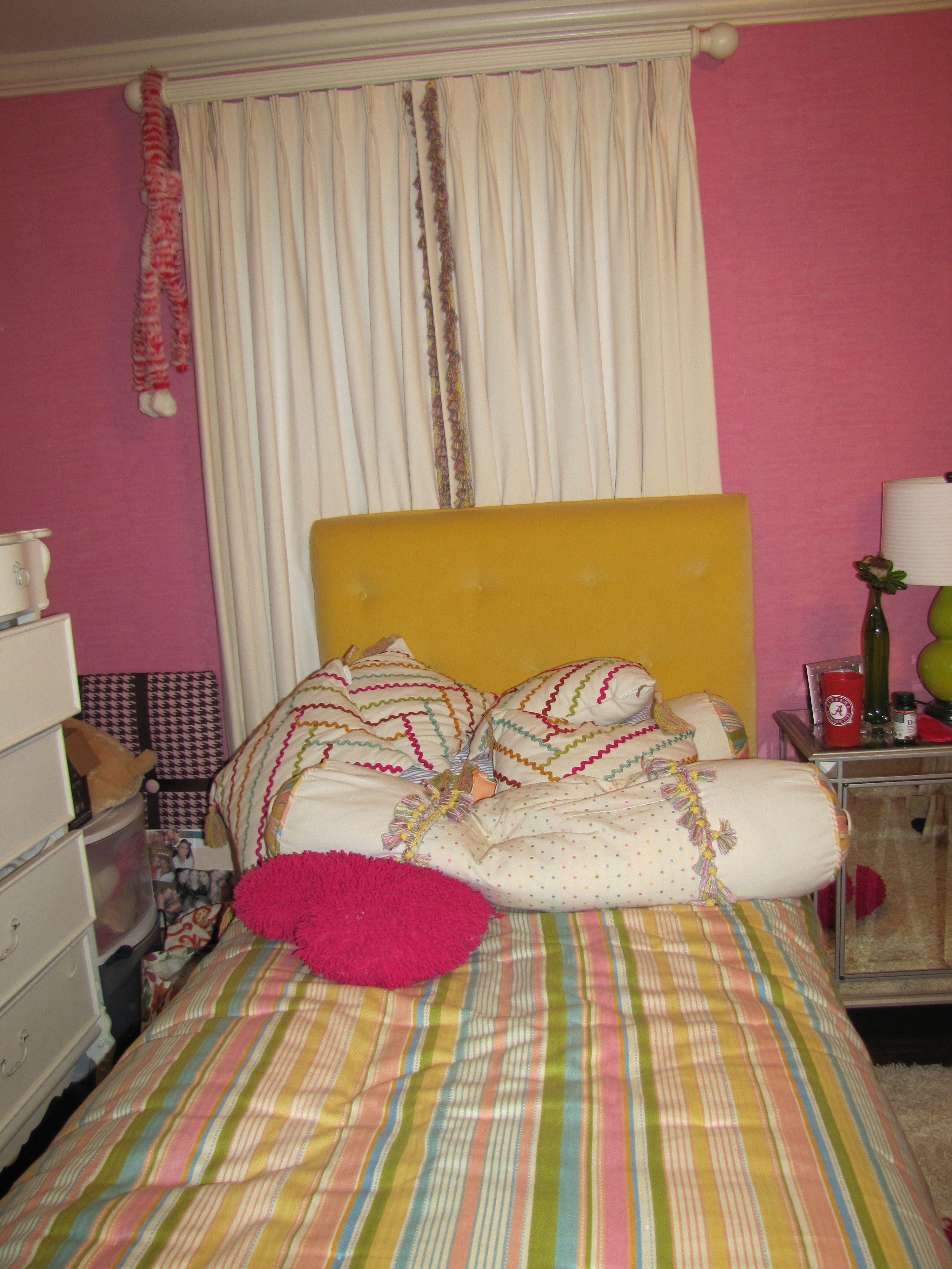
Before
And, one more time, the AFTER:

All Images Color Calling
Fabric Sources
Neckroll: Clark and Clark “Dogwood” (trade only)
Draperies: same as above.
Headboard fabric: Clark and Clark “Chinese Square” (trade only)
Bedspread, shams, comforter: Macy’s
My Top Ten Rules for Gorgeous Powder Rooms

I love to decorate Powder Rooms. Here are my Top Ten rules for a beautiful powder room:

#1
DECIDE WHAT IS MOST IMPORTANT
Select the design element that you want to have stand out. Then low-key most of the other elements so that the end result is pleasing.
So, if you are using a killer tile, scale back on the other accents, and don’t go with a too-busy-anything-else.
If you have a mirror that is extremely decorative, don’t kill it with everything else being extremely decorative.
If you like wallpaper, this is the place for that wonderful statement wallpaper. High-end designer wallpaper that would be too-too much in a regular sized room can be perfect in a powder room.
Decide what is going to become your most important design element, so you don’t get carried away with too many other decorative finishes.
A good residential stylist can keep you on track if you are prone to going over the top.


#2
Don’t mix your metals/finishes in a Powder Room.
Try to keep the same finishes in the tiny space for a more harmonious look, below.

BELOW: The Pewter color is repeated even in the wallpaper, and the all-pewter gives the powder room a harmonious look.

#3
Don’t use dinky mirrors

#4
Use sconces in addition to overhead lighting.
Over-mirror lighting can throw odd shadows and is to be avoided.

#5
VESSEL SINKS WILL BECOME DATED
If you must use a vessel sink, be sure that it has enough depth to minimize
splashing. However, I try to avoid them altogether.

#6
Use Chinoiserie for Color and Drama

#7
Keep your undertones similar.

BELOW: Undertone Perfection.


#8
Use antique, repurposed, or vintage pieces if doing a furniture-look built-in.


Otherwise, use nice built-in cabinetry. A brand-new piece of furniture for your sink almost never works .
#9
Use creamy whites with brown, and whiter whites with black.


#10
Quality over quantity. Don’t over-accessorize, and do use the nicest soaps and linens you can possibly afford.


What do you think? Do you agree with my Ten Rules for Beautiful Powder Rooms?
Don’t make an expensive mistake

Image ©Color Calling
When I first started my color consulting and residential styling business, my very first client (who kindly allowed me to photograph her living room for the blog) was a dear friend who has a very pretty house. She wanted me to help her change her living room draperies. Because of my color training, I could see the problem. Though a little old, the draperies themselves weren’t bad (though I do like my draperies to “kiss” the floor when doing a new installation.) The problem was, other than to the walls themselves, that the color of the draperies wasn’t really relating to anything else in the room.
So, we went shopping around in her own house, because she has really beautiful things. I suggested that a large gorgeous painting hanging in another room would be perfect in the living room. We removed a lovely mirror from over the mantel and moved it over a console on the same wall. If you have been reading this blog, you know how I feel about mirrors over a mantel. But, I digress. The main color (golden yellow) in the painting allowed us to repeat the drapery color again.

Image ©Color Calling
Then, all that was necessary was a little rearranging, and one simple but expert reupholstery job which repeated the color yet again. (I usually like to repeat a color three or more times.) The chair, before, is on the left, and remember, white is NOT a neutral. The chair, after, is on the right. The jewel tone silk with plenty of gold in the velvet stripe (middle photo) is just the pop of color that was needed to bring the room to life. The second of the pair of chairs is just out of camera range, but can be seen in the final shot.


Now, the draperies don’t stand out, because the color of the drapery is repeated several times. They are in harmony with the rest of the room. Have you priced custom floor length draperies lately? This one decision saved a very expensive change from being made.


Images above ©Color Calling
I have seen it happen over and over and over: the thing that you think is wrong with your room may not be the thing we end up changing!
Always call a trusted design professional when you think you want to make a change. She may just help you avoid what might be a very expensive mistake.
How do you hang a mirror?
There are a number of places to effectively hang a mirror. Over a dressing table, it is positively expected. Make it count with a beautiful shape or a gorgeous finish.
Hang your mirror to relate to what it is hanging over. For a mirror over your dressing table, for example, hang it so that you can actually use it while seated. For a mirror over a console, make sure you hang so that it relates to the console and not to the ceiling.
Wherever you use a mirror, allow it to double your view of something beautiful that you love!

Above: A hand-carved water gilt mirror, hung at dressing table height
Below: An ornate mirror reflects Chinoiserie wallpaper
All Photographs ©Color Calling

