High Style Chinoiserie for the powder room!
for beautiful chinoiserie (or other high style) wallpapers, fabrics, and finishes.
Because of the small scale, it is much more affordable to install that fancy wallpaper,
go for the silk roman shades, the marble counter, gorgeous pair of sconces, etc.
I like to advise my design/color clients to go all out with the colors, and/or high style they love
but might not like in larger doses for a big room.
My own powder room is teeny tiny. I would never go Plain Jane in a space this small.
Here is a detail of my sconce and mirror.
Which set against a scenic chinoiserie toile paper, causes the eye to travel.
Style maven Diana Vreeland said it first, and it is so true: “The Eye Must Travel.“
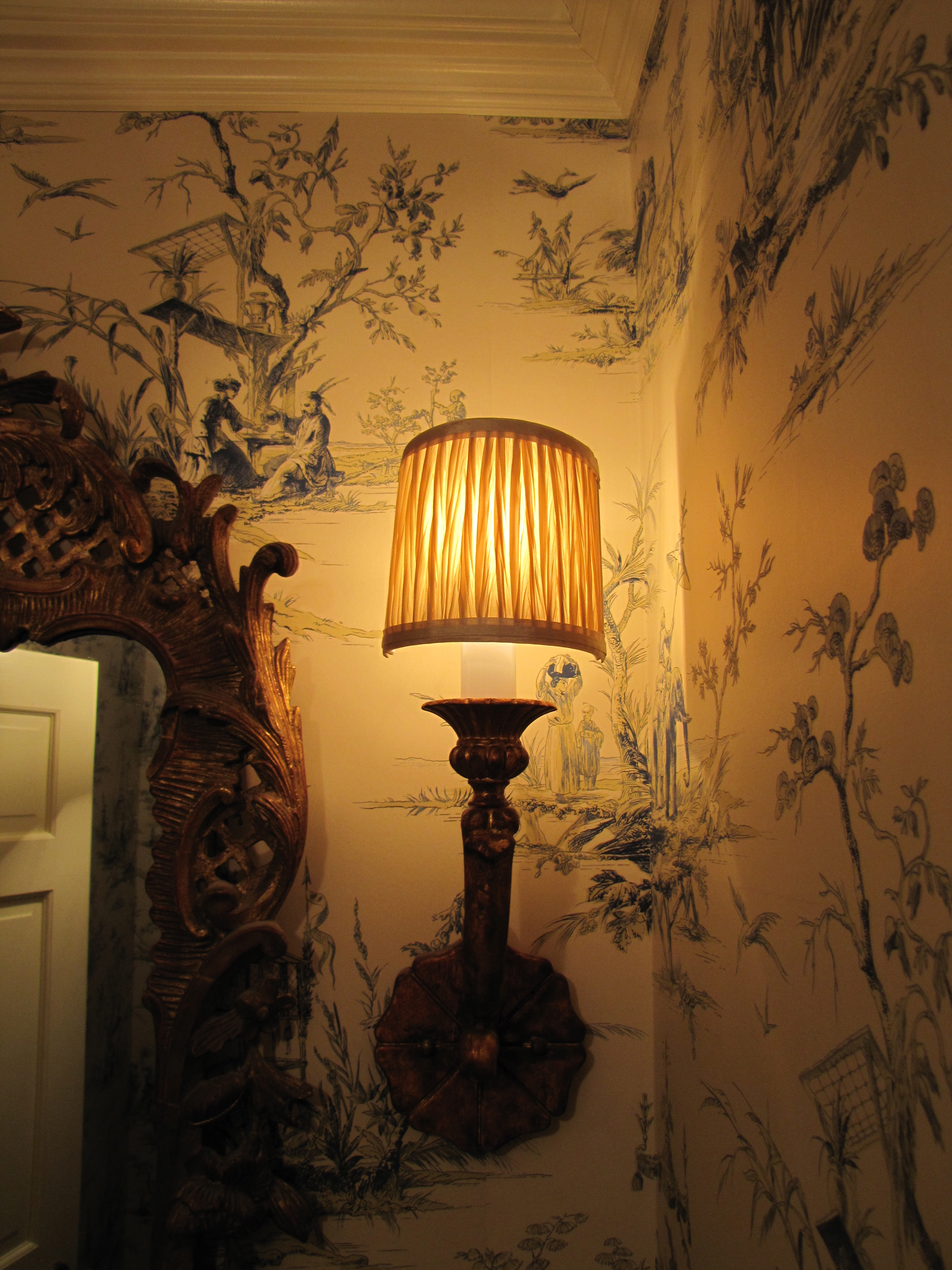
Image Color Calling
Here is another powder room with similar scale to mine (basically a chest-of-drawers width
wide).
Although I would avoid grouted tile counter tops, which are dated, I truly love the lyrical
nature of the yellow and muted green scenic paper.
The touch of red is perfect, as are the golden koi decorations on the counter top. As for
the red in the wallpaper, notice how your eye travels from the red to the red,
almost involuntarily?
Let’s look at some other fabulous chinoiserie powder rooms that may give you some ideas.
More scenic paper, see anything you like?
Style tip: No offense to whom I am sure is a very talented designer, but the cabinetry, just below,
is a little “too-too” for me.
I personally find this mix of finishes jarring (i.e, the pewter basin + gilt mirror + shiny cabinet
+ heavily veined marble top.)
Remember the “decide what is most important” rule?
I would have underplayed/simplified the basin, countertop, and cabinetry to let the over-the-top
trio of fabulous wallpaper, gorgeous rock crystal sconces and ornate mirror take center stage.
Together, it just way too much ornateness.
That being said, “it is much easier to criticize than it is to create something from scratch.“
And hopefully, this is taken as constructive feedback for my readers rather than criticism
to another design professional.
All is forgiven, though, by use of the handpainted Gracie silvered scenic, which is divine.
Breath-taking!


A client is about to enlarge her kitchen, taking away the powder room. Must shoot it before it’s gone, gorgeous paper & etc… xo t
January 9, 2013 at 9:51 am
Your wallpaper is fabulous! xo Maria
January 30, 2013 at 9:54 pm