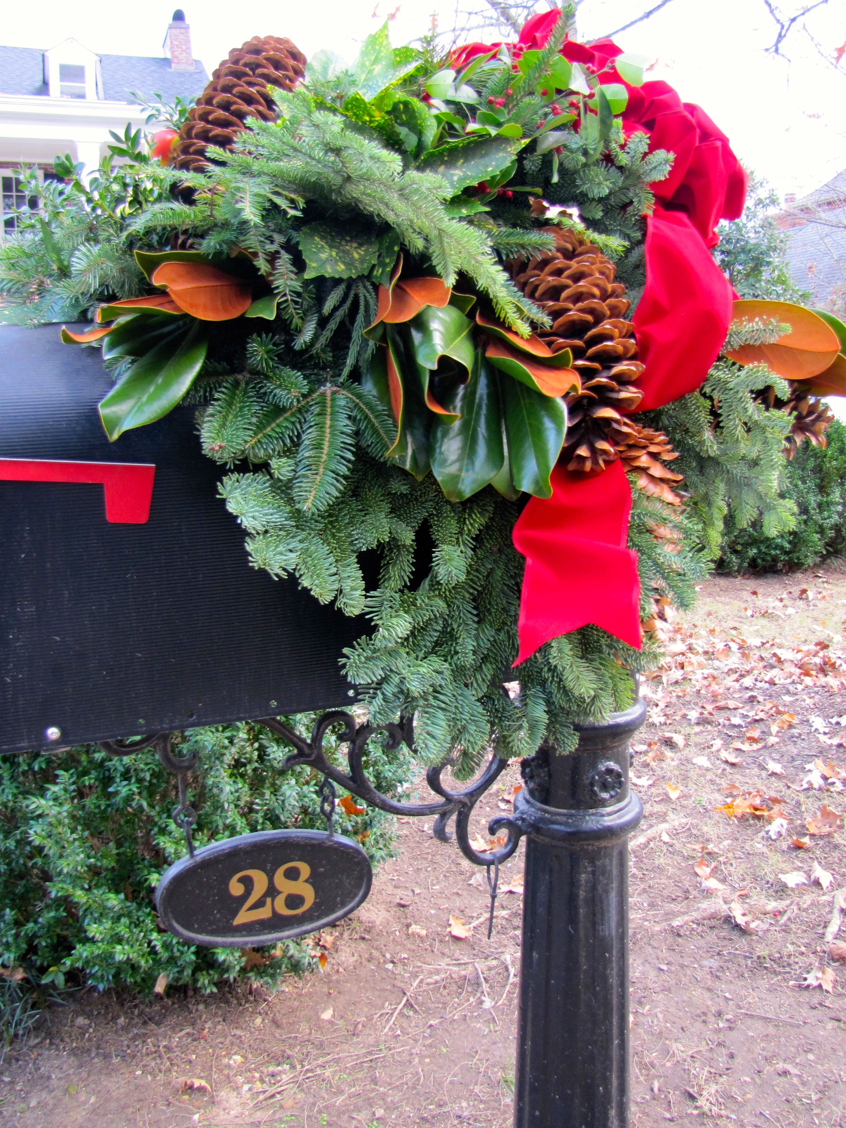
You can ring my bell
That late 1970s/early 1980s disco song keeps rummaging
through my head.
You see, we just installed this darling marine bell at the beach home of a family member.

ring my bell
We installed it to relate to the door, without being too close to interfere
with normal comings and goings.
It has the nicest, most welcoming cling-clang.
Solid brass.
Adorable anchor-motif backplate.
Genuine marine-grade rope pull.
So much more “beachy” than a regular electric doorbell.
You can ring my bell.


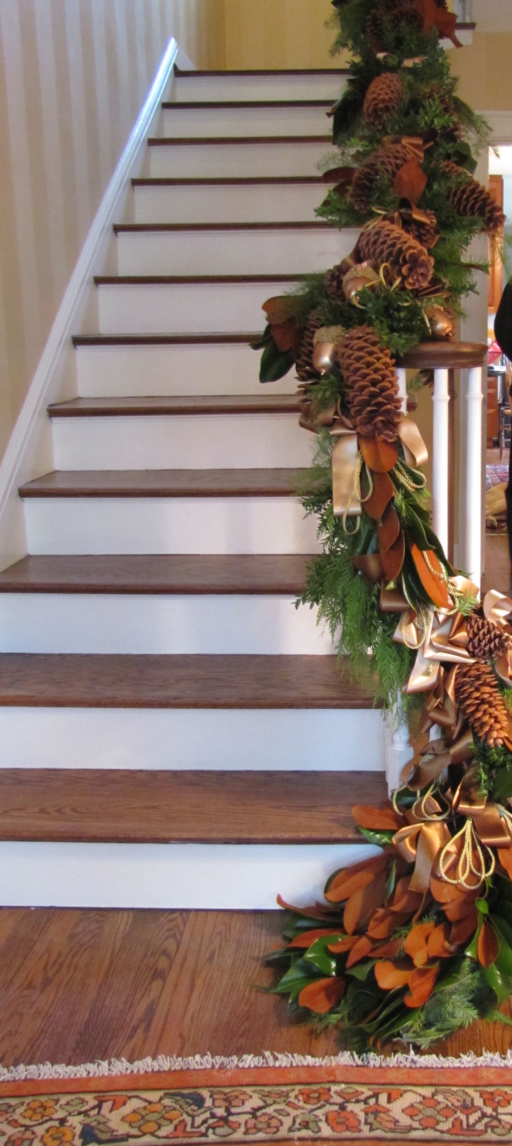
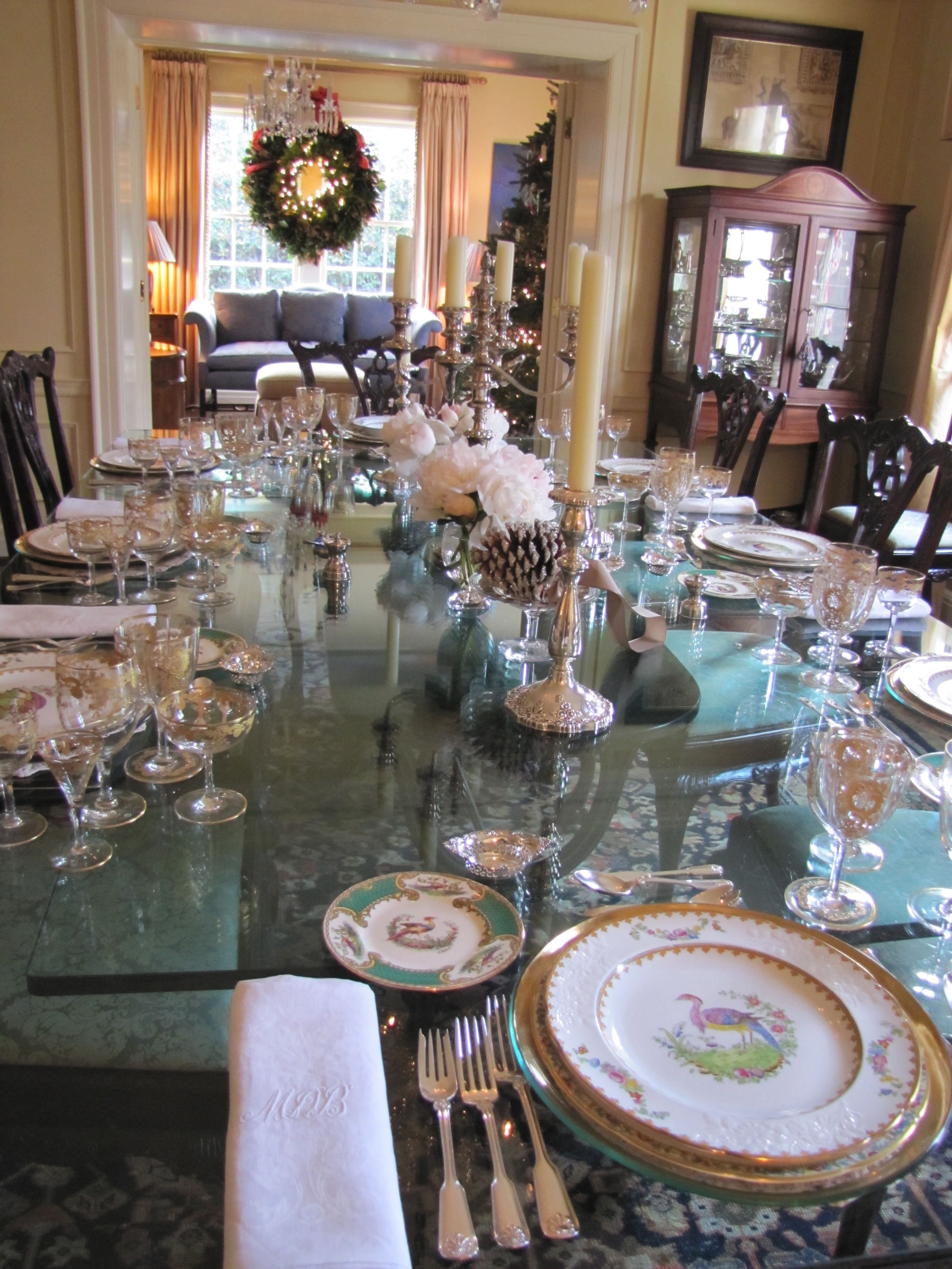
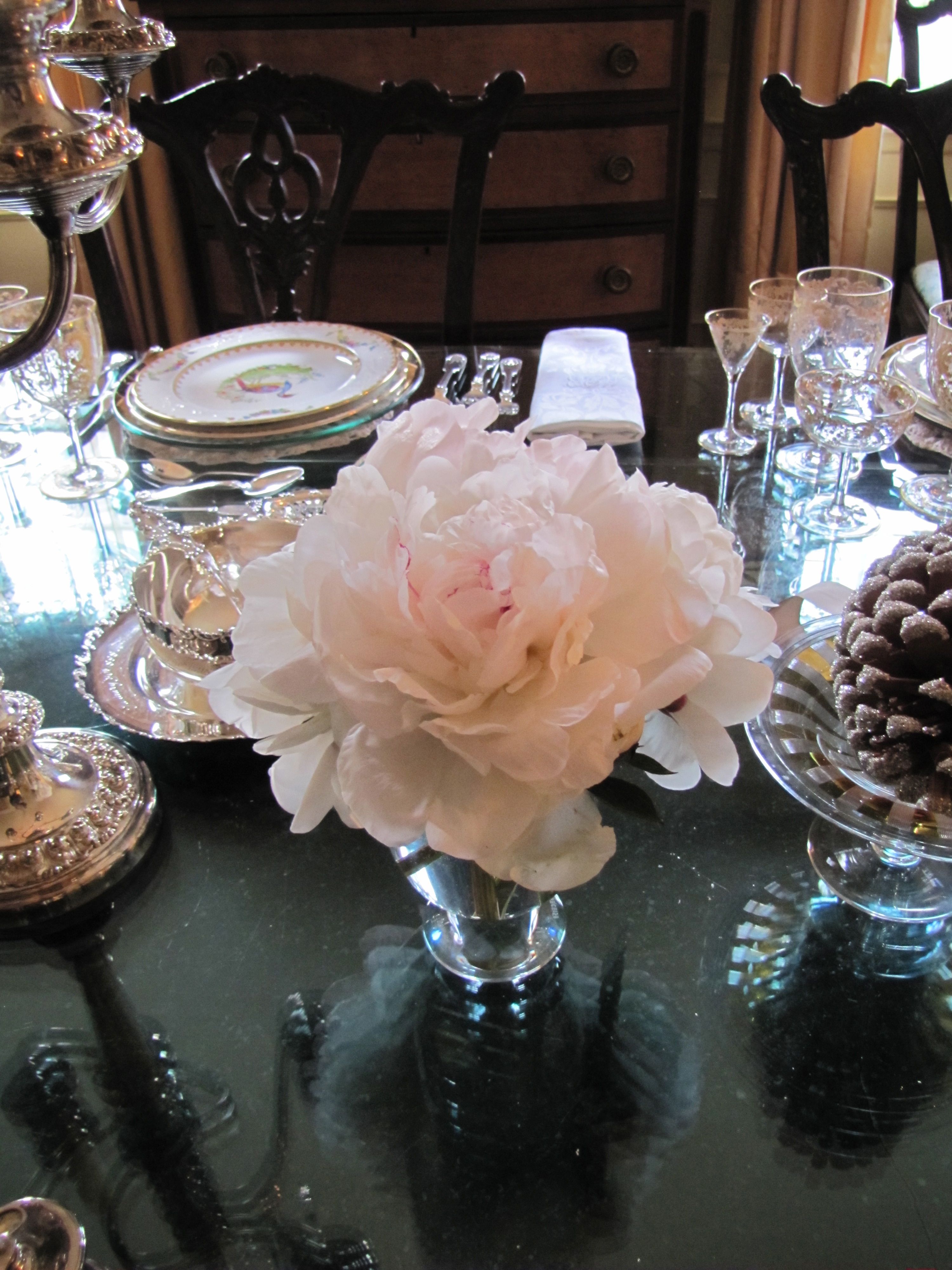
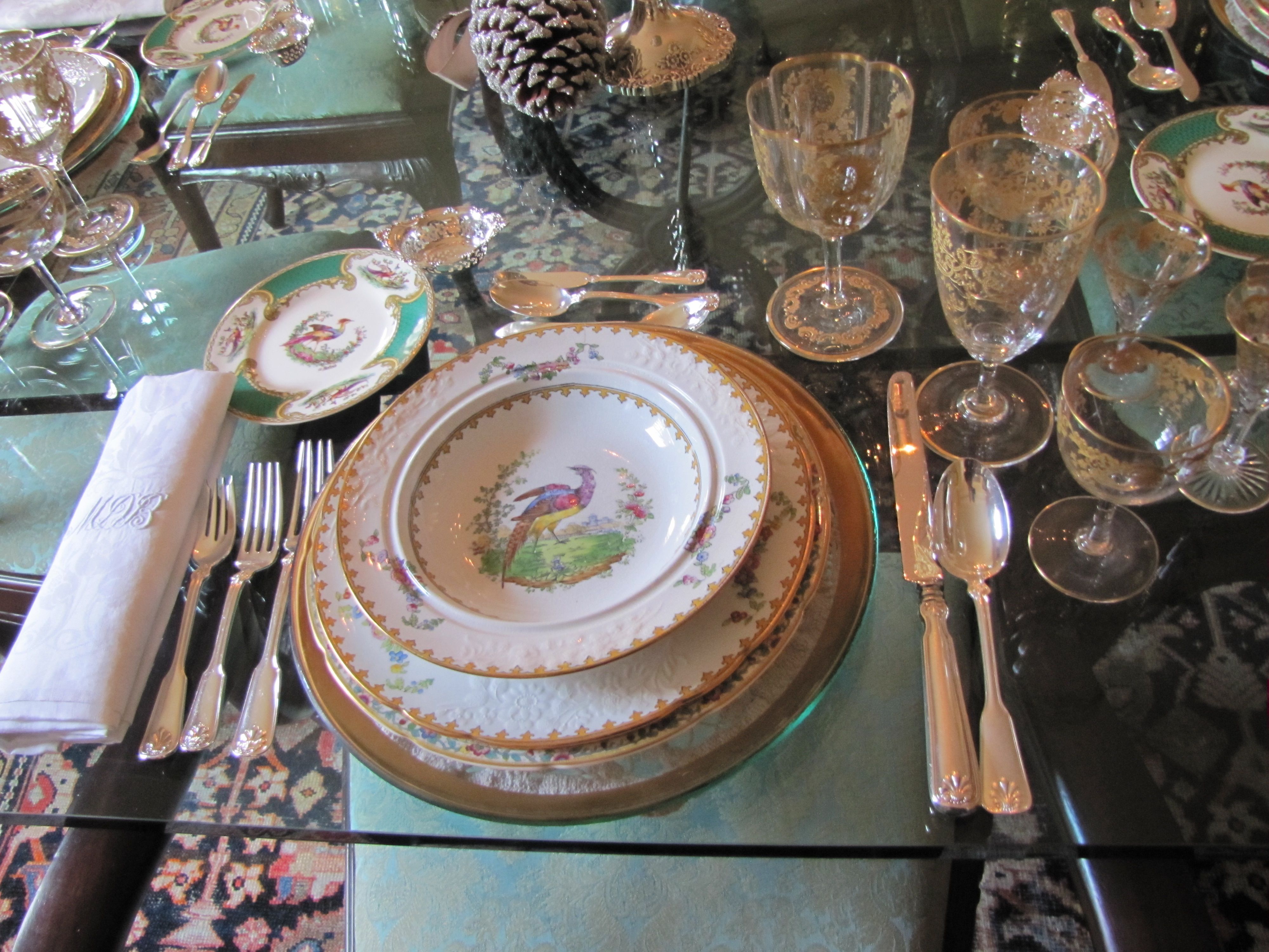
Sneak Peek: Independent Church Holiday Home Tour

If you are in the Birmingham, AL area, don’t miss this weekend’s home tour benefitting
the Fresh Air Fund of Independent Presbyterian Church, a very worthy cause.
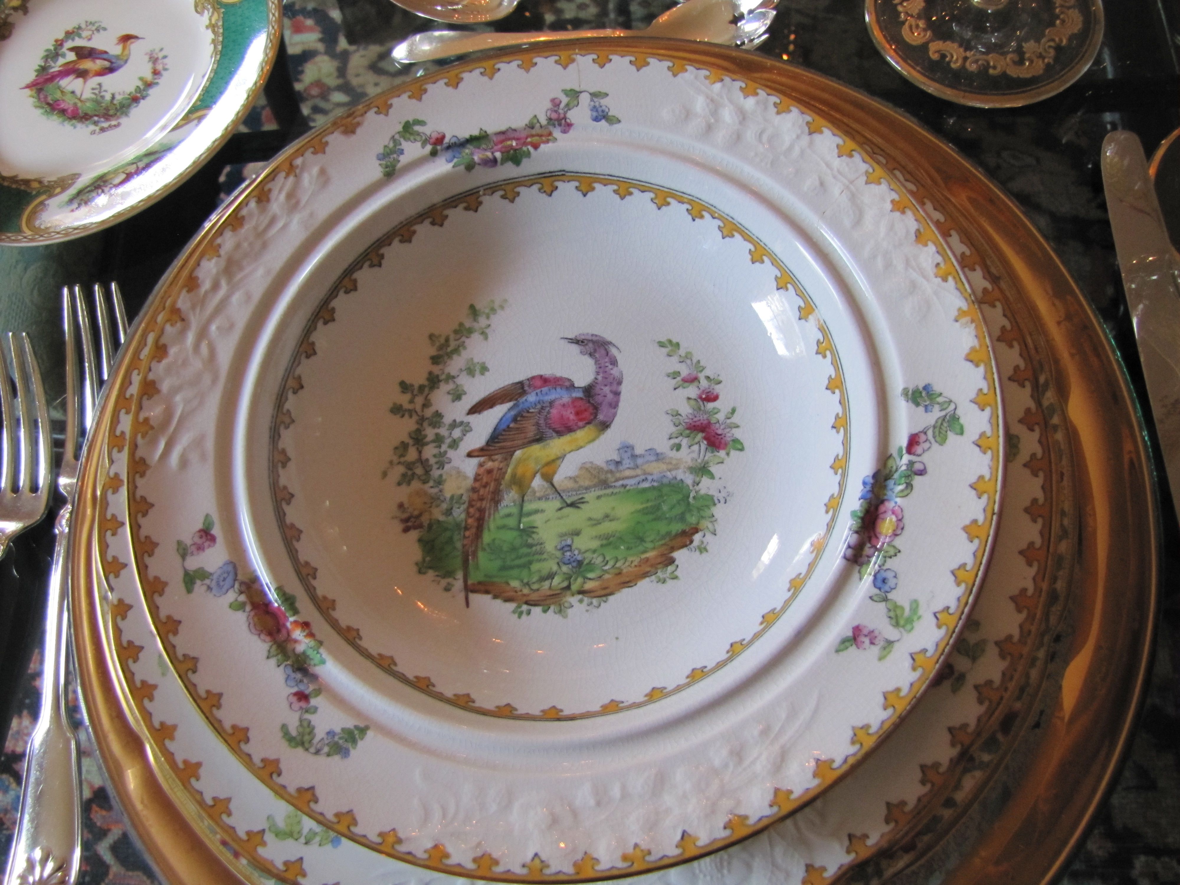
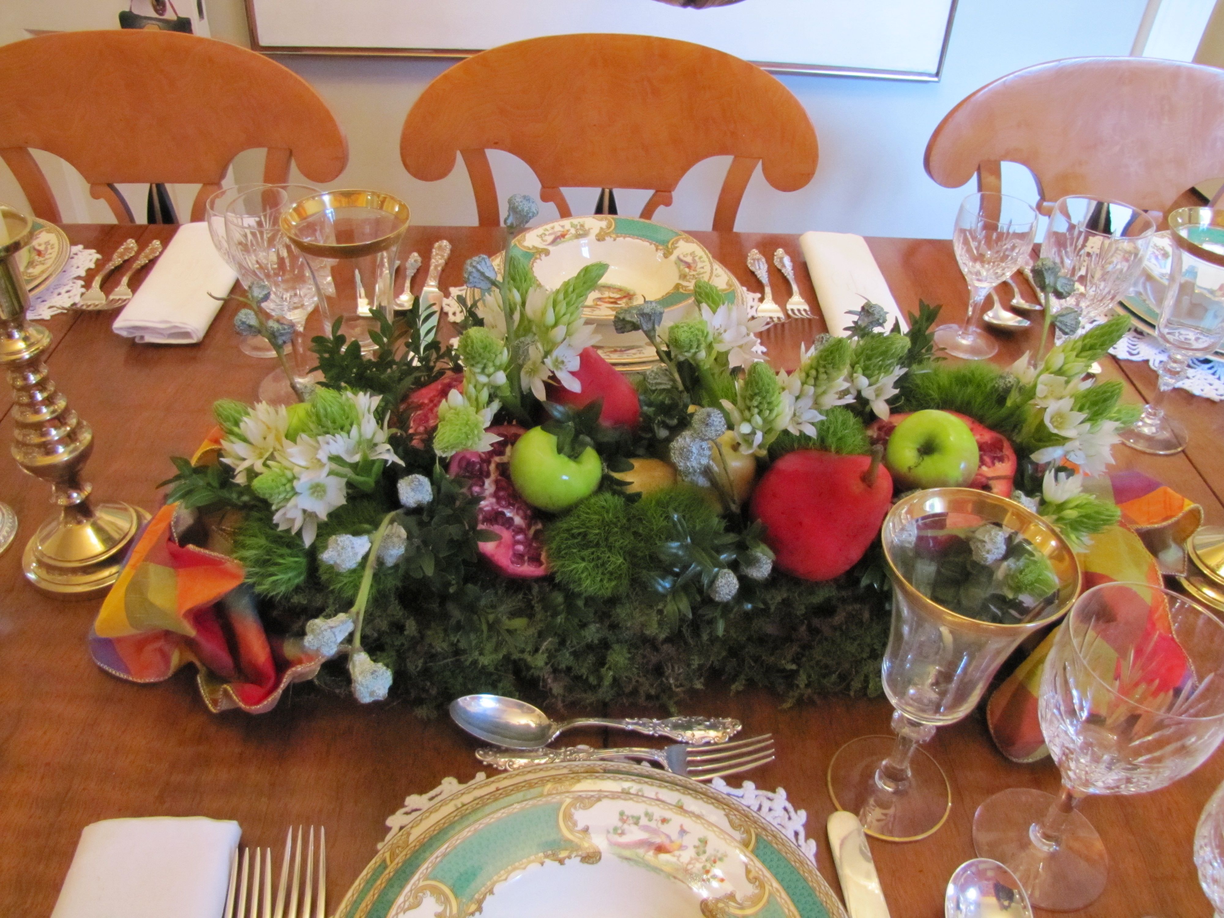
This home belongs to one of my dearest friends.
She has the most gorgeous collection of antique English bone china
you have ever seen.
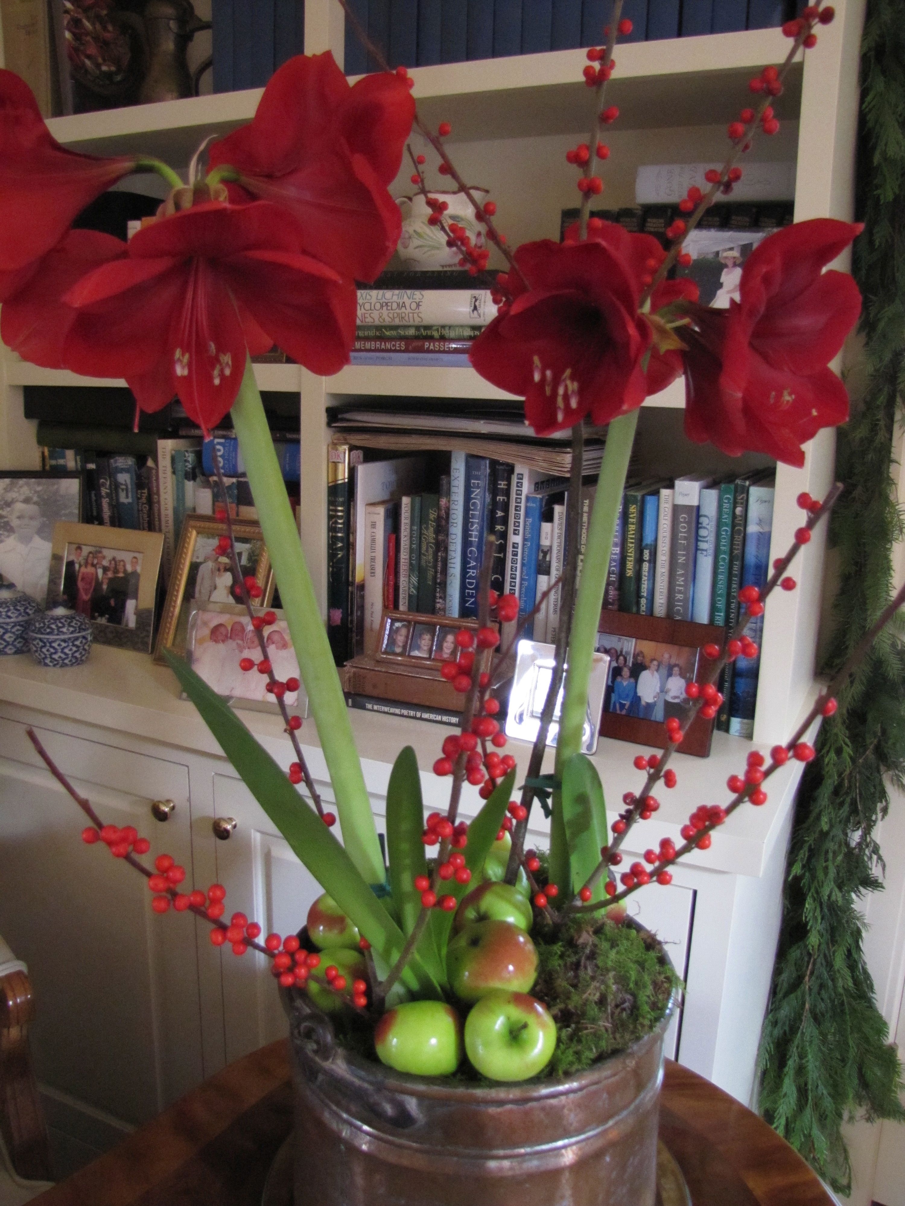
(The dining table looks straight out of Downton Abbey, with six gold-and-crystal Art Nouveau goblets per place setting!)
I had to dodge some photographers from “Southern Lady” magazine,
who were there photographing for their 2013 Christmas issue, but you’ll get the idea.
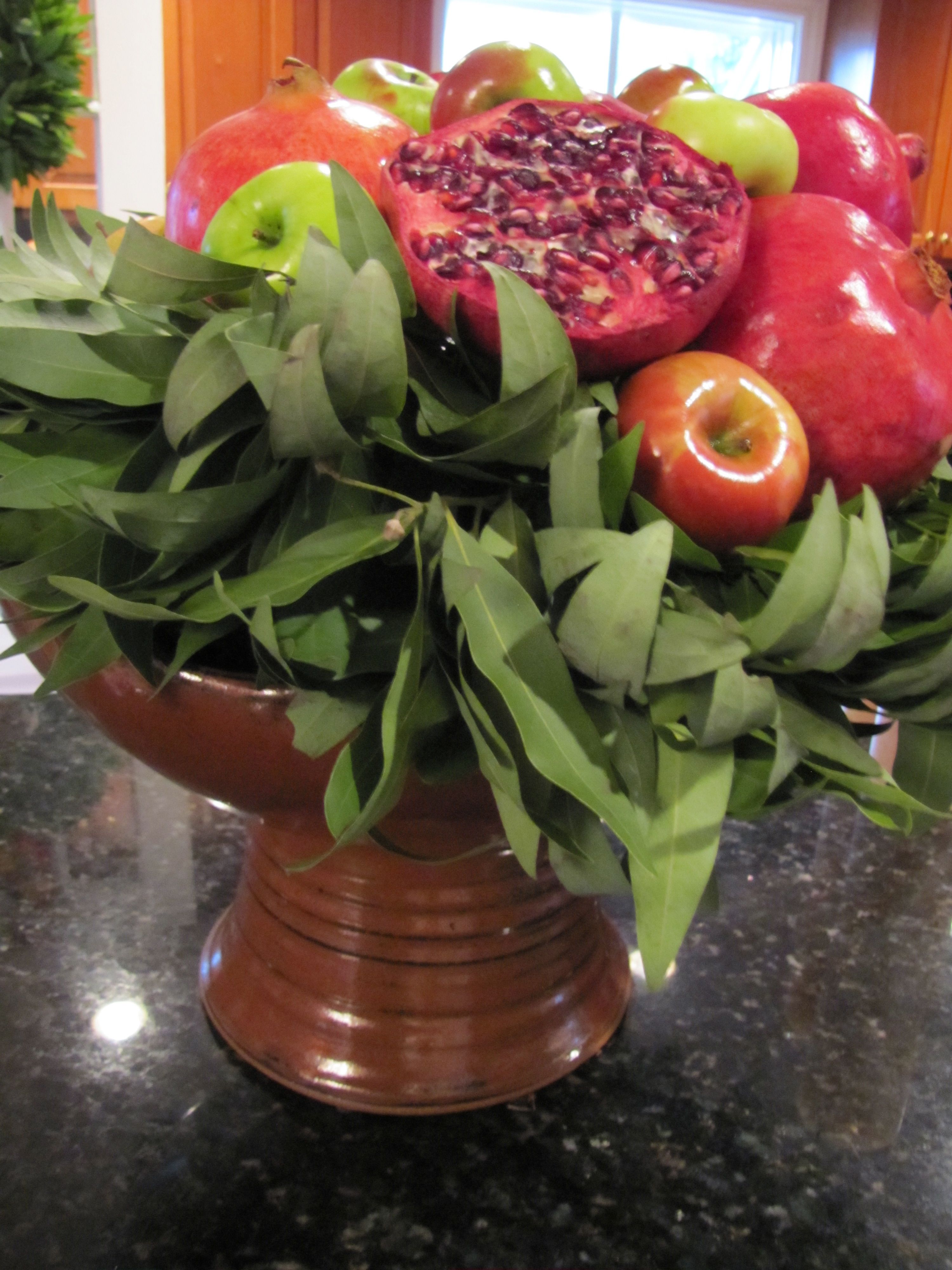
The decorations are the work of the fabulous Leah Hazzard,
another friend, and flower arranger extraordinaire .

All Images Color Calling


How do you determine exterior light size?
We all know curb appeal is important. When I do exterior color consultations, I always look at the big picture.
Many times, I will recommend that my homeowner consider upgrading the main doorway light fixture(s).
Think about it, your home is being most often viewed from street distance. Make sure your light fixture is proper size.


Now that your eye has been shown a good proportion, take a look at the following lighting scheme:

Don’t you prefer the 4:1 ratio of door to light? Doesn’t the above lighting scheme look dinky now that I am pointing this out?
The house below is a tad busy, but the main front door lighting has nice proportions. By the way, better to be a bit big than too little:

What about this one?

If you said too small, I agree. (I am not loving the huge sidelight to the right of the door, which would be the correct place to have a light).
What about this?

Did this visual exercise help you determine the correct size for your lighting? Does your own exterior lighting have enough presence?
Do you agree with my proper proportions guideline?
How to use repetition in your entry hall
We’ll look today at interior entries and foyers, and the importance of repeating shapes, colors and motifs for unifying the space.
So, let’s look at what works with interior entries/foyers, from grand to humble. And for clarity, I’ll mention a few things that in my opinion don’t work.


ALL YOU DÉCOR BUFFS WHO LOVE GRAY RIGHT NOW, DOES THIS, below, DO IT FOR YOU?


SIMPLE AND BEAUTIFUL, above. A great example of good design that probably didn’t cost a fortune. What is repeated here?
WATER REFERENCE: See the subtle reference to the ocean in the coral print pillows and the jaunty black and white photograph? Both repeating the reference to the water. Just enough.
VERTICAL LINES: The slats on the settee repeat the vertical lines of the tongue in groove panels and the vertical border of the rug. Also, the center pillow has a strong vertical motif.
BALL/CIRCLE MOTIF: The circles on the two end settee pillows repeat the balls of the little sconce. Are you seeing that when things are repeated, they are more pleasing to the eye?
COLOR HARMONY: The pale blue wall is perfect with the pinky-beige paver tiles. No clashing undertones in this humble but lovely space.

NOW, I’ll BREAK DOWN THIS “HIT AND MISS”, below:
THE MILLWORK IS NICE, AND THE PAINTING MAKES A BEAUTIFUL STATEMENT ON THE LANDING. THE HANDRAIL IS PERFECT.
However, they should have repeated the black, on the door. The ash finish of the wood door is off, it needs to be black.The countrified rust and beige check coloration on the relaxed-Roman shade comes out of nowhere, do you agree? I think a cozy ebonized settee with a soft cushion covered in a rich emerald green (cue color from the oil painting) would be much prettier and more welcoming than the oddly place round table, and would have kept your eye away from the A/C return vent. And, if I were styling this entry, I would certainly add a rug. Additionally, I find the flooring a tad busy since it is stained a different way than the stair. P.S. I hate rounded door hinges. See prior post on Does your Million Dollar Home have $2 hinges?.


NEVER OBSTRUCT YOUR STAIRS, but otherwise love this rustic rear entry, below. Can you name the two main repetitions used here to nice effect?

FARMHOUSE PERFECTION, below. Repeating the color black again here. I could just die over the iron door strapping and original hardware. The arch of the bookcase references the ellipses in the transom, and repeats in the lantern as well. The strong vertical lines of the tongue in groove paneling, stair spindles, and bench spindles work perfectly. The rug has motifs which reference each of these.

Your front door is speaking
According to the latest research, a first impression is formed in 1/10th of a second. Make the first impression of your entryway a good one.

Source: athomearkansas.com via Ellen on Pinterest
The stunningly beautiful entryway above, which belongs to my fellow True Colour Expert Andrea Brooks of Arkansas, speaks to guests long before they arrive at the stoop. Any guesses as to what it is saying? This has to be one of the prettiest front doors I have ever seen. Welcome, how do you do, and please come in, is what it is saying. Wouldn’t it be exciting to walk up to this beauty and ring the bell?
And, speaking of bells, if you have a doorbell, does it work? Do you have your door freshly re-painted or re-varnished every two or three years? Or do the dogs’ claw marks and muddy run-off rule the day?
When is the last time you or whoever helps you trotted out the metal polish and worked on the door hardware? Are your stoop and steps swept regularly, and power-washed occasionally? Do you have your windows professionally cleaned at least every one to two years?
Is your door mat (think simple, natural material, and with a size relating to the actual front door frontage) in reasonable shape?
If you have planters and pots nestled close by, do they look of high quality and are they tended? The easiest gardener’s formula for a pretty planter: use a thriller, a filler, and a spiller.
In less than 30 minutes a week, and an annual call to the painter or the pressure-washer, your entryway will make a good impression. It will tell me that you are glad I’m here, even if you are not at home!
Ultra-Glam Bobby McAlpine home
Not so often do you find a Bobby-McAlpine-designed home for sale. This one in Mountain Brook, Alabama, however, is. It is gracefully tucked into a very private wooded lane which you would hardly know is there. And it is gorgeous.

Master Bedroom overlooking the terrace garden
The expansive master bedroom, bathed in light from a bank of full-length mahogany windows. A room-long custom rod supports untold yards of drapery. A pair of French fleur-de-lys sconces flank an antique chest. Comfy lounge chairs, each with a floor lamp and a martini table, face one another. A cushioned antique French settee rests at the foot of the bed. As a color expert, I truly enjoy trying to guess paint color from my Ben Moore fan deck: here I am guessing French White (Benjamin Moore 1093).
Moving to one of the public rooms:

Informal dining
Two hundred year-old rough cut wood planks from a Virginia mill provide flooring throughout much of the ground level. Paint guess for above: Historic Collection Jamesboro Gold HC-88.

Gourmet kitchen with dual islands
A custom rack with a gourmet’s collection of All-Clad copper pots soldiers across the kitchen window. An second Subzero, identical to the one pictured, is just out of the photograph and set at an angle on the lower right side. Dual islands allow freedom of movement in the core cooking area both for the family or for entertaining. Moving through the kitchen, a light-filled breakfast room features an easy exit into the porte-cochère for convenient access. Paint guess (kitchen cabinetry): Historic Collection Yorktowne Green HC-133.

Sunny breakfast room as viewed from the kitchen
Breakfast room/morning room: This area of the house is floored with gorgeous Peacock Pavers, a Bobby McAlpine favorite. Made right here in Alabama by the inmates at Atmore prison! When you see Peacock Pavers for the first time, you might mistake them for the finest European limestone. They are actually made of concrete, and are incredibly durable as well as being stunningly beautiful. Casual comfortable seating invites relaxing over a cup of tea or the morning newspaper. A free-standing settee provides casual seating on one side of the table. Notice how nicely the back of the settee relates to the back of the chairs’ height. Tongue in groove woodwork on the ceiling is a glossy counterpoint to the matte paver flooring. An angled fireplace allows cozy dining on cool nights.

Formal living room
The living room with its deeply coffered ceiling. Focal point is a museum-quality tapestry from France above the fireplace. The soft, muted colors convey an atmosphere of quality, comfort and elegance. The draperies on the right side of the photograph serve as portières when desired. Paint guess: ceiling, Historic Collection Tyler Taupe HC-43. Body, a really rough guess: French White same as in the Master Bedroom.

Formal dining with two seating areas
Entry and Dining Room: The arched main front door is visible, whereby guests may enter directly into the dining area. There is also also a hallway with another portière on the right side of photograph, which leads into the body of the house. Notice the exquisite lacquered finish on the ceiling. This is just one example of amazing workmanship throughout. Paint guess: same shade on walls and ceiling, with high gloss on ceiling and eggshell on the walls, Historic Collection Woodlawn Blue HC-147.

A guest's view of dining room upon entering the front door

Pool and pool house
The swimming pool and charming pool house are set apart at an intentional distance from the main residence, and take advantage of the natural tree line of the property. Trim color guess: Historic Collection Van Courtland Blue: HC-145

Expansive rear lawn as viewed from pool area
Although large, the home nestles beautifully into the property and soft landscaping. It has a stateliness and a quiet elegance as you see it unfold across the length of the rear lawn.

Lovely covered terrace
An old copper sugarcane kettle (to the right) has been fashioned into a water-feature. The triple bank of doors on the left lead into one of the family rooms (partially photographed and shown above as “informal dining”). The windows on the right are in the master bedroom.
Front of the house with off-set entry stairway:

Understated country French-inspired front façade
The shutters appear to be close to Benjamin Moore Historic Color Yorktowne Green, HC -133, though the door trim is apparently somewhat more muted, possibly Van Courtland Blue.The beautifully crafted, but understated, front does not give evidence of the expanse of the residence as viewed from the back.
As a point of interest, 85 truck loads of concrete were brought in for constructing the 36″ wide foundation walls. This was built to last.
For more information the Listing agent is Jeffrey Klinner, LAH Real Estate, Mountain Brook Office, Birmingham, AL. All photos from Birmingham Area MLS Inc.
