What is the Energy Level of your Room?
Rooms can have energy. By that I mean a sense of drama or punch. Some would say pop.
Can you feel it? Now, imagine the painting gone. See what I mean? There is the room’s energy.

Some of the quietest, lowest-key people I know have extremely vibrant rooms in their homes.
And, some of the most boisterous of my acquaintances have some of the most neutrally-decorated rooms.
With little memory of all those college-level psych courses I took, I can’t begin to tell you why that might be.
But I can help you infuse some energy…drama…pop….punch….into your existing space.
As a color designer, I respect the existing undertones of fixed elements which are not being changed.
And, I have tried to select examples with the same, where undertones are coordinating, or at least are non-clashing.
So, today, let’s look at some things that can rev-up a space if you want to give it more energy.
A dramatic focal point.


Traditional Entry design by Sroka Design, Inc.
Color.

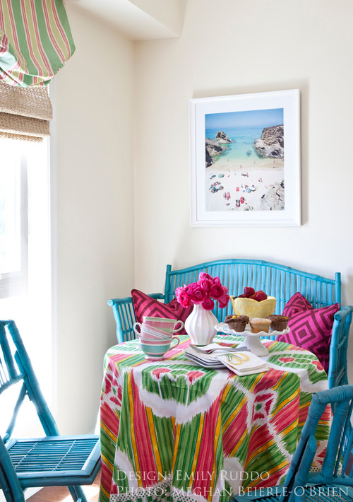
Red, yellow, black and orange can be especially dramatic.
Do you see how this is otherwise an extremely neutral space? The eye goes STRAIGHT to the high visual energy in the large painting, below:

Something graphic.


And, even something as simple as vibrant toss pillows, one of the easiest ways to punch up an existing room:

Source: st.houzz.com via Ellen on Pinterest
Do you have a place somewhere in your home for a little extra energy?
Next time, what to do when you want to quiet down a room….please stay tuned.


The eye craves balance

Source: myhomeideas.com via Kay on Pinterest
The eye craves balance.
Do you believe me? Have you ever walked into someone’s house and a painting or mirror is hanging askew?
Does it drive you a bit crazy? Don’t you find yourself wanting to straighten it?
Now, it does not always happen in your own house (this is because your brain will tune out the things that you are seeing regularly.)
The same thing happens with symmetry. Quick, off the top of your head, do you have a favorite room in your house, or a room that you really, really love as your dream room that you saw in a magazine?
Check it out. I will bet you dollars to doughnuts that the room is highly symmetrical or balanced.
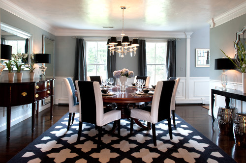
Rooms that are symmetrical are more pleasing to the eye. They create visual harmony and balance. This is an age-old decorating principle.
Today we’ll look at rooms with “mirror image” symmetry. Come along!

Design by Ellen Rhett of Color Calling

Source: houseofturquoise.com via Frances on Pinterest
So, symmetry for the furniture placement is a decorating form that is pleasing to the eye.
“Mirror-image” symmetry is what we see in the bedroom above. Other than the focal point bed+ starburst mirror, there are two of
everything, matching.
Even the nosegays on the bedsides are identical.
The same design principle is true when the decorating is done around a focal point fireplace, or any other focal point.


Source: indulgy.com via Kristen on Pinterest

Source: casatreschic.blogspot.com via Laura Mitchell on Pinterest

Source: Uploaded by user via Kelli on Pinterest

Source:

Source: southernpiphi.tumblr.com via Jean on Pinterest
Bronze sculpture by Jane DeDecker
A recent post spoke of focal points. Have you considered a beautiful bronze sculpture as your focal point? Yes, the price point is high. But, a museum-quality bronze is forever. It is timeless. And, Jane DeDecker is one of the best. Can’t you see this resting on the corner of a Carrara marble tub surround?

Source: saksgalleries.com via Ellen on Pinterest
Can you stand the darling daddy, below, tying his baby’s shoe? And, the baby just in awe. Priceless.

Source: morriswhiteside.com via Ellen on Pinterest

Source: flickr.com via Ellen on Pinterest
The above Jane DeDecker sculpture is a gift of a couple in Des Moines, Iowa, in memory of their son, Christopher, who was a victim of juvenile diabetes. Apparently, their dog clearly mourned the loss of his human companion so that the parents were moved to donate this sculpture to the City. What a beautiful and heartfelt (and heartbreaking) tribute to boy and dog.
My friend, Master’s of Art holder Holly S., introduced me to the sculpture of Jane DeDecker 11 years ago. I have been captivated ever since. I am the proud owner of two of her works, “Tippy-Toes,” which reminds me of my dancing daughter,

Source: google.com via Ellen on Pinterest
and an almost-sleeping dog bronze called “Ol’ Faithful” (which looks just like my ‘Pepper’, prone to one floppy ear)

Source: cavaliergalleries.com via Ellen on Pinterest
Source: flickr.com via Ellen on Pinterest

Image ©Color Calling, Pepper.

Source: cavaliergalleries.com via Ellen on Pinterest
And, please tell me you have never seen anything cuter than this little snow elf:

Source: claggettrey.com via Ellen on Pinterest
Another stunner:

Source: claggettrey.com via Ellen on Pinterest
DeDecker is a master. Save. Save some more. You will love forever.
