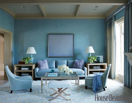
Can you trust a magazine’s color advice?
It seems like a lot of magazines are getting called out for things like this.
House Beautiful, I am disappointed in you.
The real Tobi Fairley room featuring Sherwin Williams “Silvermist” (bottom image) looks nothing
like your color-enhanced and color-saturated cover shot.


Wow, great comparison! Thanks for sharing.
October 25, 2012 at 10:36 pm
The top photo looks nothing like the bedroom that I have painted Silvermist. Too bad, it is a lovely color without the enhancement.
October 25, 2012 at 10:43 pm
What???? Oh my goodness, how horrible for House Beautiful to do that. I love the original, REAL, silvermist colouring.
October 26, 2012 at 12:37 am
And those TV landscapes? Funny at the end of the show, knowing what all those plants will grow into.
Of course who cares on TV?
Magazine gardens? Amazing in the 80’s. Now? Let’s not go there!
Go Ellen Go……………….if pros don’t write about this stuff, who will?
Garden & Be Well, XO Tara
October 26, 2012 at 9:00 am
Not being a blue lover myself, the HB cover this month didn’t really rate highly on my list of “let’s do this color”. However, I DO like the Silvermist real look much better. We all know mags photoshop things to make them look better. Who knew HB would change an entire room to something they “want” ….:-( Why not pick a room that was really done in blue?Sad….
November 2, 2012 at 7:19 pm
Now I better understand the propensity of magazines to so frequently list “custom color” in their resource guide. They have altered the color for publication!
November 2, 2012 at 7:34 pm
I could never understand why people are so crazy to learn the name of a particular color they see in a magazine photo. What are the chances it will look anything like they envision, given the lighting and reflections in their own home and the way publications and printers tweak colors?
November 2, 2012 at 10:13 pm