Residential Color and Style from a Certified True Color Expert.

Latest

Does your designer understand family living?

In my residential styling business, I am big on the way in which a room functions. Part of that function includes placing lamps (click  to see my post on beautiful lamps) where people will be sitting to read. And, another part of that function includes placing a table or other flat surface where people who are sitting can conveniently place a teacup (or a martini).

Below:  The designer here really got it right. Notice the lamps which are placed behind the sofa on a long, high sofa table. Clean lines, beautiful carpet, upholstery and drapery, and perfectly functional:

                                                                                     Another view of the same room Source: southernliving.com via teri on Pinterest

Two images Below: While not unattractive, the designers whose rooms are pictured next, sadly didn’t think through the actual living in these rooms. Why are there no lamps in these rooms? Do you notice that there is nowhere to sit and read? Overhead lighting doesn’t count here. Overhead lighting is not proper task lighting. A little teeny sconce doesn’t count, either. Can you imagine how much warmer these rooms would feel if there were some pretty, well-placed lamp lighting? Where are you supposed to place your cup of coffee while watching the morning news? Where is your teenaged son going to put his feet up? Are you with me? These rooms don’t live. And, in the turquoise room, there is only one seat in the entire space angled for comfortable television viewing.

I don’t get the current trend of ‘no’ task lighting in the room, but I am seeing it everywhere. Don’t fall for this trend. This isn’t just about style, it is about function. Every main seating place should have a lamp for reading and a nearby surface for putting down a drink. Then, you can enjoy the look and feel of your family room, because it functions for a family. And, it can be done beautifully.

Benjamin Moore Sea Haze

Sea Haze on the walls, Source: houzz.com via Kathy on Pinterest

Let’s look at the beautiful Benjamin Moore paint color called Sea Haze, pictured in actual rooms.

As a Certified True Color Expert, trained by Canadian colour (I add the ‘u’ to the word color because she does) expert Maria Killam, I know that color on the wall can’t be chosen successfully from a tiny paint chip from a fan deck. And, I know that the color on the chip isn’t even paint, it is a printed interpretation of a paint color. That is why I always rely on my large painted samples when helping a client select paint color.

Sea Haze is what I call a magic color, because it changes beautifully with the light. Of course, every color changes with the light. Sea Haze just has so many permutations when the light is changing, and each one is wonderful. Here is Sea Haze used in a tranquil bedroom:

Image: google.com via Ellen on Pinterest

And Sea Haze used in a Candace Olson-designed bedroom/bath combination, where you can see some of the various shades which the color Sea Haze can read.

Image: google.com via Ellen on Pinterest

My very first kitchen consultation had greeny gray granite countertops as the focal color in the kitchen. The existing beige color on the walls wasn’t doing a thing for the focal color granite in the room.

At the initial consultation, I selected Sea Haze with my magic wand fan deck as the probable choice. Once the large sample was painted up and brought over, it was the clear choice. The client and I could immediately see that the granite color simply came alive next to Sea Haze. Remember, Sea Haze is a magic color, and changes beautifully with the light.

Here is the actual Sea Haze sample I used in the kitchen consultation. Notice how the color  of the large sample brings out the rich greeny grays of the existing granite countertop. That is what the right color does in a room. It creates visual harmony. Remember that, because it is one of the most important things that will happen when you paint the right color on your walls. The right color creates visual harmony.

Benjamin Moore Sea Haze. Image ©Color Calling

Are the paint colors in your home helping you achieve visual harmony? With furniture, between a pricey antique and even a wonderful reproduction, there could be many thousands of dollars’ difference. With paint, it costs exactly the same to paint a wonderful color which gives visual harmony, as it does to paint the wrong color which never will!

Eden Gardens State Park

We spent a lovely late afternoon at Eden Gardens State Park, located about 10 minutes from WaterColor Resort, in
Point Washington, Florida. Dogs on a leash are welcome.  The azaleas were sadly past their peak, but a few camellias were blooming. The other real enjoyment for me was taking photos of the fabulous bronze sculptures of children at play placed beautifully along the walking trail. What a treat!

March blooming camellia
Image ©Color Calling

Beautiful bronze fountain
Image ©Color Calling

Close up of one of the several wonderful sculptures
Image ©Color Calling

close up of little boy sculpture
Image ©Color Calling

Under the gorgeous 600 year old oak tree, a favorite wedding venue for local brides
Image ©Color Calling

Source: google.com via Ellen on Pinterest

Below: the Wesley House  is open for tours on the grounds of the Eden State Park

Creativity in the garden

Don’t you love it when someone’s creativity and imagination just make you go WOW!

Here are some garden accents which I find inspiring and beautiful right now

From Goff Creek Pottery

A lovely birdbath, in an almost-impossible-to-find all copper. It is the correct depth as well. Don’t buy a birdbath with a pool depth of more than about 3 inches, according to bird experts.

P.Allen Smith’s Allium beds:

Source: t

http://www.thegardenbuzz.com/2011/06/a-little-something-about-alliums.html

Beautiful lamps

As a color expert, sometimes what is perceived to be a paint issue turns out to be a lighting issue. When possible, I like to have  light available in each corner of a room. There is nothing like a nice lamp with the correct shade to enhance everything else about the room, and to cast a warm glow which makes moods, complexions, and everything about the room look right. My personal favorite style of lampshade is an English silk pleated shade which has a tonal stripe look when lighted.

Source: google.com via Ellen on Pinterest

Sometimes you can break the rules and have a fabulous space. Look here, I can’t really explain why this works, but it does. It looks like the designer did a great job with using  a lot of pinky-beige undertones in the carpet and wall-covering, which really ramp up and enhance the clean strong purples. Great floor lamp! (the smaller lamp  doesn’t work, though, it’s way too small and looks like an afterthought)

Source: houzz.com via Ellen on Pinterest

Sometimes an odd-ball lamp is just perfect for a culture-specific space

Source: houzz.com via Ellen on Pinterest

Lovely statement lamp in a neutral room

Source: houzz.com via Ellen on Pinterest

Nice updated lamps for a young collector’s look

Source: houzz.com via Ellen on Pinterest

Great lamp, but this is one where I would recommend upgrading the shade

Source: houzz.com via Ellen on Pinterest

Great style in a pretty Chinoiserie room. Wouldn’t change a thing.

Nice looking vintage orange lamps with black pagoda silk shades

Source: google.com via Ellen on Pinterest

How fab are these for a beach house? They make the room.

Source: houzz.com via Ellen on Pinterest

Happy decorating!

Ellen

Pretty patios

Since I have been reworking the furniture, and the look of my terrace, I am loving researching patio décor. I have my old patio sets sent out to be stripped and freshly powder coated. Some of the odd pieces are going to stay rustic to add patina. It won’t look too matchy-matchy when I have finished. I will bring out a couple of blue and white Chinese garden stools to add color, and I found some killer outdoor toss pillows in a navy-blue and white Schumacher ‘Imperial Trellis’ knock-off for a song.

Here are some of the looks that I like and found inspiring:

Source: houzz.com via Ellen on Pinterest

Source: decor8blog.com via Ellen on Pinterest

Desperately seeking Tulipière

Source: sanamemami.com via Juju on Pinterest

I want a tulipière, a fancy name for a tulip vase. I am loving buying fresh Virginia Tulips at my local Whole Foods for $7.99 a bunch. I have not missed a week since they came in season. Tomorrow, the fresh daffodils begin arriving at WF.  Happiness in a vase, preferably a tulip vase, a tulipière. Just can’t find one, anywhere. If you see a tall one, I’m interested.

Images below: Christie’s

image via House Beautiful

Source:Carolyne Roehm vis  google.com via Kelly on Pinterest

Source: google.com via Kelly on Pinterest

Source: google.com via Kelly on Pinterest

How to Decorate around the Television

How do you like to watch television? Do you like to lie down on the sofa? Here is your best view:

When the television is to the left (or right) of the fireplace, I like this arrangement of console behind the sofa, and two medium sized chairs which can be easily turned for viewing.

The television is inside cabinetry above the fireplace. Four chairs allow for easy conversation when not viewing a program.

Source: countryliving.com via Susan on Pinterest

Above,  two sofas at right angles. Television,not shown, likely on bookcase to the right.

Below, comfortable arrangement of statement sofa and comfortable high-backed upholstered chairs. Television would be placed above mantel.

Source: houzz.com via Susan on Pinterest

Source: houzz.com via Christine on Pinterest

Source: bhg.com via Sarah on Pinterest

Source: bhg.com via Sarah on Pinterest

Ultra-Glam Bobby McAlpine home

Not so often do you find a Bobby-McAlpine-designed home for sale. This one in Mountain Brook, Alabama, however, is. It is gracefully tucked into a very private wooded lane which you would hardly know is there. And it is gorgeous.

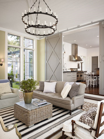
Master Bedroom overlooking the terrace garden

The expansive master bedroom, bathed in light from a bank of full-length mahogany windows. A room-long custom rod supports untold yards of drapery. A pair of French fleur-de-lys sconces flank an antique chest. Comfy lounge chairs, each with a floor lamp and a martini table, face one another. A cushioned antique  French settee rests at the foot of the bed. As a color expert, I truly enjoy trying to guess paint color from my Ben Moore fan deck:  here I am guessing French White (Benjamin Moore 1093).

Moving to one of the public rooms:

Informal dining

Two hundred year-old rough cut wood planks from a Virginia mill provide flooring throughout much of the ground level. Paint guess for above: Historic Collection Jamesboro Gold HC-88.

Gourmet kitchen with dual islands

A custom rack with a gourmet’s collection of All-Clad copper pots soldiers across the kitchen window. An second Subzero, identical to the one pictured, is just out of the photograph and set at an angle on the lower right side. Dual islands allow freedom of movement in the core cooking area both for the family or for entertaining. Moving through the kitchen, a light-filled breakfast room features an easy exit into the porte-cochère for convenient access. Paint guess (kitchen cabinetry): Historic Collection Yorktowne Green HC-133.

Sunny breakfast room as viewed from the kitchen

Breakfast room/morning room: This area of the house is floored with gorgeous Peacock Pavers, a Bobby McAlpine favorite. Made right here in Alabama by the inmates at Atmore prison! When you see Peacock Pavers for the first time, you might mistake them for  the finest European limestone. They are actually made of concrete, and are incredibly durable as well as being stunningly beautiful. Casual comfortable seating invites relaxing over a cup of tea or the morning newspaper. A free-standing settee provides casual seating on one side of the table. Notice how nicely  the back of the settee relates to the back of the chairs’ height. Tongue in groove woodwork on the ceiling is a glossy counterpoint to the matte paver flooring. An angled fireplace allows cozy dining on cool nights.

Formal living room

The living room with its deeply coffered ceiling. Focal point is a museum-quality tapestry from France above the fireplace. The soft, muted colors convey an atmosphere of quality, comfort and elegance. The draperies on the right side of the photograph serve as portières when desired. Paint guess: ceiling, Historic Collection Tyler Taupe HC-43. Body, a really rough guess: French White same as in the Master Bedroom.

Formal dining with two seating areas

Entry and Dining Room: The arched main front door is visible, whereby guests may enter directly into the dining area. There is also also a hallway with another portière on the right side of photograph, which leads into the body of the house. Notice the exquisite lacquered finish on the ceiling. This is just one example of amazing workmanship throughout.  Paint guess: same shade on walls and ceiling, with high gloss on ceiling and eggshell on the walls, Historic Collection Woodlawn Blue HC-147.

A guest's view of dining room upon entering the front door

Pool and pool house

The swimming pool and charming pool house are set apart at an intentional distance from the main residence, and take advantage of the natural tree line of the property. Trim color guess: Historic Collection Van Courtland Blue: HC-145

Expansive rear lawn as viewed from pool area

Although large, the home nestles beautifully into the property and soft landscaping. It has a stateliness and a quiet elegance as you see it unfold across the length of the rear lawn.

Lovely covered terrace

An old copper sugarcane kettle  (to the right) has been fashioned into a water-feature. The triple bank of doors on the left lead into one of the family rooms (partially photographed and shown above as “informal dining”). The windows on the right are in the master bedroom.

Front of the house with off-set entry stairway:

Understated country French-inspired front façade

The shutters appear to be close to Benjamin Moore Historic Color Yorktowne Green, HC -133, though the door trim is apparently somewhat more muted, possibly Van Courtland Blue.The beautifully crafted, but understated, front does not give evidence of the expanse of the residence as viewed from the back.

As a point of interest, 85 truck loads of concrete were brought in for constructing the 36″ wide foundation walls. This was built to last.

For more information the Listing agent is Jeffrey Klinner, LAH Real Estate, Mountain Brook Office, Birmingham, AL. All photos from Birmingham Area MLS Inc.

Quote
A little green inspiration for the first day of meteorological spring.

Source: inspirationforhome.blogspot.com via Tanya on Pinterest

Sage green kitchen:

Source: itkupilli-inspirations.blogspot.com via OKIFOLKI on Pinterest

Be sure to check back tomorrow. I will be showcasing a very glamorous  Bobby McAlpine-designed home!