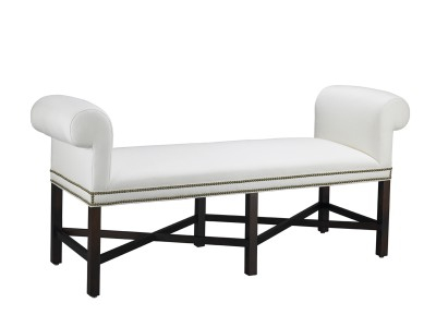
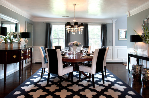
Mr. and Mrs. Howard for Sherrill Furniture

Overstock.com

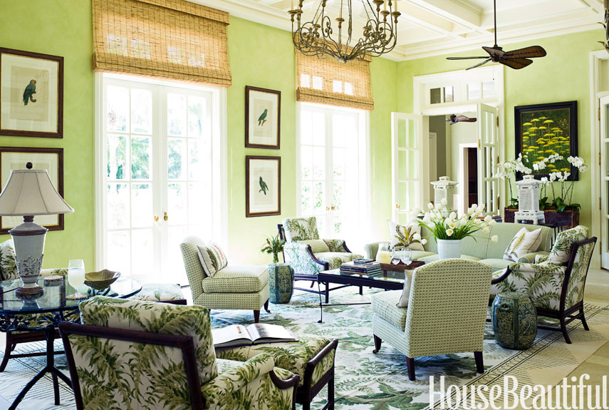
Mr. and Mrs. Howard for Sherrill Furniture
Overstock.com
For those blessed with a second home at the shore
(or even a nice outbuilding such as a pool house)
you know what fun it is to mix it up a little bit.
And, anyway, it’s always fun to dream!

Source: housebeautiful.com via Ellen on Pinterest
By that, I mean, you do something perhaps a little kooky, a little off-beat,
a little more colorful than you might select for your main house.
Because, in the main house, kooky can turn weird, off-beat can hit a sour note,
and vibrant color can grow cold on you, if you are seeing it day in and day out, all the time.
I first think of the gorgeous homes in Palm Beach.
Many of the seasonal residents live part of the year in much colder climes,
so they embrace the tropical lifestyle, for part of the year, in all its colored splendor.
And it works, beautifully:
source
They wouldn’t dream of having the same sort of decor in their Park Avenue Apartment, though.
Lovely though it is, it Just Wouldn’t Work.
What a treat it would be to open the front door of this little PB number
after a flight in from, say, snowy Boston:

Source: photoarchive.1stdibs.com via Noir on Pinterest
Do you see what I mean by mixing it up a bit?
These are not rooms that you would have in a Buckhead home or anywhere else,
really, besides where they are.
There is a PLACE element that makes them totally wonderful for the location.
Perfect for Place.
This is a time that selected elements of whimsy can hit a home run rather than fall flat.
It means looking for unique elements that reflect both your taste and the PLACE.
A FEW totally charming ‘location’ pieces. With A Sense of PLACE:
An off-beat driftwood hanging light, perfect for this Beaufort-area beach home.
It says beach without screaming it.
Driftwood mirrors in a fun shape, Moravian star pendant. Perfect.

Source: theenchantedhome.blogspot.com via Ellen on Pinterest
Ship lap on the walls adds the sense of place here:

Source: theenchantedhome.blogspot.com via Ellen on Pinterest
Check out the green ceiling. And that quirky tobacco basket on the wall. Fabulous coastal casual.

Well, why not? This Australian beach cottage, below, has a simply framed trio of swimsuits,
which clearly held sway for many a year on a beloved grandmother.
Eclectic Dining Room design by Brisbane Media And Blogs Beach Vintage
The fancier the house, the more it can take on a bit more:
via The Foo Dog Ate my Homework

via The Foo Dog Ate my Homework
via CarolyneRoehm.com

Hope you’ve enjoyed the little getaway! Do you have a favorite?

These are a few of my tips for calming a busy room:
I find that often people have lived with things so long, that they have completely tuned out something that is not working. A pair of fresh eyes can be invaluable in guiding your decisions.
Here is where using the right neutrals can make all the difference.
Replacing a wall color or multiple wall colors (i.e. accent wall) with the “right” neutral can really calm down a space. What is the right neutral? The one with the correct undertone.
After True Color Expert training with Maria Killam, I can see an undertone clashing a mile away. Even if you don’t understand undertones, you will know, “for some reason, that is not really working.”
This is to reduce visual clutter.
First place to start: personal framed photographs. Select a few that are particularly meaningful to keep out and display. Place the others in a beautiful archival leather photo album, and have it within reach on your family room coffee table. You will now be able to see ALL your photos.
Ask a friend with a great eye, or engage a design professional for two hours on a one-time basis. ASK what is worth keeping and what should go? Which also might include storing dated pieces, perking them up with a coat of paint, giving them away, or repurposing them.
There is hardly a room in existence that doesn’t benefit from a bit of freshening at least every 5 to 7 years. And, if you have consistently selected trendy over traditional, be prepared for an even shorter shelf life.
This is just one example, and happens to be something on my mind for a project.
Crown moulding should “read” as one piece.
This is what you want, below, trimmed out in one paint color from top of crown to bottom.
Generally should be semi-gloss, though sometimes I spec high gloss:


![]()
If you don’t have crown, a good design professional or your architect can tell you what is appropriate for adding this feature to your house. It will really add the finishing interest and elegance to a room to have the right crown moulding, properly chosen and installed.
Holding on to a lumpy sofa? Or a poorly made leather one?
Nothing dates a room faster.
Sofas need replacing or reupholstering about every six to eight years. Washable slipcovers can extend this.
If your family room sofa has been in its current state for 10 years (or more), it’s probably time.
Is your furniture the right scale for the space? Or, are you crowding every thing you own into a space, just because you have it?
Brickwork can be very tricky because it can date a room very quickly.
I know that many people (men) are hesitant to paint
brick.
Especially around a fireplace,
soot can and will darken the paint.
This is usually easily wiped off, but you can always touch-up
paint again when/if it gets really noticeable.
Take a look at fellow Color Expert Kristie Barnett of Nashville’s amazing before and after.
You can click to supersize the before shot (if you dare):

before and after photos: courtesy Kristie Barnett, TheDecorologist.com
AND THE AMAZING AFTER PICTURE IS WORTH A 1000 WORDS:
Establish ONE main focal point in the room, with subsidiary focal points appropriate to the space. (Professional guidance can get you there. This is what we are trained to do.)
Is the traffic pattern working? A bad traffic pattern can “build up” over the years. Again, you may have lived with something so long that you don’t realize something is not working.
A pair of FRESH EYES can help you see things the way guests see them when they enter your home.
If you need help in calming down a busy family room, it is probably a good idea to seek professional advice.
This is always money well-spent to keep you from making the same mistakes again.


Answer a) or b) to the following short preference questions.
You can click on any image to supersize it.
Do you prefer:
a) Chippendale
or

b) Roccoco
a)transferware
or

b) Sèvres
a) Retriever
or

b) Shepherd
a)Barley twist leg
or
b) straight and narrow with fluting
a)Scone
or
b)Macaron
a) fox hunt
or
b) Stag hunt
a)trifle
or
b) truffle

a) William Shakespeare
or
b) Victor Hugo
a) fascinator
or
b) chapeaux
a)James Bond
or
b) Inspector Clouseau
a) family portrait
or
b) family crest
a) smoked salmon
or
b) smoked trout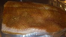
a) stilton
or
b) roquefort
a) curry
or
b) herbs de provence
a) quarter sawn oak
or
b) satin finish walnut
a)knot garden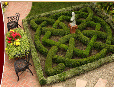
or
b) topiary garden
a)punting
or
b) bicycling
a)Gordon Ramsey
or
b)Jacques Pepin
a) Buckingham
or
b) Versailles
a)Catherine, as in Duchess
or
b) Catherine, as in Denueve
a) Gainsborough
or
b) Gaugin
a) Sissinghurst
or
b) Giverny
a)Bangers and mash
or
b) Cassoulet
a) Mario Buatta
or
b) Charles Faudree
a) Cotswolds
or
b) Provence
a) sherry
or
b) lillet
a) foxglove
or
b) sunflower
a) tea with lemon
or
b) café au lait
Finished?
Count your a’s and b’s.
( really, both #16 could be either French or English)
mostly A’s are Anglophiles
mostly B’s are Francophiles
Anglophile here, which are you?
But, I have to laugh when I see some of the
whacky things that a designer suggested and the owner actually implemented.
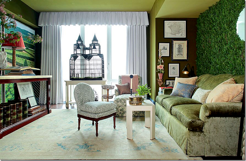
These greenery interior walls are just too much. Can you say maintenance nightmare?

Source: ainonline.com via Ellen on Pinterest
Source: tournesolsiteworks.com via Ellen on Pinteres
Source: blumohito.com via Ellen on Pinterest

Source: dezeen.com via Ellen on Pinterest

Source: blackeiffel.blogspot.com via Ellen on Pinterest
Well, I have done it.
I read an entire post on one of my favorite blogs, Cote De Texas.
And as I read it, I assumed I was reading about Bunny Williams.
Only the post was about Charlotte Moss.
Honestly, I have always confused the two.

Source

Source
Top pic, Charlotte Moss. Lower pic, Bunny Williams. (I think.)
When I read one of the reader comments on Cote de Texas blog, commenting that those two
have such similar design looks and books,
that they must be in competition,
I realized what I had done.
And to be honest, I really couldn’t see Bunny using a faux greenery accent wall in any of her projects.
With a porthole.
Twice.
It just didn’t jibe with my idea of Bunny’s design sensibilities.
Nothing against faux evergreenery, of course.
Nor faux portholes.
And, really, do you know anyone who has a better monogram for a bath towel than this? 😉

accent wall #1
accent wall #2
(above rooms decorated by Charlotte Moss)
I have heard them each speak at local lectures, and have several of Bunny’s books.
Why am I so confused as to which is which?
Am I the only one who gets these two mixed up in my head?

Rooms can have energy. By that I mean a sense of drama or punch. Some would say pop.
Can you feel it? Now, imagine the painting gone. See what I mean? There is the room’s energy.

Some of the quietest, lowest-key people I know have extremely vibrant rooms in their homes.
And, some of the most boisterous of my acquaintances have some of the most neutrally-decorated rooms.
With little memory of all those college-level psych courses I took, I can’t begin to tell you why that might be.
But I can help you infuse some energy…drama…pop….punch….into your existing space.
As a color designer, I respect the existing undertones of fixed elements which are not being changed.
And, I have tried to select examples with the same, where undertones are coordinating, or at least are non-clashing.
So, today, let’s look at some things that can rev-up a space if you want to give it more energy.


Traditional Entry design by Sroka Design, Inc.

Red, yellow, black and orange can be especially dramatic.
Do you see how this is otherwise an extremely neutral space? The eye goes STRAIGHT to the high visual energy in the large painting, below:


Source: st.houzz.com via Ellen on Pinterest
Next time, what to do when you want to quiet down a room….please stay tuned.


Mrs. Howard

When you are styling areas of your home, try using three of something.
It gives your eye a beginning, a middle, and an end.
Very visually satisfying. Sometimes much more so than a pair.
Have you used the rule of three in your home?
As smart a lady as Oprah Winfrey is, she made one of the classic mistakes in her own home.
She forgot to listen to the inner voice which says, “I want it to be pretty, but I also want to be comfortable here.”
She forgot that making your home a beautiful place to come home to, doesn’t mean that you have to sacrifice comfort.
She forgot that she is allowed to say ‘no’ when her decorator/architect/stylist suggests something that she doesn’t think is true to herself and the way she lives.
You can have it both: Beauty and comfort.
So she is redoing her entire Santa Barbara (Montecito) home.
Rose Tarlow got the commission for the work, and I will be waiting to see the new look!
We will talk about and establish your goals for a look and feel for your home.
And, that look and feel will reflect YOU.
And that is what is wrong with Oprah’s home.
It may be beautiful, but she readily admits that she can’t be herself in her own home.
It isn’t livable.
Her designer says, ” “One of the redo’s key goals is a living room that can actually be lived in.”
Oprah’s hilarious take: ‘It’s not easy to do an entire library that says, Do not touch the books. But somehow I managed.’
Here is Oprah’s Look but don’t touch Library:

Source: dailymail.co.uk via Ellen on Pinterest
Does your home beautifully and comfortably reflect YOU and the way YOU actually live?

Thank you, Dear Readers!
Have loved sharing my thoughts, ideas, and a few of my projects with you.
I can’t believe it has been one year since I started blogging.
I appreciate your readership and your support! Keep those comments coming! I truly enjoy hearing from you.
All the best,

