Just for fun

Green Bunny

Easter Eggs
Aren’t these the cutest eggs?
They are a treasured memory from my mother and father to my children, one or two every Easter.
The detail is adorable.

redhead

Purple Bunny


Why your design professional should have a blog
Because—
when you need a chandelier, your designer spots this
chinoiserie chandelier for a song in a local antique store:

And knows that world famous designer Barbara Barry has it in her client’s Beverly Hills breakfast room, guaranteed for a lot more than a song: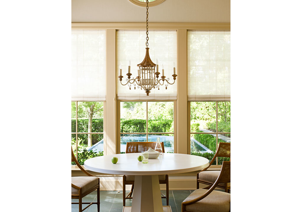
Blogging keeps us current.
Style Watch

via Horchow.com
I am really loving the cleaner lines of a full-drop bedspread.
With mattress depths all over the yardstick: 9 to 22 inches deep,
a ready-made option will rarely work, with standard drop
[measurement from the seam to the floor] about 28″.
A good design professional can guide you through fabric and tailoring options.
What do you think?
Theme Overdose
Sometimes, but not everytime, a theme needs MORE.
MORE of the same to get the right look.
A theme overdose, says fellow blogger Tara Dillard.

Maybe Tara will weigh in as to whether a bunny overdose actually works!
Those bunnies are either a huge hit or a giant miss. Not quite sure.
I know that the interiors work.
One of a kind sofa table

Unlike the above example, most sofas are not designed to be
interesting and beautiful in the back.
Sometimes, a sofa table is perfect for adding needed interest and beauty.
Function, too. Think storage, display, or a pair of lamps.
Check out this top, below. A beautifully carved French top, perfect width. Just sitting there waiting.
It hasn’t been there for long. It was once part of a larger piece.
And it won’t last. Nope, not this one. Not at this price.

The sconces on top aren’t part of the piece, in case you are wondering.
It is going to be perfect for someone with a home in the French taste.
I see it going on top of a simple but sturdy wrought iron stand.
Custom made, just enough height to raise it to the exact sofa-table height.
A tiny flip of iron at the foot. Just enough to say, “I honor your French heritage.
But, I won’t try to compete.”
Nothing more. Eyes only on the carving.

And, no pretense of trying to marry a modern leg, made to look old, on this old piece.
Perfect for a country French room, where the back of the sofa meets the eye.
So much more beautiful to hide a visible plain sofa’s back view when possible.
And much more beautiful when you do so with a one-of-a-kind piece,
with room for a lovely pair of lamps. And even some storage space in the three bays.
What do you think?

Marble Etching mystery Revealed!
Have you read, a million times, that marble will etch?
What exactly does that mean?
Having lived with a marble counter on my wet bar, I knew that there were some marks
that just would not come off. After eight years, there were a lot of those marks.
Mostly “rings” from a glass of juice or a perhaps a bottle of red wine.
A lemon slice placed on the counter. Or a splash of tomato juice.
I get it now.
That is etching.
Do you have marble counters?
THIS IS ETCHING:

badly etched marble
Does that look familiar? The above is not my etched counter. Mine was actually worse.
No amount of elbow grease is going to remove etching.
Etching is different from staining.
Marble that has been sealed is resistant to staining.
But, not etching. From my research, I will tell you that sealing marble can not prevent etching.
A chemical reaction has occurred to the marble and it can’t be changed.
A professional marble restoration company needs to be called in.
Look at my newly restored marble bar counter.
It was ground, re-honed and sealed. What a difference!


Perfect for Place
For those blessed with a second home at the shore
(or even a nice outbuilding such as a pool house)
you know what fun it is to mix it up a little bit.
And, anyway, it’s always fun to dream!

Source: housebeautiful.com via Ellen on Pinterest
By that, I mean, you do something perhaps a little kooky, a little off-beat,
a little more colorful than you might select for your main house.
Because, in the main house, kooky can turn weird, off-beat can hit a sour note,
and vibrant color can grow cold on you, if you are seeing it day in and day out, all the time.
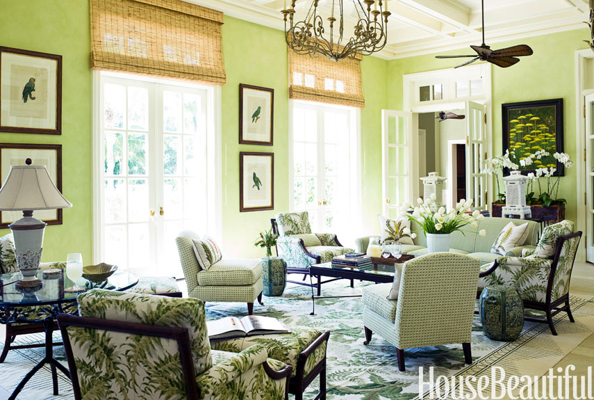
I first think of the gorgeous homes in Palm Beach.
Many of the seasonal residents live part of the year in much colder climes,
so they embrace the tropical lifestyle, for part of the year, in all its colored splendor.
And it works, beautifully:
source
They wouldn’t dream of having the same sort of decor in their Park Avenue Apartment, though.
Lovely though it is, it Just Wouldn’t Work.
What a treat it would be to open the front door of this little PB number
after a flight in from, say, snowy Boston:

Source: photoarchive.1stdibs.com via Noir on Pinterest
Do you see what I mean by mixing it up a bit?
These are not rooms that you would have in a Buckhead home or anywhere else,
really, besides where they are.
There is a PLACE element that makes them totally wonderful for the location.
Perfect for Place.
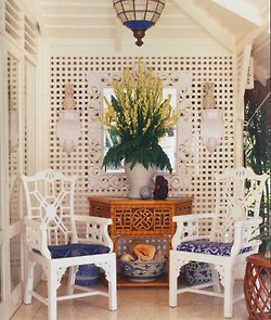
This is a time that selected elements of whimsy can hit a home run rather than fall flat.
It means looking for unique elements that reflect both your taste and the PLACE.
A FEW totally charming ‘location’ pieces. With A Sense of PLACE:
An off-beat driftwood hanging light, perfect for this Beaufort-area beach home.
It says beach without screaming it.

Driftwood mirrors in a fun shape, Moravian star pendant. Perfect.

Source: theenchantedhome.blogspot.com via Ellen on Pinterest
Ship lap on the walls adds the sense of place here:

Source: theenchantedhome.blogspot.com via Ellen on Pinterest
Check out the green ceiling. And that quirky tobacco basket on the wall. Fabulous coastal casual.

Well, why not? This Australian beach cottage, below, has a simply framed trio of swimsuits,
which clearly held sway for many a year on a beloved grandmother.
Eclectic Dining Room design by Brisbane Media And Blogs Beach Vintage
The fancier the house, the more it can take on a bit more:
via The Foo Dog Ate my Homework

via The Foo Dog Ate my Homework
via CarolyneRoehm.com

Hope you’ve enjoyed the little getaway! Do you have a favorite?

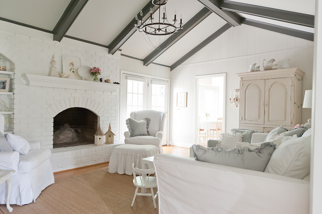
How to calm a busy family room
Now, what if you have TOO MUCH going on in the room, and want to quiet it down to something calmer like the below:
These are a few of my tips for calming a busy room:
1) Evaluate
I find that often people have lived with things so long, that they have completely tuned out something that is not working. A pair of fresh eyes can be invaluable in guiding your decisions.
2) PAINT
Here is where using the right neutrals can make all the difference.
Replacing a wall color or multiple wall colors (i.e. accent wall) with the “right” neutral can really calm down a space. What is the right neutral? The one with the correct undertone.
After True Color Expert training with Maria Killam, I can see an undertone clashing a mile away. Even if you don’t understand undertones, you will know, “for some reason, that is not really working.”
3) EDIT
This is to reduce visual clutter.
First place to start: personal framed photographs. Select a few that are particularly meaningful to keep out and display. Place the others in a beautiful archival leather photo album, and have it within reach on your family room coffee table. You will now be able to see ALL your photos.
4) PURGE
Ask a friend with a great eye, or engage a design professional for two hours on a one-time basis. ASK what is worth keeping and what should go? Which also might include storing dated pieces, perking them up with a coat of paint, giving them away, or repurposing them.
There is hardly a room in existence that doesn’t benefit from a bit of freshening at least every 5 to 7 years. And, if you have consistently selected trendy over traditional, be prepared for an even shorter shelf life.
5) DETAILS
This is just one example, and happens to be something on my mind for a project.
Crown moulding should “read” as one piece.
This is what you want, below, trimmed out in one paint color from top of crown to bottom.
Generally should be semi-gloss, though sometimes I spec high gloss:

And, this is what you don’t want:
Layers of moulding, broken by layer(s) of painted sheetrock:


![]()
If you don’t have crown, a good design professional or your architect can tell you what is appropriate for adding this feature to your house. It will really add the finishing interest and elegance to a room to have the right crown moulding, properly chosen and installed.
6) SOFA
Holding on to a lumpy sofa? Or a poorly made leather one?
Nothing dates a room faster.
Sofas need replacing or reupholstering about every six to eight years. Washable slipcovers can extend this.
If your family room sofa has been in its current state for 10 years (or more), it’s probably time.
6) Scale
Is your furniture the right scale for the space? Or, are you crowding every thing you own into a space, just because you have it?
7) Brickwork
Brickwork can be very tricky because it can date a room very quickly.
I know that many people (men) are hesitant to paint
brick.
Especially around a fireplace,
soot can and will darken the paint.
This is usually easily wiped off, but you can always touch-up
paint again when/if it gets really noticeable.
Take a look at fellow Color Expert Kristie Barnett of Nashville’s amazing before and after.
You can click to supersize the before shot (if you dare):

before and after photos: courtesy Kristie Barnett, TheDecorologist.com
AND THE AMAZING AFTER PICTURE IS WORTH A 1000 WORDS:
8) FOCAL POINT
Establish ONE main focal point in the room, with subsidiary focal points appropriate to the space. (Professional guidance can get you there. This is what we are trained to do.)
9) Take it easy on the pattern
To look “today” instead of “yesterday,” it is important to know how to lighten up a space weighed down by TOO MUCH pattern. Slipcovers can be a beautiful, cost-effective way to lighten the look without emptying the wallet.
10) FLOW
Is the traffic pattern working? A bad traffic pattern can “build up” over the years. Again, you may have lived with something so long that you don’t realize something is not working.
A pair of FRESH EYES can help you see things the way guests see them when they enter your home.
If you need help in calming down a busy family room, it is probably a good idea to seek professional advice.
This is always money well-spent to keep you from making the same mistakes again.

Anglophile or Francophile?
Do you want to take a fun little test?

Do your design sensibilities lean toward France or toward England?

So, are you a Francophile or an Anglophile?
Answer a) or b) to the following short preference questions.
You can click on any image to supersize it.
Do you prefer:
1. In furniture
a) Chippendale
or

b) Roccoco
2. China
a)transferware
or

b) Sèvres
3. Pups
a) Retriever
or

b) Shepherd
4. Furniture style
a)Barley twist leg
or
b) straight and narrow with fluting
5. Afternoon snack
a)Scone
or
b)Macaron
6. Sporting
a) fox hunt
or
b) Stag hunt
7. Sweets
a)trifle
or
b) truffle

8. Literature Classic
a) William Shakespeare
or
b) Victor Hugo
9. Headwear
a) fascinator
or
b) chapeaux
10. Spy
a)James Bond
or
b) Inspector Clouseau
11. Decorative arts
a) family portrait
or
b) family crest
12. Appetizer
a) smoked salmon
or
b) smoked trout
13. Cheese tray
a) stilton
or
b) roquefort
14. Spice
a) curry
or
b) herbs de provence
15. Wood panels
a) quarter sawn oak
or
b) satin finish walnut
16. Gardening
a)knot garden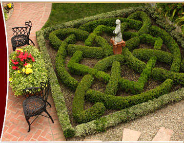
or
b) topiary garden
17. sporting activity
a)punting
or
b) bicycling
18. chef
a)Gordon Ramsey
or
b)Jacques Pepin
19. Palace
a) Buckingham
or
b) Versailles
20. Beauty
a)Catherine, as in Duchess
or
b) Catherine, as in Denueve
21. Artist
a) Gainsborough
or
b) Gaugin
22. Gardens
a) Sissinghurst
or
b) Giverny
23.Comfort food
a)Bangers and mash
or
b) Cassoulet
24. Decorator
a) Mario Buatta
or
b) Charles Faudree
25. Travel
a) Cotswolds
or
b) Provence
26. apéritif
a) sherry
or
b) lillet
27. Flower
a) foxglove
or
b) sunflower
28. Morning caffeine 🙂
a) tea with lemon
or
b) café au lait
Finished?
Count your a’s and b’s.
( really, both #16 could be either French or English)
mostly A’s are Anglophiles
mostly B’s are Francophiles
Anglophile here, which are you?
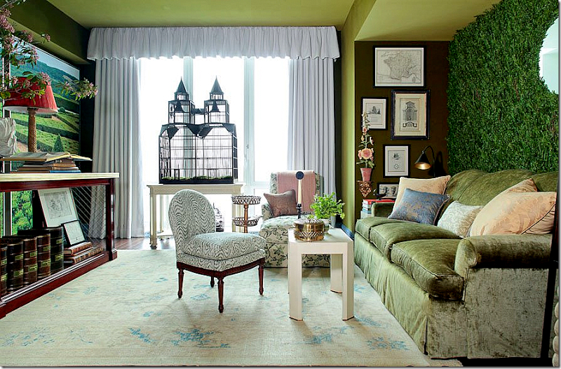
Bringing the outside in?
But, I have to laugh when I see some of the
whacky things that a designer suggested and the owner actually implemented.
These greenery interior walls are just too much. Can you say maintenance nightmare?

Source: ainonline.com via Ellen on Pinterest
Source: tournesolsiteworks.com via Ellen on Pinteres
Source: blumohito.com via Ellen on Pinterest

Source: dezeen.com via Ellen on Pinterest

Source: blackeiffel.blogspot.com via Ellen on Pinterest
This is a trend that makes a novel one-time photo opportunity for an edgy magazine.
Don’t fall for this one.
Does anyone else confuse Charlotte Moss and Bunny Williams?
Well, I have done it.
I read an entire post on one of my favorite blogs, Cote De Texas.
And as I read it, I assumed I was reading about Bunny Williams.
Only the post was about Charlotte Moss.
Honestly, I have always confused the two.

Source

Source
Top pic, Charlotte Moss. Lower pic, Bunny Williams. (I think.)
When I read one of the reader comments on Cote de Texas blog, commenting that those two
have such similar design looks and books,
that they must be in competition,
I realized what I had done.
And to be honest, I really couldn’t see Bunny using a faux greenery accent wall in any of her projects.
With a porthole.
Twice.
It just didn’t jibe with my idea of Bunny’s design sensibilities.
Nothing against faux evergreenery, of course.
Nor faux portholes.
And, really, do you know anyone who has a better monogram for a bath towel than this? 😉

accent wall #1
accent wall #2
(above rooms decorated by Charlotte Moss)
I have heard them each speak at local lectures, and have several of Bunny’s books.
Why am I so confused as to which is which?
Am I the only one who gets these two mixed up in my head?
What is the Energy Level of your Room?
Rooms can have energy. By that I mean a sense of drama or punch. Some would say pop.
Can you feel it? Now, imagine the painting gone. See what I mean? There is the room’s energy.

Some of the quietest, lowest-key people I know have extremely vibrant rooms in their homes.
And, some of the most boisterous of my acquaintances have some of the most neutrally-decorated rooms.
With little memory of all those college-level psych courses I took, I can’t begin to tell you why that might be.
But I can help you infuse some energy…drama…pop….punch….into your existing space.
As a color designer, I respect the existing undertones of fixed elements which are not being changed.
And, I have tried to select examples with the same, where undertones are coordinating, or at least are non-clashing.
So, today, let’s look at some things that can rev-up a space if you want to give it more energy.
A dramatic focal point.


Traditional Entry design by Sroka Design, Inc.
Color.

Red, yellow, black and orange can be especially dramatic.
Do you see how this is otherwise an extremely neutral space? The eye goes STRAIGHT to the high visual energy in the large painting, below:

Something graphic.


And, even something as simple as vibrant toss pillows, one of the easiest ways to punch up an existing room:

Source: st.houzz.com via Ellen on Pinterest
Do you have a place somewhere in your home for a little extra energy?
Next time, what to do when you want to quiet down a room….please stay tuned.
The rule of three


Mrs. Howard

When you are styling areas of your home, try using three of something.
It gives your eye a beginning, a middle, and an end.
Very visually satisfying. Sometimes much more so than a pair.
Have you used the rule of three in your home?
Oprah Winfrey just said no to the Look-but-don’t-touch-Look
As smart a lady as Oprah Winfrey is, she made one of the classic mistakes in her own home.
She forgot to listen to the inner voice which says, “I want it to be pretty, but I also want to be comfortable here.”
She forgot that making your home a beautiful place to come home to, doesn’t mean that you have to sacrifice comfort.
She forgot that she is allowed to say ‘no’ when her decorator/architect/stylist suggests something that she doesn’t think is true to herself and the way she lives.
You can have it both: Beauty and comfort.
So she is redoing her entire Santa Barbara (Montecito) home.
Rose Tarlow got the commission for the work, and I will be waiting to see the new look!
We will talk about and establish your goals for a look and feel for your home.
And, that look and feel will reflect YOU.
And that is what is wrong with Oprah’s home.
It may be beautiful, but she readily admits that she can’t be herself in her own home.
It isn’t livable.
Her designer says, ” “One of the redo’s key goals is a living room that can actually be lived in.”
Oprah’s hilarious take: ‘It’s not easy to do an entire library that says, Do not touch the books. But somehow I managed.’
Here is Oprah’s Look but don’t touch Library:

Source: dailymail.co.uk via Ellen on Pinterest
Does your home beautifully and comfortably reflect YOU and the way YOU actually live?
My First Blog Anniversary!

Thank you, Dear Readers!
Have loved sharing my thoughts, ideas, and a few of my projects with you.
I can’t believe it has been one year since I started blogging.
I appreciate your readership and your support! Keep those comments coming! I truly enjoy hearing from you.
All the best,
Sneak peek: Pardon our progress…


wallpaper gone
People, let me tell you, this is huge! The first step is always the hardest.
But, I am in motion. My wonderful wallpaper man is busy finishing stripping the existing paper as I type this.
Just look!
The rusty green wallpaper is au revoir!
Adios!
Goodbye!
I am so uplifted just walking in and looking at the bare SheetRock.
In all my color installations/demolitions, I have never seen a wallpaper absorb the light out of a room like
ol’ Rusty Green.
It is amazing, the difference.
Furthermore, my husband hates changing anything in our house. He loves everything to stay the same.
Bless his heart, he agreed to put up with the disruption entailed by this project.
So I will say again, this is huge!
Remember, this is just the bare SheetRock, not the new paint color. Obviously, still a work site!
making progress!
above, BEFORE (Ol’ Rusty Green)

I know you probably don’t want to see contractor bags, you come here to look at the pretty pictures.
This is real life, though. And, it will look nice in no time.
It is a very cloudy gray day, but you’d never know it by what is going on in my house today.
I can’t wait to get my crew over from Atlanta to work on the travertine. It must be cleaned, re-honed and re-grouted, then we’ll be ready for the new paint.
Can you notice that the pink undertone in the travertine is looking much less pink, now that Rusty Green is gone? Compare the before with the ‘during’:

Cleaned up a bit to show you the difference:
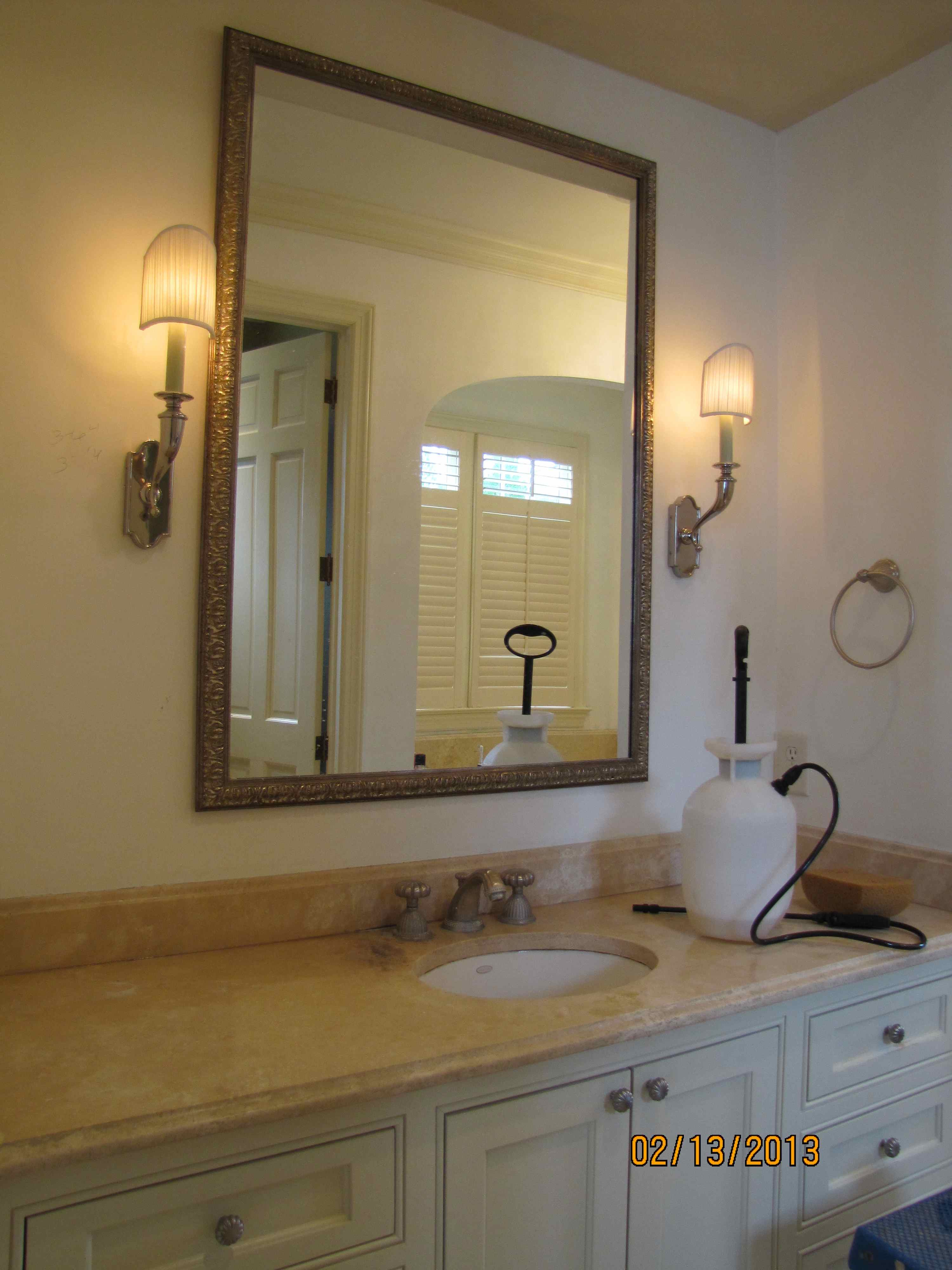
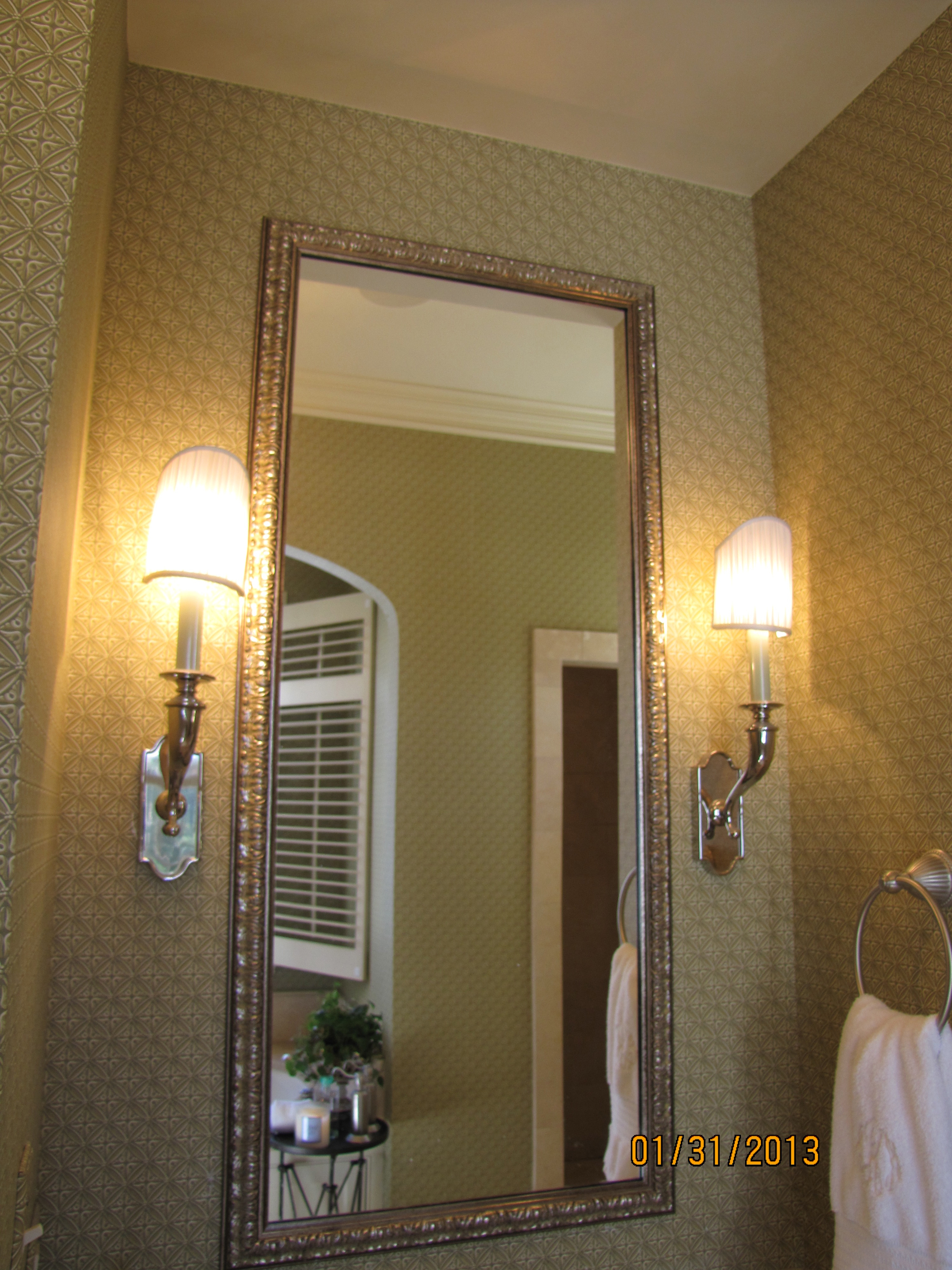
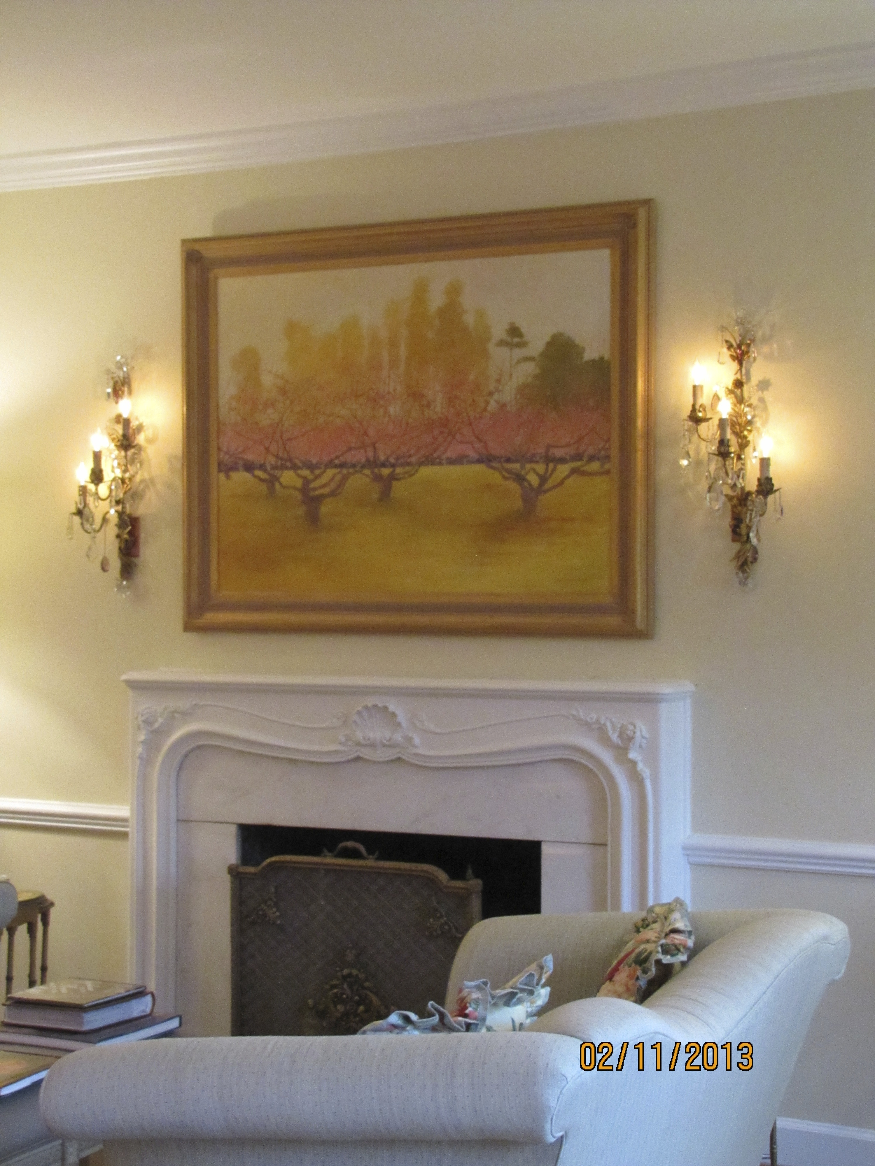
Jewelry for your Wall
Nothing dresses up a wall like a beautiful painting flanked by a pair of sconces.
The branches of the sconce repeat the branches of the trees in the painting.
The pair of sconces frame the painting, and give the painting more importance.

photo by Ellen Rhett
Here is the before:

before
This lady’s electrician told her it couldn’t be done.
No way.
My electrical man says he always likes a challenge.
I have given him many, and he has always made it happen.
What a difference!
sconces
Identical Layout!

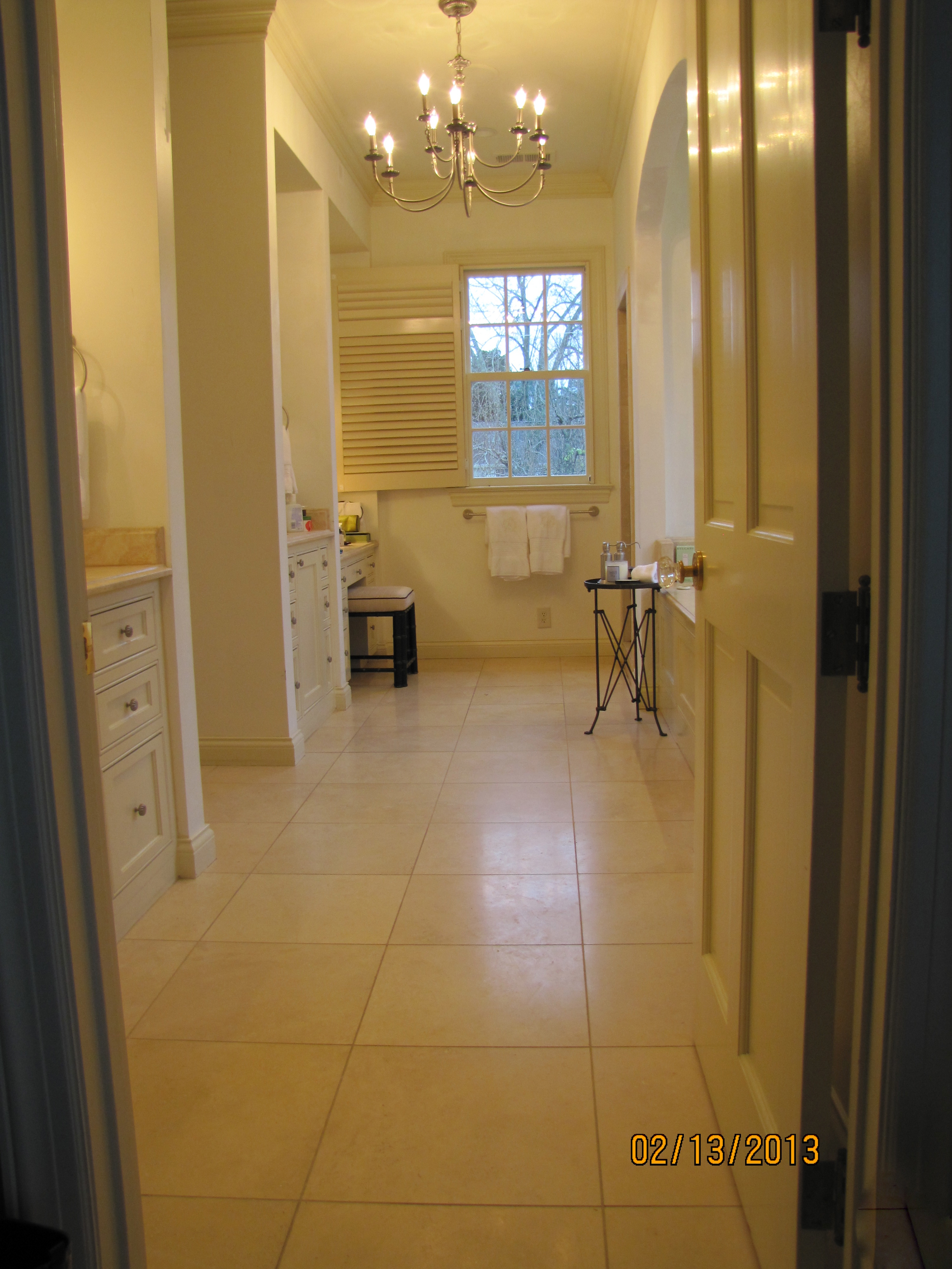
I almost fell out of my chair when I saw this bath.
And, not because of the textures, finishes, or colors used.
It is because the layout is EXACTLY. LIKE. MINE.
I mean, identical. Same placement of tub, shower, his sink, her sink and vanity. Same window.
Same opening to the closet area.
I have never seen this exact layout ever before in a photo.
Here is mine. I have wing walls instead of completely open cabinetry or a full-glass shower enclosure.
It hides everyday toiletries better. It hides the workings of the shower.
You know the family above keeps soap on the counter. And shampoo bottles in the shower.
So do I, you just can’t see it.

master bath
even the sconces are similar
And, yes, this is the same bath
from which I am removing all the existing wallpaper.
I can hardly wait!
Then, it is going to be painted Shaker Beige, see the dollop.

Source: benjaminmoore.com via Laura on Pinterest
Cabinets will be Ivory White.
Soon.
Goodbye rusty green wallpaper!
Simple Perfection

Source: designcrushblog.com via Ellen on Pinterest

Source: prettystuff.tumblr.com via Ellen on Pinterest

Source: bymildred.blogspot.com via Maria on Pinterest

Source: prettystuff.tumblr.com via Ellen on Pinterest

Source: prettystuff.tumblr.com via Ellen on Pinterest
Are you CHASING the color or CHOOSING the color?

YES, we’ve been there.
The contractor is breathing down our neck, he needs the colors picked out.
He needs them ALL, two weeks from today!
As we’ve talked about before, paint color should be the last thing that is chosen.
It should be the thing that pulls everything else in the room together.
But, sometimes that is not possible.
What are some good neutrals to use?
Where should there be an actual color?

Source: benjaminmoore.com via Ellen on Pinterest
How should it all tie together so the home has color flow?
This is when you really, really need to call in a certified color consultant.
We know how some of the prettiest neutrals can “go pink” on some walls.
We know which neutral colors turn “apartment beige” in which rooms.
We know how to pick out/rule out the tile for your bath and the counter for your kitchen.
We are trained in color flow throughout the house.
We know where to insist on oil-based paint, and where not ever to use high-gloss.
Many consultants are happy to schedule a couple of hours, one-time.
Not saying all of the above can be accomplished in two hours, but you’d be amazed what can.
Benjamin Moore Sandy Brown

I don’t work with those tiny chips you find at the paint store.
I work with large painted samples on boards.
There is now a big difference in this young man’s bedroom.
Above, the new paint color, Sandy Brown. A rich caramel beige.
Lots of depth and warmth, perfect for a cozy bedroom,
and gorgeous against the existing caramel color draperies.
Before, the color was Linen White.
With my large samples, we were easily able to narrow the color selection,
based on the undertones in the existing soft furnishings, to the clear winner.
Sandy Brown.
(If you want richness, depth, and warmth in a bedroom, Linen White is not your color.)

Source: housebeautiful.com via Ellen on Pinterest
Linen White

Source: pinterest.com via Ellen on Pinterest
Sandy Brown
Wild about animal prints
Animal prints glam up a room better than almost anything.

There are a couple of tricks, though.
First, is to use only in moderation.
ONCE is enough. This is an accent, not the main attraction.
Second, make sure you repeat the color of the animal print somewhere else in the room.
The key is not to overdose so that it kills the look.
You can overdose some themes, and succeed. But, animal prints are not for overdosing.
The exception is when you use an animal print carpet. It will be the main attraction:

Source: morewejadore.com via Maria on Pinterest

Source: Uploaded by user via Wilma on Pinterest

Source: houzz.com via Emily on Pinterest
And please save leopard print walls for Snooki 😉
It takes a practiced hand to repeat the colors without overdosing the accent fabric.
Take a look at some gorgeous examples.

Source: col109.mail.live.com via
Below, the gold and the black of the leopard ottoman are repeated in the portrait.

Source: alovelybeing.com via Gloria on Pinterest


Memphis/Palm Beach decorator William Eubanks takes it to the max, but he always follows the rule of one:

William Eubanks again:

And I will let you see for yourself what happens
when you break the “rule of one”:


Or the colors in the animal print are not
repeated properly or at all:


Is there a place for an accent animal print in your home?
It can be done very tastefully.
Just remember to use as an accent.
And repeat the colors in the animal print elsewhere in the room.
Bride on the Brain

With two of my nieces soon marrying within a few weeks of each other,
you could say I have weddings on my brain.
So, although I am not involved with the planning of either wedding,
I find myself going to favorite wedding inspiration sites such as StyleMePretty.com,
and pouring through bridal magazines when I see them in the beauty salon.
And, when I ran across this stunning image of a ‘real’ bride, above,
I have to admit I became obsessed with the individuality and personality
that are shining through this perfect stranger.
I am a traditionalist, so I know some of you will think there should not be
any color used for a bridal ensemble, but have you ever?
I mean, when was the last time you saw anything more captivating than this?
See other wedding photos of the gorgeous bride and read more about the headpiece and earrings, here.
