Residential Color and Style from a Certified True Color Expert.

Latest

Pt.2 The eye craves balance

The previous post was about symmetry, mirror image symmetry. Let’s look at  “asymmetrical balance” today.

Asymmetrical balance is not the same as mirror image symmetry. Asymmetrical balance, another decorating technique, relies on similar visual weight.  

In design, it is also very pleasing to the eye to have a focal point flanked with two sides of equal weight, but not necessarily identical (mirror image) sides.

See how — though not identical — both sides of the room have approximately equivalent visual weight?

Below:
This is a combination of mirror image symmetry plus asymmetrical balance. Can you find the elements of each?

Asymmetrical Balance: note the central focal point  (which is the fireplace) serves to anchor the other elements on left and right.

For people who love to color outside the lines, asymmetrical balance can give them a bit looser structure, and still be very visually pleasing.

Which do you prefer, mirror image symmetry; asymmetrical balance; or a combination of each?

The eye craves balance

Source: myhomeideas.com via Kay on Pinterest

The eye craves balance.

Do you believe me? Have you ever walked into someone’s house and a painting or mirror is hanging askew?

Does it drive you a bit crazy? Don’t you find yourself wanting to straighten it?

Now, it does not always happen in your own house (this is because your brain will tune out the things that you are seeing regularly.)

The same thing happens with symmetry. Quick, off the top of your head, do you have a favorite room in your house, or a room that you really, really love as your dream room that you saw in a magazine?

Check it out. I will bet you dollars to doughnuts that the room is highly symmetrical or balanced.

Rooms that are symmetrical are more pleasing to the eye. They create visual harmony and balance. This is an age-old decorating principle.  

Today we’ll look at rooms with “mirror image” symmetry.  Come along!

Design by Ellen Rhett of Color Calling

Source: houseofturquoise.com via Frances on Pinterest

So, symmetry for the furniture placement is a decorating form that is pleasing to the eye.

“Mirror-image” symmetry is what we see in the bedroom above. Other than the focal point bed+ starburst mirror, there are two of

everything, matching.

Even the nosegays on the bedsides are identical.

The same design principle is true when the decorating is done around a focal point fireplace, or any other focal point.

Source: houzz.com via Kathy on Pinterest

Source: indulgy.com via Kristen on Pinterest

Source:

Source: southernpiphi.tumblr.com via Jean on Pinterest


Does your eye crave balance? Are there any places you could add visual harmony with symmetry?

Designing a Tasteful Home Movie Room

Yes, it is possible to have a tasteful home movie room. What are some decorator secrets for an attractive dedicated home movie room?

Eclectic Media Room design by Minneapolis Interior Designer Mingle

#1 Don’t call it a Home Theater

This verbiage has less-than-tasteful connotations, I am going to call it like I see it.

Home Theater draws an image of a soldier-row of lumpy leather recliners with built-in cup holders. 

What about calling it your movie room? It sounds so much more attractive already!

#2 Function First

A good Audio Video specialist can help you decide what type of equipment fits your demands and your budget.

If possible, have your room pre-wired for the type of equipment before your walls are installed.

I personally like a front-projection system in a dedicated (completely light-controlled) movie room, see the little projector mounted on the ceiling below?  Visit a good A/V demonstration room to see what you like and what fits your parameters.

#3 Know your optimal viewing distance

Ask your A/V specialist what the optimal viewing distance is for the system you have selected. Obviously, the larger the screen, the further away the optimal viewing distance. This is where your main sofa should be placed.  

Make sure your screen is placed at optimal viewing height as well (above a fireplace is usually NOT optimal height if you wish to avoid neck strain.) You can see how comfortable viewing would be from the main sofa here, below:

This is not the time to go it alone. Get an experienced designer involved before your  installation is purchased.

If you are on a budget, you can not afford to make a mistake.

Working together, your designer can suggest a floor plan and soft furnishings that will enhance the use and beauty of your movie room, so that it will be one of your favorite rooms in your house.

#4 Pad and cover your walls with fabric for optimal sound.

This is a job for an experienced professional.  

Don’t forget extra sound-proofing between floors.

#5 Carpet is a must for any good audio system to sound its best.

#6 Use operable (hand-drawn) draperies with full black-out lining for complete light control.

#7 Good-looking case goods/built in cabinetry for housing components.

#8 Comfortable furniture and a soft place to prop your feet

Think a full-sized sofa, some lounge chairs, and ottomans.

No hard-surface coffee tables, which are uncomfortable for foot-propping, and will improperly reflect sound waves. 

A better look is to have your dedicated movie room look more like a regular family room, tailored around the movie screen.

#9 No extraneous appliances or auxiliary activities

As tempting as this may be, don’t put anything else such as pool table, ping-pong or appliances in the same room. If possible use an adjoining area nearby.

Ice machines, even the most expensive, make distracting noise and should never be placed in the movie room.

Find a place in a nearby area to install the wet bar, ice machine, a small fridge, etc.

It might sound like a fun idea at the time, but a ping-pong table or pool-playing are not really compatible activities with movie-viewing, and as such really don’t  belong in a dedicated movie room.

#10 Dimmers on all lights in a movie room.

Make sure that you can easily and quickly access them when entering and exiting, because a dedicated movie room is dark without natural light. This is an overlooked tip that will enhance your enjoyment of the room.

Source: homedepot.com via Dani on Pinterest

Do you have a movie room, or would you want one? What are the important elements for you in a room like this? 

How do you determine exterior light size?

We all know curb appeal is important. When I do exterior color consultations, I always look at the big picture.

Many times, I will recommend that my homeowner consider upgrading the main doorway light fixture(s).  

Think about it, your home is being most often viewed from street distance.  Make sure your light fixture is proper size.

A good rule of thumb is that your exterior light should be 1/4 the measurement of the height of your door.  
So, if your front door measures 8 feet in height,  you need to look at light fixtures around 2 feet high (8 divided by 4), or around 24″.  
Don’t try to judge the correct size on your own.  You will invariably undersize the light!

Now that your eye has been shown a good proportion, take a look at the following lighting scheme:

Don’t you prefer the 4:1 ratio of door to light? Doesn’t the above lighting scheme look dinky now that I am pointing this out?

The house below is a tad busy, but the main front door lighting has nice proportions. By the way, better to be a bit big than too little:

What about this one?

If you said too small, I agree. (I am not loving the huge sidelight to the right of the door, which would be the correct place to  have a light).

What about this?

Did this visual exercise help you determine the correct size for your lighting? Does your own exterior lighting have enough presence?

Do you agree with my proper proportions guideline?

Use These Six S’s to Jazz up your Bedroom

#1  The Show-Stopper

The bed.

First, I assess the actual placement of the bed. If possible, the bed should be the first thing you see when you come into

the bedroom. It should be the focal point. It should provide the visual wow factor. This is always an investment.

Bed Design by Ellen Rhett, Image ©Color Calling

#2 SYMMETRY

Use pairings to create symmetry, which keeps the eye rested. Then add a few unusual pieces and accessories to keep the eye interested!

I like to create symmetry by using matching lamps on the tables to each side of the bed.

I sometimes specify matching bedside tables, but we want to avoid the dark, dated “bedroom suite” look.

It is important that the matching lamps are on the same plane, in other words, that one is not higher than the other.

This can be easily accomplished by resting the lamp base on a coffee table book or a decorative box, below.

Think a pair of smallish upholstered lounge chairs, with at least one ottoman if there is space, for further symmetry.

Source: thefoodogatemyhomework.tumblr.com via Jennifer on Pinterest

Another tip: Never, never, never place a leather chair in a traditional master bedroom.

It is not the right element and will look cheesy, unless it it done like this, in a darker bedroom with a clearly funky/masculine vibe:

#3 SCALE

Don’t overload your wall space with furniture. This is the room that should be your sanctuary from your busy life.

It will be a much more restful place without huge pieces of hulking furniture.

If possible, use closet shelving for storage rather than big chests-of-drawers. If you must use large furniture, consider lighter colors to keep

from overwhelming the space.

Resist the urge to put a television in your master. Remember, you are creating a space apart from the real world!

#4 STYLE

Scour decorating magazines and find your style. A good design person can help you bring your vision to life. She can also help you decide which of your existing pieces of art or furniture can be used again, and where to allocate your budget for maximum impact.

#5 SOFTEN

Soften hard edges. Place a bench at the end of the bed. Think of ways to add soft furnishings to the bedroom.

Use a gorgeous vintage chandelier, and put the switch on a dimmer for soft, romantic lighting.

Design by Ellen Rhett, Image ©Color Calling

Add a cashmere or other luxury throw somewhere in the room. Add a chaise and then use it for reading / napping!

#6 SAVOR

Invest in the finest mattress and sheets you can afford.

I love Tempurpedic and would recommend it to anyone. (full disclosure: I am not getting anything for saying that, I truly believe in the product).

I love luxury linens and I make sure they are ironed each week.  Nothing is more heavenly!

Enjoy your retreat from the outside world. Make it beautiful and make it your own. You can’t afford to make mistakes, so invest in professional advice to

stay on track!

These are my “S” tips for creating a master bedroom that you will love. What do you think? Is this advice you can live with?

Summer Entertaining with a complementary color scheme

Source: google.com via Ellen

I use my love of color and color combinations when I entertain. Blue/

Orange are complementary (opposite) colors on an artist’s color wheel.

Here is a sampling of a classic casual look which captures those late-

summer colors. Below, a simple but delicious lobster dinner was

served for a family birthday.

Notice the play of the colors in the “Nantucket Red” placemats and

the bright saffron embroidered-lobster napkins, with the complement

of the blue accessories and the blue and cream stripes on the chairs.

ImageImage ©Color Calling

Image ©Color Calling

When using the color scheme of blue and orange in decorating, these

complementary colors actually intensify one another visually.

I find true blue/true orange combinations too jolting or too juvenile for

home decór, when you live with them on a daily basis. (The muted versions

of the two colors can be very pleasing, however.)

Most complementary color combos work well in a table setting, though,

because table decór is all about stimulating the senses.

Nothing says summer like blue and white

This is Benjamin Moore Maritime White

My Top Ten Rules for Gorgeous Powder Rooms

I love to decorate Powder Rooms.  Here are my Top Ten rules for a beautiful powder room:

#1

DECIDE WHAT IS MOST IMPORTANT

Select the design element that you want to have stand out. Then low-key most of the other elements so that the end result is pleasing.

So, if you are using a killer tile, scale back on the other accents, and don’t go with a too-busy-anything-else.

If you have a mirror that is extremely decorative, don’t kill it with everything else being extremely decorative.

If you like wallpaper, this is the place for that wonderful statement wallpaper. High-end designer wallpaper that would be too-too much in a regular sized room can be perfect in a powder room.

Decide what is going to become  your most important design element, so you don’t get carried away with too many other  decorative finishes.

A good residential stylist can keep you on track if you are prone to going over the top.

ABOVE, both photos:  This gorgeous chinoiserie wallpaper is the most dramatic element in each of the above powder rooms, with proper restraint used everywhere else. 

#2

Don’t mix your metals/finishes in a Powder Room.

Try to keep the same finishes in the tiny space for a more harmonious look, below.

ABOVE: The color white is repeated several times. The nickel hardware is repeated several times. The airy mirror almost goes away and lets other elements take center stage.

BELOW: The Pewter color is repeated even in the wallpaper, and the all-pewter gives the powder room a harmonious look.

#3

Don’t use dinky mirrors

ABOVE: Even a very tall person can see his reflection in this nicely-sized mirror.

#4

Use sconces in addition to overhead lighting.

Over-mirror lighting can throw odd shadows and is to be avoided.

#5

VESSEL SINKS WILL BECOME  DATED

If you must use a vessel sink, be sure that it has enough depth to minimize

splashing.  However, I try to avoid them altogether.

#6

Use Chinoiserie for Color and Drama

#7

Keep your undertones similar.

ABOVE: The gray undertones of the marble work stunningly with the swoop of gray in the wallpaper. The green
accents pick up the main color of the wallpaper. Just enough drama without going over the top.

BELOW:  Undertone Perfection.

#8

Use antique, repurposed, or vintage pieces if doing a furniture-look built-in.

Otherwise, use nice built-in cabinetry. A brand-new piece of furniture for your sink almost never works .

#9

Use creamy whites with brown, and whiter whites with black.

#10

Quality over quantity. Don’t over-accessorize, and do use the nicest soaps and linens you can possibly afford.

What do you think? Do you agree with my Ten Rules for Beautiful Powder Rooms?

Why are dining rooms so difficult to decorate?

Everyone in the design business knows this: dining rooms are notoriously difficult to decorate.  

Have you ever wondered why?  

Here are some thoughts, and some suggestions for avoiding some common pitfalls.

Dining rooms have very little in the way of upholstery to soften all the wood in the room.  

I find that draperies are a must in a dining area, both for acoustical reasons as well as to visually soften the hard surfaces of sideboard and table.

No other room in the house has so many horizontally-planed wooden surfaces, think about it.

Even a wood-paneled study has vertically-planed wood, which for some reason, seems much different than the horizontal planes of the dining room wood.

And a study is filled with soft furnishings (like a sofa.)

Make sure that your dining room has a proper focal point. Below, it is simply the graphic black mutton and mullion

elements of the windows.  The chandelier is so airy it almost goes away.

Perfectly scaled chandelier as a focal point, and also notice the repetition of the curves in the wallpaper scene. Masterful.

Source: savearecipe.blogspot.ca via Shannon on Pinterest

TWO CHANDELIERS OR ONE?

I usually prefer one, the two below keep the room from having its proper focal point, and are too delicate for the space.

Have you noticed many more rooms in magazines and blogs are showing two full-sized chandeliers? (This is just a trend, so it is going to look dated in a few years).  

WATCH OUT FOR  MATCHY MATCHY

What about a different pair at the host and hostess place to break up a matched set?

If art is the focal point, make it as large and dramatic as possible, here:Source: houzz.com via Julie on Pinterest

And here, for a very modern treatment, P.S. Dear Owner, please drop the painting 30-36″ and it will be visually correct. It is hung entirely too high.

A few common pitfalls:

  • Make sure that your rug fits the space.

It is better–far better– to have a bare floor than to have a too-skimpy rug. A residential style expert or even a friend

with a good eye can help you decide the proper size for your space.

  • Beware of banquette seating. It is one trend that looks great in photographs, but can be extremely impractical.

See my post here

  • Consider a round table if you have a square or square-ish dining room:

How to use repetition in your entry hall

We’ll look today at interior entries and foyers, and the importance of repeating shapes, colors and motifs for unifying the space.

So, let’s look at what works with interior entries/foyers, from grand to humble. And for clarity, I’ll mention a few things that in my opinion don’t work.

ABOVE: We have a nod to the water with the vintage photograph of an outrigger. I would guess that with the millwork and dark floors and hydrangeas, that this home in in the Hamptons.  Why does this work so well?  From a color perspective, it is the repetition of the color black. Two pieces of substantial ebonized furniture, black floor, black melon stools, black iron strapping and chain on the bell jar light, black handrail on the stairs, black and white photo, etc.  Beautifully done.
ABOVE, another example of repetition of the color black, not as pleasing as the first one above, in my opinion.  The heavy iron scroll-work of the stair is too lyrical for the graphic geometric black and yellow-white flooring.  The copper sconce lighting flanking the door into the parlor is completely ill-placed, and competes/clashes with the brass finish of the stair rail and the gilding of the accent chair. The lonely chair doesn’t take up enough visual space in the area. It doesn’t make sense there. Repeating the geometric shapes  of the picture wall and flooring on the iron work would definitely help unify this space.
Above, the overall look is stylistically right. Very nice look. Great proportions and geometric repetition. If I had to find fault here, I would say that the paint shouldn’t be all high-gloss. I find all that glossiness a bit distracting.  The Oriental rug is a warm and inviting counterpoint.
What do you think of this one, below? I happen to think it works nicely. I love the repetition of movement and curvy lines in the rug, painting, and platter, also repeated in the table joinery and chairs. Gorgeous warm wall color with the wood, possibly Benjamin Moore HC-36, Hepplewhite Ivory, repeated in the rug and in the painting.

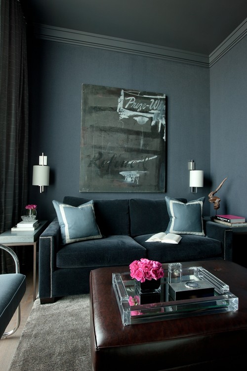
ALL YOU DÉCOR BUFFS WHO LOVE GRAY RIGHT NOW, DOES THIS, below, DO IT FOR YOU?

 I personally find the coloration more than a little lifeless, but I do like the dark sculpture of the woman against the left wall. I think the sculpture is stunning. The overall balance of light and dark in the space is amazingly well-done. But, gray MUST have a color to bring it to life. That is what is lacking here.

SIMPLE AND BEAUTIFUL, above. A great example of  good design that probably didn’t cost a fortune.  What is repeated here?

WATER REFERENCE:  See the subtle reference to the ocean in the coral print pillows and the jaunty black and white photograph? Both repeating the reference to the water. Just enough.

VERTICAL LINES: The slats on the settee repeat the vertical lines of the tongue in groove panels and the vertical border of the rug. Also, the center pillow has a strong vertical motif.

BALL/CIRCLE MOTIF: The circles on the two end settee pillows repeat the balls of the little sconce. Are you seeing that when things are repeated, they are more pleasing to the eye?

COLOR HARMONY:  The pale blue wall is perfect with the pinky-beige paver tiles. No clashing undertones in this humble but lovely space.

Above, BRITISH COLONIAL-INSPIRED PERFECTION. Stunning. I love every single rich detail. The dark brown mahogany color is repeated four times, five including the iron lantern. The Starburst motif in the glass transom repeats the shape of the palm tree just outside, and references the shape of the lantern top as well. My favorite of all these!

NOW, I’ll BREAK DOWN THIS “HIT AND MISS”, below:

THE MILLWORK IS NICE, AND THE PAINTING MAKES A BEAUTIFUL STATEMENT ON THE LANDING. THE HANDRAIL IS PERFECT.

However, they should have repeated the black, on the door. The ash finish of the wood door is off, it needs to be black.The countrified rust and beige check coloration on the relaxed-Roman shade comes out of nowhere, do you agree? I think a cozy ebonized settee with a soft cushion covered in a rich emerald green (cue color from the oil painting) would be much prettier and more welcoming than the oddly place round table, and would have kept your eye away from the A/C return vent.  And, if I were styling this entry, I would certainly add a rug. Additionally, I find the flooring a tad busy since it is stained a different way than the stair. P.S. I hate rounded door hinges. See prior post on Does your Million Dollar Home have $2 hinges?.

I would paint out the return vent, above (see how it is glaring black behind the console?), but love the shape of the barrel vault repeated in the arched back door and the arches underneath the console. The end sweep of the curve of the banister repeats the shape again, as do all the curvy/round accessories. As a color specialist, though, I would have suggested a wallpaper for the top portion of the walls above the millwork. This space needs a little more interest, possibly a muted Jacobean motif wallpaper on the upper walls.

NEVER OBSTRUCT YOUR STAIRS, but otherwise love this rustic rear entry, below. Can you name the two main repetitions used here to nice effect?

FARMHOUSE PERFECTION, below. Repeating the color black again here. I could just die over the iron door strapping and original hardware. The arch of the bookcase references the ellipses in the transom, and repeats in the lantern as well. The strong vertical lines of the tongue in groove paneling, stair spindles, and bench spindles work perfectly. The rug has motifs which reference each of these.

Are you using repetition in your entry-way to best effect?  Can you think of anything your entryway has that you could repeat another time or two?  Which one of these entries do you like most, do you have a personal favorite?