Does your house tell a story?

The story of a house. Landscape Designer extraordinaire Tara Dillard says it best. The narrative. Tara designs gardens that tell a story. I work with houses. Story-telling. Narratives. Narratives are wonderful.
The golden codfish overdoor, above, is part of the narrative of my little Cape Cod summer cottage. Don’t get me wrong, I am not talking about going overboard with a cloying theme for your house. No “Welcome to the Beach” signs over the sink. I am talking about a simple story-line, a thread, a narrative. A narrative is how I say “welcome to the beach.” Here is my narrative. What story does your house tell?


All images ©Color Calling
My Top Ten Tips for Styling a Fireplace Mantel
Tip #1: Use real art, not a mirror, over the fireplace. This will provide depth and character.

Source: houseofturquoise.com via Minna on Pinterest
Tip #2: If you have a collection, pair it with complementary real art for a statement that is yours alone:


Source: eleanorcummings.com via Emily Cayne on Pinterest
Tip #4 Select art with a color palette that looks good with the rest of the room. This is a good place for a pop of color (that you should repeat three more times in the room.)

Tip #5 No dinky accessories. (These are nicely proportioned.)

Source: houzz.com via Natalie on Pinterest
Tip #6 Handcrafted vases, antique vases, bronzes, antique tapestry hangings, are all good possibilities. Take a look around your house for others. Look for pieces with presence to accessorize.

Source: vacationist.com via Cathy on Pinterest
Tip #7 This is your main focal point in the room. Make it count.

Source: saffroniabaldwin.com via Ann on Pinterest
Tip #7 Use sconces.

Source: Uploaded by user via Sandy on Pinterest
Tip #8 No framed family photographs. Find other accessories for a more current overall look.

Tip #9 Remember that you must balance the large dark hole of the firebox. Think deep and rich, not dainty, for the over mantel décor.

Source: housebeautiful.com via Harper on Pinterest
(#9 Balance the dark hole of the firebox)

Tip #10 Use a portrait light (not shown).

For easy reference, here are my top ten tips for styling a beautiful fireplace and mantel area:
(1) Use real art, not a mirror.
(2) Bigger is better, but don’t exceed the width of the mantel.
(3) This is your main focal point in the room. Make it count.
(4) No dinky accessories.
(5) No framed family photographs.
(6) Handcrafted vases, antique vases, bronzes, antique tapestry hangings, are all good possibilities. Take a look around your house for others. Look for pieces with presence to accessorize. If you have a collection, this may be a good place to incorporate it with a complementary piece of art overhead.
(7) Remember that you must balance the large dark hole of the firebox. Think deep and rich, not dainty, for the over mantel décor.
(8) Select art with a color palette that looks good with the rest of the room.
(9) Use a portrait light over an oil painting.
(10) Add a pair of sconces.
Summer Chinoiserie
Sometimes a dash of light-or-white Chinoiserie is the perfect punch for summer living, whether in a summer getaway,
or in a room in your home that is more frequently used in the summer. Here, some summer inspiration:

Source: housebeautiful.com via Emily on Pinterest


Losing your Ledge
Compare the good-looking built-in bookcase, below……..

Source: shelterness.com via Ellen on Pinterest
……..to the Southern Living Bookcases, here, below. Do you know what I mean by “Southern Living” Bookcases? Here is what I am referring to:

Source: findingfabulousblog.com via Ellen on Pinterest
This is my personal terminology. A Southern Living Bookcase. It is what I call a built-in with a ledge. Usually with a dreaded colonial curve in the panel and a not-so-attractive visible hinge.
This was the hot look for some, back in the early 1980s. Nearly every family room example in a 1980s Southern Living magazine featured a built-in bookcase like the one above. Everyone wanted to have a built-in with a ledge, which was generally used to display a plethora of framed family photographs.
Flash forward. This is a very dated look. Although about half of the houses I work with have Southern Living Bookcases, it took me half an hour to find an online photo of this look. Here is a little decorating secret that I learned in True Expert Training with trend/color expert Maria Killam: if it has been a long time since you’ve seen something in design magazines, it is probably dated.
Are you holding on to a Southern Living Bookcase in your beautiful home:
a) because it’s been there so long you didn’t even notice it
b) because you don’t know how to make it better, or
c) because you don’t agree that it is dated.
If you answered a) or b), don’t worry!
There is help. When the bookcase is made flush from top to bottom, a dated-look suddenly becomes current. But, please trust me on this, you are going to have to lose the ledge, if you want to update the look!
This is going to require a carpenter. This is going to be a retrofit job. But, it can be done, and it can be done beautifully.
You have several choices:
— remove the bulky bottom section and repeat the open shelving from top to bottom;
— maintain the section of closed cabinetry, but decrease the depth of the bottom section in order to bring the bottom section into the same plane as the top section
(there may be flooring constraints, so beware if you are working around wall-to-wall carpet that is not being changed, for example);
— or increase the depth of the top section.
Here, we simply added a pair of doors to the top section with some gorgeous antique brass French open-work wire inset. See how much nicer a flush line of cabinetry looks? How much cleaner the visual line running ceiling to floor looks?

Image ©Color Calling
Painting the interior of the back of the shelves in a different color can also be a good idea in some rooms. A darker color paint can add depth and elegance when properly executed. The three photos below show how a combination of open and closed shelving can work nicely. Notice that the open shelving is flush with the base cabinetry.
Source: shelterness.com via Ellen on Pinterest
Shelves that are too thin look dated as well as skimpy. Your carpenter can beef them up with a custom strip of wood (painted to match) across the shelf to give an illusion of thicker shelves. This is the likely reason that the shelving below left looks so substantial:

Source: lucitetable.net via Victoria on Pinterest

Source: google.com.au via Alyda on Pinterest
Then, what about adding some library lighting to really enhance the new look?


A good residential stylist can help you decide how to update your old built-in bookcases. So, are you ready to lose your ledge?
Adding Accessories
Accessories are like jewelry for your home. Accessories make your home yours, they reflect your style and design aesthetic. I am always on the lookout for that unique element of style, the one that will be just perfect. The casual nautical vibe of this one-of-a-kind stained glass, below, is perfect for a beach home.

Stained glass bluefish in a beach home window Image ©Color Calling
In addition to the beautiful color pop in this kitchen, the stained glass art blocks an uninspiring view of the back parking area, and affords privacy, while still allowing light to stream in.

Image ©Color Calling
A good designer or even a friend with a great eye can tell you where to accessorize and where to edit. You want your accessories to have maximum impact with minimum clutter. It is all about creating visual appeal. A good designer can help you vary colors, shapes, heights, and textures to achieve just that.
What’s with these pot-filler faucets?

Source: houseofturquoise.com via Emily on Pinterest


Source: twopeasandtheirpod.com via frecklesqueak on Pinterest
Some trendy design features absolutely baffle me. Really tall banquette seating that relates to nothing else in the breakfast room is one. A pot-filler faucet over the range is another.
Unless you have a pasta drain next to your range, you are going to be carrying an even heavier pot than the one you just filled, back to the sink to drain it.
And, like it or not, this off-center, wonky-looking faucet will be the focal point of your range. It just will be.
Are you thinking of installing a pot-filler in your new kitchen? Or, do you have a pot-filler already? Is my take on this fair? What do you think?
Bold summer colors for entertaining
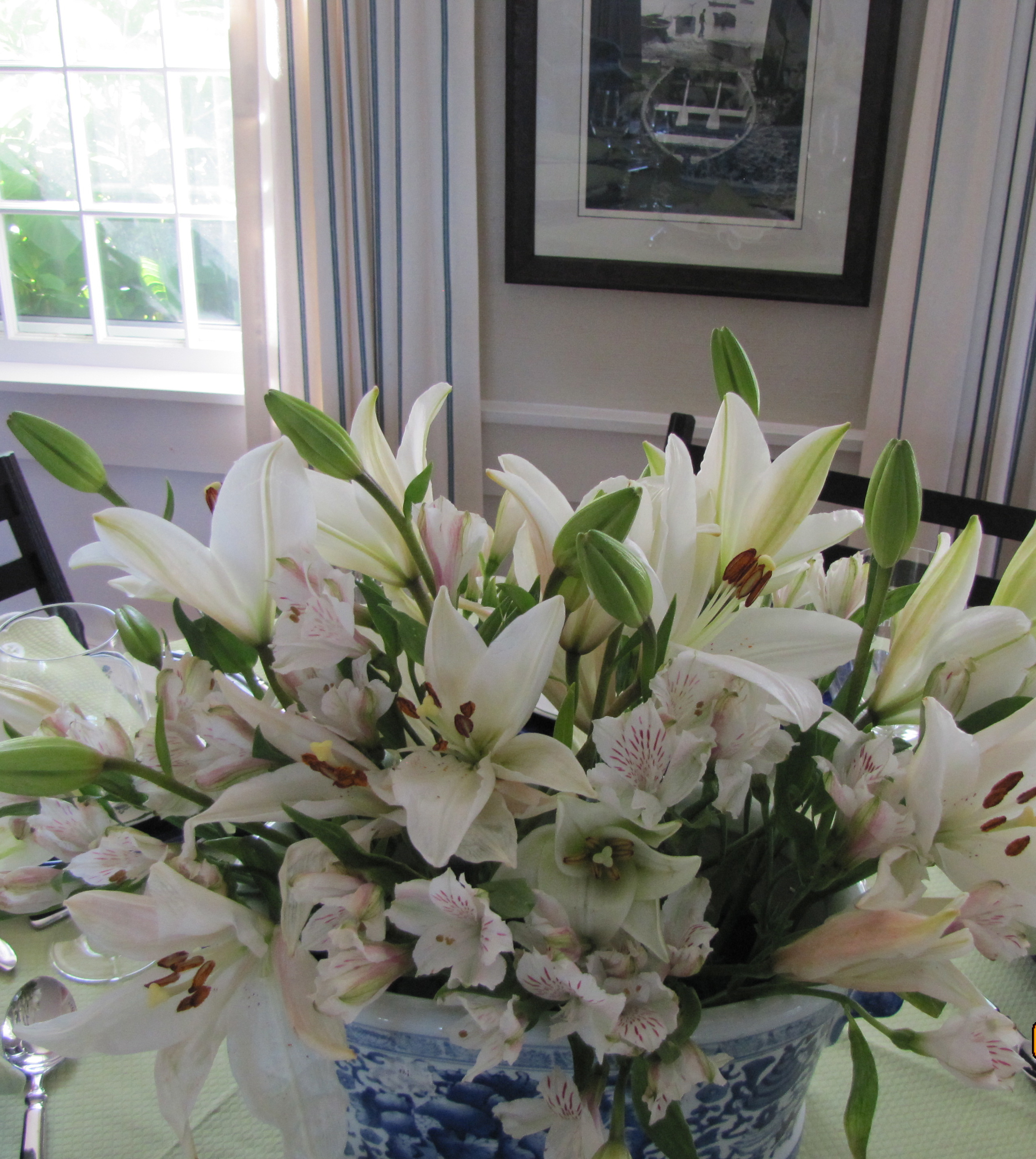
With the start of the summer months, people naturally spend more time outdoors. Outdoor entertaining is one of the great pleasures of the warm weather months. Summer calls for bright, bold, happy colors on the table. Here are some ideas.
White hydrangeas in simple glasses tied with festive grosgrain:

Source: google.com via Ellen on Pinterest
How about this stunner for the tablecloth?

Source: lsfabrics.com via Ellen on Pinterest
Add this charger to pick up on the punch of orange:

Source: overstock.com via Ellen on Pinterest
These darling Kate Spade dinner plates to rest on the larger orange chargers (pictures not to scale)

Summer evenings call for warm-weather fare. How about crab cakes, fresh corn pudding, and cole slaw?

Source: Uploaded by user via Ellen on Pinterest
Bon appétit!
A Touch of Black

Nothing kills the calm in a neutral beige room faster than dead-white lampshades. These are going to be changed out for black (or maybe navy) drum shades as soon as I can find a pair of them in the right size!
A Touch of Red
Which famous decorator said, “Every room needs a touch of red.”? I believe it was Albert Hadley. Well, I don’t think a touch of red works in every room, but in rooms where red works, it gives a visual excitement not associated with any other color. Do you have a place for a touch of red in your home?

Image ©Color Calling
Graduation gifts they’ll love
Graduation time! Show your friends that you care about their children with the perfect “congratulations” present when they graduate from high school. Here are some tried and true ideas in a variety of price ranges. Check my Pinterest page for more information http://www.pinterest.com/colorcalling
Soft monogrammed towels are always appreciated. Don’t monogram the washcloths, though. Choose a color they love, not their school color. (It is not cool to go overboard on school colors/school mascots, in case you didn’t know.)

Did you consider giving just the pillowcases? Have a pair done up with an extra-fancy monogram in their dorm room colors:


Have a fuzzy throw monogrammed at an angle in the corner
A hinged clothing bar for the car is useful and budget-friendly:

What about a rolling laundry hamper, with a huge laser-cut monogram on the side?

These ideas are all tried and true, and will be appreciated by your favorite graduate!
Peonies
Anyone who knows me, knows that I just love peonies! Never have they been more affordable than since our new Whole Foods market opened here in Birmingham. Peonies are available there for only a short season in May and then they are gone. Is there anything prettier?

image ©Color Calling
Choosing the perfect ceiling color

Benjamin Moore Vanilla Ice Cream Image ©Color Calling
This can be a wonderful look: paint your ceilings the same color as your trim. Here is the formula. Use semi-gloss oil-based paint on the trim. Oil-based semi-gloss is also what I like to specify for painted kitchen cabinetry. Then, use flat latex in the same color for the ceiling. Here, I specified Benjamin Moore Vanilla Ice Cream. This creamy white is a perfect match for the subtle stripe in the wallpaper. And, how did I find this perfect match? With my large samples, of course!
One more tip: make sure that your painter paints the air conditioning vents and speaker covers. Yes, you can safely paint your vents and ceiling speakers (by hand with a brush, please and thank you). Don’t be afraid to venture out from the dreaded “Ceiling White.” A good color consultant can help you find your perfect color match!
Glimpses of a Spectacular Private Garden

Just returned yesterday from a tour of a spectacular private garden on Lake Martin, Alabama. Images are large, please allow a few moments for them to load. Enjoy!

bright yellow lilies frame a water view Image ©Color Calling

Garden Room at the Entrance with large urn focal point Image © Color Calling

Hydrangea above and below Images ©Color Calling


Purple Clematis Image ©Color Calling

Gardenia

Cherub playing his flute, as a charming fountain Image ©Color Calling

Another garden room with a very different fountain Image ©Color Calling

Waterfall in the Garden Image ©Color Calling

This cave is accessible to the left of the waterfall. Image ©Color Calling
 This view is behind the waterfall, from inside the cave! Image ©Color Calling
The large garden, spread over several acres, includes at least two dozen garden rooms, as well as numerous places to sit and enjoy the spectacular vistas over the lake. Here is my favorite part. Can you believe that this garden has a wine cellar?

Beautiful high lake view near wine cellar entrance Image ©Color Calling
The wine cellar is entered from the outside, just to the right of the above photograph. A large arched oak door marks the entrance (I could not get a photograph of the door due to our tour-goers’ entering and exiting). The cellar’s interior drew special awe from our visiting group of gardeners:

Expansive Wine Cellar Image ©Color Calling

White wines are usually stored near the bottom where it is coolest Image ©Color Calling

Entering the tasting room Image ©Color Calling

Statuary in the tasting room, depicting both saint and sinner Images ©Color Calling


Murals were painted by art students from nearby Auburn University Image ©Color Calling
Returning to the garden, more garden rooms and interesting focal points.

Statuary bust resting in a fern glade Image ©Color Calling

restful arbor Image ©Color Calling

Cool and Verdant Fern Glade Image ©Color Calling

Ceramics are thoughtfully placed throughout the garden Image ©Color Calling

Handrails over steps lead swimmers down into the water Image ©Color Calling

Focal urn at water’s edge Image ©Color Calling
I hope you have enjoyed the tour of this wonderful garden!
Garden Folly
Love the term “Garden Folly.” Outbuilding or shed just doesn’t have the same caché.

Source: flickr.com via Ellen on Pinterest At Castle Howard
To be fair to the name, in architecture, a true Folly is primarily (some might even say, strictly) for decoration. A true Folly doesn’t serve any other purpose. Obviously, a garden shed or outbuilding would be at least somewhat utilitarian. That doesn’t mean that your shed can’t have charm, beauty or an element of mystery.
 Here are a few other images for inspiration:


Charlotte Moss in New York, one of my (and all of blogdom’s) all-time favorites:


Style watch
Here is a thought for anyone having reupholstery work on dining/breakfast room chairs. Use an accent fabric on the back of the chair.

Source: google.com via Ellen on Pinterest

Source: google.com via Ellen on Pinterest
You want to make sure that your upholsterer provides quality workmanship. This one, below, did not. Notice the seaming in the back isn’t uniform, and that the fabric change ends/begins oddly. (Sorry, but I am going to call them as I see them. This one doesn’t look professional).

Source: google.com via Ellen on Pinterest
You can accent just the back part of the chair back, or wrap the accent all the way around. A good design professional can help you decide. Properly done, what a great look that will enliven your breakfast room or dining room!

Don’t make an expensive mistake

Image ©Color Calling
When I first started my color consulting and residential styling business, my very first client (who kindly allowed me to photograph her living room for the blog) was a dear friend who has a very pretty house. She wanted me to help her change her living room draperies. Because of my color training, I could see the problem. Though a little old, the draperies themselves weren’t bad (though I do like my draperies to “kiss” the floor when doing a new installation.) The problem was, other than to the walls themselves, that the color of the draperies wasn’t really relating to anything else in the room.
So, we went shopping around in her own house, because she has really beautiful things. I suggested that a large gorgeous painting hanging in another room would be perfect in the living room. We removed a lovely mirror from over the mantel and moved it over a console on the same wall. If you have been reading this blog, you know how I feel about mirrors over a mantel. But, I digress. The main color (golden yellow) in the painting allowed us to repeat the drapery color again.

Image ©Color Calling
Then, all that was necessary was a little rearranging, and one simple but expert reupholstery job which repeated the color yet again. (I usually like to repeat a color three or more times.) The chair, before, is on the left, and remember, white is NOT a neutral. The chair, after, is on the right. The jewel tone silk with plenty of gold in the velvet stripe (middle photo) is just the pop of color that was needed to bring the room to life. The second of the pair of chairs is just out of camera range, but can be seen in the final shot.


Now, the draperies don’t stand out, because the color of the drapery is repeated several times. They are in harmony with the rest of the room. Have you priced custom floor length draperies lately? This one decision saved a very expensive change from being made.


Images above ©Color Calling
I have seen it happen over and over and over: the thing that you think is wrong with your room may not be the thing we end up changing!
Always call a trusted design professional when you think you want to make a change. She may just help you avoid what might be a very expensive mistake.
Trend Watch
Bath hooks for hanging towels. I am seeing this trend everywhere.

Source: habituallychic.blogspot.com via Ellen on Pinterest
Source: remodelista.com via Ellen on Pinterest
Source: habituallychic.blogspot.com via Ellen on Pinterest

Source: Uploaded by user via Ellen on Pinterest

Source: remodelista.com via Ellen on Pinterest

Source: oldhouseonline.com via Ellen on Pinterest

Source: houseandhome.com via Ellen on Pinterest

Source: houseandhome.com via Ellen on Pinterest
And, in case you are wondering, it’s okay to follow a few trends to update your home. Where I advise you to look out, is when the trend is either very expensive, or clearly headed bye-bye after it has played out. Towel hooks. A very on-trend look that you’ll be seeing more and more.
What can a Color Consultant do for my home?
What does a color consultant do? That is a question that I am frequently asked.
My goal is, always, to help you love the look and feel of your home. If I had a mission statement, that would pretty well sum it up. I believe Jane Austen, my literary hero, wrote it well: “There is nothing like staying home for real comfort.” So, what I want to do is to make your home a haven, a place of comfort, a place of beauty, and a place where you can retreat after a busy day. I want your home to be the place that you look forward to.
You see, it breaks my heart when someone says that they hate their house. Why would anyone want to feel that way? That’s what I am here for! I have access to designer carpet, wallpaper, fabric and custom furniture, available to trade-only, in addition to helping select paint colors. If we need to rearrange the existing furniture, I have someone who can come in to move things around and hang or re-hang pictures and mirrors. Sometimes a fresh eye is all that is needed, and that is what I can be.
Now, let me be clear. I don’t have any particular gift of vision. I see exactly the way that anyone with normal vision sees. However, it is the understanding of what I see as compared to other colors that is perhaps different than many.
After going through True Color Expert Training with Canadian color expert Maria Killam, something that was not in me before, actually became a wired-in part of my visual understanding. Have you ever heard someone say, “The lightbulb in my head went on” ? That is exactly what her course did for me. It turned on a lightbulb of understanding undertones of colors, and of how to achieve visual harmony through common undertones, color flow, focal points, and repetition. The rhythm of a home. That’s what I do.
Every house is different, and that is why I love doing what I do. But, my best work happens when the client trusts me and implements the ideas to make the changes I am suggesting. People are naturally resistant to change. But, when something is not working (functionally or visually), you must be prepared for possible changes if you want to be happy with your house. The things that are holding your home back from being its best: those things won’t magically get better, and you are not going wake up one morning to find that you suddenly love something that you now hate. That I can promise you.
~~~~~~~~~~~~~~~~~~~~~~~~~~~~~~~~~~~~~~~~~~~~~~~~~~~~~~~~
It is my passion, my calling, and a joy to select colors as a certified color professional. I stay current by writing this blog and by reading dozens of other décor blogs and magazines.
And, on a final note, if you are a decision-making executive affiliated with Habitat for Humanity, I now offer a number of pro bono hours each year in the Birmingham, AL metro area to Habitat House homeowners who are selecting the color finishes, interior and exterior, for their new Habitat House. Click on the “about” section in the top bar, and you will see how send me an email. Please include the details of your request, including the time frame and location involved.
Does your kitchen have clean lines?

Do you have enough outlets, where you need them and are actually using them? There are too many cords floating around in this kitchen, above. Consider an appliance garage or have your electrician install plug strips under your upper cabinetry. Plug strips are a great decorator’s secret to keep your backsplash area free of unsightly outlets.
~~~~~~~~~~~~~~~~~~~~~~~~~~~~~~~~~~~~~~~~~~~~~~~~~~~~~~~~~~~~~~~~~~~~~~~~~~~~~~
Lighting is important. Make sure your lighting is enhancing your kitchen. Below, someone got carried away with a cute light fixture and decided that if two are good, four will be twice as good. The result is a clutter of visual competition. The wrought iron breakfast room fixture really looks out of place as well. Notice how the metals don’t work well together, and how the height of hanging distracts your eye? However, kudos for the upper cabinet connecting with the ceiling! Visually much more pleasing than dead air between.
Source: traditionalhome.com via Ellen on Pinterest

Source: traditionalhome.com via Ellen on Pinterest

Source: traditionalhome.com via Ellen on Pinterest
Source: traditionalhome.com via Ellen on Pinterest
I don’t understand the purpose of having dead space between the upper cabinetry and the ceiling. It creates a much cleaner line to join the two visually. This happens in the nicest of homes, so be sure to discuss this with your cabinet maker as well as your architect so that there is no mistake. Can you visualize how much better the above kitchen would look with the left and right “X” cabinetry extending in a clean line to the ceiling?
It is the small details that can really make your kitchen visually pleasing. Clear your kitchen of distracting cords dangling at eye level, and of too many light fixtures hanging down from the ceiling above. Join your cabinetry to the ceiling if possible.
Make sure your design professional understands the importance of clean lines.
But my husband won’t paint the paneling!

Above: beautifully painted paneling instantly updates a formerly heavy room.
In my residential styling and color consulting business, I see a lot of paneled wood rooms. Sometimes they are beautiful, but more often, they are not. If you are a woman reading this, you probably know this already: Men do not like to paint paneling. In fact, they really don’t like to paint anything that is wood. Even the merest hint of grain is enough to squelch any desire to paint that surface. Although I laugh when I say this, I am serious: it is in their DNA.
Are all paneled rooms in need of paint? No, but when my eye tells me that the room looks too dated/dark/dreary to work with the existing wood tones, I will usually pull out my fan deck of colors and look for the right color to paint. And what I generally find, is that the wife agrees (either on the spot or eventually) that it should be painted, but the husband won’t hear of it.
After a master bedroom addition, the dark little library/den (below, now painted) was no longer at the end of the house, and had become the pass-through to the master area. It was more about “flow.” In this case, I mean color flow, not traffic flow. I wanted the house to flow nicely from the light-colored living room, through to the light blue master suite. But, the dark paneled (very small) library with its dark interior shutters was preventing proper color flow. What does the husband say now? “I wish I had done this a long time ago.”
Color flow is important, and lack of color flow can really chop up a house. Below, the formerly dark paneled little library is now a sunny sitting room which flows nicely from living room on one side into the master bedroom on the other. The only panels here are the silk ones on the windows. The morning light, blocked before by dated wooden shutters, now comes streaming in.
Notice all the millwork is painted one neutral color, the same color as the adjoining living room (Benjamin Moore Monroe Bisque HC-26 ). By the way, good paneling takes paint beautifully, and looks much nicer and more substantial than SheetRock.
Sitting room painted millwork Image ©Color Calling.

 Sitting room painted millwork Image ©Color Calling
Now you walk from one light-filled space into another. There is now visual harmony and color flow in the space, as you walk from the living room through the sitting room and into the master area.
 Adjoining pale blue bedroom Image ©Color Calling
Above Source:
Can you see how the above room now has wonderful visual harmony? The paneling was obviously very nicely done in its wood-grained state, but now it looks fresh and updated, not dark and dreary. Do you think the above room looks any less worthy of attention just because it now has a painted surface instead of its former wood (and wood-colored) surface?
Here is a little test: If the paneling in your own home looks at all like any of these rooms below, it is dated. Please let me gently tell you this again. It is dated.
Source: americanpac.com via Ellen on Pinterest


Above images
,
The ceiling height in the living room is very low to be using accent paneling, and the paneling is not adding to any sort of harmony in either room. Can you see that although the paneling itself is not awful, the visual impact of the paneling is truly terrible? It does nothing for either room. There is no visual harmony in this living room or in the bath above it.

The paneling above has a strong pink undertone. Although this paneling is shown in a current advertisement, this look actually has been dated for decades. I can’t think of a single instance in which I would not advise painting paneling with either strong pink or strong orange undertones. This look just isn’t ever going to come back.

Source: americanpac.com via Ellen on Pinterest
Here, the paneled wood is clearly fighting the white fireplace. This is another good example of a room where the paneling itself isn’t terrible, but it is preventing visual harmony in the room.
A “before and after,” for your viewing pleasure.
Before, and yes, there are people who won’t paint even this low grade of paneling:

Source: cutoncemeasuretwice.blogspot.com via Ellen on Pinterest
After, fortunately, this owner wasn’t one of them.
And, yes, this really is the same room:

Source: cutoncemeasuretwice.blogspot.com via Ellen on Pinterest
Once again, does every paneled room need to be painted? No. But, if your paneled room is either dated, is chopping up color flow, or simply does not have visual harmony, give some real thought to painting it.With gentle guidance from a trustworthy professional, or even from a trusted friend with a great decorating eye, you can move forward.
So, are you letting dated paneling hold you back from having the best possible look and feel for your own home?
Happy decorating!
Bronze sculpture by Jane DeDecker
A recent post spoke of focal points. Have you considered a beautiful bronze sculpture as your focal point? Yes, the price point is high. But, a museum-quality bronze is forever. It is timeless. And, Jane DeDecker is one of the best. Can’t you see this resting on the corner of a Carrara marble tub surround?

Source: saksgalleries.com via Ellen on Pinterest
Can you stand the darling daddy, below, tying his baby’s shoe? And, the baby just in awe. Priceless.

Source: morriswhiteside.com via Ellen on Pinterest

Source: flickr.com via Ellen on Pinterest
The above Jane DeDecker sculpture is a gift of a couple in Des Moines, Iowa, in memory of their son, Christopher, who was a victim of juvenile diabetes. Apparently, their dog clearly mourned the loss of his human companion so that the parents were moved to donate this sculpture to the City. What a beautiful and heartfelt (and heartbreaking) tribute to boy and dog.
My friend, Master’s of Art holder Holly S., introduced me to the sculpture of Jane DeDecker 11 years ago. I have been captivated ever since. I am the proud owner of two of her works, “Tippy-Toes,” which reminds me of my dancing daughter,

Source: google.com via Ellen on Pinterest
and an almost-sleeping dog bronze called “Ol’ Faithful” (which looks just like my ‘Pepper’, prone to one floppy ear)

Source: cavaliergalleries.com via Ellen on Pinterest
Source: flickr.com via Ellen on Pinterest

Image ©Color Calling, Pepper.

Source: cavaliergalleries.com via Ellen on Pinterest
And, please tell me you have never seen anything cuter than this little snow elf:

Source: claggettrey.com via Ellen on Pinterest
Another stunner:

Source: claggettrey.com via Ellen on Pinterest
DeDecker is a master. Save. Save some more. You will love forever.
Benjamin Moore Smokey Taupe

Source: traditionalhome.com via Ellen on Pinterest
Benjamin Moore Smokey Taupe is one of the great interior colors. BM-983. Such a beautiful complex neutral! Remember, always paint a large sample when considering a new color (paint your sample on a 1/2 sheet of white poster paper, 2 full coats, so you can move it around the room).
And, did you know color should be the last thing selected? The right wall color should pull everything else in the room together, beautifully!
Happy decorating!


Are you creating focal points?
The eye needs a place to rest. It also needs a place to connect. When I walk into a room, I can almost always isolate the focal point, or where I would create the focal point. In the photo below, anyone can see that the focal point is not even inside the room. Your eye is drawn past the lovely soft furnishings on out to the mountain vista beyond. Well, I guess you could say that the large window frames the focal point. In fact, every part of the room frames the window which frames the view. Nicely done.

The most interesting rooms always have a focal point. Focal points create drama in a room. What are some successful focal points? If the room has a fireplace, that is going to be the focal point. I always want to create sight lines and drama around the fireplace. This fireplace area has wonderful drama in a contemporary space (I am ignoring the combo of colors used here, which I don’t particularly care for):

Below, this is an architectural device known as enfilade. See how you can look through several door frames down to the kitchen pendant light? The dark light at the end is the focal point here. Are you seeing how your eye naturally searches for a place to rest, and it wants to come to a rest (and to a focus) on the dark light at the end? The designer did a marvelous job of framing the sight-lines all the way through the view to the ending focal point. There is no visual clutter, just pleasing objects of interest to catch our passing glance on the way to the end. I would guess that a fireplace is the focal point if you are standing in the kitchen looking down the axis the other way, looking back toward the main room pictured here.

Our eyes have a natural desire to find a nice place to rest. Too much distraction, clutter, and visual disharmony make it difficult to give our eyes that natural place to rest. Have you ever walked in to someone’s house, and there was so much stuff, that you didn’t know where to look? Remember, the eye needs and wants a place to rest in a room.

Visual harmony and a screen focal point. Source: traditionalhome.com via Ellen on Pinterest

