They never sit here together

Source: architecturaldigest.com via Rivers on Pinterest

Source: bhg.com via Jessi on Pinterest

Source: theenchantedhome.blogspot.com via Liz on Pinterest

Source: myhomeideas.com via Allyson on Pinterest

Source: coastalliving.com via Laura on Pinterest

Source: casatreschic.blogspot.com via Anna on Pinterest

Source: houseofturquoise.com via Anna on Pinterest

No, the couple have never sat together, here.
Not even once, well, maybe just that one time when they first arrived.
But, so what?
A pair of comfy chairs looks dynamite in the master bedroom.
What a nice secondary focal point to the bed.
It is nice to have a place to sit in the bedroom (besides the bed).
The perfect place to toss a robe before climbing into bed.
Comfortable enough for her five-minute morning check-in conversation with her best friend.
He likes to put his socks on here.
And, the teenage daughter always perches here, on the edge, just so,
to tell them that she is back by curfew.
A pair of chairs in the master.
Do you have room in yours for this wonderful style vignette?
Master Bath inspiration

I like the quiet elegance of this master bath.
There is a look and feel of quality. Not overdone.
Doors and gates of Charleston
A few days in Charleston is all you need to get hooked (for the fourth time or the fortieth).
Here are a few peeks from a random stroll down Church St. All images by Color Calling.
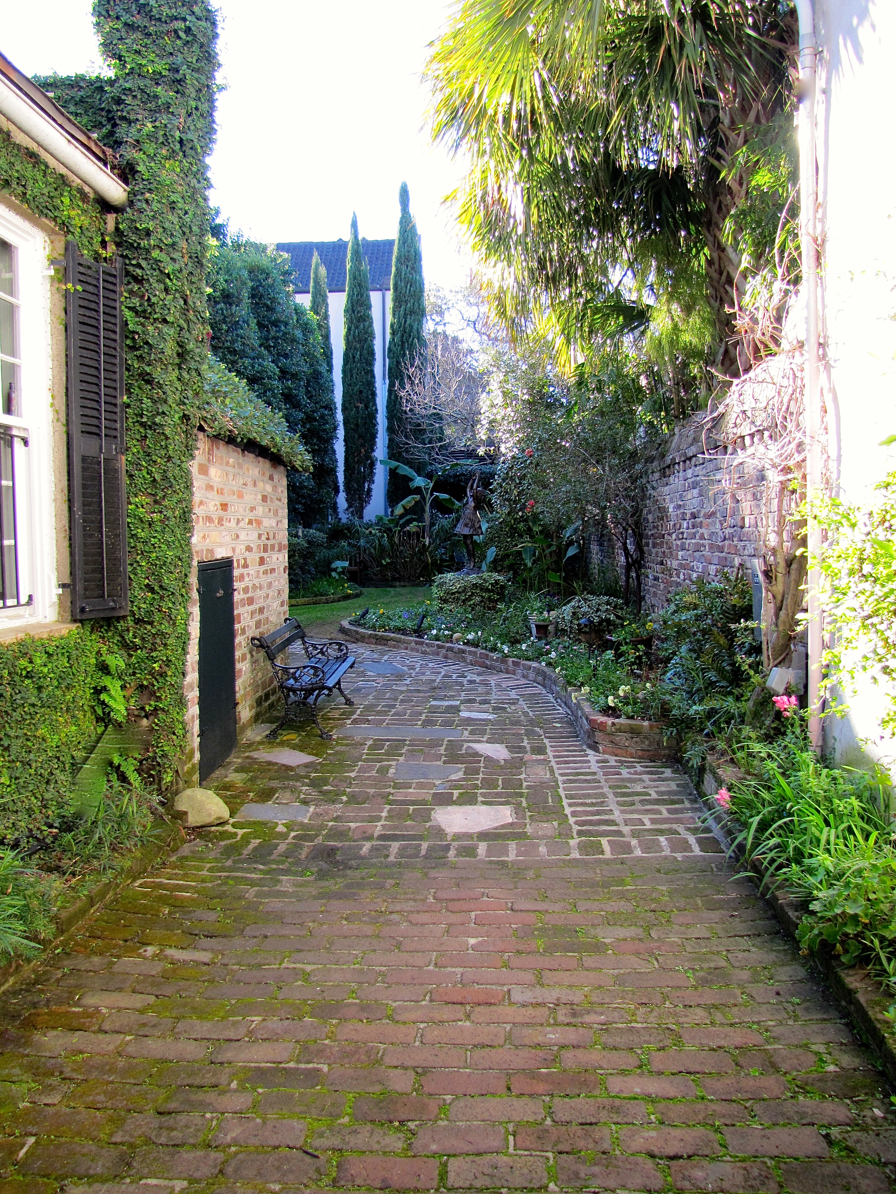
Typical Charleston courtyard

Charleston courtyard, same as above, with close up of bronze child. She is on tippy-toes and still just can’t quite reach the tree branch! How cute is she?
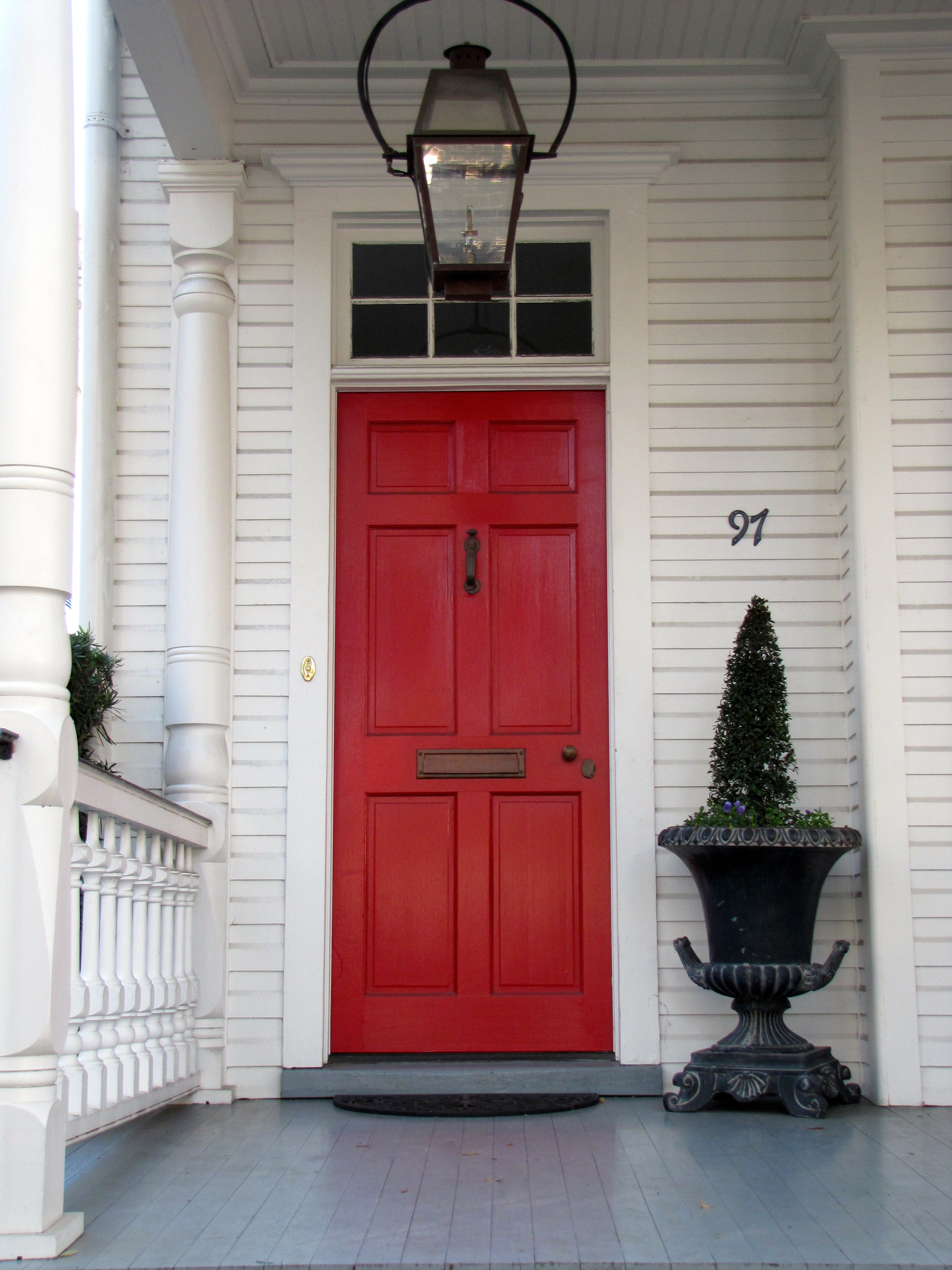
red door in Charleston
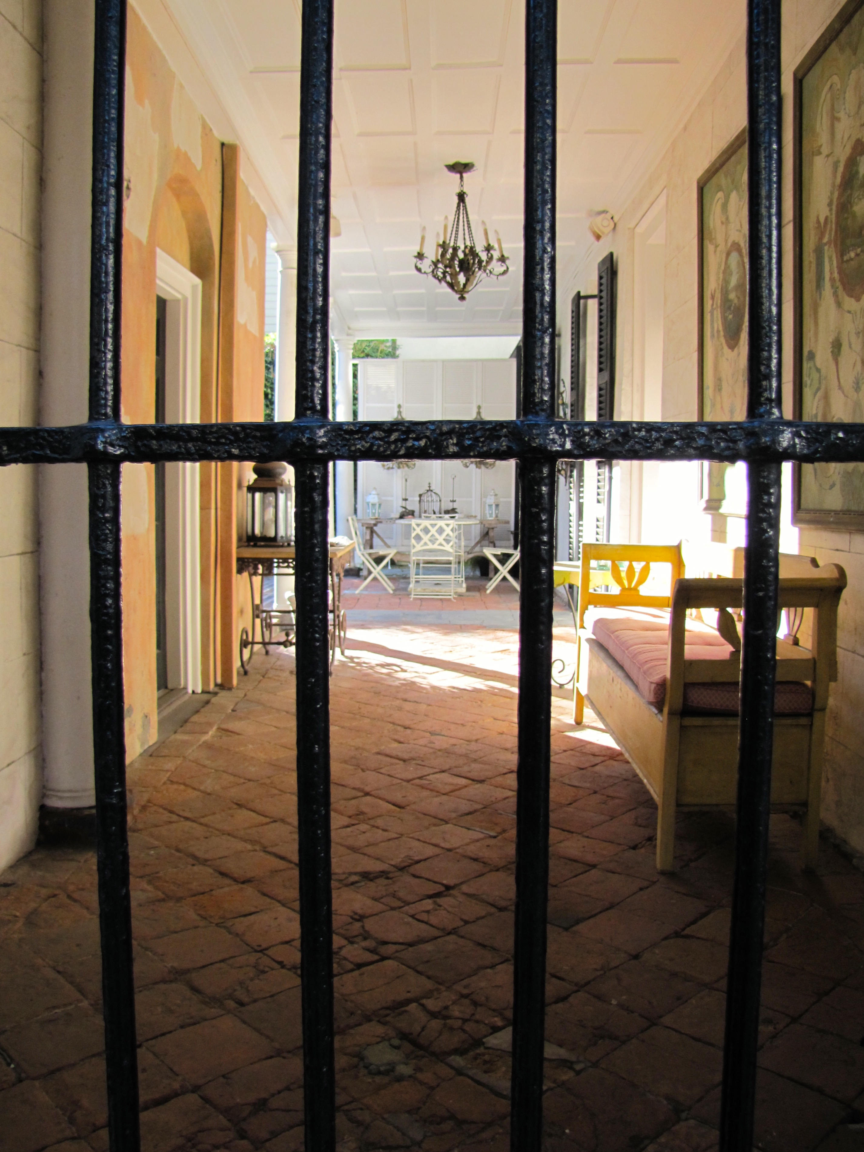
Now, this is what I call an outdoor room!

close up of outdoor room

black door with freshly polished brass gleaming in the sun
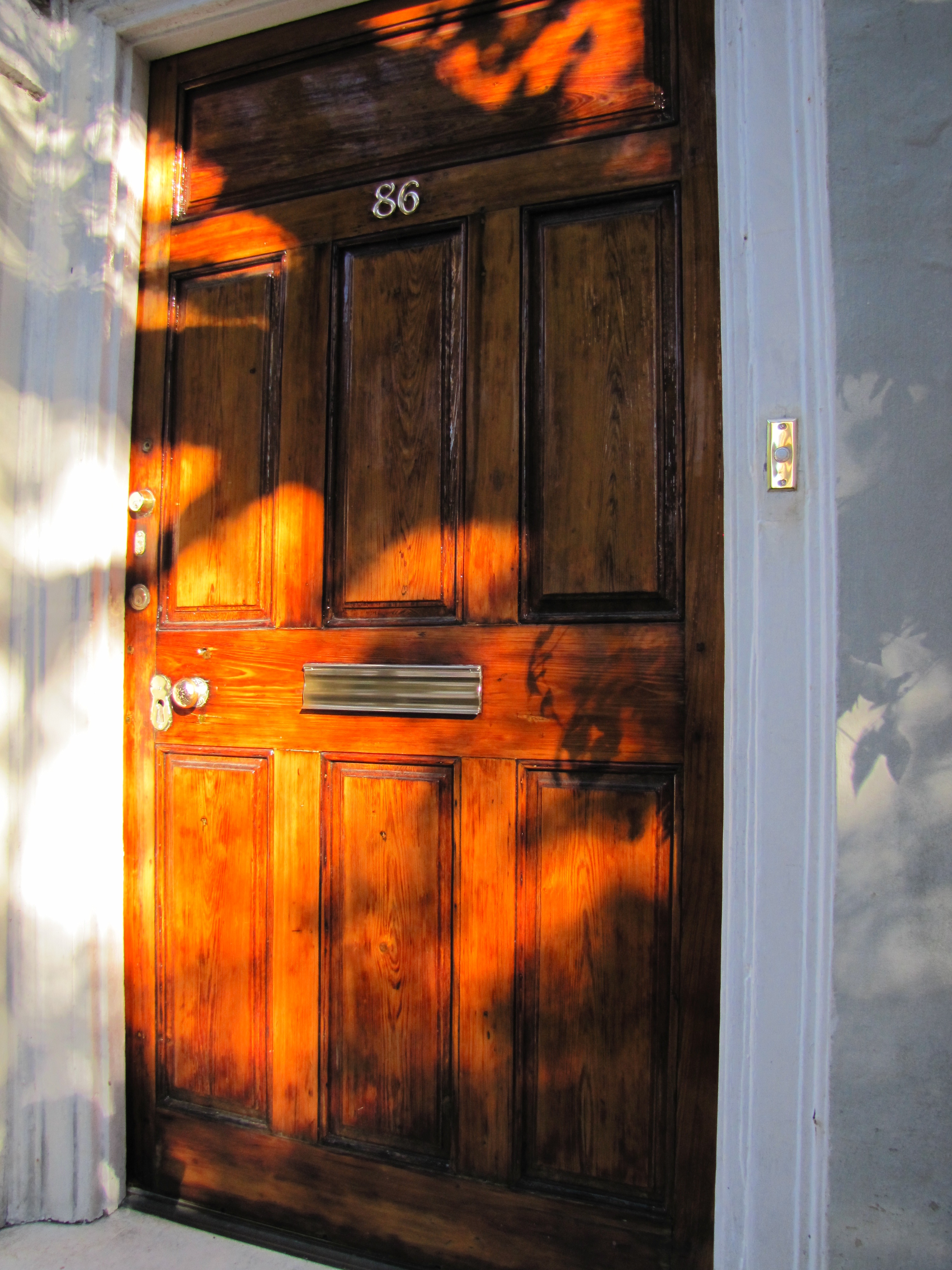
Varnished Wooden door

side porch

black gate
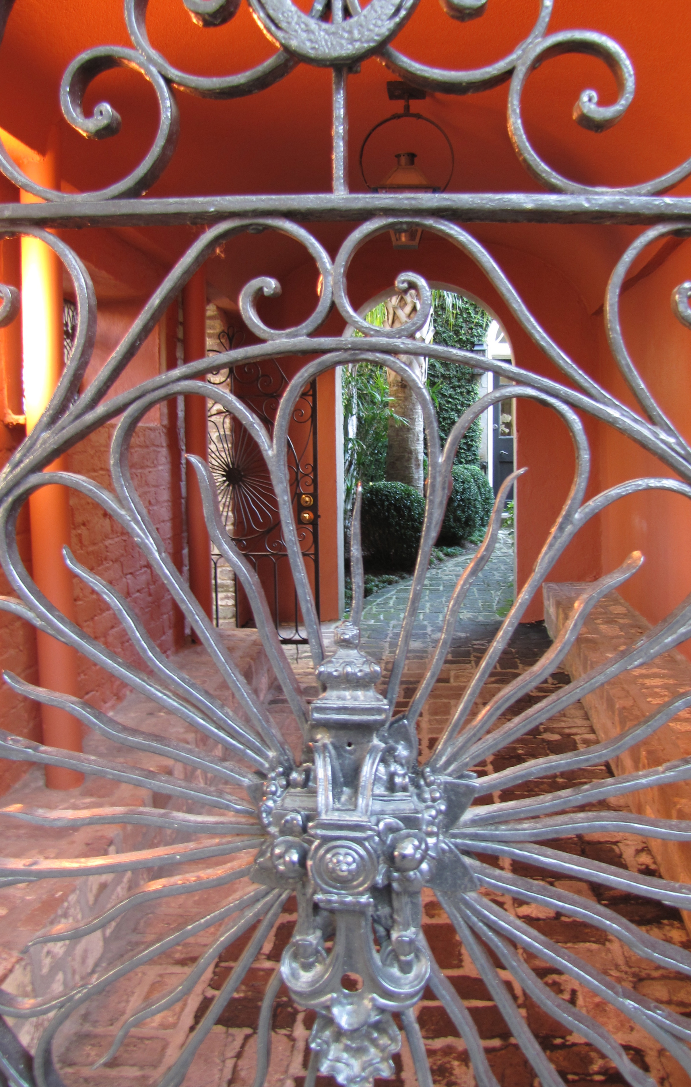
silver gate
Back from the Flu and a question about Instagram
I am back. I was flattened for about a week.
That bronchial flu is not fun.
Then, playing catch up with my life.
SO, I have been looking at a lot of other blogs lately.
I made a sort-of discovery.
And, I am not ashamed to admit it.
I don’t “get” Instagram.
I spend a good bit of time trying to take somewhat decent pictures with my somewhat decent camera.
So, what is the deal with Instagram? Am I missing something?
Why do people want to take/look at low-resolution/low quality pictures of anything?
I don’t like looking at someone else’s fuzzy shots. Do you?
I’ll be back with a décor post soon!
High Style Chinoiserie for the powder room!
for beautiful chinoiserie (or other high style) wallpapers, fabrics, and finishes.
Because of the small scale, it is much more affordable to install that fancy wallpaper,
go for the silk roman shades, the marble counter, gorgeous pair of sconces, etc.
I like to advise my design/color clients to go all out with the colors, and/or high style they love
but might not like in larger doses for a big room.
My own powder room is teeny tiny. I would never go Plain Jane in a space this small.
Here is a detail of my sconce and mirror.
Which set against a scenic chinoiserie toile paper, causes the eye to travel.
Style maven Diana Vreeland said it first, and it is so true: “The Eye Must Travel.“
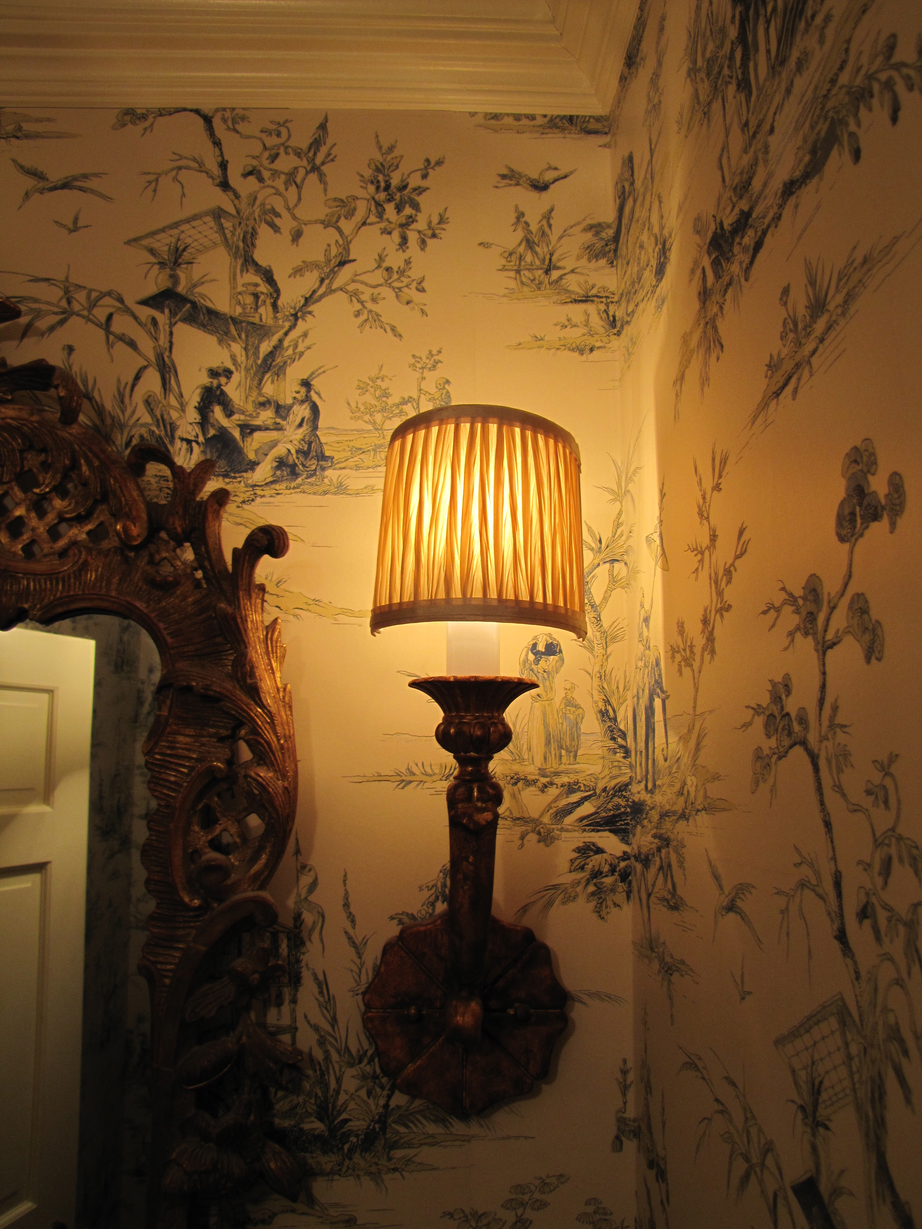
Image Color Calling
Here is another powder room with similar scale to mine (basically a chest-of-drawers width
wide).
Although I would avoid grouted tile counter tops, which are dated, I truly love the lyrical
nature of the yellow and muted green scenic paper.
The touch of red is perfect, as are the golden koi decorations on the counter top. As for
the red in the wallpaper, notice how your eye travels from the red to the red,
almost involuntarily?
Let’s look at some other fabulous chinoiserie powder rooms that may give you some ideas.
More scenic paper, see anything you like?
Style tip: No offense to whom I am sure is a very talented designer, but the cabinetry, just below,
is a little “too-too” for me.
I personally find this mix of finishes jarring (i.e, the pewter basin + gilt mirror + shiny cabinet
+ heavily veined marble top.)
Remember the “decide what is most important” rule?
I would have underplayed/simplified the basin, countertop, and cabinetry to let the over-the-top
trio of fabulous wallpaper, gorgeous rock crystal sconces and ornate mirror take center stage.
Together, it just way too much ornateness.
That being said, “it is much easier to criticize than it is to create something from scratch.“
And hopefully, this is taken as constructive feedback for my readers rather than criticism
to another design professional.
All is forgiven, though, by use of the handpainted Gracie silvered scenic, which is divine.
Breath-taking!


Keep Calm
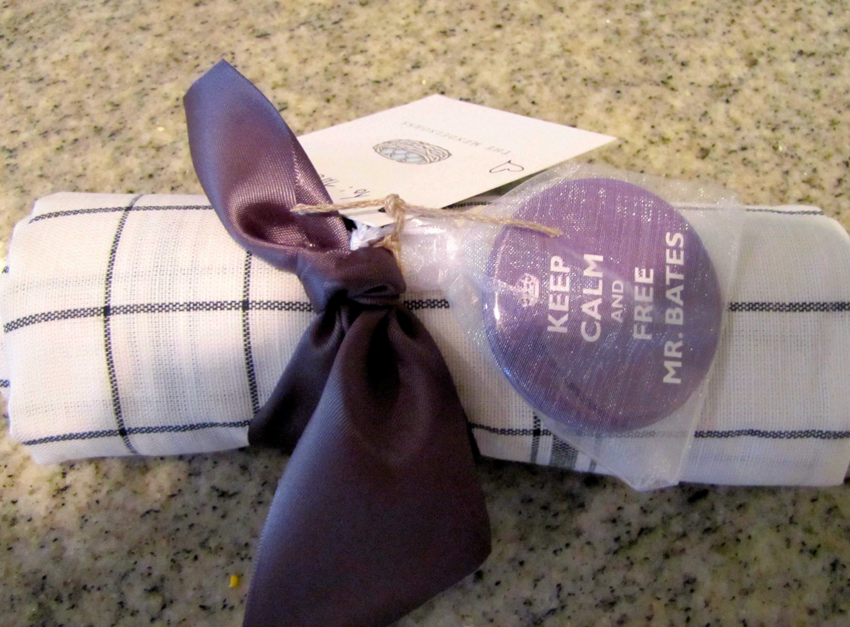
How cute is this? A friend dropped it off in my mailbox last night right before the start of Downton Abbey!
Happy New Year and a New York Ball (but not the one in Times Square!)
To all my readers, I wish you a very happy New Year!
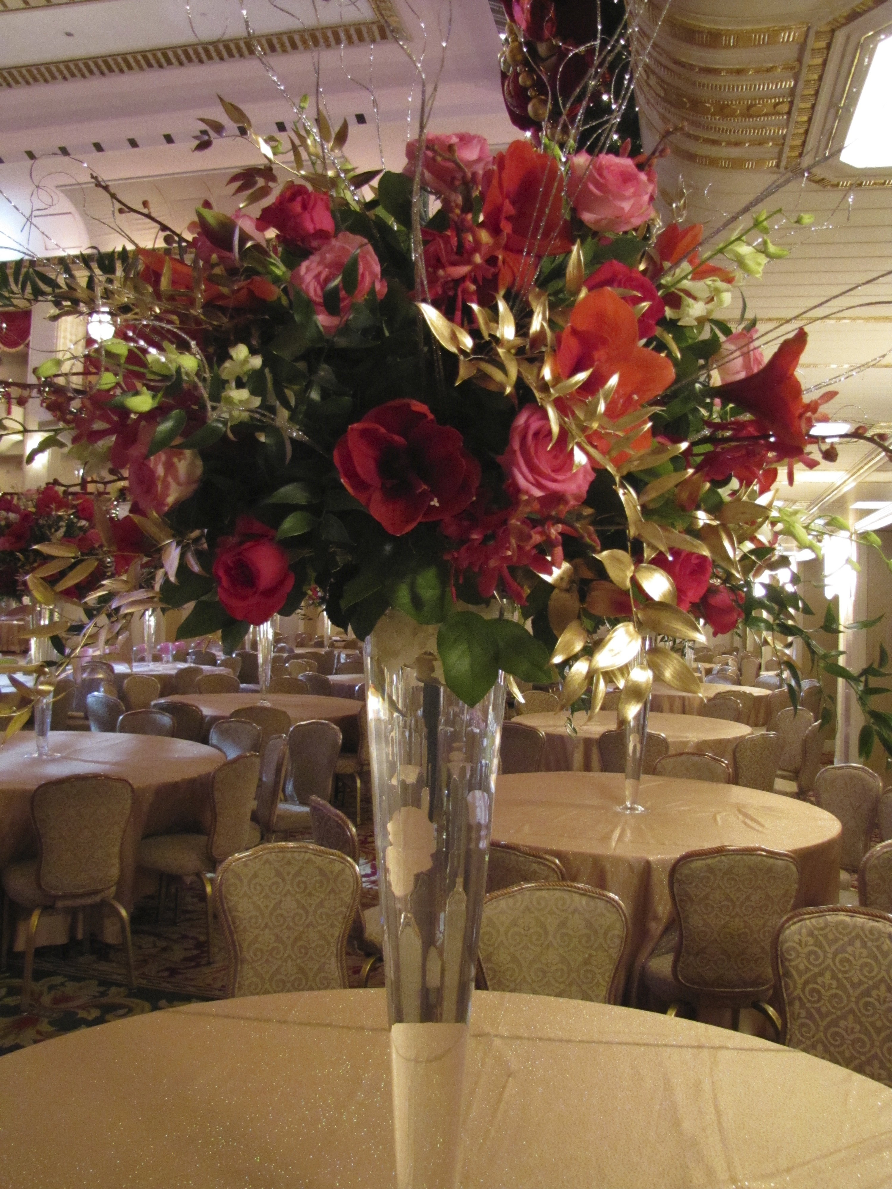
I am just back from New York. What a fabulous trip!
My family was invited to attend the International Débutante Ball, held at the venerable Waldorf-Astoria Hotel.
Want to take a peek?
The grand ballroom, shot the afternoon of the ball:

A close-up of the very tall and beautiful flower arrangements:
A shot of the dance floor, and then the stage. You can see some of the chairs aren’t placed yet.


The gold leaf ceiling:


Prior to the Ball itself, here is where the receiving line was held, above.
Each deb stands in front of her state or country flag during the receiving line. 
Guests starting to arrive in the main ballroom:

Dinner is served before the presentation of the débutantes:

The young men who serve as military escorts presenting the colors:

A flag bearer carrying the flag of the girl’s state or country follows behind the deb and her escort.
A crowd favorite was the lovely Scottish deb who had a piper (bagpipe player) follow her and her escort to the stage.
The American debs have a famous song about their state playing as they walk to the stage.
It is dramatic and beautiful pageantry to watch and hear.
The Texas debs also received thunderous applause, partly due to the extremely difficult “Texas Dip” (a form of the English Court low-bow), which they are expected to perform instead of the normal curtsy. It is breathtaking to watch these girls maneuver their Texas Dip!
Then, after the presentation, the fun begins.


What a night to remember, a real-life fairy tale!
(all photographs by Color Calling)
Love Came Down at Christmas

The really hectic days preceding Christmas can make us lose sight
of the reason for the season.
If you have just three minutes, watch and listen to this beautiful video set to
“Love Came Down at Christmas.”
I promise you that you will feel so uplifted.
The music is soaring and the art is gorgeous.
Click here to watch and listen.
Safe and happy holidays to all my readers!
I will be posting very sporadically this very busy week while I spend time with family and friends.
See you in the New Year!
Christmas Cocktails
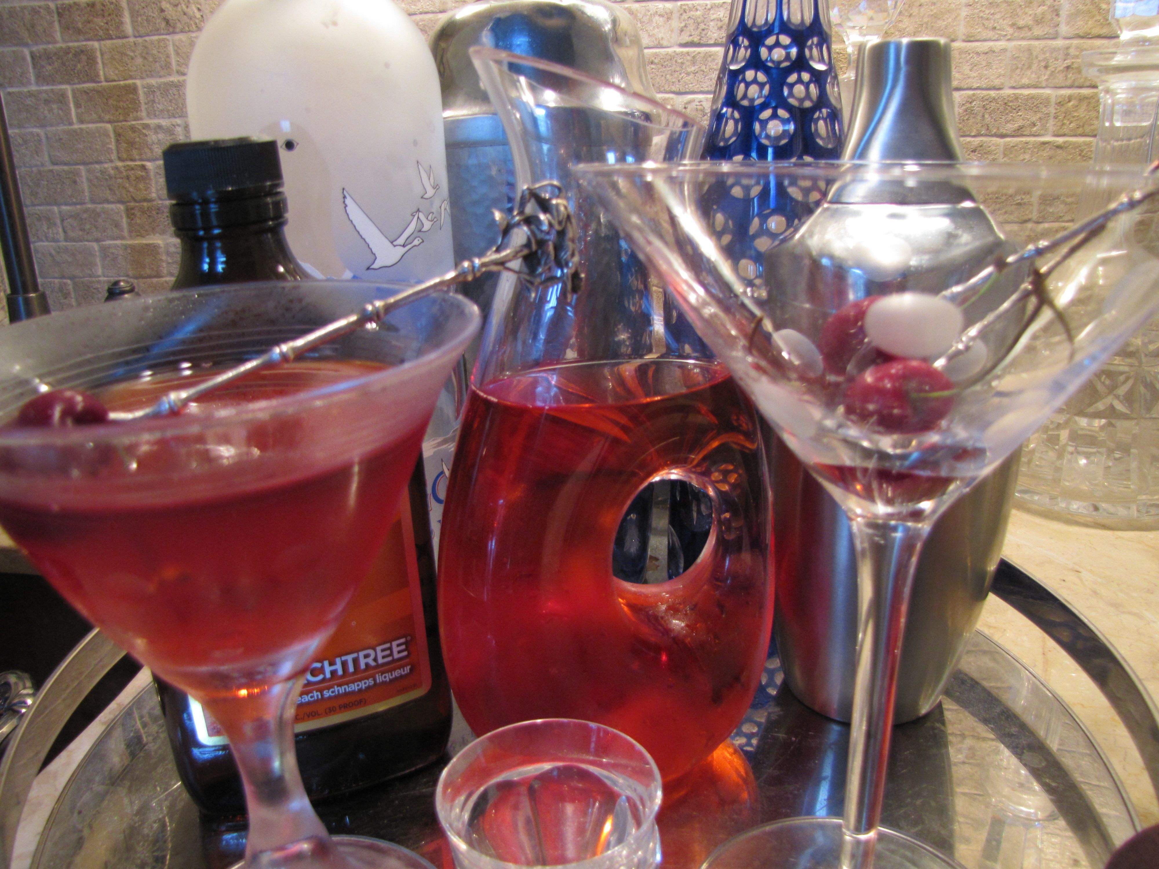
Nothing says “Party” like a martini, and a pretty martini is a favorite drink during the holidays.
Place a (dry) crystal martini glass in the freezer for 10 to 15 minutes to chill.
Here is a good shaker which works better than any we have tried.
With its high-style shape, it also looks great on your bar.


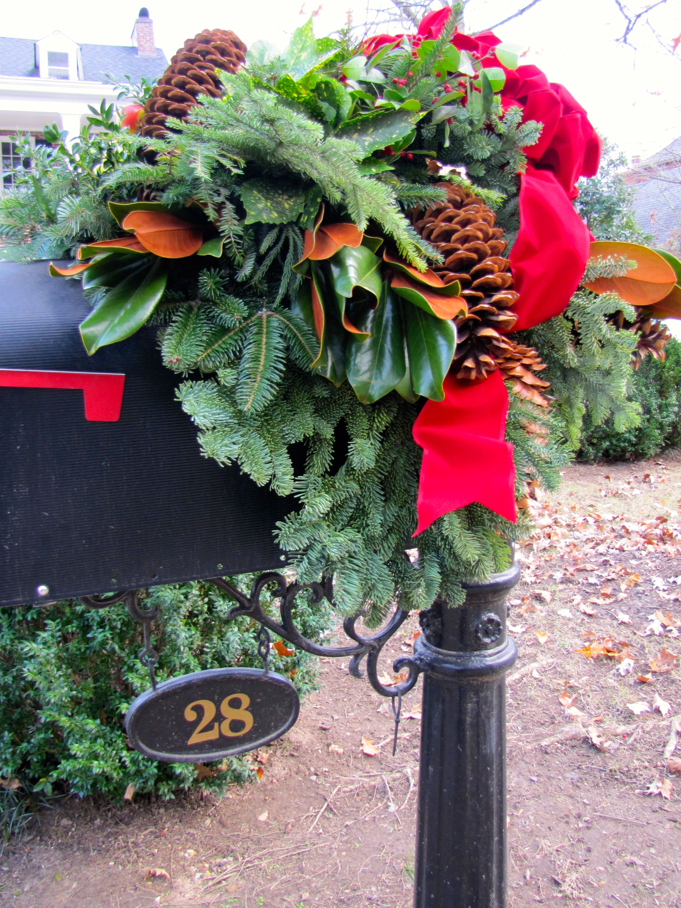
Christmas Mailbox
Do you live in a community where residents decorate their mailboxes?

Image Color Calling
Just one more way to add a festive look to your house for the holidays!
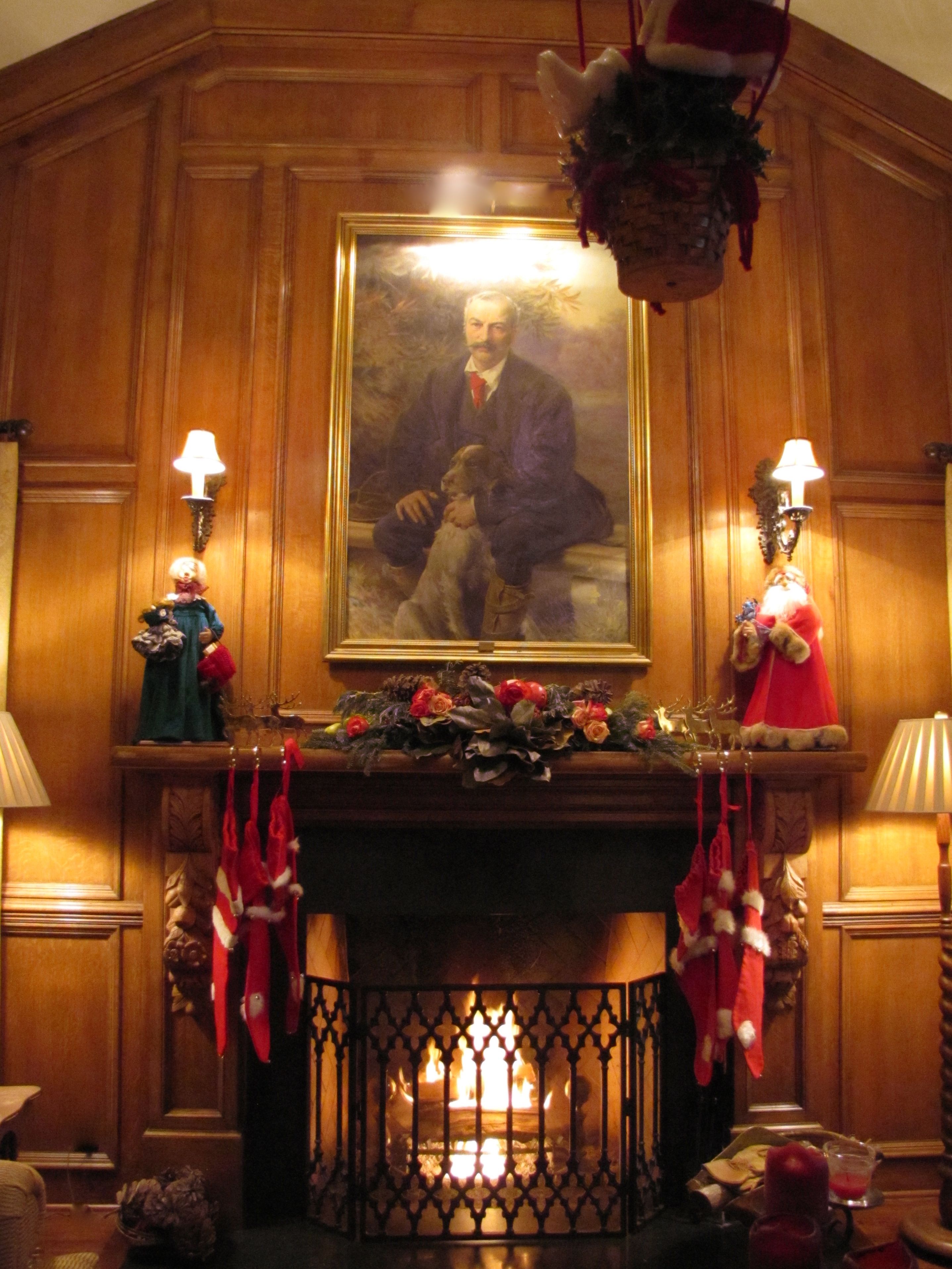
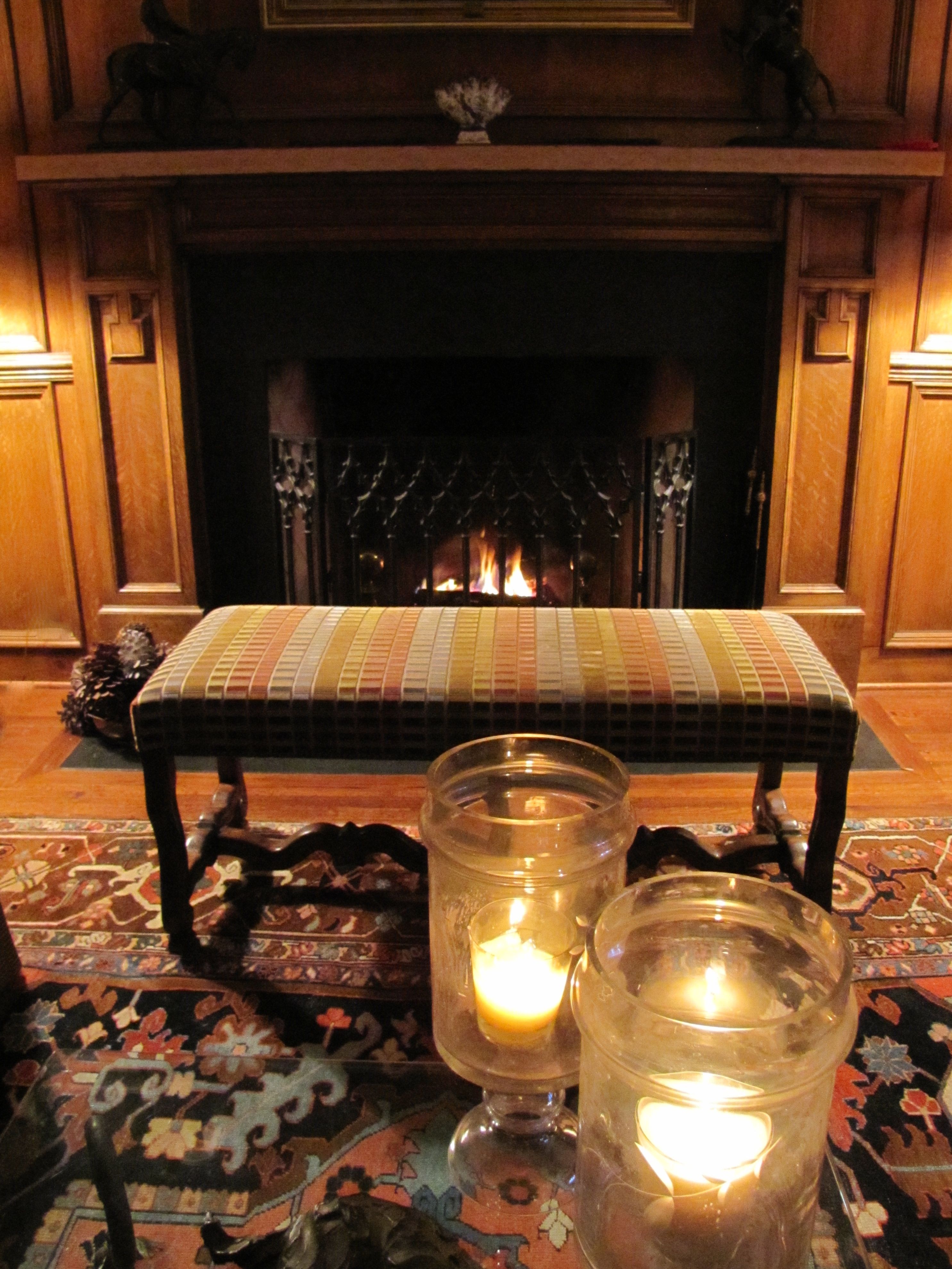
Mantel progress!
A few weeks ago, I posted about the state of my family room mantel, here.
Today, I want to show you the finished mantel installation.
My wonderful carpenter and his crew did a beautiful job installing the hand-carved panels.
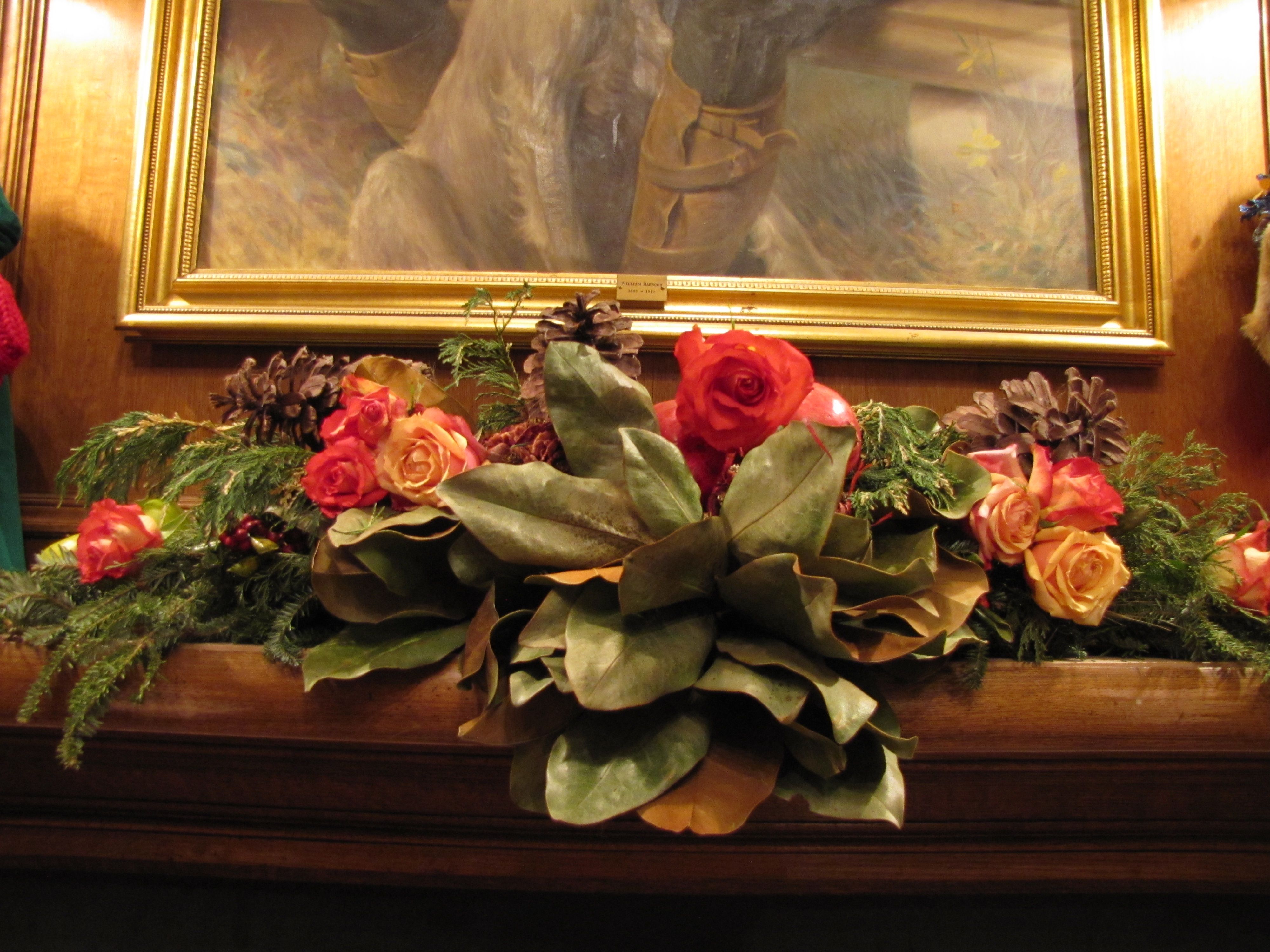
Mantel Greenery with a few leftover roses tucked in! Image Color Calling
Remember the Before?
Mantel BEFORE, Image Color Calling Hand-carved fruit pilasters, each from a single piece of wood.
There is a little touch up work to be done on the mantel’s wood finish,
which will happen after the holidays.
I am very pleased. It really gives some needed ornamentation to the fireplace.

Image Color Calling
Did you notice Mrs. Claus and Santa flanking the centerpiece?
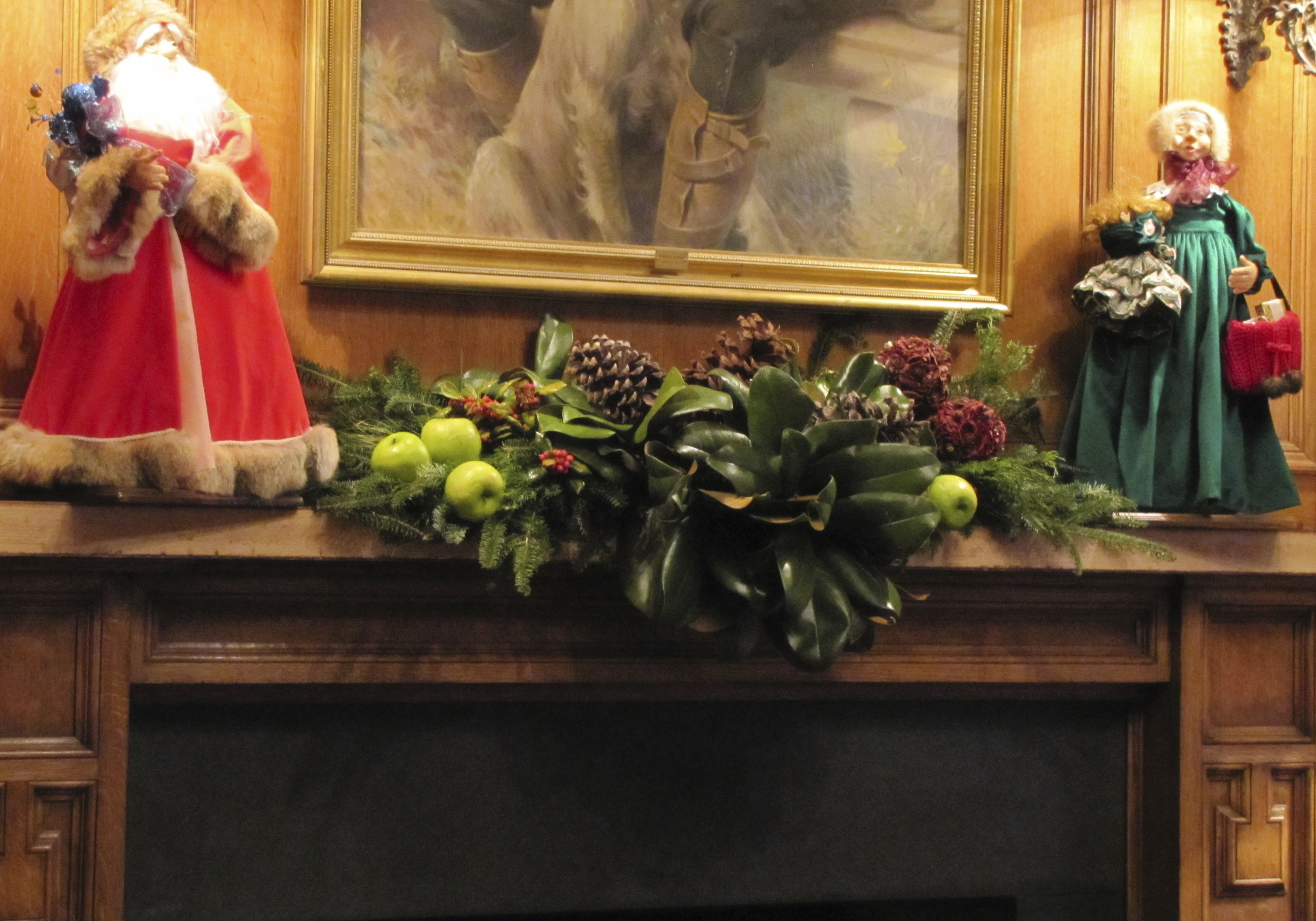
Handmade Mr. and Mrs. Claus

Image Color Calling

Image Color Calling
They are handmade, and have such dear little faces and details.
They stand over two feet high!

Image Color Calling
I have a few more finishing decorating touches, so I’ll update on those later.
Readers, is anything hanging you up with your decorations, or are you finished?
I would love to see and share your mantel masterpieces!
Please email to me: color.calling@yahoo.com
The December Birthday Rule you should never break
Make sure the birthday is treated like a birthday!
That means giving the themes and colors of Christmas
a rest for the day. At least for the wrapping paper, cake,
and gift.
So, no angels, gingerbread men, pinecones, or snowmen.
And no red and green, either.


I have always felt for my friends and family with December birthdays.
There is always so much going on that they can feel lost in the shuffle.
But, treating the birthday like a birthday instead of just another part of the holidays,
seems to please them tremendously!
December-born Readers, do you agree with my December birthday rule?
Latest find
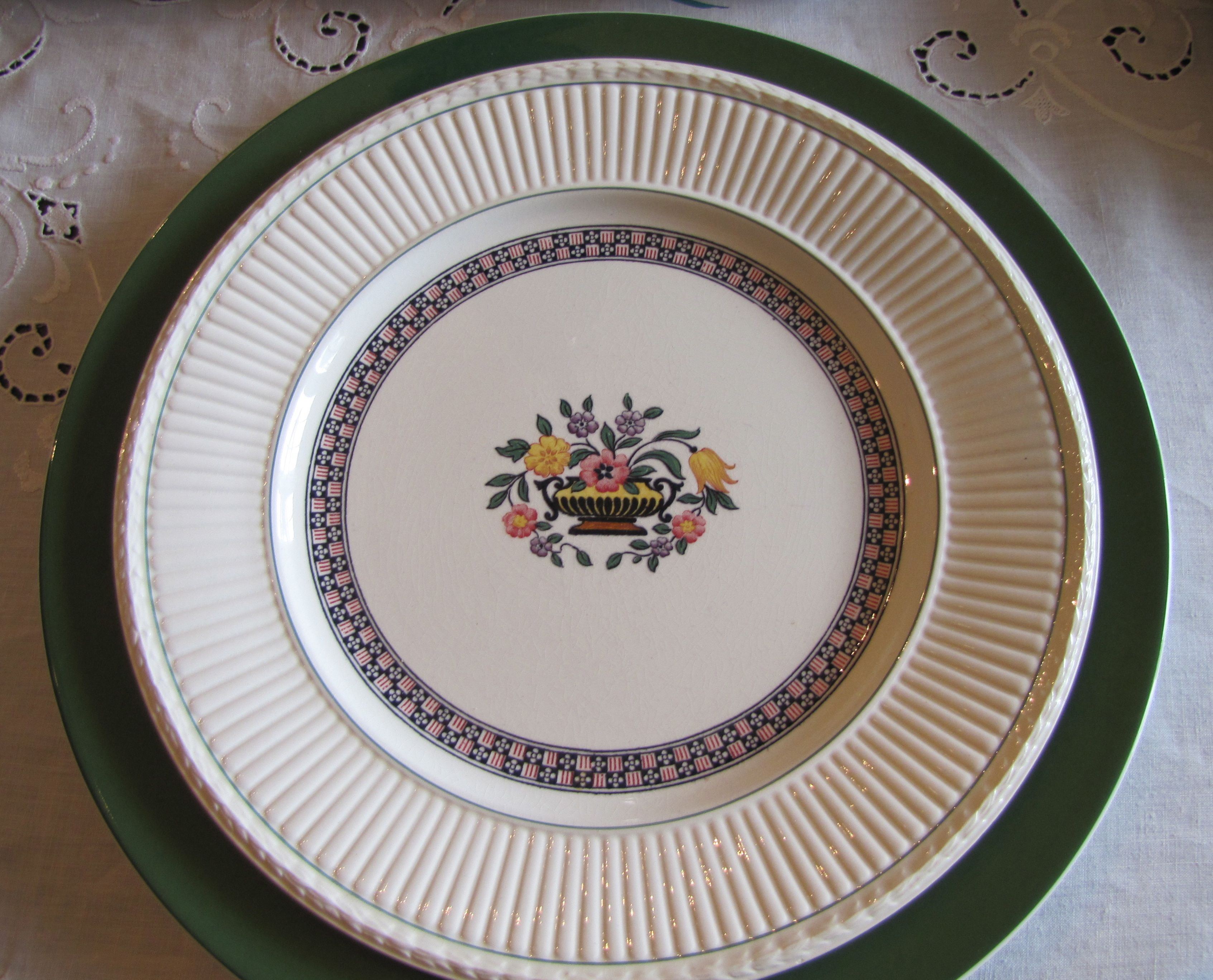
If you follow this blog, you know how much I like chargers.
No, I don’t mean teenage daughters who want to go to Forever 21 with my credit card.
I am talking about the service plate kind of charger, as in dinnerware.
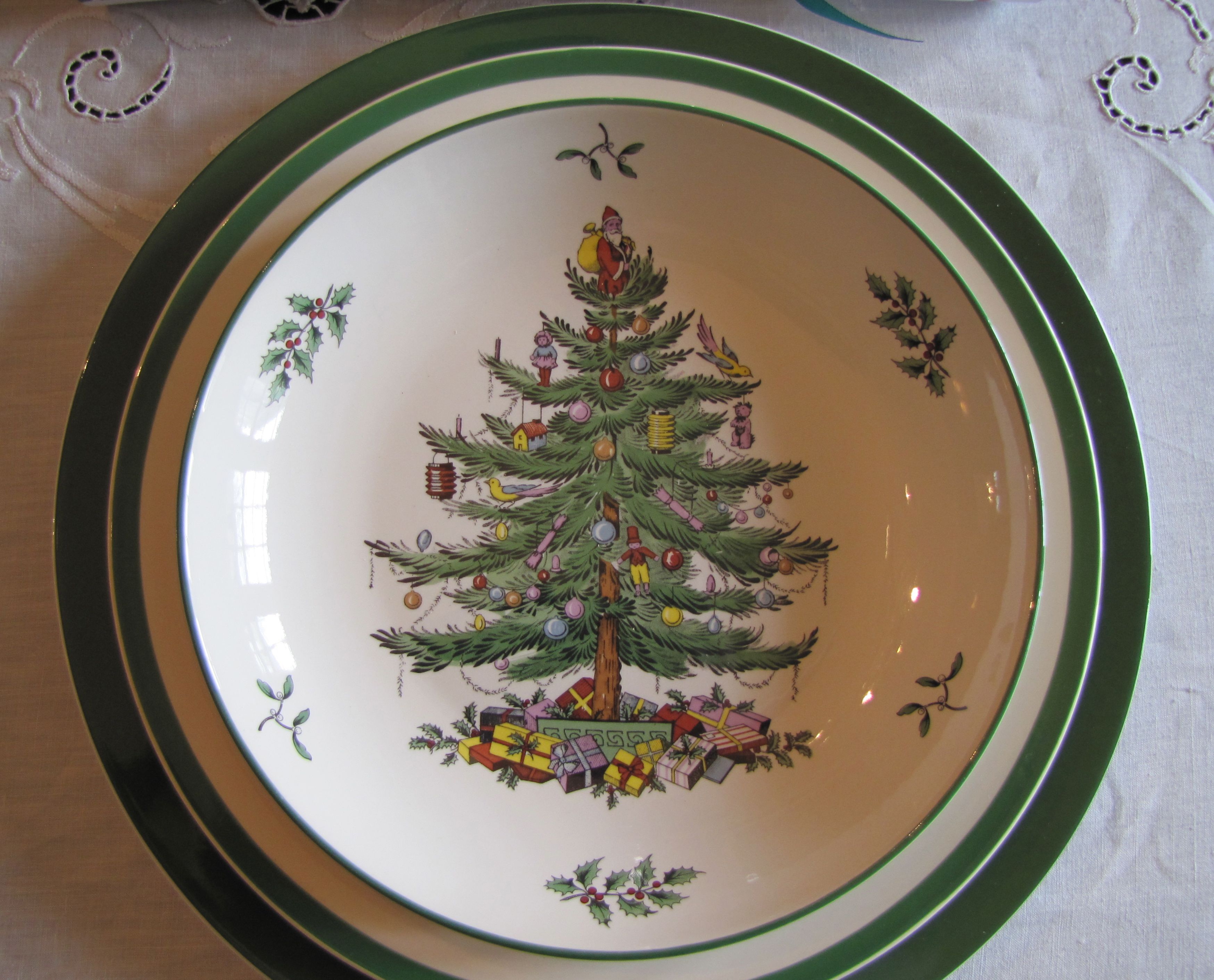
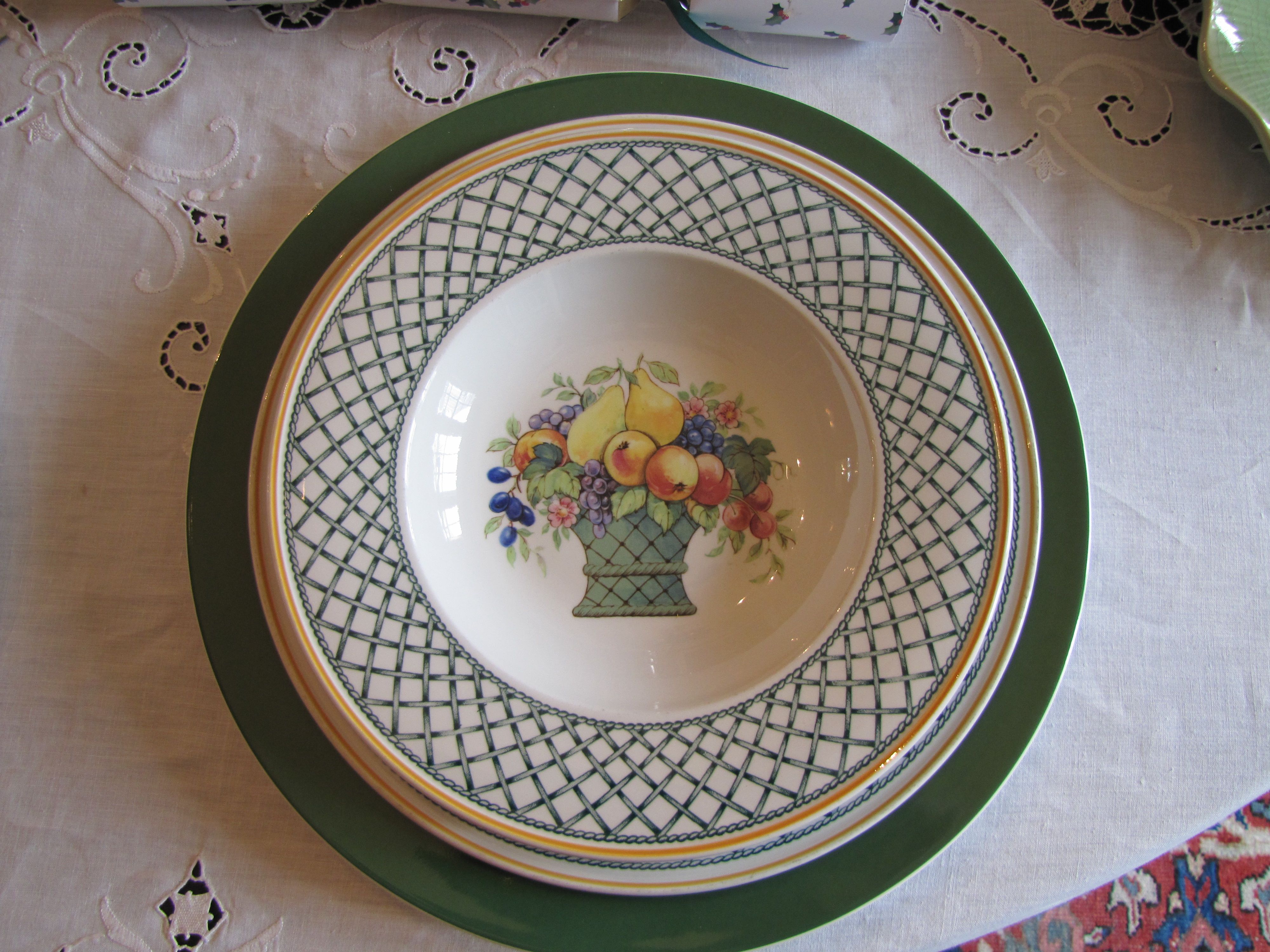
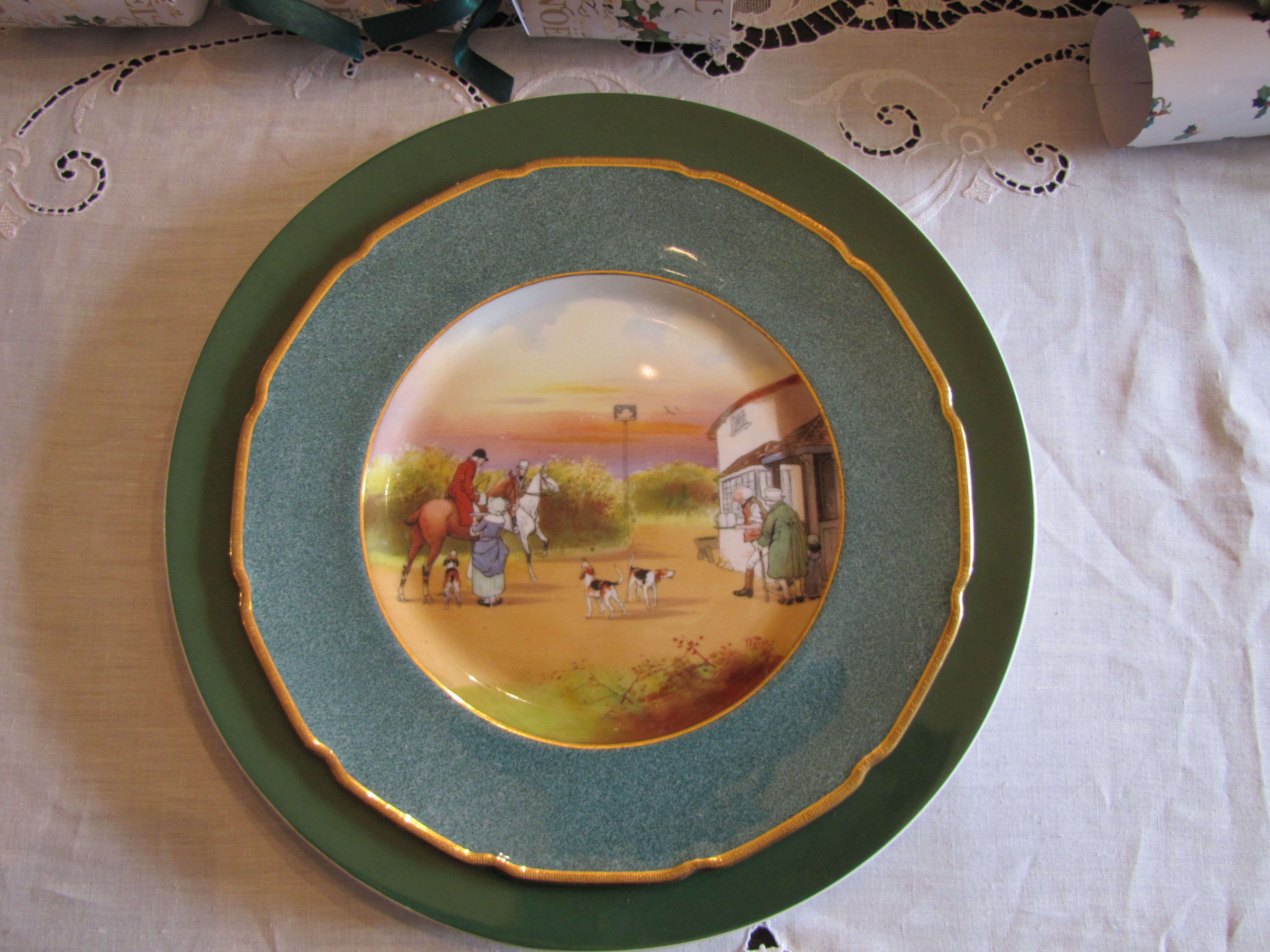
I just had to share my latest find, above, pictured with my Spode Christmas china.
Here it is:

I found this on sale at Bed Bath & Beyond (online).
Green-rimmed bone china chargers.
About 12 1/4″ in diameter.
$6.99 plus free shipping. Yes, $6.99. Whoo-hoo.
The best part of this, is, it looks good with my other china as well.
My Wedgwood Trentham (my grandmother’s china)
My Lenox Autumn
My everyday Basket by Villeroy and Boch
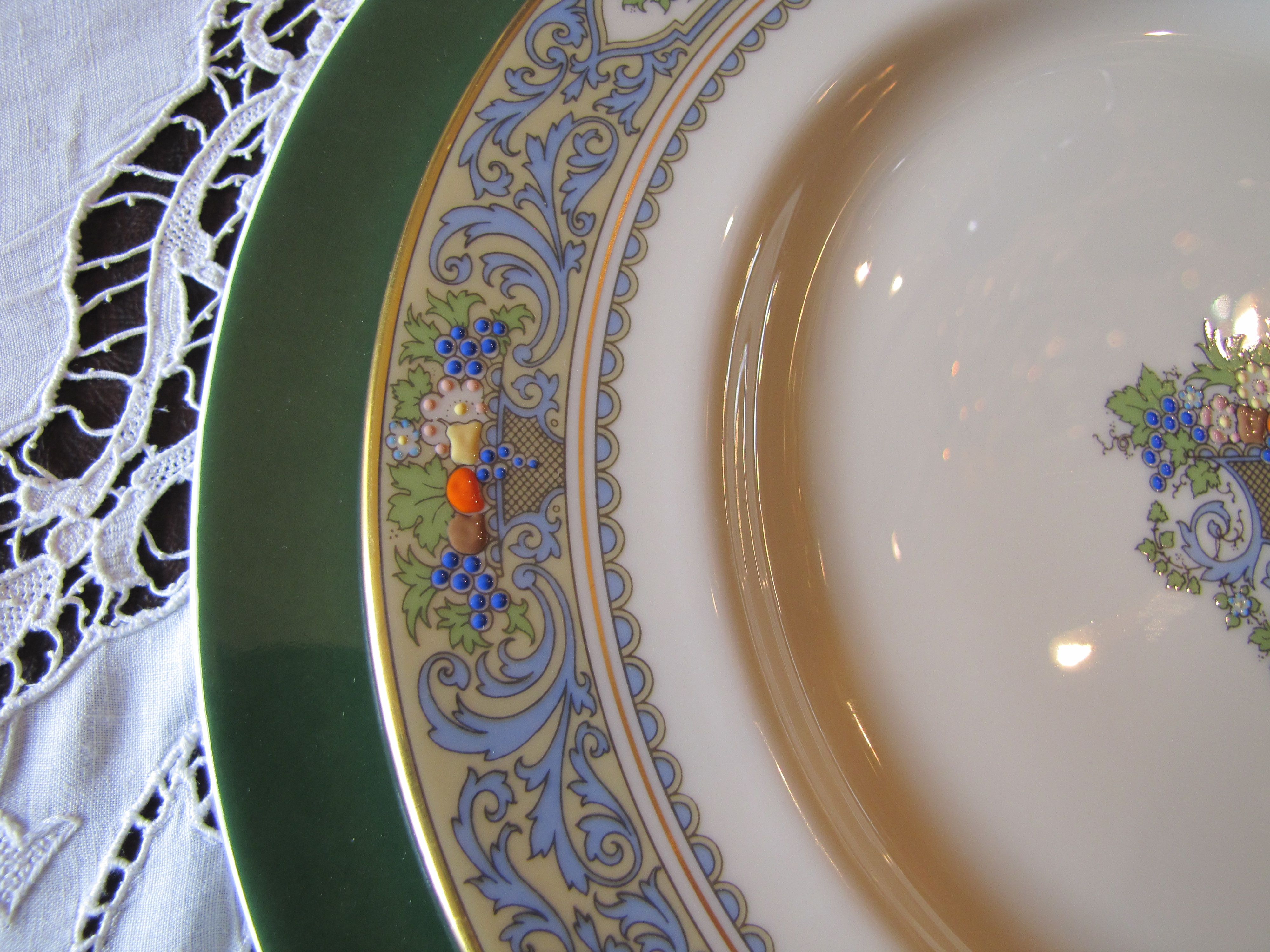
And it even looks nice with my set of Hunt Scene china (not sure of the pattern name) by Royal Doulton:
I just had to share my good luck in finding this great deal!
I think the quality is amazing for the price (there was a $24.99 sticker underneath the label).
Clearly, this is a very versatile piece of dinnerware.
You can check it out here. I received my charger plates within a week of ordering them!
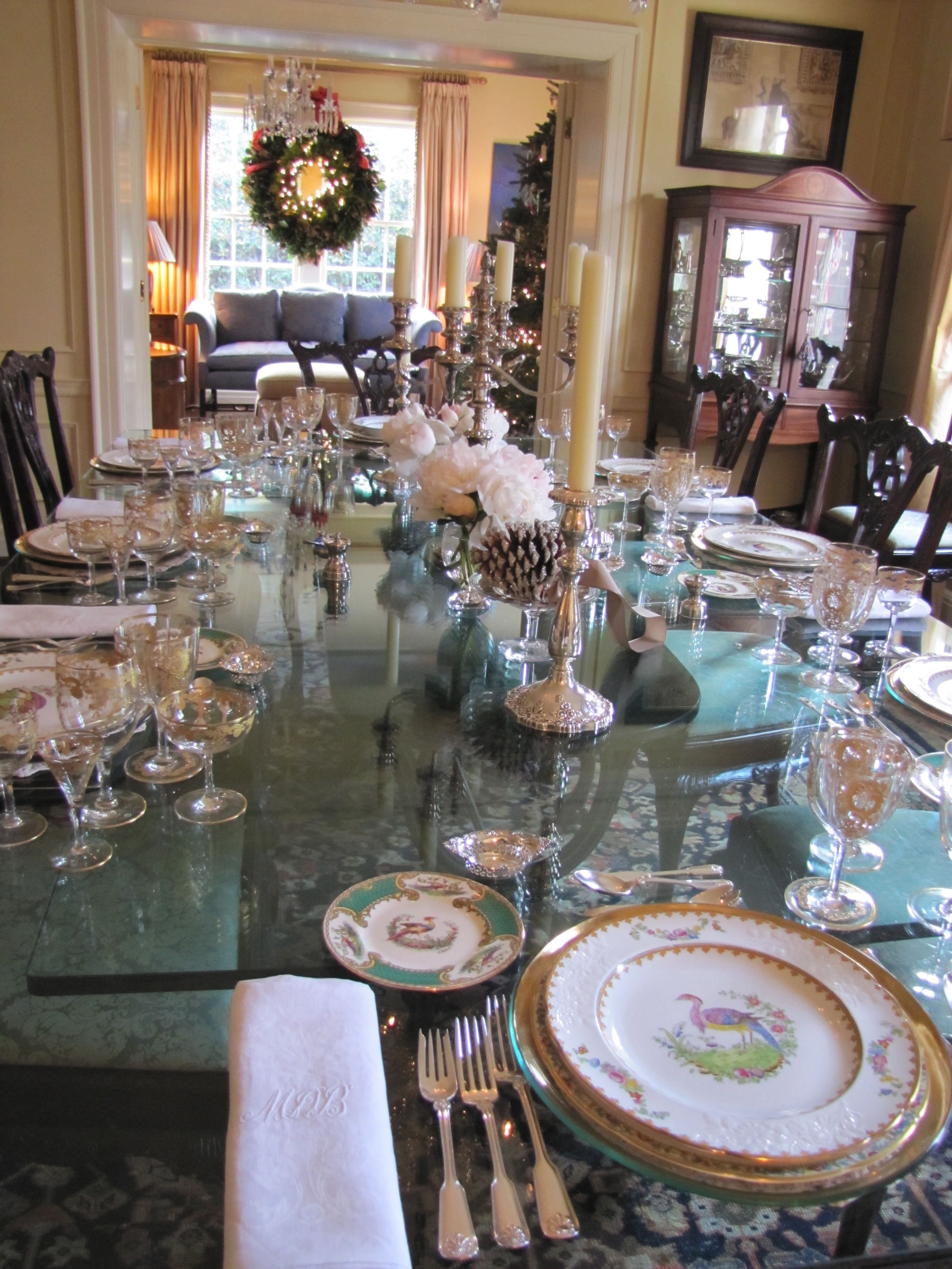
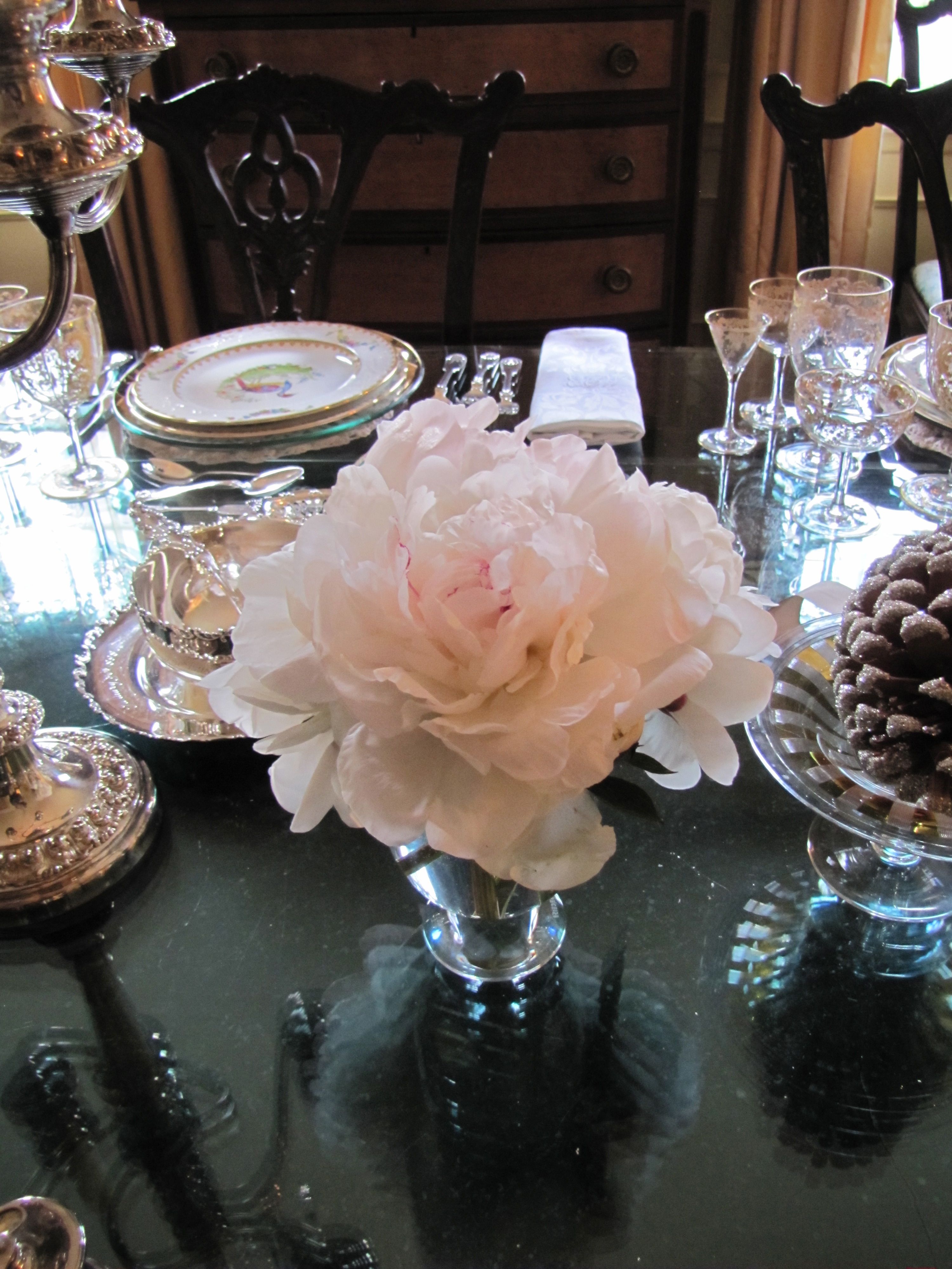
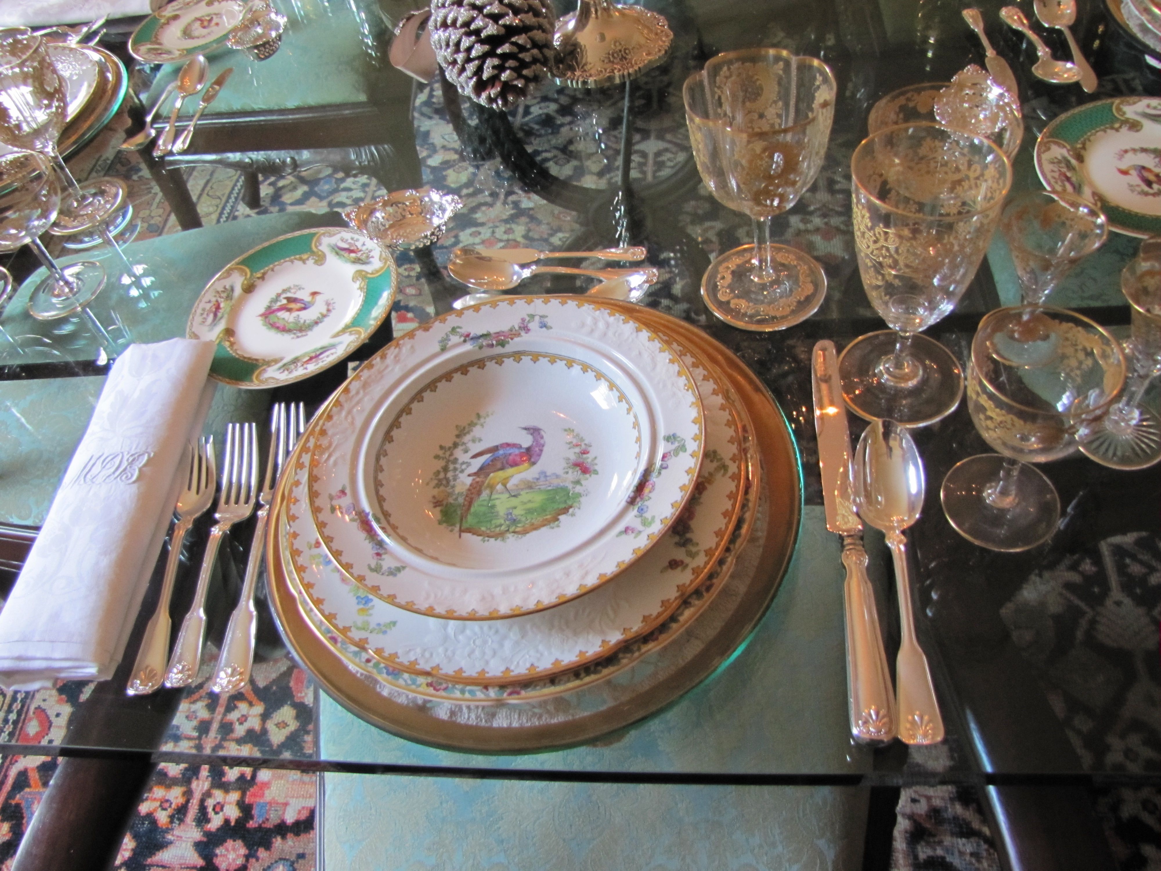
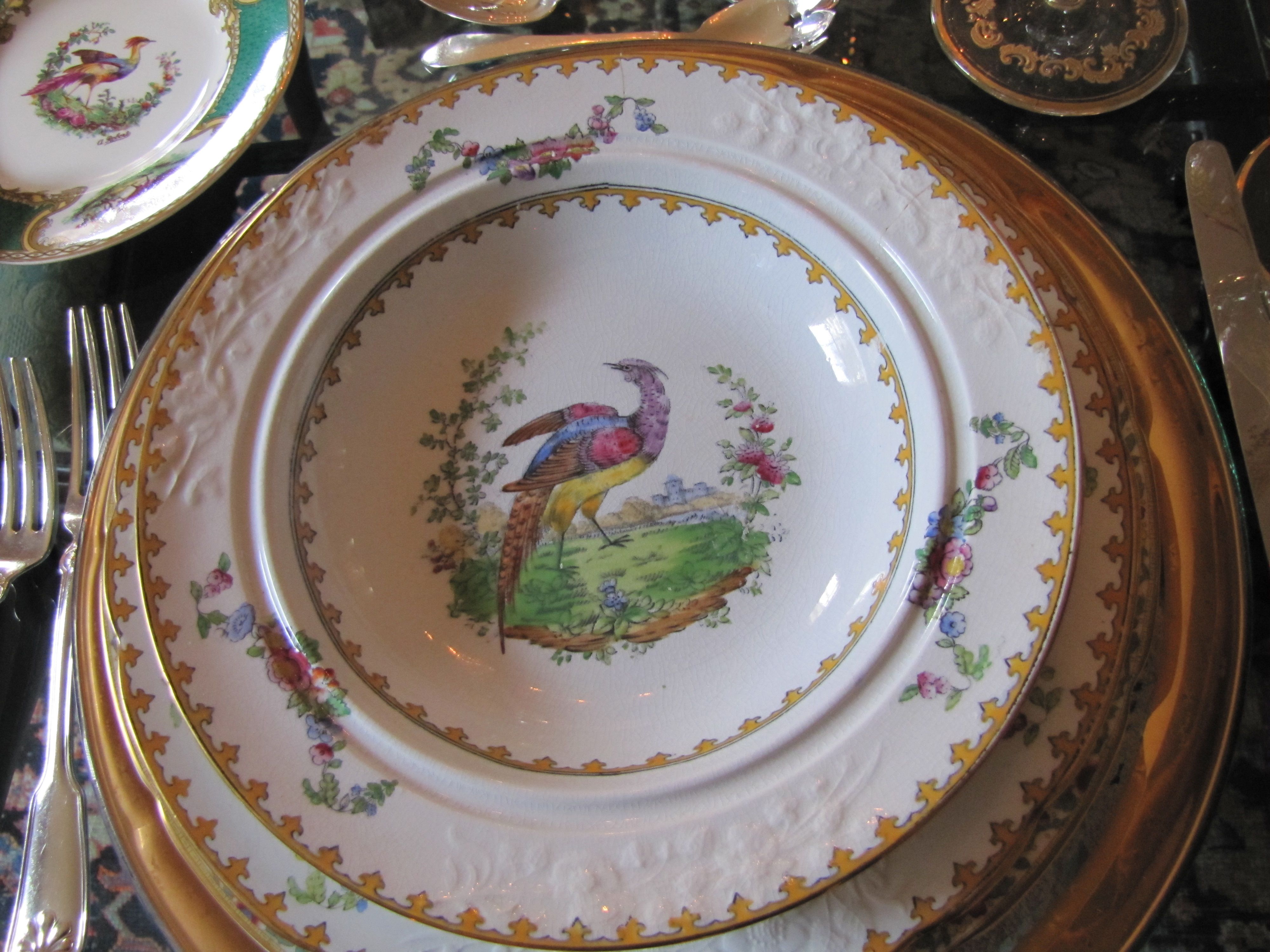
Sneak Peek: Independent Church Holiday Home Tour

If you are in the Birmingham, AL area, don’t miss this weekend’s home tour benefitting
the Fresh Air Fund of Independent Presbyterian Church, a very worthy cause.
This home belongs to one of my dearest friends.
She has the most gorgeous collection of antique English bone china
you have ever seen.
(The dining table looks straight out of Downton Abbey, with six gold-and-crystal Art Nouveau goblets per place setting!)
I had to dodge some photographers from “Southern Lady” magazine,
who were there photographing for their 2013 Christmas issue, but you’ll get the idea.
The decorations are the work of the fabulous Leah Hazzard,
another friend, and flower arranger extraordinaire .

All Images Color Calling


Is Green the Perfect Color?

Source: charmhomedesign.com via Melissa on Pinterest
With Green so often used in Christmas decorating

Source: tginteriors.blogspot.com via Lisa Farmer on Pinterest
and since Pantone just announced its 2013 Color of the Year

Source: pantone.com via Ellen on Pinterest
Let’s talk about the color green.
Here are the primary colors on a color wheel– red, blue and yellow:

Source: kmb-designs.com via tlm2 on Pinterest
The color green is sometimes called the fourth primary color.
This is not true, because primary colors can’t be made by mixing any other colors together.
Green is not a primary color because it is made by mixing blue and yellow.
However, I think this refers to its versatility in décor, as it is the one and only color
that has some shade of it which will go beautifully with every other color.

Source: Uploaded by user via iinviteall on Pinterest
Janice Lindsay refers to greens as “the chromatic peacekeepers, getting along with any color.”
Green is actually categorized as a secondary for color (as in paint, with the three primaries being red, blue and yellow),
but a primary for light (speaking in terms of wavelength, with red and blue being
the other two).
[credit: Janice Lindsay, All about Colour]

Source: outoforderdesign.com via Mich on Pinterest
When you think of nature, our Creator, the perfect colorist, gave every possible flower color an equally perfect leaf color!

Source: Uploaded by user via Betty & Gary on Pinterest

Source: finegardening.com via Mychelle on Pinterest

Source: thedphoto.com via Denita on Pinterest
When you draw greens from nature’s palette, the way colors are found naturally,
it is hard to go wrong!
Green, it really is the perfect color.
Crowd the Table

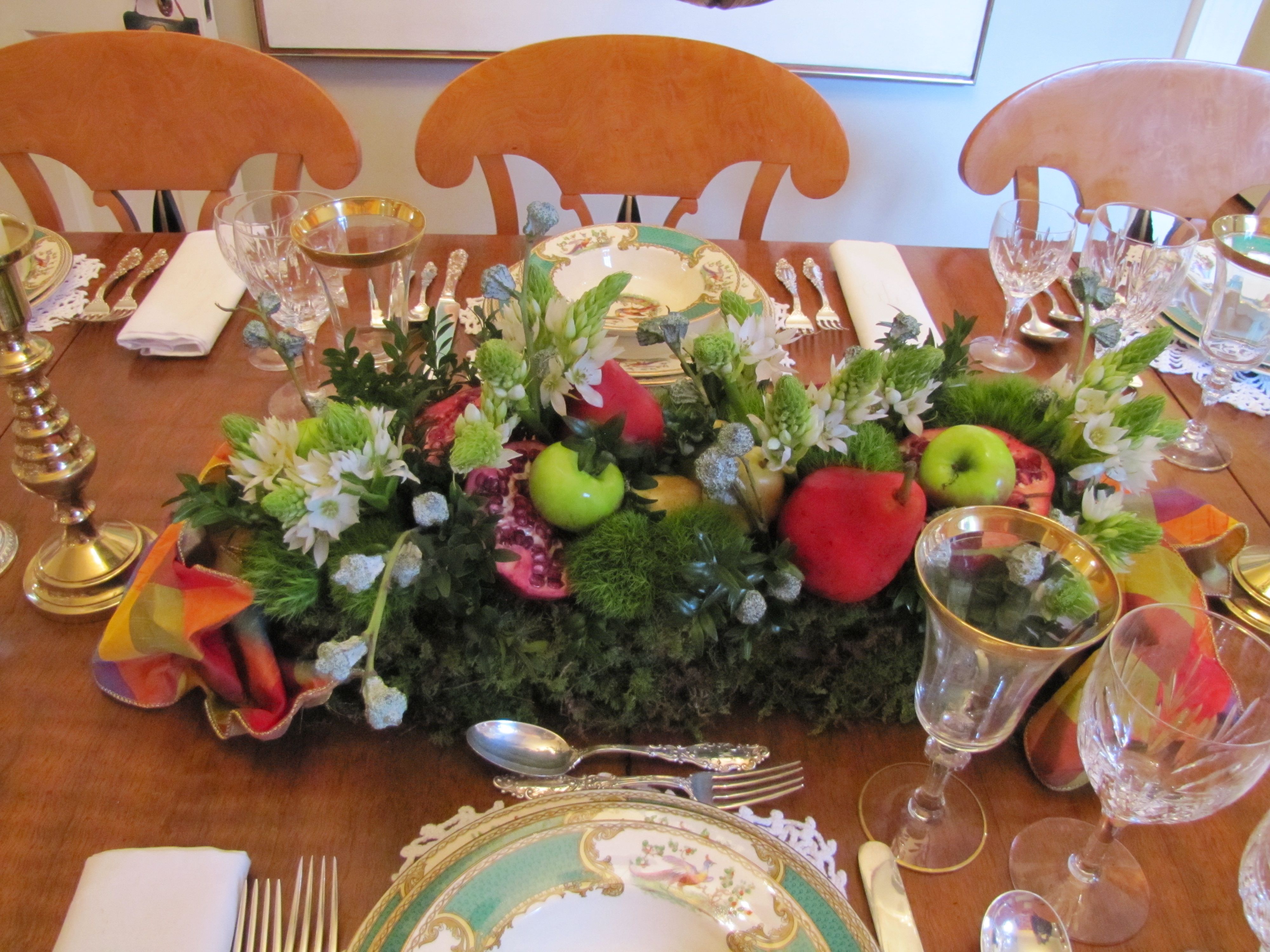
Have you ever heard the advice, “If you want everyone to have a good time, crowd the table!”? Recently, a round dinner table set for 9 had to be turned quickly into seating for 11. The maître d’ did not think it could be done, but our host stayed with it. All eleven of us, at a 60″ round table! It was fun to be crowded. Conversation flowed. I can’t remember such laughter. Can you think of ways to crowd your table?

Chinoiserie bedroom makeover for a young twenty-something
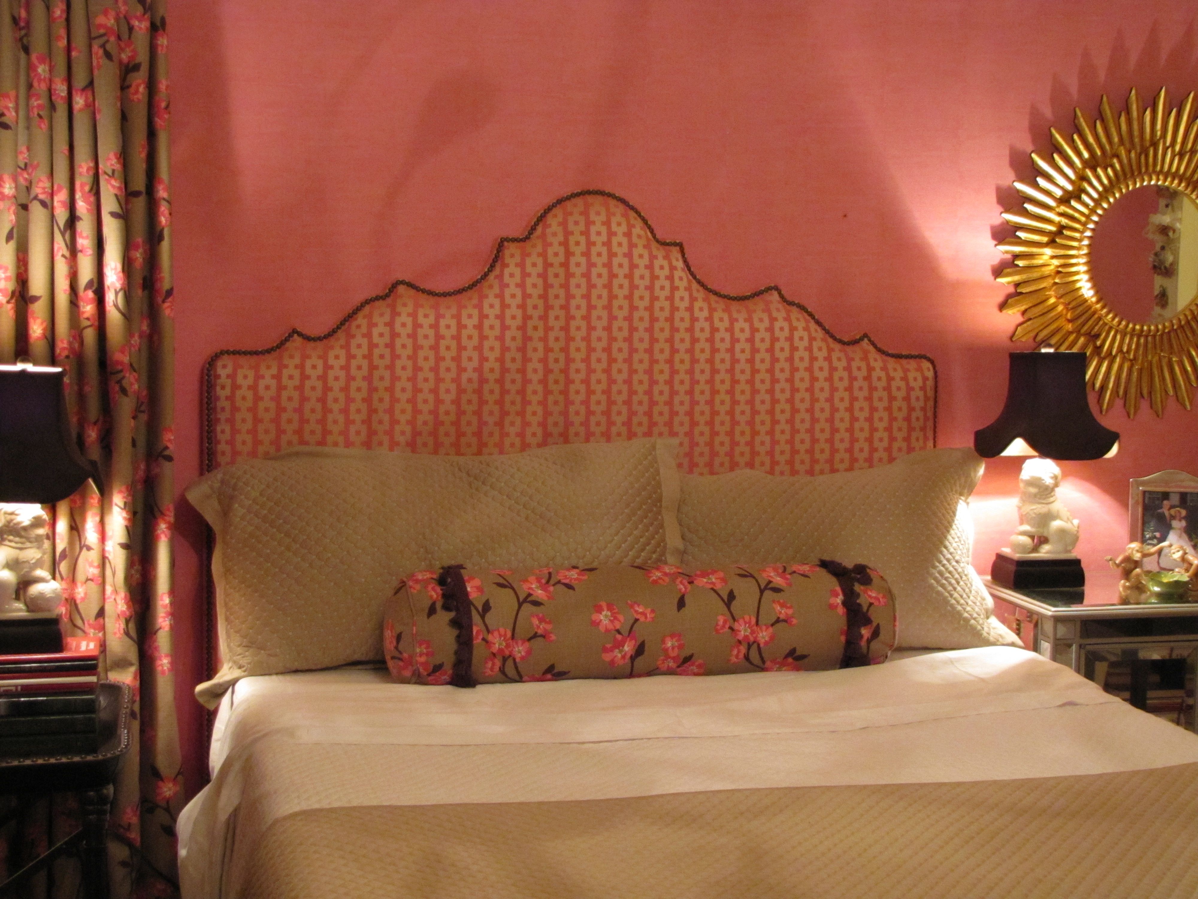
Design by Ellen Rhett
My young collegiate was anxious for an update to the room that had last been decorated when she was thirteen.
A college co-ed desires a sophisticated space to return to when she’s home.
Chic chinoiserie details pleased and surprised.

Pink dogwood linen fabric unifies the hot-pink wallpaper with the neutrals.
And repeats the Chinoiserie theme.
Existing strié wallpaper was kept.
Foo dog lamps add a youthful vibe and continue the Chinoiserie theme.
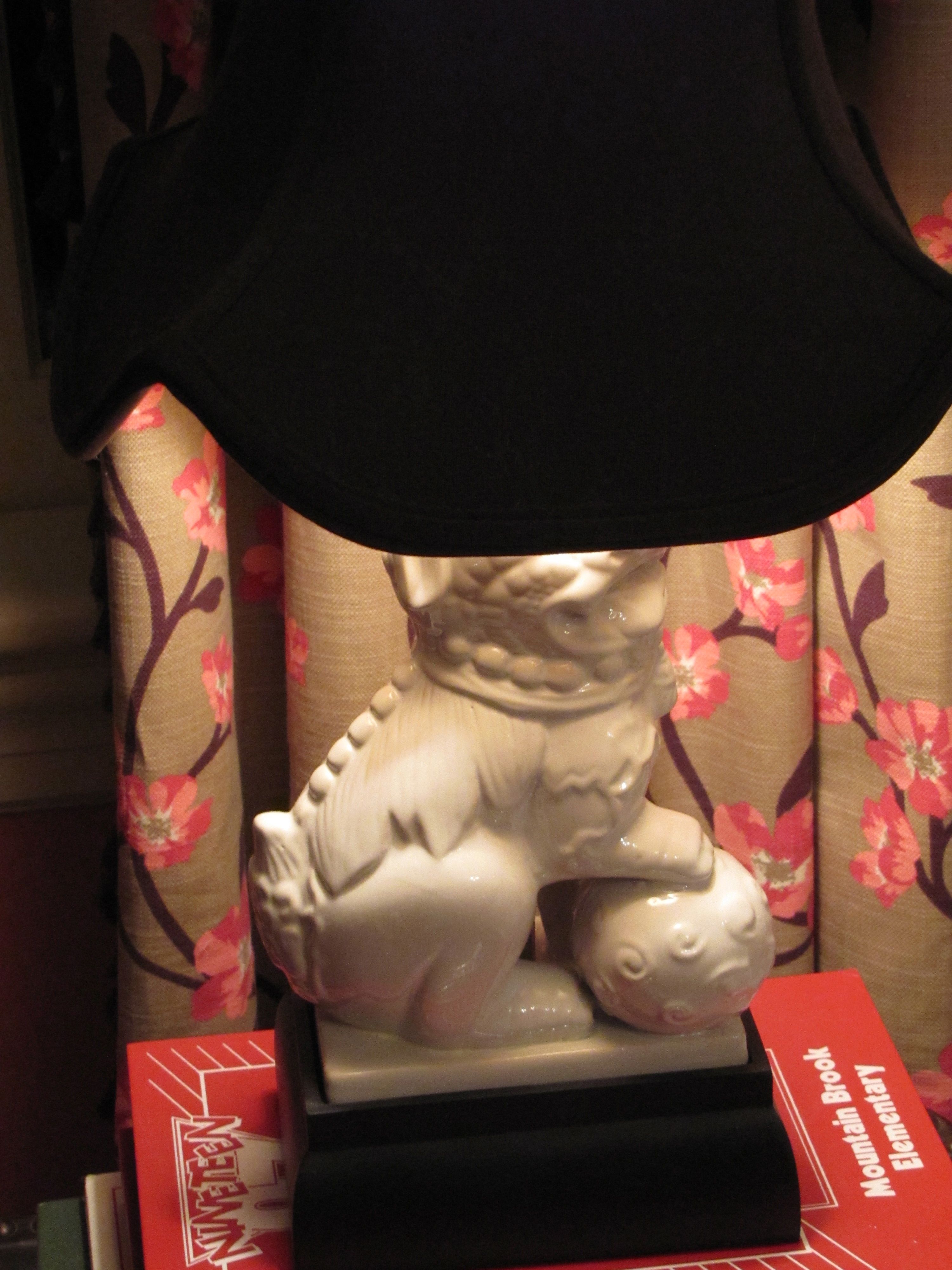
They also repeat the white in the dogwood fabric and bedding.
Remember, white is never a neutral in décor, even though it always is in fashion.
It must be repeated at least three times in a room.
White peonies, a favorite, are a natural in this room.

Design by Ellen Rhett
Custom padded headboard with expertly hand-applied nailheads (by my wonderful upholsterer)

Fun and funky and ultra-feminine light fixture, below, with plenty of sparkle and a dark finish.
Repeating the shape, movement, darkness, of the branches on the drapery and neckroll fabric.
Repeating the color of the lampshades as well.
And, a gorgeous on-trend sunburst accent mirror, handmade and all-wood.

Design by Ellen Rhett
Both sourced online for a song.
If I told you from where, you wouldn’t believe it anyway.
But, I know you, reader.
I know what you really want.
You want the before.
I’ll show you the before.
Get ready.
A little embarrassing so I’ll make this quick.
Here you are:
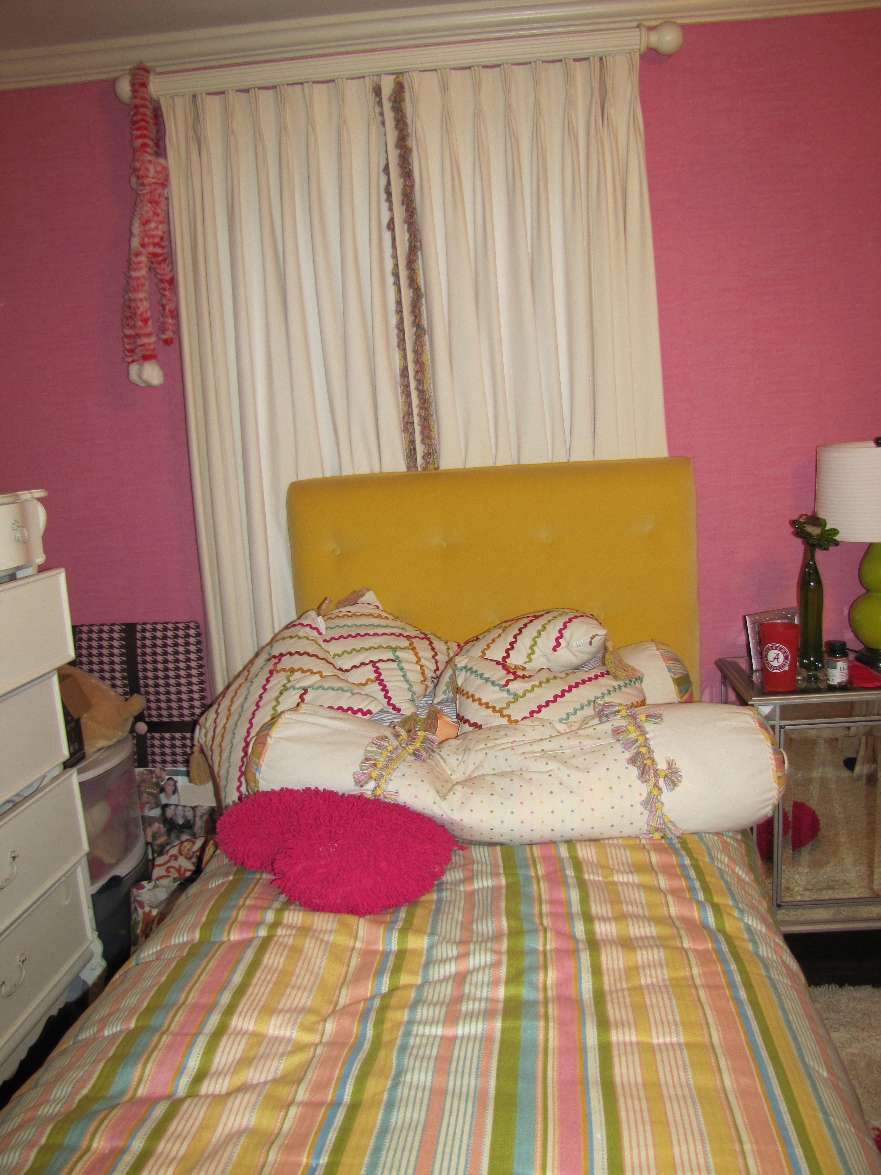
Before
And, one more time, the AFTER:

All Images Color Calling
Fabric Sources
Neckroll: Clark and Clark “Dogwood” (trade only)
Draperies: same as above.
Headboard fabric: Clark and Clark “Chinese Square” (trade only)
Bedspread, shams, comforter: Macy’s
Charger Plates
Here is a simple tip for making your holiday table look better.
Use a charger plate under your dinner plate. It gives a nice layered effect.

Sometimes called “service plates,” they are used to cradle the first course plates,
and are usually (though not always) removed for the entrée plate.
However, etiquette dictates that they are always removed from the table before the dessert course.
Here are some good looks for both casual and formal Christmas settings using chargers.

Source: google.com via Ellen on Pinterest

Source: barefootfloor.com via Ellen on Pinterest

Source: google.com via Ellen on Pinterest

Source: hyacinthforthesoul.blogspot.com via Ellen on Pinterest

Source: upnorthpreppy.blogspot.com via Ellen on Pinterest

Source: google.com via Ellen on Pinterest

Source: google.com via Ellen on Pinterest


Source: media-cache3.pinterest.com via Ellen on Pinterest

Source: betweennapsontheporch.net via Ellen on Pinterest
Decorating for Christmas

Image ©Color Calling
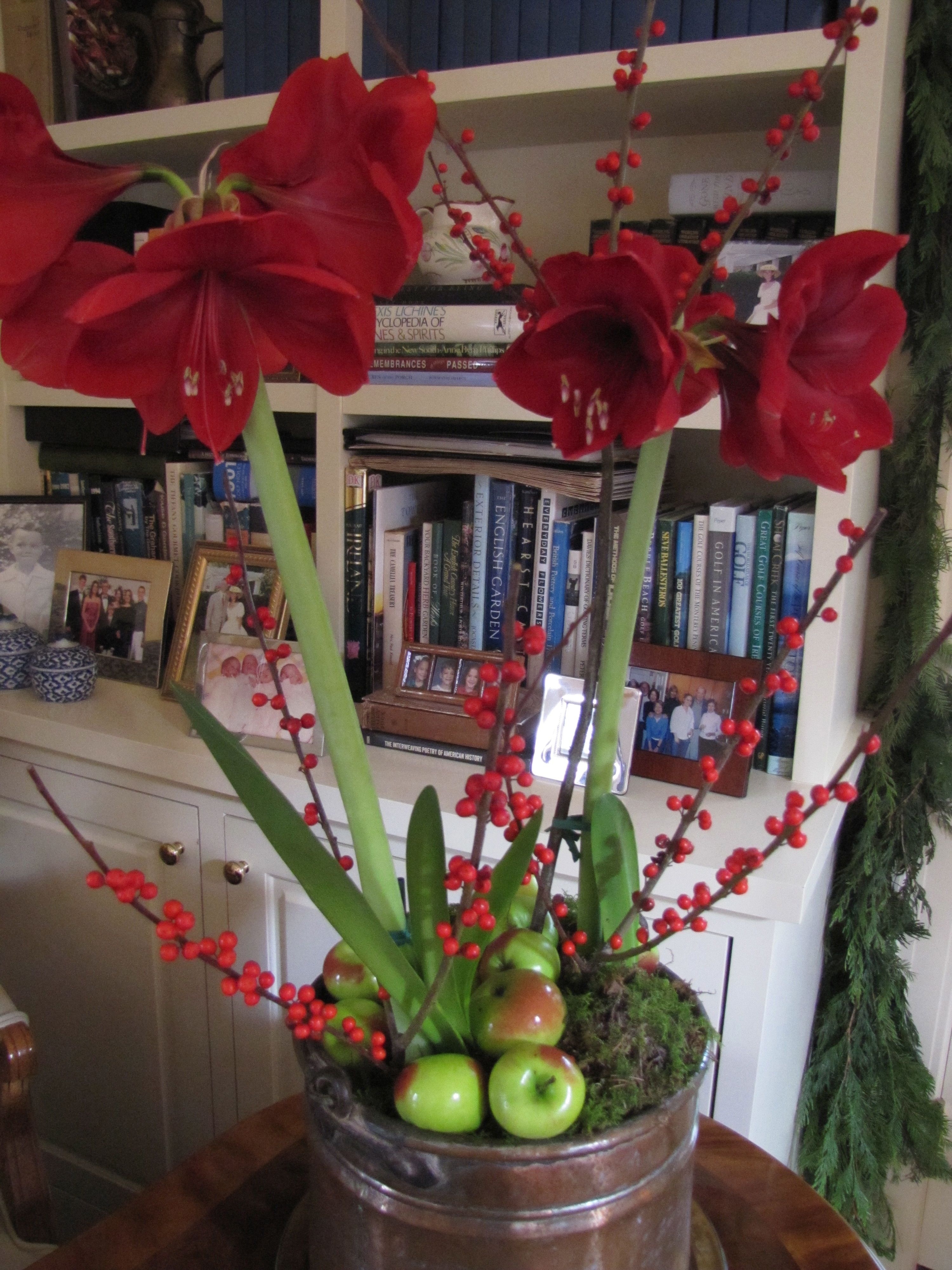
I have a new go-to resource for my Christmas greenery.
The Curb Market, located in downtown Montgomery, Alabama.
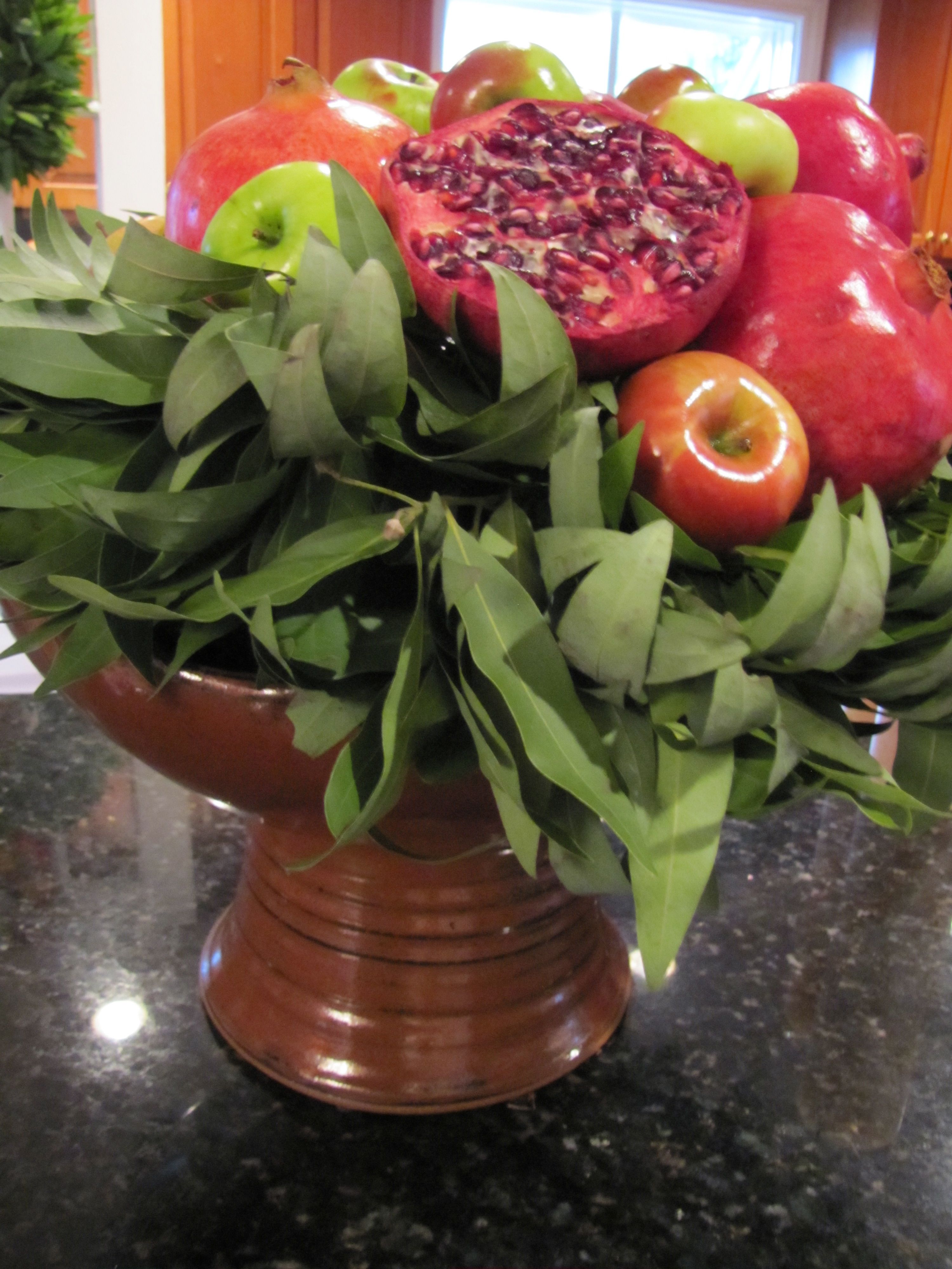
Above is one of the large centerpieces, (there are two) which will go on my mantels,
after I gussy them up a bit with pine cones and holly sprigs.
And maybe some pomegranates and lady apples as well.
Here are my box garlands and wreaths.
The velvet bows came with the wreaths, and maybe need a little work before everything is hung.

Image ©Color Calling
For some reason, I have always wanted a gold spray-painted magnolia wreath.
This one is a very muted gold. I like it because it doesn’t look too shiny.
I have no idea where it will go (somewhere inside, maybe on the breakfast room table?), but here it is:

Image ©Color Calling
Readers, what are your decorating plans this year?
Corn Husk Angel
I love interesting crafts.
This one is my most favorite.
It was given to me by my mother.
A handmade corn husk angel.
It will be our tree topper again this (and every) year.
Isn’t she simply beautiful?

Image ©Color Calling

Image ©Color Calling
Available by pre-order only from Troy (Alabama) Marketplace: marketplace@troycable.net
Holiday Treats

Image ©Color Calling

Christmas will be here before we know it.
I love to make Christmas treats for friends.
They will receive either my homemade Cheese Straws,
or pictured above, my Chocolate Peanut Clusters.
Recipe here.
Happy Thanksgiving!

Source: weddingstylemagazine.com via Donna on Pinterest

Source: homestoriesatoz.com via Kelly Oliver on Pinterest

Source: housebeautiful.com via Sandra on Pinterest

Source: thefancyladygourmet.blogspot.com via Maritza on Pinterest

Source: stonegable.blogspot.com via Betty on Pinterest

Source: marthastewart.com via Mary on Pinterest

Source: tartanscot.blogspot.com via Jamie on Pinterest

Source: bing.com via Louisa on Pinterest

Source: 3.bp.blogspot.com via Paige on Pinterest

Source: maddycakesmuse.blogspot.com via Kristin on Pinterest

Source: sweetsomethingdesign.blogspot.com via Carrie on Pinterest

Image ©Color Calling
Accents for the Master Bath


Sometimes an accent table in the Master Bath is the perfect touch.
This is for looks as well as extra surface area near the tub,
or anywhere you need some extra space.
For your fanciest bath gel, cell phone, a magazine, a drink.
Your accent table should repeat one of the colors or finishes in the room.
Here are some well-scaled ideas.


Keeping it Simple in the Master Bath
Color harmony. A simple concept.
Made easier with an understanding of undertones.
Now, I don’t mean plain or too matching.
And I certainly don’t mean boring.
As a color specialist, it means selecting the right color.
For example, today, with my large samples, I selected a gorgeous white paint color
for a friend’s Carrara marble bath.
If you have been reading this blog, you know about my large samples, right?
Here are my inspiration photos.

Source: cotedetexas.blogspot.com via Ellen on Pinterest

Source: countryliving.com via Ellen on Pinterest

Source: pinkpreppylillylover.blogspot.com via Buffi on Pinterest
Sometimes the right color is white.
So, when you have Carrara marble, for instance,
don’t be afraid to go with white walls.
There are several whites that really sing with Carrara.
An all white bath.
A very simple concept, which will always be timeless.
Beautiful. Not boring.
I am humming to myself just thinking about this project.
If she agrees to photos, I’ll post before and afters.
