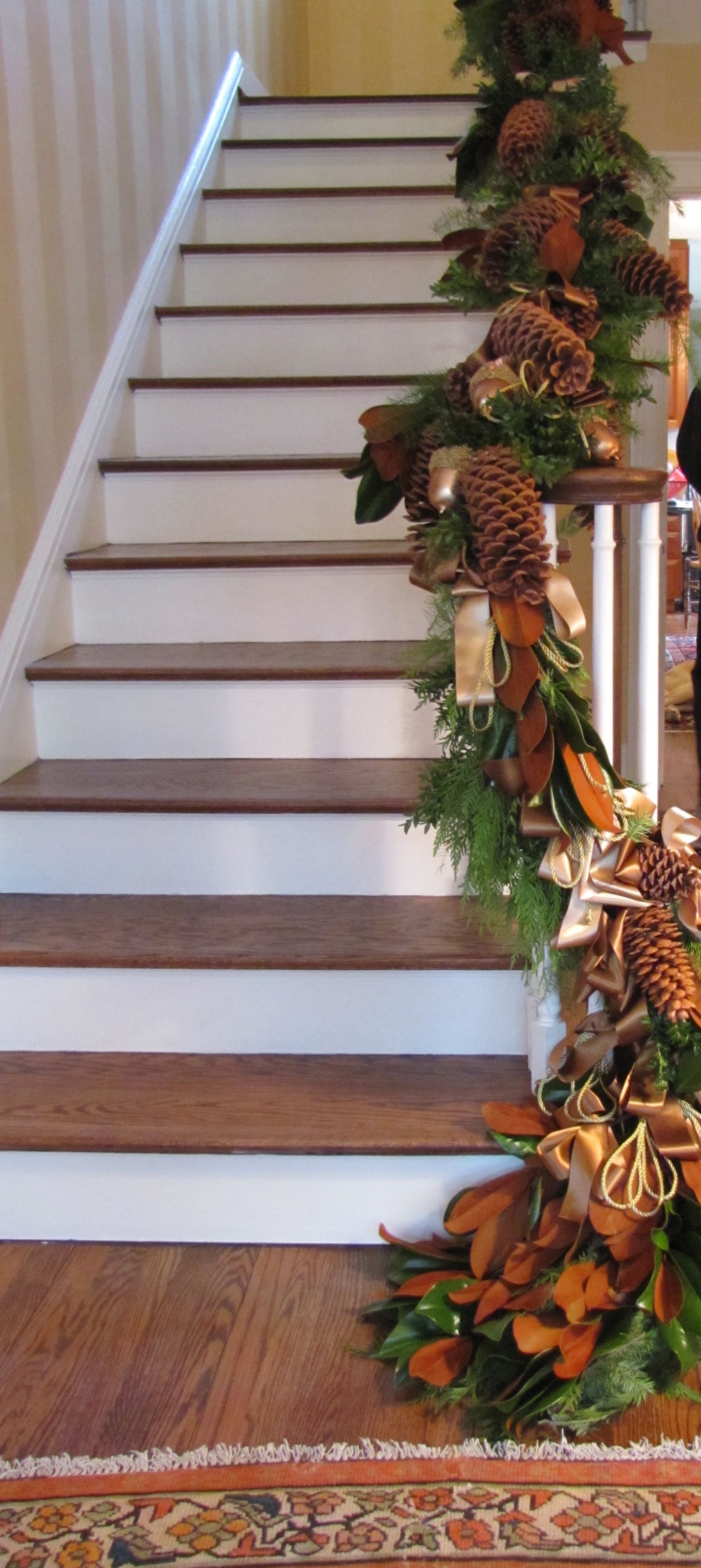
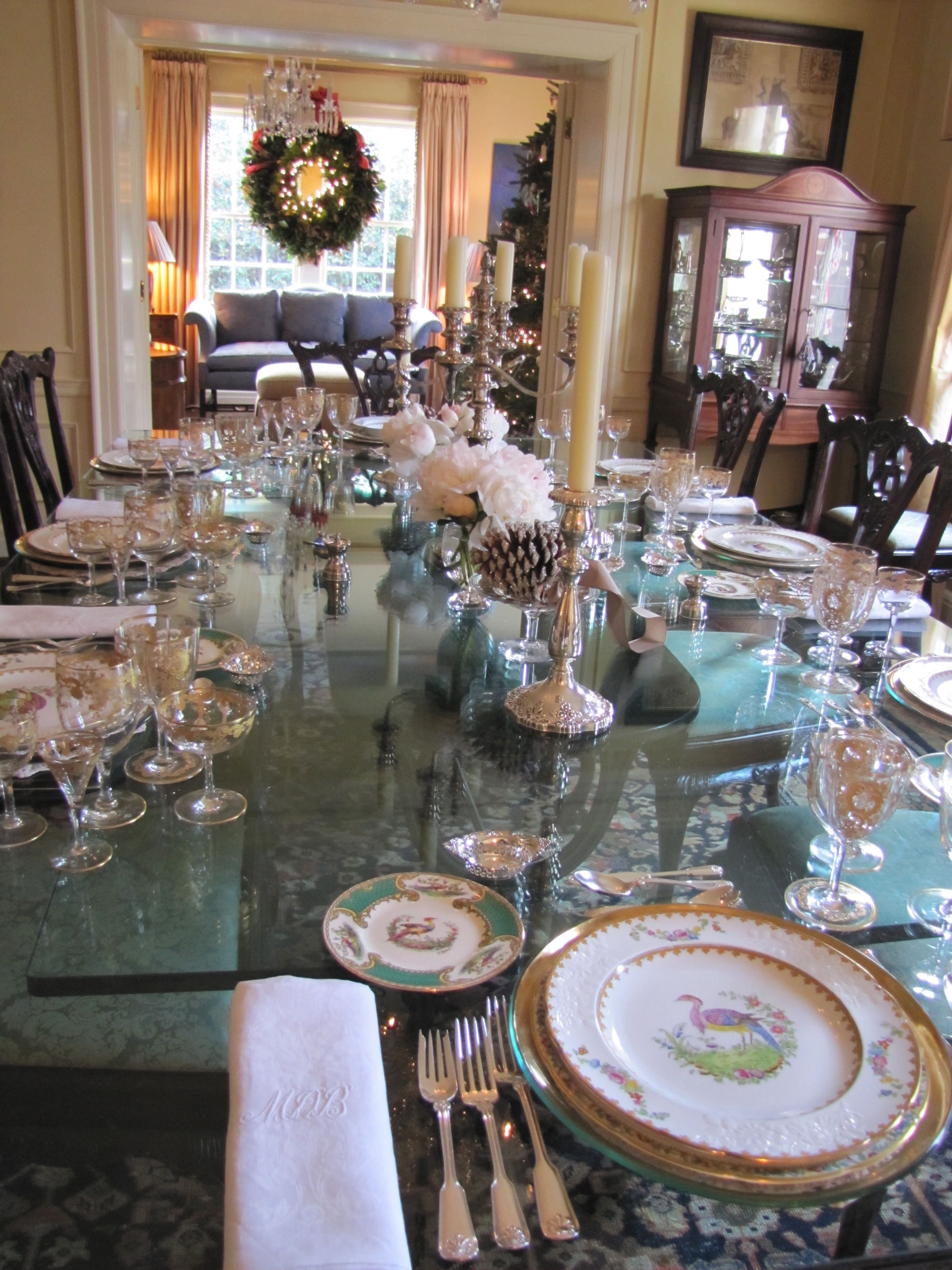
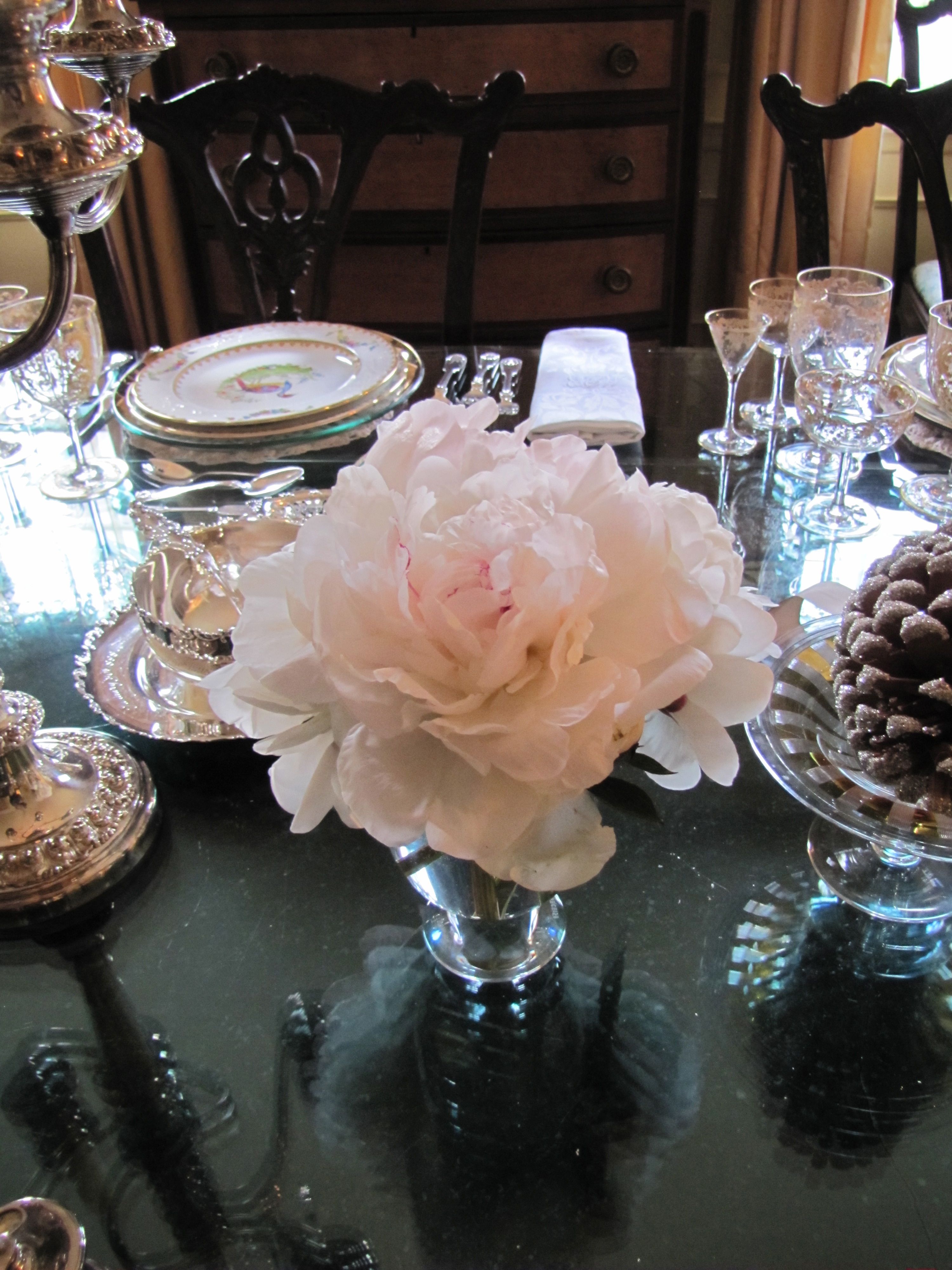
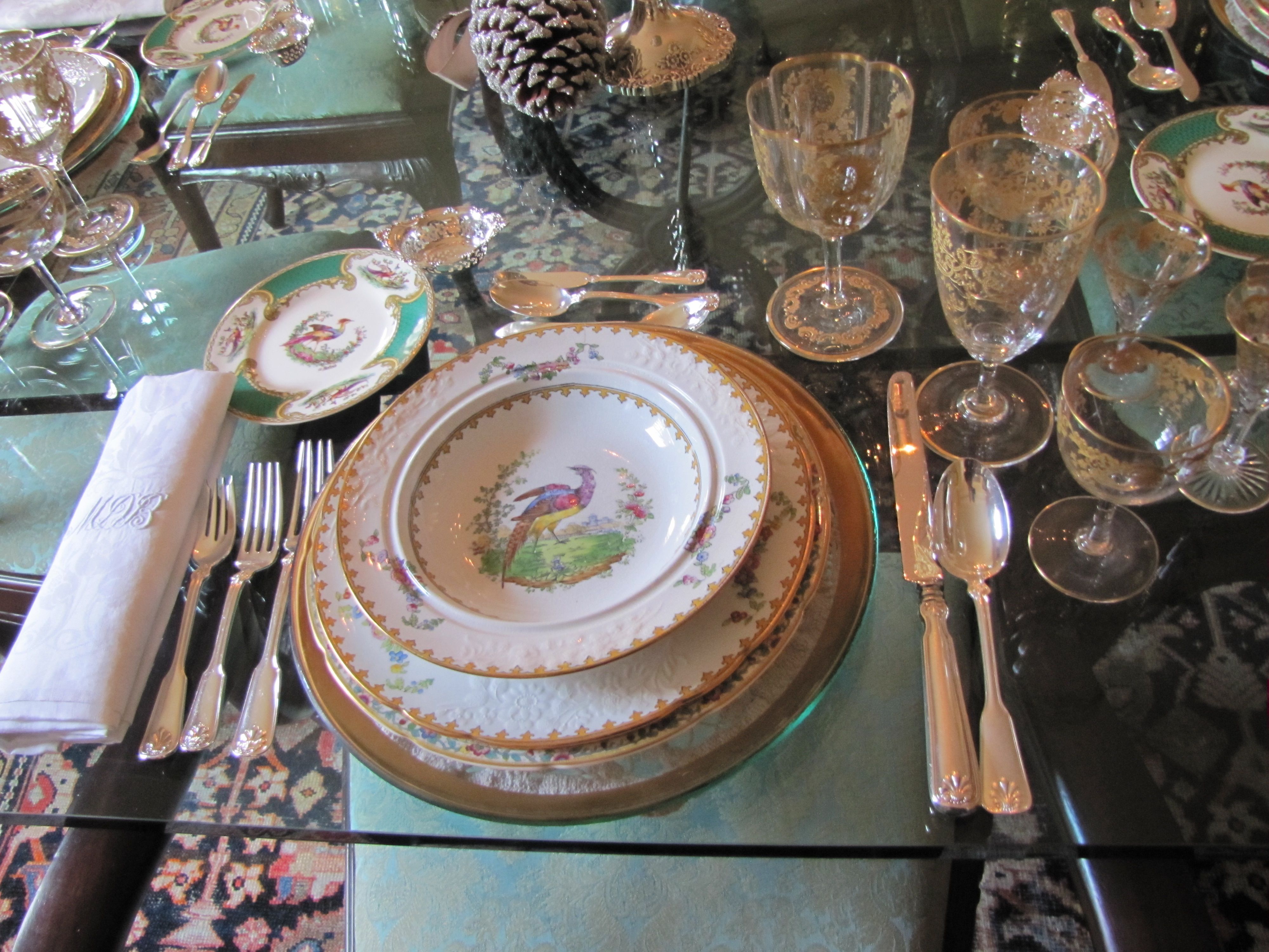
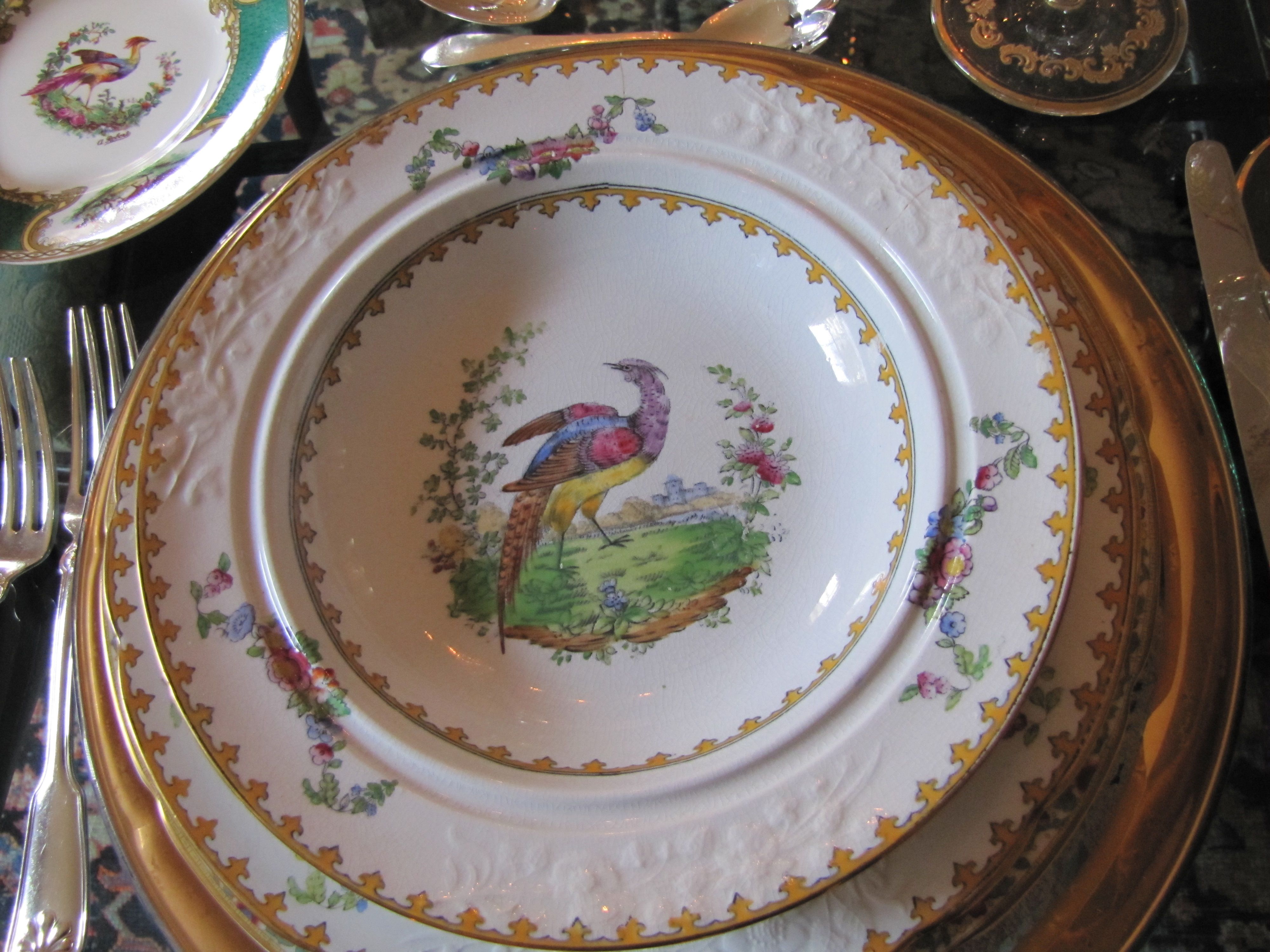
Sneak Peek: Independent Church Holiday Home Tour

If you are in the Birmingham, AL area, don’t miss this weekend’s home tour benefitting
the Fresh Air Fund of Independent Presbyterian Church, a very worthy cause.
This home belongs to one of my dearest friends.
She has the most gorgeous collection of antique English bone china
you have ever seen.
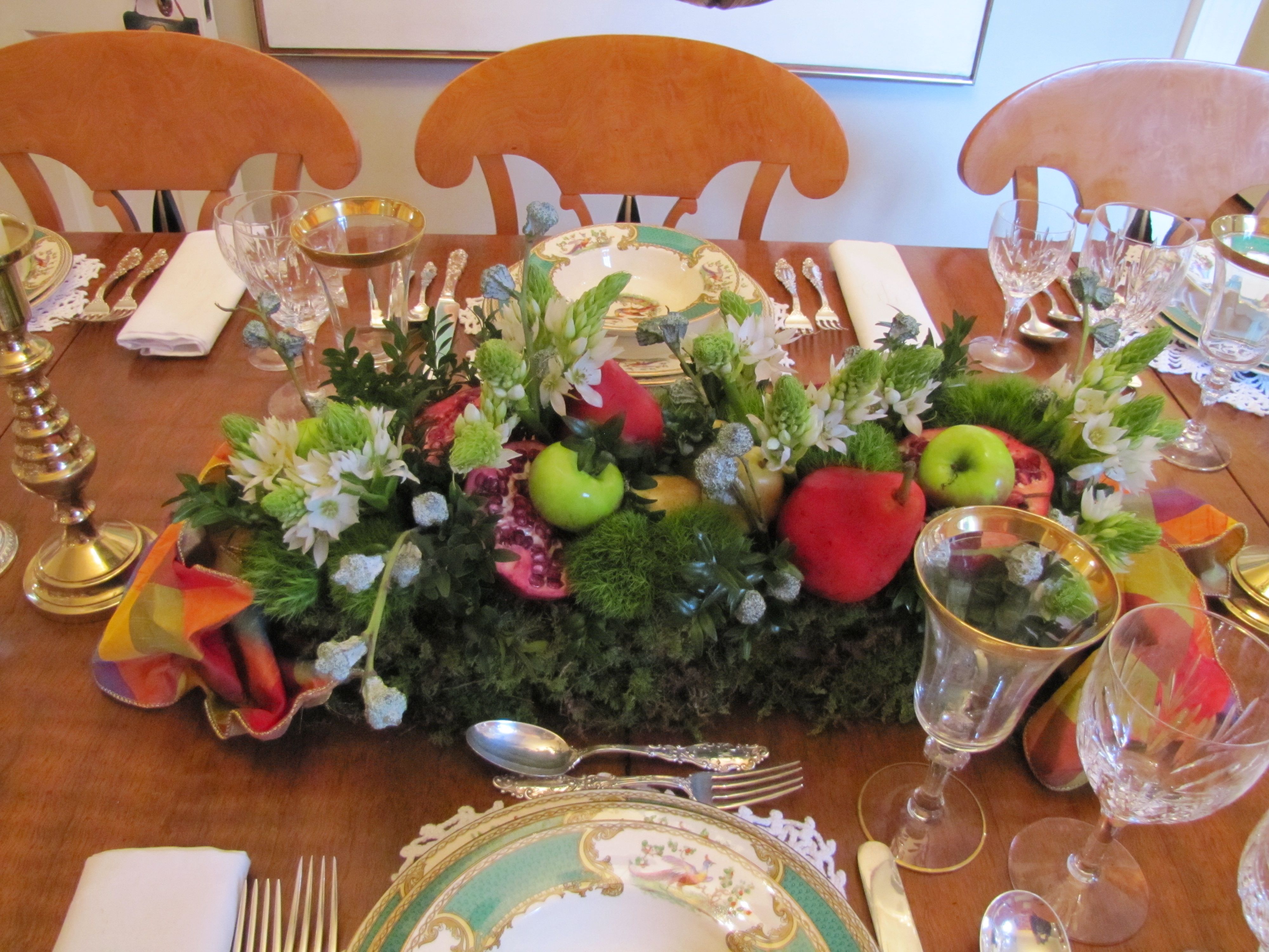
(The dining table looks straight out of Downton Abbey, with six gold-and-crystal Art Nouveau goblets per place setting!)
I had to dodge some photographers from “Southern Lady” magazine,
who were there photographing for their 2013 Christmas issue, but you’ll get the idea.
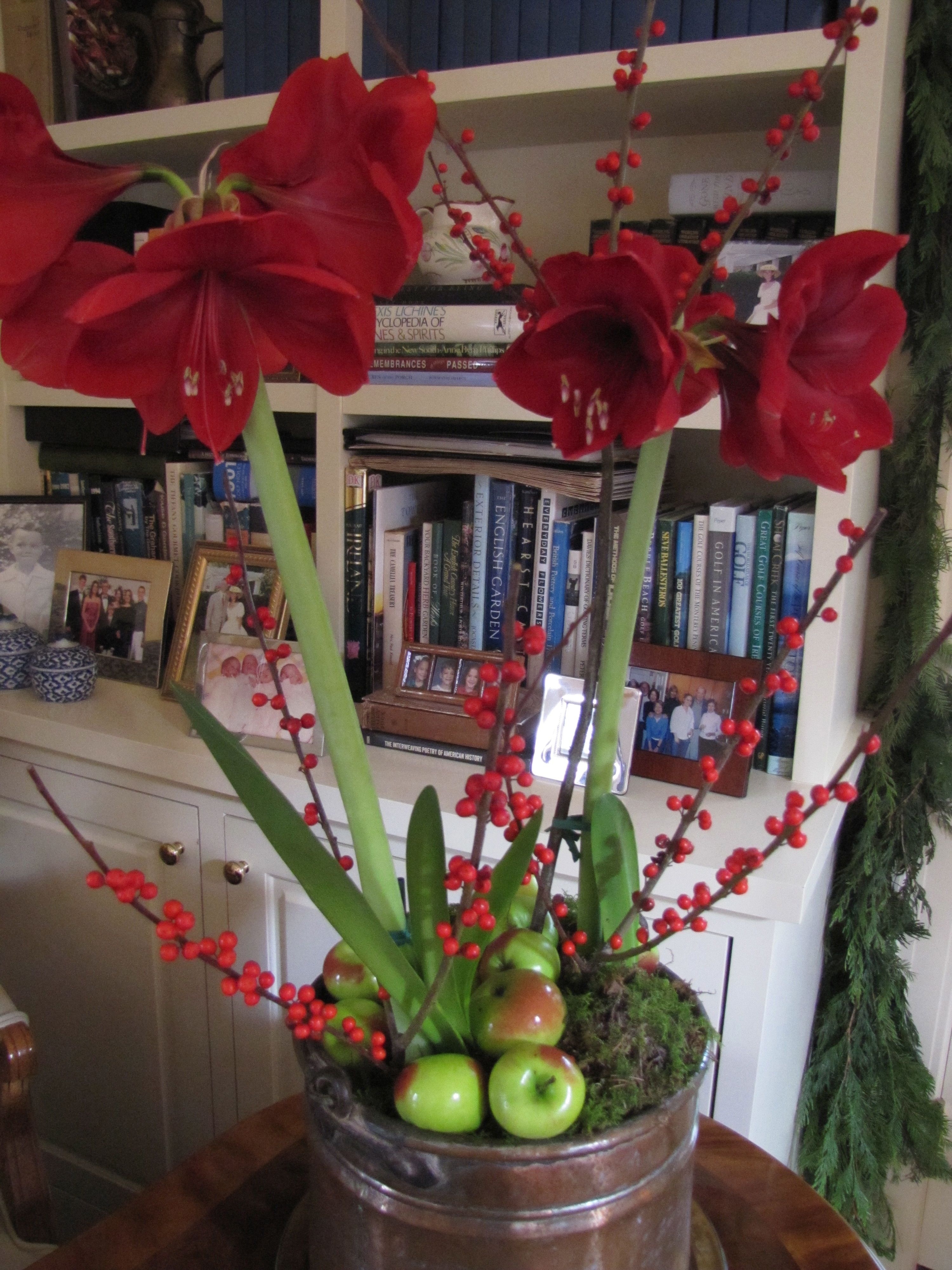
The decorations are the work of the fabulous Leah Hazzard,
another friend, and flower arranger extraordinaire .

All Images Color Calling


Is Green the Perfect Color?

Source: charmhomedesign.com via Melissa on Pinterest
With Green so often used in Christmas decorating

Source: tginteriors.blogspot.com via Lisa Farmer on Pinterest
and since Pantone just announced its 2013 Color of the Year

Source: pantone.com via Ellen on Pinterest
Let’s talk about the color green.
Here are the primary colors on a color wheel– red, blue and yellow:

Source: kmb-designs.com via tlm2 on Pinterest
The color green is sometimes called the fourth primary color.
This is not true, because primary colors can’t be made by mixing any other colors together.
Green is not a primary color because it is made by mixing blue and yellow.
However, I think this refers to its versatility in décor, as it is the one and only color
that has some shade of it which will go beautifully with every other color.

Source: Uploaded by user via iinviteall on Pinterest
Janice Lindsay refers to greens as “the chromatic peacekeepers, getting along with any color.”
Green is actually categorized as a secondary for color (as in paint, with the three primaries being red, blue and yellow),
but a primary for light (speaking in terms of wavelength, with red and blue being
the other two).
[credit: Janice Lindsay, All about Colour]

Source: outoforderdesign.com via Mich on Pinterest
When you think of nature, our Creator, the perfect colorist, gave every possible flower color an equally perfect leaf color!

Source: Uploaded by user via Betty & Gary on Pinterest

Source: finegardening.com via Mychelle on Pinterest

Source: thedphoto.com via Denita on Pinterest
When you draw greens from nature’s palette, the way colors are found naturally,
it is hard to go wrong!
Green, it really is the perfect color.
Crowd the Table

Have you ever heard the advice, “If you want everyone to have a good time, crowd the table!”? Recently, a round dinner table set for 9 had to be turned quickly into seating for 11. The maître d’ did not think it could be done, but our host stayed with it. All eleven of us, at a 60″ round table! It was fun to be crowded. Conversation flowed. I can’t remember such laughter. Can you think of ways to crowd your table?

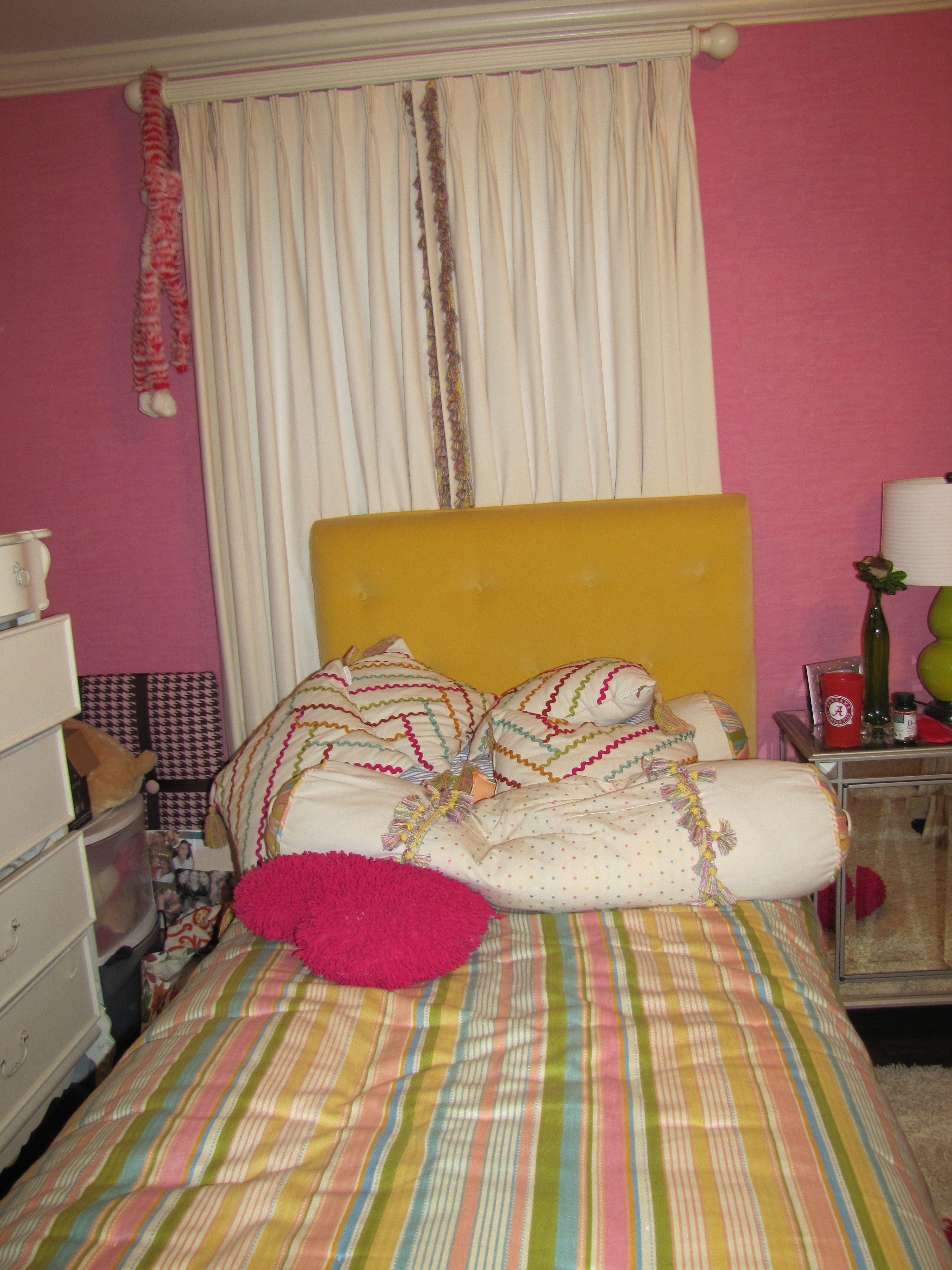
Chinoiserie bedroom makeover for a young twenty-something
Design by Ellen Rhett
My young collegiate was anxious for an update to the room that had last been decorated when she was thirteen.
A college co-ed desires a sophisticated space to return to when she’s home.
Chic chinoiserie details pleased and surprised.

Pink dogwood linen fabric unifies the hot-pink wallpaper with the neutrals.
And repeats the Chinoiserie theme.
Existing strié wallpaper was kept.
Foo dog lamps add a youthful vibe and continue the Chinoiserie theme.
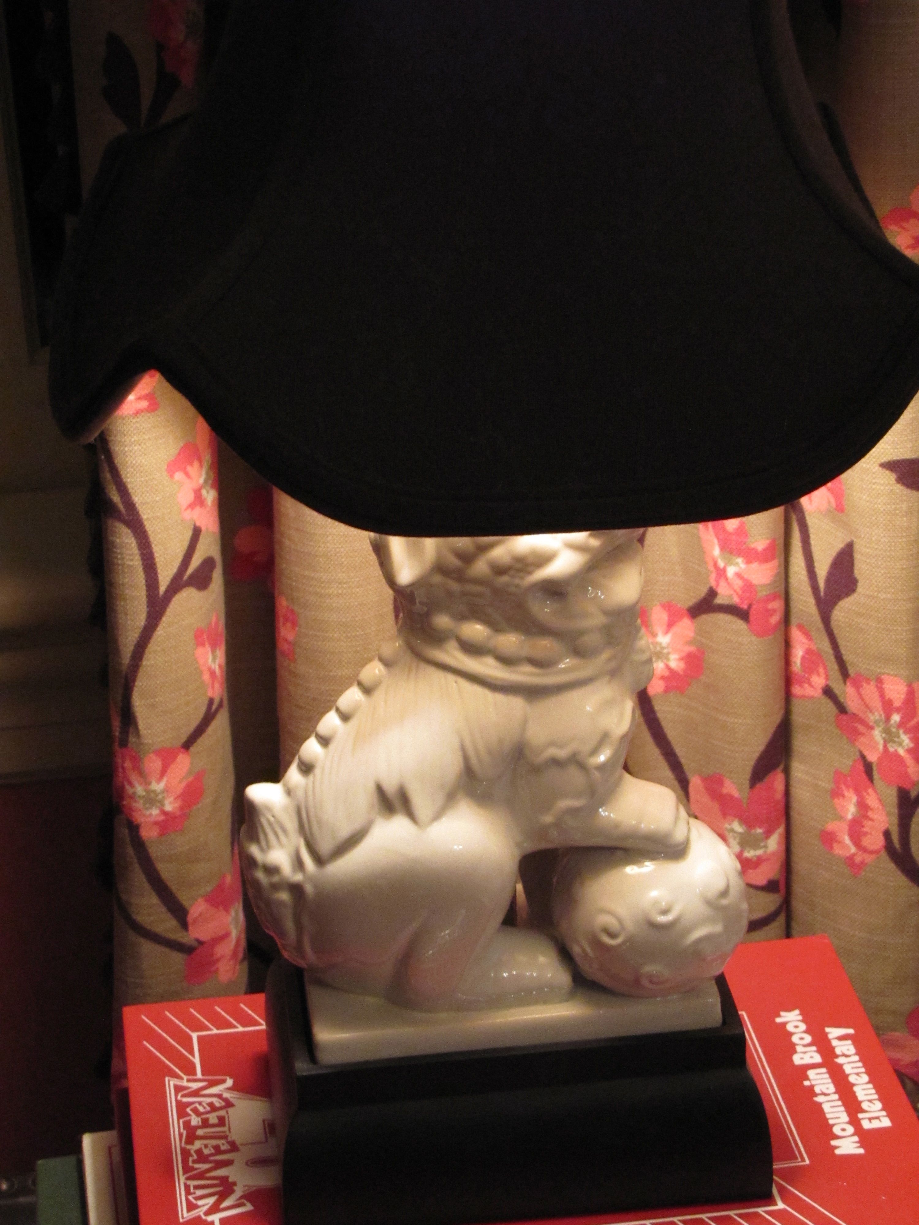
They also repeat the white in the dogwood fabric and bedding.
Remember, white is never a neutral in décor, even though it always is in fashion.
It must be repeated at least three times in a room.
White peonies, a favorite, are a natural in this room.

Design by Ellen Rhett
Custom padded headboard with expertly hand-applied nailheads (by my wonderful upholsterer)

Fun and funky and ultra-feminine light fixture, below, with plenty of sparkle and a dark finish.
Repeating the shape, movement, darkness, of the branches on the drapery and neckroll fabric.
Repeating the color of the lampshades as well.
And, a gorgeous on-trend sunburst accent mirror, handmade and all-wood.

Design by Ellen Rhett
Both sourced online for a song.
If I told you from where, you wouldn’t believe it anyway.
But, I know you, reader.
I know what you really want.
You want the before.
I’ll show you the before.
Get ready.
A little embarrassing so I’ll make this quick.
Here you are:
Before
And, one more time, the AFTER:

All Images Color Calling
Fabric Sources
Neckroll: Clark and Clark “Dogwood” (trade only)
Draperies: same as above.
Headboard fabric: Clark and Clark “Chinese Square” (trade only)
Bedspread, shams, comforter: Macy’s
Charger Plates
Here is a simple tip for making your holiday table look better.
Use a charger plate under your dinner plate. It gives a nice layered effect.

Sometimes called “service plates,” they are used to cradle the first course plates,
and are usually (though not always) removed for the entrée plate.
However, etiquette dictates that they are always removed from the table before the dessert course.
Here are some good looks for both casual and formal Christmas settings using chargers.

Source: google.com via Ellen on Pinterest

Source: barefootfloor.com via Ellen on Pinterest

Source: google.com via Ellen on Pinterest

Source: hyacinthforthesoul.blogspot.com via Ellen on Pinterest

Source: upnorthpreppy.blogspot.com via Ellen on Pinterest

Source: google.com via Ellen on Pinterest

Source: google.com via Ellen on Pinterest


Source: media-cache3.pinterest.com via Ellen on Pinterest

Source: betweennapsontheporch.net via Ellen on Pinterest
Corn Husk Angel
I love interesting crafts.
This one is my most favorite.
It was given to me by my mother.
A handmade corn husk angel.
It will be our tree topper again this (and every) year.
Isn’t she simply beautiful?

Image ©Color Calling

Image ©Color Calling
Available by pre-order only from Troy (Alabama) Marketplace: marketplace@troycable.net
Holiday Treats

Image ©Color Calling

Christmas will be here before we know it.
I love to make Christmas treats for friends.
They will receive either my homemade Cheese Straws,
or pictured above, my Chocolate Peanut Clusters.
Recipe here.
Happy Thanksgiving!

Source: weddingstylemagazine.com via Donna on Pinterest

Source: homestoriesatoz.com via Kelly Oliver on Pinterest

Source: housebeautiful.com via Sandra on Pinterest

Source: thefancyladygourmet.blogspot.com via Maritza on Pinterest

Source: stonegable.blogspot.com via Betty on Pinterest

Source: marthastewart.com via Mary on Pinterest

Source: tartanscot.blogspot.com via Jamie on Pinterest

Source: bing.com via Louisa on Pinterest

Source: 3.bp.blogspot.com via Paige on Pinterest

Source: maddycakesmuse.blogspot.com via Kristin on Pinterest

Source: sweetsomethingdesign.blogspot.com via Carrie on Pinterest

Image ©Color Calling
Accents for the Master Bath


Sometimes an accent table in the Master Bath is the perfect touch.
This is for looks as well as extra surface area near the tub,
or anywhere you need some extra space.
For your fanciest bath gel, cell phone, a magazine, a drink.
Your accent table should repeat one of the colors or finishes in the room.
Here are some well-scaled ideas.


Keeping it Simple in the Master Bath
Color harmony. A simple concept.
Made easier with an understanding of undertones.
Now, I don’t mean plain or too matching.
And I certainly don’t mean boring.
As a color specialist, it means selecting the right color.
For example, today, with my large samples, I selected a gorgeous white paint color
for a friend’s Carrara marble bath.
If you have been reading this blog, you know about my large samples, right?
Here are my inspiration photos.

Source: cotedetexas.blogspot.com via Ellen on Pinterest

Source: countryliving.com via Ellen on Pinterest

Source: pinkpreppylillylover.blogspot.com via Buffi on Pinterest
Sometimes the right color is white.
So, when you have Carrara marble, for instance,
don’t be afraid to go with white walls.
There are several whites that really sing with Carrara.
An all white bath.
A very simple concept, which will always be timeless.
Beautiful. Not boring.
I am humming to myself just thinking about this project.
If she agrees to photos, I’ll post before and afters.
Dismantled Mantel

Image ©Color Calling
My quarter-sawn oak mantel, above, has been dismantled. See the raw wood exposed, above?
I have been thinking about how to improve my mantel. A recent shopping trip gave me an idea.
To accommodate these:

Image ©Color Calling
19th century handcarved pine brackets.
They are resting upside down in case you are wondering.
Those thistles got me. The national symbol of Scotland.

Source: google.com via Ellen on Pinterest

Image ©Color Calling
From a local estate, and found at one of our lovely local antique shops.
Soon they will be vertically (and right-side up) attached to my mantel surround,
incorporated as pilasters.
Sort of an antique, longer version of this. One of my mentors recently posted this, below, on her
Pinterest page, and I knew that it was speaking to me.
See how the carved brackets rest and jut right up to the underside of the mantel?
Avoiding Your Master Bath Wish-List


Source: us.kohler.com via Ragan on Pinterest

Source: google.com via P on Pinterest
A few months ago, I posted about a popular current look in master baths: Free Standing Tubs
Yes, claw foot tubs have been around since the early 1880s. But, you know what I mean.
The new ones with no feet. The ones which sit plop on the floor.
With very fancy, very expensive plumbing hardware, usually located at the center back.
When I see more and more and more of this look appearing in magazines and design blogs,
I know that my residential clients are going to be talking about the same in their own baths.
Remember when we talked about how a good design professional
can keep you from making an expensive mistake?
Let’s talk about some potential pitfalls which might look wonderful, but would go into that category:
An expensive mistake.
Are any of these master bath trends on your wish list? Stay with me.
For starters: do you notice how far you are going to have to reach across these new tubs
to access some of the plumbing hardware you are seeing everywhere?
Some of the hardware is so far back that you will actually have to step into the tub to reach it!

Or, walk around to the back of the tub to access.

Do you see all the problems with bathing here? Yes, it appears very sleek and modern. But, look.

You’ll have to GET UP out of the tub to reach the spigots if you want to add more warm water.
You will probably get soap and water all over the painted SheetRock spigot wall if you do.
And that sink-sized wall spout is way too small for quick filling,
It would probably take an hour to fill that huge tub!
I am putting this notion of hard-to-reach plumbing hardware in the same category as these other
they-look-great-but-they-are-impractical master bath ideas:
1) full-length draperies (they will be just unsightly from water damage)


2) no window treatment in the bathroom (surely no explanation needed)


3) vessel sinks in a master bathroom (though I don’t mind them at times for light duty places)

with vessel sinks a) there is a huge splash-factor
b) they are not a comfortable height for hand washing, since you can’t lower your hands below counter-level
This last one is not necessarily impractical, but it is downright dangerous.
4) Chandeliers like low-hanging fruit above the tub.


While pretty, I find all these ideas just completely impractical.
What about it? Do you agree with my list to avoid in a master bath?
A Craftsman Paint Story: Before and After
Before, a tin-roofed cottage painted a non-traditional minty green by the previous owner.
Which stuck out like a sore thumb in a transitional neighborhood of sidewalks lined with
classic Craftsman bungalows as well as some brick houses.

Image ©Color Calling

Image ©Color Calling
After, classic Craftsman paint colors selected for the new homeowners, newlyweds.
Minty green does not belong in a classic Craftsman palette.
Greeny-grays are perfect. Great with a tin roof as well.
Grays in the mortared stone columns are reflected in the choice of color for the house body
and the darker grays accenting the trim.
Think of the earth colors of nature and there you have a pretty complete Craftsman palette.
“Georgian Brick” (Benjamin Moore) front door, which echoes the exact color of the next door
neighbor’s brick (very close by) as well as the brick High School across the street.
The young wife liked my color palette, explained to her by her husband after my initial consultation.
She was busy performing surgery and could not attend the original color consultation.
There was just one thing.
She had her heart set on a REALLY RED front door.
But, once I explained “WHY” the more muted red I selected was picked out
(it is better for a Craftsman palette;
it reflects the adjoining neighbor’s red brick;
matches the brick of the high school very visible across the street;
honors some similarly colored decorative brickwork set in their yard, etc.).
And, with this color selection system, there is ALWAYS a WHY.
She immediately understood.
She is one smart cookie. Beautiful, too.
The system works.
And, this is it: Evaluate the FIXED finishes and go from there.
Doesn’t have to include the neighbors, but when you can reach out and almost touch their brick side wall from your front porch, better to take into consideration. Think existing stone, brick, roof, etc., that will not be changed. That is what a fixed finish is.
Felt a glow of satisfaction when a passerby walking down the sidewalk told me, “Wow, the house looks great. What a difference!” as I was taking the ‘after’ photo shot.
The Pillow Dilemma

Image ©Color Calling
It seems like everyone under the sun has an opinion on how many pillows you should have on your bed.
Mrs. Howard likes a lot of pillows. Here is the eight-pillow combo that she suggests:
“A king bed with three euros, 2 king pillows, 1 square decorative, 2 lumbar pillows,” shown here, below,

Source: mrshowardpersonalshopper.com via Ellen on Pinterest
Another pillowed-out Mrs. Howard bed, below:

Source: Uploaded by user via Tobi on Pinterest
Vicente Wolfe is more minimalistic in his coloration, but apparently he likes a lot of pillows:

Source: images.search.yahoo.com via Lindajane on Pinterest
Color king Miles Redd likes white pillows, with some flat and some propped pillows:

Source: saragilbaneinteriors.com via Ellen on Pinterest
Style maven Martha Stewart is not afraid to let her sleeping pillows show:

Source: marthastewart.com via Raquel on Pinterest
Queen of graphic-look rooms Mary MacDonald likes to go all out with her pillows:

Source: stylecourt.blogspot.com via Lauren on Pinterest
Colour designer Maria Killam likes a jazz of fresh orange plus green prints and white Euros:

Source: mariakillam.com via Maria on Pinterest
Kelly Wearstler goes for one long round neckroll-type back pillow with a single breakfast pillow in front:

Source: google.com via Ellen on Pinterest
Ralph Lauren is one of the few decorators doing shams with big ruffles right now:

Source: blog.timesunion.com via Ellen on Pinterest
Keith Langham designed this fancy bed, with white embroidered pillows,
all matching but in different sizes:

Source: francesschultz.com via Ellen on Pinterest
Gorgeous Find

As a residential stylist and color designer, not only do I try to stay on top of what is going on in the world of interior design,
I also have the pleasure of seeking out beautiful finds in our lovely local shops.
I like to just look. Sometimes I find something, sometimes not.
Above, my latest obsession.
A PAIR of Etruscan-scene lidded vases.
Black (basalt?), cream, gold and ‘Hermès’ orange. A delicate aqua swath.
They are a whopping 28″ tall.
Museum quality, rare, circa 1860. Probably Staffordshire.
I know this because two museums have already looked.
$5400 for the pair. In a larger city, they would easily fetch twice that.
On 1st Dibs, an online antique resource, several similar single urns are/have been listed.
None as large, or as stunning in coloration.
These are all singles, no pairs.
$9000+ for this one, immediately below.

Source: 1stdibs.com via Ellen on Pinterest

Source: 1stdibs.com via Ellen on Pinterest
and this one, written up in Maine Antiques Digest, went for $6400.

Source: maineantiquedigest.com via Ellen on Pinterest
A gorgeous statement for the right room.
Decorating around Travertine

Source: google.com via Lauren on Pinterest
Many homeowners choose travertine for master bathrooms if they want a “fairly” neutral
natural stone with some warmth of color.
Travertine is very tricky to decorate around, however.
Unless you understand undertones.
Most travertine has a pink undertone.
For wallpaper, I really like this great-looking Thibaut paper (trade-only).
This choice looks great with Travertine and the existing satin stainless hardware,
with a somewhat modern vibe.

Image Color Calling
If painting, I would start with Benjamin Moore Shaker Beige, a warm neutral which has a
slight pink undertone.
A warm white with a whisper of pink could also work, such as Muslin, also a Benjamin Moore
color.
Too much pink will just look dated, though.
Here is one of my samples of Shaker Beige, painted on poster board and held up to the
travertine.

Avoid yellow-beige (the wrong undertone) on walls or cabinetry.
Green is not the best choice either. See how the existing yellow-green wallpaper
(above to the right side, and also
below) fights the stone, and the Shaker Beige just looks
so much more harmonious?

Travertine is the largest fixed element in this master bath. So, we look for ways to bring
more color harmony into the space. Undertones must be considered for color harmony.
(As a side note, I am starting to move away from natural stone in my consultations.
The maintenance factor is just horrendous. This travertine which is 7 years installed, has begun
to pit and even crack in places.
I am looking at Cambria Quartz, which is 90% natural, but much easier to maintain,
for my next bath project).
Are you this afraid of color?

Image ©Color Calling
Before I became a True Color Expert, I was terrified of making a mistake with color.
I even used to monogram my towels white-on-white (really, you can see so above) so that I wouldn’t have to live with a color mistake.
(You can hardly even see the monogram!)
Now, I pick out colors for others as a business.
I do so with confidence, now that I understand undertones, color flow, and a whole litany of color terminology.
Are you afraid of color?
Maybe it’s time to bring color, which includes the correct neutral, into your home.
Fabulous Focal Point

WOW.
What a view, from the moment you enter.
The linear grouping of four chandeliers (one exterior, three interior).
Notice the sculpture on the round table.
It gives your eye a place to rest as it absorbs the incredible ocean view beyond.
Masterful.
November means Thanksgiving

Image ©Color Calling
If you have been reading this blog, you know I don’t care much for Halloween.
I am glad it is over so that I can start planning Thanksgiving.
My Top 10 for Loving your Master Bedroom
As promised in my post last week, here are some practical guidelines for getting started with your new Master Bedroom.

1) BUY THE BEST MATTRESS YOU CAN AFFORD.

I have had wonderful luck with Tempurpedic. I like their Cloud. Do your own research.
This is an investment, and worth your time to get it right.
If you have a queen size mattress currently, and want a little more room, don’t miss trying out a California King.
The proportions are so much better than a regular King, and I don’t know why they aren’t more popular.
I find a regular King almost too wide for most couples (and they are so boxy looking, because they are almost square.)
A California King is 4″ narrower and 4″ LONGER than a standard King.
California Kings are fully 12″ wider than most Queens.
Love them.
2) LET THERE BE LIGHT. OR NOT.

Source
Natural light is a must for our emotional well-being.
If your bedroom has dinky windows, consider elongating them.
If you have access to the outdoors, consider installing French doors.
You will love having access to the outdoors on pretty days. Yes, this is an investment.
Your master bedroom is the most important room in your house for your peace of mind.
So, don’t put it at the very bottom of your wish-list.
Your bedroom draperies should be on a draw-rod, not the kind on rings which must be pushed and pulled by hand across the rod.
They should be lined and interlined for privacy, and should also have black-out lining to control the morning light.
3) QUALITY SHEETS.

You will spend over 1/3 of your life in bed. I consider quality sheets a necessity.
I personally like either Matouk or Sferra though there are certainly others that are wonderful.
Some designers swear by Soft Sheets at Target. I am not one of them.
(I do like their nicest quality plain white towels by Thomas O’Brien, though.)
I buy my Sferra sheets for a great price at Tuesday Morning.
You have to be diligent now, because it has gotten harder to find them. I like the embroidered ones.
The ones I have all say “Hand Embroidered” on the hang-tag, but skeptic that I am, I do think they are machine embroidered.
Still, they are gorgeous, they feel so crisp/soft, and my house guests almost always comment on them.
There is also now an on-line sheet section on their website.
I buy my Matouk sheets at the Matouk Outlet in Fall River, MA.
It can be hit or miss there, but lately I have been hitting. This is an in-person proposition only.
No phone or internet orders accepted. They have some truly amazing deals if you are ever in the area.
Use fabric softener to keep your sheets soft.
And, have your pillowcases and at least the top of your sheet, ironed. It is worth it.
Oh, and in case you don’t know this, NEVER wash your sheets with towels. That is what causes pilling.
A little ‘cheat’ that works pretty well, is to buy wrinkle remover spray (I use the kind they sell at Dollar General)
and spray lightly on your bottom sheet after you have put the bottom sheet on the bed.
Smooth by hand. Spray and smooth some more. This works.
4) A PAIR OF LAMPS

With upgraded lampshades if necessary. Yes, a pair. With bedroom lamps,
Matchy matchy = Good, sometimes. This is one of those times.
On the same visual plane as each other, even if you have non-matching bedside tables.
You can use pretty books to raise the lower lamp if needed.
One of my pet peeves is dinky lighting by a bed.
If your bedside lamp isn’t 28″ (at least) from top to bottom, it is likely not proper height for reading at bedside.
I like my lamps with regular incandescent 3-way bulbs. Stock up.
I hate those new snakey, one-second-pause-before-working, bulbs, otherwise known as CFL.
They throw out the most horrible excuse for lighting.
Supposedly, the incandescent 100W bulbs are being completely phased out,
due to concerns about their energy usage.
(Big government over-reach, since the new swirly ones have up to 4 mg of mercury, per bulb, in them,
but that is for another post.
Just don’t feel too smug if you are using them, I personally think they are far more dangerous to your person.
If you break one accidentally, you will have one big toxic problem on your hands.
Please do your own research. And, as I said, stock up on the old 100w kind while you still can.)
5) WALL TO WALL carpet or big room-sized rug.

If you or your spouse are allergy prone, you might consider skipping the big rug
and going for a small rug by each side of the bed only.
6) WATCH THE VOLUME OF DARK WOOD FURNITURE
Lighter may be better.

Source
Nothing dates a bedroom more than a matching bedroom suite consisting of a dark chest of drawers,
a dark highboy, and a pair of dark matching bedside tables.
A good residential stylist can advise you how to update your existing pieces or guide you if you need new furniture.
Bedrooms today are much lighter in their look and feel.
7) Please say NO to a ceiling fan
in your Master Bedroom space. A chandelier is 100x better.

Put it on a dimmer.
You will never look back.
Trust me on this one.
8) SEATING if you have room

Source
A nice side chair or a lounge chair (or a pair) is terrific for so many reasons.
It is nice to sit in a proper chair when you are zipping up or pulling up boots, lacing up your tennis shoes, etc.
A chaise longue is ideal and can be visually pleasing as well as versatile.
Of course, make sure you have a lamp beside your chair.
If you are a really light sleeper, experts advise that you don’t go to bed
until you are actually ready for sleep.
A bedroom lounge chair can help the transition from awake to asleep.
9) No television
I am unlike many in that I truly hate television.
As I have gotten older, I see how addictive and utterly useless it is, and what a time waster it can be.
I do enjoy watching my Crimson Tide football team play (RTR!) when I can’t make it to the stadium.
And, Downton Abbey. Don’t even get me started.
But, other than that, I almost never turn the television on.
Yes, it is hard to give up a master tv if you are used to it. You may not be able to give it up.
But, if you don’t have one, may I suggest keeping it that way?
Television is not conducive for conversation. Television programs are certainly not relaxing these days.
Your master bedroom should be a sanctuary and an oasis of calm.
You will assuredly sleep better with no television to distract or disturb you.
10) Only Non squirmy/non-whiny pets on the bed.

Source: cocomale.com via Margie on Pinterest
You may have to crate the squirmers and the whiners elsewhere.
They really won’t mind after the first few nights.
YOUR sleep is more important than giving in to squirminess, so stand firm.
Don’t feel guilty about this.
If you have a storm-related whiner, try a sleep/sound machine in your room
instead of giving them so-called doggy valium.
Works wonders on my dogs.
So, those are my top 10 for a master bedroom.
Any thoughts or additions to the list? Fire away!
Can you trust a magazine’s color advice?


It seems like a lot of magazines are getting called out for things like this.
House Beautiful, I am disappointed in you.
The real Tobi Fairley room featuring Sherwin Williams “Silvermist” (bottom image) looks nothing
like your color-enhanced and color-saturated cover shot.
Have you Punted your Master Bedroom?

Image ©Color Calling
Excuse the football terminology, but I think it is apt.Your Master Bedroom is Worthy. Don’t punt it.Worthy of attention to detail, attention to scale, and attention to making it a beautiful space.
Of all the spaces in your home, the one place that usually gets shortest shrift is the Master Bedroom.
If you have been ignoring your Master in favor of other, more public rooms in your house,
why not give this some thought.
Why not give yourself permission to attend to the most private space in your home?
Your bedroom should be the inner sanctum to which you can retreat at the end of a busy day.

Source: safavieh.com via Ellen on Pinterest
It should be a place of refuge and relaxation.
And you should have a bed that is reasonably new and utterly comfortable.
If you are sleeping on a mattress you bought 15 years ago (or more), let me suggest that you start putting your personal comfort on your
priority list, at least somewhere.
You are probably not even getting a good night’s sleep. Have you admitted this to yourself?
When you have children, jobs, many commitments, the Master Bedroom can easily get lost in the shuffle.
Make it a priority. Next post, some tips on getting started!


Source: lh5.ggpht.com via Maria on Pinterest

Source: ethanallen.com via Maria on Pinterest

Source: getdecorating.com via Meghan on Pinterest

Source: chictip.com via Tracy on Pinterest

Source: stylisheve.com via Linda on Pinterest

Source: southernliving.com via Dawn on Pinterest

Source: Uploaded by user via Stephanie on Pinterest

Source: southernliving.com via Susan on Pinterest

Source: southernsororitygirl.tumblr.com via Kristi on Pinterest

Source: southernliving.com via Traci @ Beneath My Heart on Pinterest

Source: boysbedroomdesign.blogspot.com via Dominique on Pinterest
Source: housebeautiful.com via Courtney on Pinterest
Repeating colors
Repetition of color is important.
The eye notices.
Take a look at this vignette:

Apricot Flowers, Image Color Calling
But now look, below. Does your eye just go, YES? It is picking up on the repetition of the color red in the man’s tie and the repetition of red in the tulips.

Are you using repetition in your home?
Determine one of your accent colors and try repeating it.
Accent colors should be repeated at least three times around the room.
It will make a difference.
Matchy-matchy versus Harmonious
In my consulting business, I am frequently told by the client that she doesn’t want things to be too matchy-matchy.
I love some matchy-matchy. Matching lamps flanking a bed, for example.
To look more restful, and to add to the feeling of balance in the room.
Too much matching, though, just looks amateur. Not collected over time.
However, I always believe in HARMONY. Colors must be harmonious, especially.
Take a look at my latest paint transformation. A small bath with dated fixed finishes.
No styling, no photographic tricks, just the transformative power of the right paint color.

Bath, above, BEFORE

- Bath, AFTER Images © Color Calling

Benjamin Moore “In Your Eyes” blue.
Painted by Noah, below.

