Image ©Color Calling
My quarter-sawn oak mantel, above, has been dismantled. See the raw wood exposed, above?
I have been thinking about how to improve my mantel. A recent shopping trip gave me an idea.
To accommodate these:

Image ©Color Calling
19th century handcarved pine brackets.
They are resting upside down in case you are wondering.
Those thistles got me. The national symbol of Scotland.

Image ©Color Calling
From a local estate, and found at one of our lovely local antique shops.
Soon they will be vertically (and right-side up) attached to my mantel surround,
incorporated as pilasters.
Sort of an antique, longer version of this. One of my mentors recently posted this, below, on her
Pinterest page, and I knew that it was speaking to me.
See how the carved brackets rest and jut right up to the underside of the mantel?
(more…)
November 14, 2012 | Categories: fireplace, Residential styling | Tags: brackets, hand carved, mantels, thistle | Leave a comment

Image ©Color Calling

Image ©Color Callng

Image ©Color Calling

Image ©Color Calling
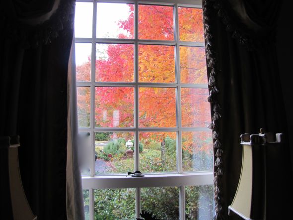
November 13, 2012 | Categories: Colors of Nature | Tags: fall color, Glory Maple | 2 Comments
CURATED

I am going to scream if I see or hear that word one more time.
I have already seen it written at least eight times today.
Twice in magazines and six times on other blogs.
There is now even a “Curated Insurance Blog.”
And, above, there must be two hundred random Pinterest images marked “Curated“
Enough, people.
Why do people like that word so much?
I think it sounds pretentious at worst, and misused at best, do you agree?
I think it primarily should be used in relation to museums or exhibitions.
Not to be used for just any ol’ thing someone happens to pick out.
What about saying,
“carefully selected.”
“Lovingly chosen”
“Picked out with a sense of style”
“Unerringly grouped”
Let’s give “curated” a rest.
Have you seen that word as much as I have?
November 12, 2012 | Categories: Monday Rant | Tags: curated | 3 Comments


Source: google.com via P on Pinterest
A few months ago, I posted about a popular current look in master baths: Free Standing Tubs
Yes, claw foot tubs have been around since the early 1880s. But, you know what I mean.
The new ones with no feet. The ones which sit plop on the floor.
With very fancy, very expensive plumbing hardware, usually located at the center back.
When I see more and more and more of this look appearing in magazines and design blogs,
I know that my residential clients are going to be talking about the same in their own baths.
Remember when we talked about how a good design professional
can keep you from making an expensive mistake?
Let’s talk about some potential pitfalls which might look wonderful, but would go into that category:
An expensive mistake.
Are any of these master bath trends on your wish list? Stay with me.
For starters: do you notice how far you are going to have to reach across these new tubs
to access some of the plumbing hardware you are seeing everywhere?
Some of the hardware is so far back that you will actually have to step into the tub to reach it!
Or, walk around to the back of the tub to access.
Do you see all the problems with bathing here? Yes, it appears very sleek and modern. But, look.
You’ll have to GET UP out of the tub to reach the spigots if you want to add more warm water.
You will probably get soap and water all over the painted SheetRock spigot wall if you do.
And that sink-sized wall spout is way too small for quick filling,
It would probably take an hour to fill that huge tub!
I am putting this notion of hard-to-reach plumbing hardware in the same category as these other
they-look-great-but-they-are-impractical master bath ideas:
1) full-length draperies (they will be just unsightly from water damage)
2) no window treatment in the bathroom (surely no explanation needed)
3) vessel sinks in a master bathroom (though I don’t mind them at times for light duty places)
with vessel sinks a) there is a huge splash-factor
b) they are not a comfortable height for hand washing, since you can’t lower your hands below counter-level
This last one is not necessarily impractical, but it is downright dangerous.
4) Chandeliers like low-hanging fruit above the tub.
While pretty, I find all these ideas just completely impractical.
What about it? Do you agree with my list to avoid in a master bath?
November 12, 2012 | Categories: Decorating trends, Residential styling | Tags: bath trends, master bath, vessel sinks | 4 Comments
Before, a tin-roofed cottage painted a non-traditional minty green by the previous owner.
Which stuck out like a sore thumb in a transitional neighborhood of sidewalks lined with
classic Craftsman bungalows as well as some brick houses.

Image ©Color Calling

Image ©Color Calling
After, classic Craftsman paint colors selected for the new homeowners, newlyweds.
Minty green does not belong in a classic Craftsman palette.
Greeny-grays are perfect. Great with a tin roof as well.
Grays in the mortared stone columns are reflected in the choice of color for the house body
and the darker grays accenting the trim.
Think of the earth colors of nature and there you have a pretty complete Craftsman palette.
“Georgian Brick” (Benjamin Moore) front door, which echoes the exact color of the next door
neighbor’s brick (very close by) as well as the brick High School across the street.
The young wife liked my color palette, explained to her by her husband after my initial consultation.
She was busy performing surgery and could not attend the original color consultation.
There was just one thing.
She had her heart set on a REALLY RED front door.
But, once I explained “WHY” the more muted red I selected was picked out
(it is better for a Craftsman palette;
it reflects the adjoining neighbor’s red brick;
matches the brick of the high school very visible across the street;
honors some similarly colored decorative brickwork set in their yard, etc.).
And, with this color selection system, there is ALWAYS a WHY.
She immediately understood.
She is one smart cookie. Beautiful, too.
The system works.
And, this is it: Evaluate the FIXED finishes and go from there.
Doesn’t have to include the neighbors, but when you can reach out and almost touch their brick side wall from your front porch, better to take into consideration. Think existing stone, brick, roof, etc., that will not be changed. That is what a fixed finish is.
Felt a glow of satisfaction when a passerby walking down the sidewalk told me, “Wow, the house looks great. What a difference!” as I was taking the ‘after’ photo shot.
November 9, 2012 | Categories: Benjamin Moore colors, Front door entry, green, Residential styling | Tags: "Georgian Brick", Craftsman, Craftsman color palette, Georgian Red, matching brick to paint, tin roof | 4 Comments

Image ©Color Calling
It seems like everyone under the sun has an opinion on how many pillows you should have on your bed.
Mrs. Howard likes a lot of pillows. Here is the eight-pillow combo that she suggests:
“A king bed with three euros, 2 king pillows, 1 square decorative, 2 lumbar pillows,” shown here, below,
November 7, 2012 | Categories: Decorating trends, Residential styling | Tags: bedroom pillows, decorative pillows, Euro pillows, lumbar pillows | 3 Comments

As a residential stylist and color designer, not only do I try to stay on top of what is going on in the world of interior design,
I also have the pleasure of seeking out beautiful finds in our lovely local shops.
I like to just look. Sometimes I find something, sometimes not.
Above, my latest obsession.
A PAIR of Etruscan-scene lidded vases.
Black (basalt?), cream, gold and ‘Hermès’ orange. A delicate aqua swath.
They are a whopping 28″ tall.
Museum quality, rare, circa 1860. Probably Staffordshire.
I know this because two museums have already looked.
$5400 for the pair. In a larger city, they would easily fetch twice that.
On 1st Dibs, an online antique resource, several similar single urns are/have been listed.
None as large, or as stunning in coloration.
These are all singles, no pairs.
$9000+ for this one, immediately below.
November 5, 2012 | Categories: Residential styling | Tags: basalt, Etruscan ware, Staffordshire | Leave a comment
Source: google.com via Lauren on Pinterest
Many homeowners choose travertine for master bathrooms if they want a “fairly” neutral
natural stone with some warmth of color.
Travertine is very tricky to decorate around, however.
Unless you understand undertones.
Most travertine has a pink undertone.
For wallpaper, I really like this great-looking Thibaut paper (trade-only).
This choice looks great with Travertine and the existing satin stainless hardware,
with a somewhat modern vibe.

Image Color Calling
If painting, I would start with Benjamin Moore Shaker Beige, a warm neutral which has a
slight pink undertone.
A warm white with a whisper of pink could also work, such as Muslin, also a Benjamin Moore
color.
Too much pink will just look dated, though.
Here is one of my samples of Shaker Beige, painted on poster board and held up to the
travertine.

Avoid yellow-beige (the wrong undertone) on walls or cabinetry.
Green is not the best choice either. See how the existing yellow-green wallpaper
(above to the right side, and also
below) fights the stone, and the Shaker Beige just looks
so much more harmonious?

Travertine is the largest fixed element in this master bath. So, we look for ways to bring
more color harmony into the space. Undertones must be considered for color harmony.
(As a side note, I am starting to move away from natural stone in my consultations.
The maintenance factor is just horrendous. This travertine which is 7 years installed, has begun
to pit and even crack in places.
I am looking at Cambria Quartz, which is 90% natural, but much easier to maintain,
for my next bath project).
November 3, 2012 | Categories: Benjamin Moore colors, Residential styling | Tags: Shaker Beige, Thibaut wallpaper, travertine | Leave a comment

Image ©Color Calling
Before I became a True Color Expert, I was terrified of making a mistake with color.
I even used to monogram my towels white-on-white (really, you can see so above) so that I wouldn’t have to live with a color mistake.
(You can hardly even see the monogram!)
Now, I pick out colors for others as a business.
I do so with confidence, now that I understand undertones, color flow, and a whole litany of color terminology.
Are you afraid of color?
Maybe it’s time to bring color, which includes the correct neutral, into your home.
November 2, 2012 | Categories: Residential styling | Tags: choosing color | Leave a comment
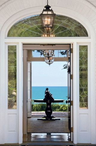
WOW.
What a view, from the moment you enter.
The linear grouping of four chandeliers (one exterior, three interior).
Notice the sculpture on the round table.
It gives your eye a place to rest as it absorbs the incredible ocean view beyond.
Masterful.
November 2, 2012 | Categories: Residential styling | Leave a comment

Image ©Color Calling
If you have been reading this blog, you know I don’t care much for Halloween.
I am glad it is over so that I can start planning Thanksgiving.
November 1, 2012 | Categories: Residential styling | Tags: Thanksgiving, Thanksgiving centerpiece | 2 Comments
As promised in my post last week, here are some practical guidelines for getting started with your new Master Bedroom.
1) BUY THE BEST MATTRESS YOU CAN AFFORD.
I have had wonderful luck with Tempurpedic. I like their Cloud. Do your own research.
This is an investment, and worth your time to get it right.
If you have a queen size mattress currently, and want a little more room, don’t miss trying out a California King.
The proportions are so much better than a regular King, and I don’t know why they aren’t more popular.
I find a regular King almost too wide for most couples (and they are so boxy looking, because they are almost square.)
A California King is 4″ narrower and 4″ LONGER than a standard King.
California Kings are fully 12″ wider than most Queens.
Love them.
2) LET THERE BE LIGHT. OR NOT.

Source
Natural light is a must for our emotional well-being.
If your bedroom has dinky windows, consider elongating them.
If you have access to the outdoors, consider installing French doors.
You will love having access to the outdoors on pretty days. Yes, this is an investment.
Your master bedroom is the most important room in your house for your peace of mind.
So, don’t put it at the very bottom of your wish-list.
Your bedroom draperies should be on a draw-rod, not the kind on rings which must be pushed and pulled by hand across the rod.
They should be lined and interlined for privacy, and should also have black-out lining to control the morning light.
3) QUALITY SHEETS.
You will spend over 1/3 of your life in bed. I consider quality sheets a necessity.
I personally like either Matouk or Sferra though there are certainly others that are wonderful.
Some designers swear by Soft Sheets at Target. I am not one of them.
(I do like their nicest quality plain white towels by Thomas O’Brien, though.)
I buy my Sferra sheets for a great price at Tuesday Morning.
You have to be diligent now, because it has gotten harder to find them. I like the embroidered ones.
The ones I have all say “Hand Embroidered” on the hang-tag, but skeptic that I am, I do think they are machine embroidered.
Still, they are gorgeous, they feel so crisp/soft, and my house guests almost always comment on them.
There is also now an on-line sheet section on their website.
I buy my Matouk sheets at the Matouk Outlet in Fall River, MA.
It can be hit or miss there, but lately I have been hitting. This is an in-person proposition only.
No phone or internet orders accepted. They have some truly amazing deals if you are ever in the area.
Use fabric softener to keep your sheets soft.
And, have your pillowcases and at least the top of your sheet, ironed. It is worth it.
Oh, and in case you don’t know this, NEVER wash your sheets with towels. That is what causes pilling.
A little ‘cheat’ that works pretty well, is to buy wrinkle remover spray (I use the kind they sell at Dollar General)
and spray lightly on your bottom sheet after you have put the bottom sheet on the bed.
Smooth by hand. Spray and smooth some more. This works.
4) A PAIR OF LAMPS
With upgraded lampshades if necessary. Yes, a pair. With bedroom lamps,
Matchy matchy = Good, sometimes. This is one of those times.
On the same visual plane as each other, even if you have non-matching bedside tables.
You can use pretty books to raise the lower lamp if needed.
One of my pet peeves is dinky lighting by a bed.
If your bedside lamp isn’t 28″ (at least) from top to bottom, it is likely not proper height for reading at bedside.
I like my lamps with regular incandescent 3-way bulbs. Stock up.
I hate those new snakey, one-second-pause-before-working, bulbs, otherwise known as CFL.
They throw out the most horrible excuse for lighting.
Supposedly, the incandescent 100W bulbs are being completely phased out,
due to concerns about their energy usage.
(Big government over-reach, since the new swirly ones have up to 4 mg of mercury, per bulb, in them,
but that is for another post.
Just don’t feel too smug if you are using them, I personally think they are far more dangerous to your person.
If you break one accidentally, you will have one big toxic problem on your hands.
Please do your own research. And, as I said, stock up on the old 100w kind while you still can.)
5) WALL TO WALL carpet or big room-sized rug.

Source
If you or your spouse are allergy prone, you might consider skipping the big rug
and going for a small rug by each side of the bed only.
6) WATCH THE VOLUME OF DARK WOOD FURNITURE
Lighter may be better.

Source
Nothing dates a bedroom more than a matching bedroom suite consisting of a dark chest of drawers,
a dark highboy, and a pair of dark matching bedside tables.
A good residential stylist can advise you how to update your existing pieces or guide you if you need new furniture.
Bedrooms today are much lighter in their look and feel.
7) Please say NO to a ceiling fan
in your Master Bedroom space. A chandelier is 100x better.
Put it on a dimmer.
You will never look back.
Trust me on this one.
8) SEATING if you have room

Source
A nice side chair or a lounge chair (or a pair) is terrific for so many reasons.
It is nice to sit in a proper chair when you are zipping up or pulling up boots, lacing up your tennis shoes, etc.
A chaise longue is ideal and can be visually pleasing as well as versatile.
Of course, make sure you have a lamp beside your chair.
If you are a really light sleeper, experts advise that you don’t go to bed
until you are actually ready for sleep.
A bedroom lounge chair can help the transition from awake to asleep.
9) No television
I am unlike many in that I truly hate television.
As I have gotten older, I see how addictive and utterly useless it is, and what a time waster it can be.
I do enjoy watching my Crimson Tide football team play (RTR!) when I can’t make it to the stadium.
And, Downton Abbey. Don’t even get me started.
But, other than that, I almost never turn the television on.
Yes, it is hard to give up a master tv if you are used to it. You may not be able to give it up.
But, if you don’t have one, may I suggest keeping it that way?
Television is not conducive for conversation. Television programs are certainly not relaxing these days.
Your master bedroom should be a sanctuary and an oasis of calm.
You will assuredly sleep better with no television to distract or disturb you.
10) Only Non squirmy/non-whiny pets on the bed.
Source: cocomale.com via Margie on Pinterest
You may have to crate the squirmers and the whiners elsewhere.
They really won’t mind after the first few nights.
YOUR sleep is more important than giving in to squirminess, so stand firm.
Don’t feel guilty about this.
If you have a storm-related whiner, try a sleep/sound machine in your room
instead of giving them so-called doggy valium.
Works wonders on my dogs.
So, those are my top 10 for a master bedroom.
Any thoughts or additions to the list? Fire away!
October 29, 2012 | Categories: Decorating trends, lamps, Residential styling, silk shades | Tags: bedroom chandelier. Crimson Tide, black out lining, California King, ceiling fan, CFL bulb fail, draw drapery, Matouk, mattress, Sferra, sleep, Tempurpedic | 2 Comments
It seems like a lot of magazines are getting called out for things like this.
House Beautiful, I am disappointed in you.
The real Tobi Fairley room featuring Sherwin Williams “Silvermist” (bottom image) looks nothing
like your color-enhanced and color-saturated cover shot.
October 25, 2012 | Categories: Residential styling | Tags: Sherwin William colors, Silver Mist, Tobi Fairley | 7 Comments

Image ©Color Calling
Excuse the football terminology, but I think it is apt.Your Master Bedroom is Worthy. Don’t punt it.Worthy of attention to detail, attention to scale, and attention to making it a beautiful space.
Of all the spaces in your home, the one place that usually gets shortest shrift is the Master Bedroom.
If you have been ignoring your Master in favor of other, more public rooms in your house,
why not give this some thought.
Why not give yourself permission to attend to the most private space in your home?
Your bedroom should be the inner sanctum to which you can retreat at the end of a busy day.
Source: safavieh.com via Ellen on Pinterest
It should be a place of refuge and relaxation.
And you should have a bed that is reasonably new and utterly comfortable.
If you are sleeping on a mattress you bought 15 years ago (or more), let me suggest that you start putting your personal comfort on your
priority list, at least somewhere.
You are probably not even getting a good night’s sleep. Have you admitted this to yourself?
When you have children, jobs, many commitments, the Master Bedroom can easily get lost in the shuffle.
Make it a priority. Next post, some tips on getting started!
Source

Source
October 22, 2012 | Categories: Residential styling | Tags: master bedroom, pair of chairs, seating in Master Bedroom | 2 Comments
Repetition of color is important.
The eye notices.
Take a look at this vignette:

Apricot Flowers, Image Color Calling
But now look, below. Does your eye just go, YES? It is picking up on the repetition of the color red in the man’s tie and the repetition of red in the tulips.

Are you using repetition in your home?
Determine one of your accent colors and try repeating it.
Accent colors should be repeated at least three times around the room.
It will make a difference.
October 20, 2012 | Categories: Residential styling | Tags: accent colors, red tulips | Leave a comment
In my consulting business, I am frequently told by the client that she doesn’t want things to be too matchy-matchy.
I love some matchy-matchy. Matching lamps flanking a bed, for example.
To look more restful, and to add to the feeling of balance in the room.
Too much matching, though, just looks amateur. Not collected over time.
However, I always believe in HARMONY. Colors must be harmonious, especially.
Take a look at my latest paint transformation. A small bath with dated fixed finishes.
No styling, no photographic tricks, just the transformative power of the right paint color.

Bath, above, BEFORE

- Bath, AFTER Images © Color Calling
Benjamin Moore “In Your Eyes” blue.
Painted by Noah, below.

October 19, 2012 | Categories: Benjamin Moore colors, Residential styling | Tags: Benjamin Moore colors, dated bath, In Your Eyes | Leave a comment
For some reason, I have always disliked Halloween with its morbid theme and unattractive color combinations.
What I love, though, is a subtle combination of soft fall colors.
Purple makes a wonderful jazz of color in the fall. Like a ripe eggplant or the full blown ranunculus flowers pictured in the bouquet above.
Fall doesn’t just have to be about black and orange.
October 17, 2012 | Categories: Residential styling | Tags: fall color | Leave a comment
Get ready.
This is a long post, one that I have been thinking about for months.
I have been on both sides of the decorating equation, so to speak.
First, as the client decorating my house with the help of a decorator.
And, now, for the past several years, as a Certified Color Specialist
and design professional helping others.
Here are a few things I have learned.
As a homeowner, do you love and gravitate towards neutral, subdued,
calming colors, as below

via Horchow.com
Or, do you prefer bright happy colors?

When you call us, we are going to give you a look
and feel in your home that is a reflection of YOU.
This takes time, and it is an investment.
I was taught that good design can cost about the same
as bad design.
And, the right paint color will not cost one penny more
than the wrong paint color.
I believe that your home should be a beautiful sanctuary
away from the stresses of your job and your busy life.
It should be a treasured place to come together as a
family for meals, for rest,
and for relaxation.
It should be a place you look forward to, and a place you
are happy to share with friends and relatives.
If your home is not all of these things, why not?
Is there something holding you back?
Even if you say “money,” keep reading.
Good design can occur at a number of price points.
Don’t let a limited budget keep you from having the
best possible look and feel for your home.
The gorgeous stair runner, below, has an equestrian motif that looks
like it could have come straight
from the Hermès Paris showroom.
But, it did not come from Hermès.
(Nope, it came from JC Penney online.
Installed to perfection by one of my resources.)
Are you with me?
I have worked with a number of young couples
just starting out, some with very, very tiny budgets.
If you are working on a tight budget,
you can’t afford to make a mistake!
This is when a resourceful design professional
is going to be invaluable.
The labor alone for painting one room is well into the hundreds,
and for kitchens and baths with cabinetry, it can easily go
into the thousands.
I have been selecting paint colors for people for several years,
and my system never relies just on those tiny 2 x 2 inch chips.

Image ©Color Calling
In fact, one difference between my system and the way you
might select a color, is that I KNOW that I can’t choose a
color properly from a tiny paint chip.
Those chips aren’t even paint, they are printed interpretations
of the paint color.
They do not reflect light the way that the
real painted wall will, either.
If you are currently a client working with,
or thinking of working with, a design professional,
there are several pointers I might suggest
to help establish and keep a good working relationship.
Custom interiors are expensive, and there are some things
you, the client, can do to get the most from your
design professional.
I would make sure that I know the following:
1) Does she keep current with
what is going on in design?

(latest collection Schumacher fabric on classicly simple Roman shade)
Do not confuse “current” with “trendy.”
Blogging keeps you current, and it helps a design professional spot
the comings and goings in decorating long before they hit print.
If you are working on a new room, today in 2012, and your designer
is suggesting starting with a brown or floral sofa, or example,
then she is probably not current.
Floral on a sofa is long gone, and Brown is trending out,
having been around for years (a decade).
Now Gray is the current neutral.
Your designer should know this.
Does this mean you need to start with Gray? Absolutely not!
See the first two images, above.
Neutral “important” pieces are the way to go if you have a limited
budget and don’t want to change out things every few years.
So, I would suggest a fairly good browsing session through magazines
such as Traditional Home, House Beautiful, and Veranda.
Get an idea of what is current so that you can see if your design
professional’s suggestions are helping you move forward,
or if she’ll just be taking you back in time.
2) Does your professional have access
to good resources?
The details and the construction in design make all the difference.
The quality of this construction would not pass my test.
See how the seams are slightly askew?
See how the lumbar pillow looks off-square?
See how the box pleats look saggy on the left?
This is an amateur job.

Source: google.com via Ellen on Pinterest
Does the workroom she uses work with quality lining and
interlining fabrics, stand behind their work, and are they
willing to come make reasonable adjustments
if necessary?
If you are doing expensive work, are they accustomed
to working with designer fabrics(fabrics which start at $150 a yard,
and you will need 12 yards for your average window)?
Can they do custom touches, for example?
You don’t want an expensive mistake being made on your job
because of inexperience.
Does your professional use a quality upholsterer?
Are your seams, lines and patterns nicely matched when you
get back your upholstery?
And, if your designer reps a particular line exclusively,
do you love that look and are you willing to forego other options?
Does she have an excellent painter, a great wallpaper hanger,
a quality furniture refinisher, a perfectionist carpet installer,
and someone who can professionally and
correctly hang those expensive new draperies?
Can she have custom furniture fabricated if you are looking for
something not readily available?
3) Does your professional always specify
the most expensive lighting, fabrics, and
carpets?
Or, does she know how to resource budget-friendly items,
say for a child’s bedroom or a playroom?
Does she at least occasionally show you a trim option from somewhere
like Lewis and Sheron fabrics (running $35/yard, not $250/yard),
a lamp from Shades of Light or Ballard or even Overstock, or an accessory
from Target, Anthro, West Elm or Pottery Barn?
When appropriate, she should.
(Wallpaper is a different story. Don’t buy cheap wallpaper, ever.
Good wallpaper is worth every penny.)
It takes work to know where to find nice reasonably-priced accessories
and budget options.
Is your professional willing to do the legwork necessary to know where?
4) Does your professional use correct/useful
design terminology?
Knowledgeable residential design professionals should be discussing concepts
such as “fixed finishes,” “undertones,” “focal point,” “symmetry,” “color harmony/
flow,” “repetition” and “balance,”
when helping you achieve an overall look and feel in your home.
She should be happy to explain (without condescension)
any terms which you aren’t familiar with.
If someone you are thinking of working with uses the words
“a matching dinette set,”
you are going to get a very different proposed look from someone who says,
“an antique Regency breakfast table mixed with Louis Seize-style chairs.”
And, watch out for someone who uses the same vague buzz words
(“edgy” and “whimsical” are two which come to my mind) many times
during a consultation.
A decorating cliché is likely to follow.
And here is what you can do for your
trusted design professional to help the
collaboration:
1) Provide magazine pictures
(tear them out and keep them in a file)
Provide your designer with pictures of rooms you love.
YOU need to decide, and then communicate, what it is that attracts
you to a particular look.
Don’t hand your designer random pictures if you don’t want her
to achieve a similar look.
We are not mind readers.
We can’t determine from a photograph that you hated the room
in general, but absolutely loved the fabric on the ottoman.
So, tell us.
If you trust your professional, you should be able to
2) articulate a clear reasonable budget
for whatever you want done.
If you have never given out a budget, you, the client, should go
to your nearest quality furniture retailer
(if they carry primarily brands such as Henkel-Harris, Sherrill, Baker,
Hancock & Moore, Henredon, then they are a quality retailer).
In Birmingham, I would tell you to start at Birmingham Wholesale Furniture,
and price out whatever is closest to what you think you may want.
That means pricing every single thing you need off of your list: rugs, tables,
chairs, sofas, lamps, etc.
If you want antiques, they have a selection of antiques there as well,
which you can price out for your budget.
This is valuable time spent, and it matters, because you now will have a
minimum starting point for the budget that you give your professional.
It will not include draperies, but you can get your professional to roughly
estimate this for you in advance.
Custom is always more expensive. Custom draperies are exorbitant.
Custom wool carpeting is price-prohibitive for most.
But, you are in for less sticker-shock, and you can spend your time more
productively, if you price needed items at retail first.
And, if you are lucky enough to be one for whom the sky is the limit,
say so if you trust your design professional.
The best professionals will save you from making expensive mistakes.
(click to go to this previous post).
3) Let your trusted professional’s ideas
percolate for a bit.
Try not to make a snap judgment about every single thing that
we suggest.
Whether designing, decorating, or selecting fabrics, accessories,
and colors, this is what we do.
We will not suggest something that we don’t think will have a
reasonable chance of filling a need or a space.
We usually see things in a different way, and our fresh eye may
have come up with a solution that you hadn’t thought of.
We know which fabrics will stand up to children and pets.
We know how to achieve a total look and feel for your home.
Try to keep an open mind and try to appreciate the vision we have
for your space, and give us the chance to articulate that vision to you.
4) Understand that quality jobs take time.
A good design professional will allocate your resources in a certain order.
Rugs should be chosen before your wall color, for example.
Special order upholstery takes 8-12 weeks.
Custom drapery jobs may take 6 weeks just to fabricate.
My best painters may be booked up for weeks.
Oh, I didn’t even mention “backorder” or “no longer current.”
We might have found the perfect fabric, and it might be out of stock with
3 months to wait for new stock.
Or, the colorway that works may have been discontinued and
is completely unavailable.
Stay flexible.
We might have to look for something else.
5) Make us tell you “the because.”
We know there are some of you out there who are going to be resistant
to any change we suggest, because that is human nature.
Ha, I always meet resistance when I suggest painting dated wood or brick
(usually orangey or pinky, but can be other colors).
Want to see “the because” on this one? Here is a great before and after by
fellow True Color Expert Kristie Barnett who lives in Tennessee,
well worth the read for an amazing transformation:
Before, dated wood and brick:

Source: thedecorologist.com via Ellen on Pinterest
After, with paint instead of dated brick and wood:

Source: thedecorologist.com via Ellen on Pinterest
Isn’t it hard to believe it is the same room? Read the entire article here.
Make sure we explain “why” to you, the client. There is a reason (or should be one!)
for everything we suggest.
We want your home to be a beautiful reflection of you.
We can tell what is visually working
and not working in a space from the moment we step in a room.
It may be that the wall color is not working
(because it is clashing with the undertones of your fixed finishes);
it may be that the artwork over your sofa is not working
(because it is entirely the wrong scale– too small, or needs upgrading);
it may be that the chest in your entry hall is much too large for the space and
is impeding access to the next room.
Ask questions and make sure you understand why we are suggesting a change.
If you get the idea that the person is just trying to sell you “more stuff,”
without a thoughtful and deliberate taking-stock of
every single room of existing furniture, you are probably right.
Listen to your instincts!
Good design professionals of integrity want your home to look great, function
beautifully, and reflect you.
We are thrilled when we can show you how to work with something
you already have.
We are ecstatic to “go shopping” in your own home and
find something we can use in a way you may not have thought of.
We are also going to think about your job when we are actually out,
and we may call you if we see something that is perfect for you.
We will mentally go over your job when we are home, when all is quiet,
and when we are “off the clock.”
Some of our best ideas come when we aren’t even charging you for our time.
We don’t just want to sell you something.
6) We do not work for free.
Unless you are our mother.
Please be prepared to pay for my time. I charge an hourly rate.
I tell you everything in advance to avoid any misunderstandings.
You are never expected to buy even one thing in return for my best advice.
I was called in several years ago to help someone replace her living room
draperies, which she said she hated, and which would have been been a very,
very expensive job.
After going through the initial consultation, I recognized that the draperies,
though a bit old, were not the problem at all.
I showed the client how we could work with the existing draperies,
and make some other, much less costly, changes to achieve a beautiful end
result.
This one piece of advice actually saved her thousands of dollars in the end.
Trust me when I tell you, we want your house to look wonderful.
But, no designer of integrity will suggest something, or even go along
with something the client thinks she needs, just to make a sale.
We want to do what is right for your home.
We want you to be happy, and a happy client is our very best referral.
~~~~~~~~~~~~~~~~~~~~~~~~~~~~~~~~~~~~~~~~~~~~~~~~~~~~~~~~~~~~~~~~~~~~~~~~~~~~~~~~~~~~~~~~~~~~~~~~~~~~~~~~~~~~~~~~~~~~~~~~~~~~~~~~~~~~~~
So, there is my list of some of the things I find important on both sides of the
equation.
Thoughts, other examples, or anything you would express differently?
October 14, 2012 | Categories: Art, Benjamin Moore colors, Decorating trends, Front door entry, lamps, Residential styling | Tags: interior design, Kristie Barnett, paint, painting brick, painting wood, True Colour Expert, using a decorator | Leave a comment

source
Sometimes things just work. This happy though still neutral large scale wallpaper is adorable.
Sophisticated enough for a guest bedroom, darling for an older teen.
I can’t stop admiring the combination of
Chinoiserie chest (looks like from Bungalow 5)
Wallpaper (looks to be Thibaut “Yvette” in the Metallic Gold or possibly Pearl colorway)
Lamp with three floral balls and drum shade
Remember our little discussion yesterday about repetition?
Here it is again.
Round gold pulls on the chest.
Roundish floral ball motif on the lamp.
Round posy motif on the wallpaper.
Repeat of the gold and cream colors.
Beautifully done.
October 12, 2012 | Categories: Residential styling | Leave a comment
When I saw this finely carved “ivoryesque” figurine at a church thrift store for a song, I couldn’t resist.
He is a Chinoiserie version of Saint Francis. See the little birds he is holding?
He looks right at home in my Chinoiserie powder room.
The wallpaper also has birds on it, do you see those storks to the left of the figurine? 
This little illustration shows one of my favorite decorating secrets, which I happily share:
Repeat, repeat, repeat.
It is visually and artistically pleasing to use repetition.
The eye will pick up on repetition as it processes what it sees in a room.
Sometimes the conscious mind does not recognize the repetition, but the subconscious mind has processed it as pleasing.
So, in the above vignette, the Chinoiserie St. Francis repeats several things from the wallpaper:
the antique cream color, the Chinoiserie style, the birds, the figural images, and even the cross-hatching in his hat is also in the wallpaper.
Take another peek and you will see these things that perhaps you didn’t notice before they were pointed out.
Now, let’s look at some elements in another room, images below.
Notice the repetitive geometric motif, diamond shapes, which I have broken down individually.
Diamond shapes are repeated throughout the room. You probably wouldn’t even notice.

Image ©Color Calling

Cut velvet upholstery, Image ©Color Calling
And here


Drapery trim Image ©Color Calling
Subtle, very subtle.
Powerful, very powerful when used together.
Because of the repetition.
Repetition, one of the best ideas in any good design professional’s bag of tricks.
Are you using repetition effectively to please the eye in the rooms in your home?
October 11, 2012 | Categories: Art, Chinoiserie, Decorating trends, Residential styling | Tags: Chinoiserie, diamond motif, repetition, using repetition | Leave a comment

Buy the best sofa you can afford. A good sofa can last 20+ years with a few re-coverings. There are several trade-only lines that I have had very good luck with over the years. There are also some excellent retail lines if you are a do-it-yourselfer.
If you are investing in a new sofa, check the legs to see if they are wood. Many brands use cheap plastic legs which will not withstand heavy wear. “8 way, hand-tied” is also an indication of quality.
Don’t think you have to have down or blend-down. Down backs require constant re-plumping to look good. Sometimes a “tight back” style is the way to go, which has no separate back cushions. Again, a good designer can help you make the right decision.
As for style, you need to decide how you will use the sofa.
In a family room where someone might lie down to watch television, for instance, you would want to avoid a Knowles-style sofa which has very high sides.
Toss-type back cushions will end up on the floor, especially if you have young children. Semi-tight backs aren’t able to be rotated, or even easily re-plumped, since they are attached.
A single bench cushion for the seat is a good look and on-trend, and is more widely available as an option now.
Two seat cushions are not as comfy for someone lying down to watch television, but more comfy if two people are sitting together (upright). All of this is worth a discussion with your design professional.
A good design professional will keep you from making an expensive mistake.
Source: cocoerosboutique.com via Coco on Pinterest
For color, a good solid neutral gives you the most flexibility.
Punches of color can come from pillows and accessories. You should avoid a pinky-beige undertone, because that particular color will limit your other design options the most.
Here is the pinky-beige color you will want to avoid if possible, especially if you have yellow or yellow beige walls. This creates a very undesirable clash of undertones:
Source
A nicely designed quality sofa is always a good investment. The wrong sofa will just be an expensive mistake.
A sofa will probably be the third most expensive soft furnishing in your room. Drapery and rug will be one and two, most likely.
Good Design is always an investment, but Bad Design is just costly.
October 10, 2012 | Categories: Decorating trends, Residential styling | Tags: sofa, soft furnishings | 2 Comments

I am seeing a new trend: baby nurseries which are not only gender-neutral, but neutral in coloration as well.
Color is used in a nursery for a very good reason, and it bears reminding new parents:
a) babies can’t see very well, and
b) color is a wonderful intellectual stimulant for babies (just like it can be for adults).
I have seen some very neutral-in-color nurseries, like the one above, that are gorgeous.
But, remember, all those famous contemplative poets and brooding artists don’t retreat to
rainy gray Seattle for nothing:
in color theory, neutral coloration promotes contemplation more than stimulation.
Bring some upbeat color into the space if you decide to decorate with pale neutrals.
Use bright colorful accessories, crib mobiles, and toys to attract and hold your baby’s interest.
October 9, 2012 | Categories: Residential styling | Leave a comment
Judging by the last few issues of the design magazines I regularly read, the answer would be yes. There are certainly a very few table lamps in sight.
But, get real!
Overhead-only lighting –especially when viewed at night — is one of the real decorating “don’ts.” Fortunately, beautiful lamps and sconces are readily available at a variety of price points.
And, if I have any magazine editors reading today, please give us a little more real life and a little less photographic perfection.
A perfect fire-lit room, gorgeous upholstery and carpet, beautiful drapery and …..no lamps, just a few pot-lights on the ceiling?
Here is a room properly lighted, see how there is lamp or sconce lighting on each side of the room? So pretty and warm.
Source: housebeautiful.com via Ellen on Pinterest
Out of the current pictures on the living room page of the House Beautiful website, look at all these living rooms with few or no lamps:
October 3, 2012 | Categories: lamps, Residential styling | Tags: lamps, lighting | 1 Comment

Party cheese tray Image ©Color Calling
Here are my tips for an quick-and-easy-to-assemble cheese board:
You need a nice large platter. I think oval ones look great for cheese. I happened to find this beautiful ceramic one, handmade in Italy, for $8 at my church’s thrift shop. It is 22″ in length.
Green grapes and red grapes, seedless.
One small package of dates (see them right in the middle, to the left of the brie wedge?) You could also beautifully use halved figs if they are in season.
Mild crackers.
A selection of cheeses.
Cheese knives of several sizes and types.
Here is what the cheese experts say, “a goat cheese, a soft cheese, a hard cheese, a washed rind, and a blue cheese.” For more information on the cheeses to use to build a nice platter, a great article can be found by the ever-stylish Gwyneth Paltrow here. I did not use a washed rind cheese, but from a style perspective, an odd number (5, in this case) is more eye-catching than the four I used.
Do you see my secret in the photo above?
My secret is to build height. My secret is to use packaged Italian thin breadsticks. See how pretty the extra height is? People love a small bite like this with their glass of wine because they are easy to hold, they have a nice crunch, and they are easy and dainty to eat.
I have also read that a chopped “KIND” bar or two make a lovely ingredient on a cheese tray. It gives a touch of nutty crunch and sweetness. I’ll have to try that next time.
Cheers!
September 15, 2012 | Categories: entertaining, Residential styling | Tags: cheese, Gwyneth Paltrow, KIND bar | Leave a comment


