Fall isn’t just black and orange
For some reason, I have always disliked Halloween with its morbid theme and unattractive color combinations.
What I love, though, is a subtle combination of soft fall colors.
Purple makes a wonderful jazz of color in the fall. Like a ripe eggplant or the full blown ranunculus flowers pictured in the bouquet above.
Fall doesn’t just have to be about black and orange.
Cute bedroom vignette
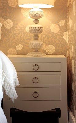
Sometimes things just work. This happy though still neutral large scale wallpaper is adorable.
Sophisticated enough for a guest bedroom, darling for an older teen.
I can’t stop admiring the combination of
Chinoiserie chest (looks like from Bungalow 5)
Wallpaper (looks to be Thibaut “Yvette” in the Metallic Gold or possibly Pearl colorway)
Lamp with three floral balls and drum shade
Remember our little discussion yesterday about repetition?
Here it is again.
Round gold pulls on the chest.
Roundish floral ball motif on the lamp.
Round posy motif on the wallpaper.
Repeat of the gold and cream colors.
Beautifully done.
Should your baby’s nursery be neutral?
I am seeing a new trend: baby nurseries which are not only gender-neutral, but neutral in coloration as well.
Color is used in a nursery for a very good reason, and it bears reminding new parents:
a) babies can’t see very well, and
b) color is a wonderful intellectual stimulant for babies (just like it can be for adults).
I have seen some very neutral-in-color nurseries, like the one above, that are gorgeous.
But, remember, all those famous contemplative poets and brooding artists don’t retreat to
rainy gray Seattle for nothing:
in color theory, neutral coloration promotes contemplation more than stimulation.
Bring some upbeat color into the space if you decide to decorate with pale neutrals.
Use bright colorful accessories, crib mobiles, and toys to attract and hold your baby’s interest.
Are lamps out of style?
Judging by the last few issues of the design magazines I regularly read, the answer would be yes. There are certainly a very few table lamps in sight.
But, get real!
Overhead-only lighting –especially when viewed at night — is one of the real decorating “don’ts.” Fortunately, beautiful lamps and sconces are readily available at a variety of price points.
And, if I have any magazine editors reading today, please give us a little more real life and a little less photographic perfection.
A perfect fire-lit room, gorgeous upholstery and carpet, beautiful drapery and …..no lamps, just a few pot-lights on the ceiling?
Here is a room properly lighted, see how there is lamp or sconce lighting on each side of the room? So pretty and warm.
Source: housebeautiful.com via Ellen on Pinterest
Out of the current pictures on the living room page of the House Beautiful website, look at all these living rooms with few or no lamps:
Source: housebeautiful.com via Ellen on Pinterest
Source: housebeautiful.com via Ellen on Pinterest
Source: housebeautiful.com via Ellen on Pinterest
Source: housebeautiful.com via Ellen on Pinterest
Source: housebeautiful.com via Ellen on Pinterest
Source: housebeautiful.com via Ellen on Pinterest
Source: housebeautiful.com via Ellen on Pinterest
Source: housebeautiful.com via Ellen on Pinterest
Source: housebeautiful.com via Ellen on Pinterest
Source: housebeautiful.com via Ellen on Pinterest
Source: housebeautiful.com via Ellen on Pinterest
Dear Editors: Please show us rooms which are both beautiful AND properly lighted!
My top five decorating no-no’s
Well, we all have our likes and dislikes.
And, if you have been following this blog at all during the last six months since I started it, you’ve seen a lot of rooms that I like, since I try to keep the negative verbiage to a minimum.
But today, please indulge me, just this once, to name a few things I don’t like.
These are some things that bug me in otherwise beautiful homes.
#1. Too many personal photographs.
Especially on bookcase shelves.
A plethora of family photographs= visual clutter.
Pick a few gorgeous ones of meaningful life events (weddings or christenings, for instance).
Invest in pretty frames that complement each other. Don’t mix a hodge podge of frame styles or color finishes.
For all your other cherished photos: Why not invest in a nice leather archival photo album, fill it with your favorites, and place it on the family room coffee table where you or your friends can actually take the time to enjoy looking through the pages?
If you have too many displayed photographs, I can practically guarantee that you don’t really “see” them anymore.
#2 Paperback books on display
This downgrades an open bookshelf immediately.
If you don’t have a decent collection of hardbacks for your shelves, use the space for some other type of collection or grouping until you do. A good designer or a friend with a practiced eye can help you style your bookshelves for maximum visual appeal.
And, as a p.s. while we are talking about books: don’t fall for the contrivance that is shown in some magazines of covering your books, paper or hardbound, in white butcher paper. That is the silliest thing I have seen lately. Books are to be seen, and read, not covered up as strictly decoration.
When you buy a paperback: Read it, then Pass It to a friend, or Donate It. Never open-shelve a paperback book.
3. Skimpy drapery.
Look through any high-end decorating magazine. Quality draperies “kiss” the floor, but yes, you can puddle your draperies if you live in New Orleans or the in English countryside. Otherwise, it is a bit dated looking. The kind of pleats you see will be soft, unpressed pleats, and several widths of fabric to look luxurious. I am not saying this isn’t an investment. It is, but well-done draperies finish a room. For a budget decorating project, use two panels of ready-made curtains per side of the window. Hang the rod high, and let the rod extend out beyond the outer sides of the sill.
4. Pink or orange wood cabinetry anywhere.
This is a very dated look. And, yes, I know men hate to paint wood.
Paint it.
White.
Here is orange:
And here is pink:
#5 Using colors out of the blue that ignore a room’s fixed finishes.
Here, below, the yellow wallpaper is just wrong in every way for the space. It is too bright for the muted blue counter and tiles, and it is not repeated anywhere else in the room, and so it sticks out like a sore thumb.
Middle image, the correct color (In Your Eyes, Benjamin Moore) takes into account the fixed muted blues everywhere else in the room. Bathrooms and kitchens are the two worst offenders, because of tile and countertops being expensive to replace.
Do you have something decoration-wise that bugs you? Do tell!
Proof your dark hallway shouldn’t be light beige
Source: google.dk via Stine on Pinterest
If you are like me, you were always told that you have to paint a dark room a light color.
Well, we were told wrong!
A light color in a dark room will turn “Landlord Beige.”
Go darker and richer in a dark room, and a stunning result will be yours.
Just a little tidbit I learned when I went through True Colour Expert Training.
Repeat after me: “A light color will never come to life in a dark room.” (Thank you, Maria Killam!) (click on Maria’s name to link to her site).
Source: heirloomphilosophy.blogspot.com via Brianna on Pinterest
Source: atticmag.com via Allison on Pinterest
Once in a blue Moon
The colors of nature are sometimes just too gorgeous to be believed.
What’s the best color for a workout room?
Contemporary Home Gym design by Vancouver Design-build Capstone Dwellings, Design-Build
I am often asked, What is the best color for my ______ room? What do I say?
So what is the best color for a workout room?
Here is a hint: NOT BORING BEIGE!
Think about it: you are stimulating your heart, and your other muscles when
you work out. Why not give yourself something pleasing to stimulate the eye as
well. I like to recommend that we start with your favorite color, and go from
there.
Anything that pleases your eye will help encourage you to go in and really use your work-out room.
Many work-out rooms (home gyms) are in low-natural-light areas, such as a
basement, anyway.
Beige is probably the worst possible color for a low-light area.
Contrary to anything you may have been told about keeping low-light areas light
in color, “A light color will never come to life in a dark room.” (wise words from Maria Killam).
Beige just looks dingy when there is little or no natural light.
So, which room would you rather exercise in, one that looks like these two, below:
 Contemporary Home Gym design by Seattle Interior DesignerShannon Diana Lynn, Klang NorthWest
HERE are some dedicated home exercise rooms in a variety of colors to give you some inspiration.
Cool gray walls and persimmon flooring.
Muted green walls with bright blue accents.
Gray walls AND ceilings with silver accents.
Happy yellow walls with an accent rug in charcoal gray.
Green.
 Contemporary Home Gym design by Seattle Interior DesignerShannon Diana Lynn, Klang NorthWest
A more Spa-like green.
A cleaner yellow combined with greens and taupes, bamboo flooring.
Red.
Source: google.com via Katie on Pinterest
Aonther bold, fun choice, terracotta red (tip: don’t ever paint out a ceiling like this).
Mustard with walnut flooring.
And another look at my favorite, Yankee blue with zippy striped carpet.
Pt.2 The eye craves balance
The previous post was about symmetry, mirror image symmetry. Let’s look at “asymmetrical balance” today.
Asymmetrical balance is not the same as mirror image symmetry. Asymmetrical balance, another decorating technique, relies on similar visual weight.
In design, it is also very pleasing to the eye to have a focal point flanked with two sides of equal weight, but not necessarily identical (mirror image) sides.
See how — though not identical — both sides of the room have approximately equivalent visual weight?
Below:
This is a combination of mirror image symmetry plus asymmetrical balance. Can you find the elements of each?
Asymmetrical Balance: note the central focal point (which is the fireplace) serves to anchor the other elements on left and right.
For people who love to color outside the lines, asymmetrical balance can give them a bit looser structure, and still be very visually pleasing.
Which do you prefer, mirror image symmetry; asymmetrical balance; or a combination of each?
The eye craves balance
Source: myhomeideas.com via Kay on Pinterest
The eye craves balance.
Do you believe me? Have you ever walked into someone’s house and a painting or mirror is hanging askew?
Does it drive you a bit crazy? Don’t you find yourself wanting to straighten it?
Now, it does not always happen in your own house (this is because your brain will tune out the things that you are seeing regularly.)
The same thing happens with symmetry. Quick, off the top of your head, do you have a favorite room in your house, or a room that you really, really love as your dream room that you saw in a magazine?
Check it out. I will bet you dollars to doughnuts that the room is highly symmetrical or balanced.
Rooms that are symmetrical are more pleasing to the eye. They create visual harmony and balance. This is an age-old decorating principle.
Today we’ll look at rooms with “mirror image” symmetry. Come along!
Source: houseofturquoise.com via Frances on Pinterest
So, symmetry for the furniture placement is a decorating form that is pleasing to the eye.
“Mirror-image” symmetry is what we see in the bedroom above. Other than the focal point bed+ starburst mirror, there are two of
everything, matching.
Even the nosegays on the bedsides are identical.
The same design principle is true when the decorating is done around a focal point fireplace, or any other focal point.
Source: indulgy.com via Kristen on Pinterest
Source: casatreschic.blogspot.com via Laura Mitchell on Pinterest
Source: Uploaded by user via Kelli on Pinterest
Source:
Source: southernpiphi.tumblr.com via Jean on Pinterest
How do you determine exterior light size?
We all know curb appeal is important. When I do exterior color consultations, I always look at the big picture.
Many times, I will recommend that my homeowner consider upgrading the main doorway light fixture(s).
Think about it, your home is being most often viewed from street distance. Make sure your light fixture is proper size.
Now that your eye has been shown a good proportion, take a look at the following lighting scheme:
Don’t you prefer the 4:1 ratio of door to light? Doesn’t the above lighting scheme look dinky now that I am pointing this out?
The house below is a tad busy, but the main front door lighting has nice proportions. By the way, better to be a bit big than too little:
What about this one?
If you said too small, I agree. (I am not loving the huge sidelight to the right of the door, which would be the correct place to have a light).
What about this?
Did this visual exercise help you determine the correct size for your lighting? Does your own exterior lighting have enough presence?
Do you agree with my proper proportions guideline?
Summer Entertaining with a complementary color scheme
Source: google.com via Ellen
I use my love of color and color combinations when I entertain. Blue/
Orange are complementary (opposite) colors on an artist’s color wheel.
Here is a sampling of a classic casual look which captures those late-
summer colors. Below, a simple but delicious lobster dinner was
served for a family birthday.
Notice the play of the colors in the “Nantucket Red” placemats and
the bright saffron embroidered-lobster napkins, with the complement
of the blue accessories and the blue and cream stripes on the chairs.
When using the color scheme of blue and orange in decorating, these
complementary colors actually intensify one another visually.
I find true blue/true orange combinations too jolting or too juvenile for
home decór, when you live with them on a daily basis. (The muted versions
of the two colors can be very pleasing, however.)
Most complementary color combos work well in a table setting, though,
because table decór is all about stimulating the senses.
Nothing says summer like blue and white
This is Benjamin Moore Maritime White
How to use repetition in your entry hall
We’ll look today at interior entries and foyers, and the importance of repeating shapes, colors and motifs for unifying the space.
So, let’s look at what works with interior entries/foyers, from grand to humble. And for clarity, I’ll mention a few things that in my opinion don’t work.
ALL YOU DÉCOR BUFFS WHO LOVE GRAY RIGHT NOW, DOES THIS, below, DO IT FOR YOU?
SIMPLE AND BEAUTIFUL, above. A great example of good design that probably didn’t cost a fortune. What is repeated here?
WATER REFERENCE: See the subtle reference to the ocean in the coral print pillows and the jaunty black and white photograph? Both repeating the reference to the water. Just enough.
VERTICAL LINES: The slats on the settee repeat the vertical lines of the tongue in groove panels and the vertical border of the rug. Also, the center pillow has a strong vertical motif.
BALL/CIRCLE MOTIF: The circles on the two end settee pillows repeat the balls of the little sconce. Are you seeing that when things are repeated, they are more pleasing to the eye?
COLOR HARMONY: The pale blue wall is perfect with the pinky-beige paver tiles. No clashing undertones in this humble but lovely space.
NOW, I’ll BREAK DOWN THIS “HIT AND MISS”, below:
THE MILLWORK IS NICE, AND THE PAINTING MAKES A BEAUTIFUL STATEMENT ON THE LANDING. THE HANDRAIL IS PERFECT.
However, they should have repeated the black, on the door. The ash finish of the wood door is off, it needs to be black.The countrified rust and beige check coloration on the relaxed-Roman shade comes out of nowhere, do you agree? I think a cozy ebonized settee with a soft cushion covered in a rich emerald green (cue color from the oil painting) would be much prettier and more welcoming than the oddly place round table, and would have kept your eye away from the A/C return vent. And, if I were styling this entry, I would certainly add a rug. Additionally, I find the flooring a tad busy since it is stained a different way than the stair. P.S. I hate rounded door hinges. See prior post on Does your Million Dollar Home have $2 hinges?.
NEVER OBSTRUCT YOUR STAIRS, but otherwise love this rustic rear entry, below. Can you name the two main repetitions used here to nice effect?
FARMHOUSE PERFECTION, below. Repeating the color black again here. I could just die over the iron door strapping and original hardware. The arch of the bookcase references the ellipses in the transom, and repeats in the lantern as well. The strong vertical lines of the tongue in groove paneling, stair spindles, and bench spindles work perfectly. The rug has motifs which reference each of these.
Style Watch: Gorgeous Freestanding Bathtubs
More contemporary, definitely masculine, and just as gorgeous:
Some things to consider:
A freestanding tub is supposed to be the focal point of the bath. Don’t hide it around a corner or behind part of the vanity area.
A freestanding tub normally has a twist-drain closure. Make sure you can reach comfortably down to close the drain.
Some freestanding tubs have such high sides that they are a challenge to enter for the less-flexible. Make sure you can comfortably step inside and back out. Some models have a lower center to make this easier to negotiate.
If you will be bathing infants or very small children/grandchildren in the tub, a freestanding tub with high sides is not for you.
Very specialized plumbing fixtures and more intricate installation are required. The price points on all are generally considerably higher than regular tubs.












 Source:


